
The detail that changes a manicure most is often almost invisible at first: a narrow border, a few deliberately spaced dots, or one untouched strip of nude base. Matte fall nails design 2026 works best when that small decision has a job, because a muted surface can make placement, shape, and proportion much more noticeable. Instead of chasing a louder color, look for the feature that gives the hand its rhythm and decide whether it should be repeated, isolated, or softened.
A useful selection rule is to balance visual weight before adding decoration. Deep shades, long points, and broad dark tips already carry attention, while pale bases and short squares create more room for a single precise accent. If a detail makes the nail feel crowded at arm’s length, reduce its scale or move it to fewer nails; if a simple color feels unfinished, add contrast at an edge rather than covering the whole surface.
Dusty Pink Dots With a Quiet Rhythm
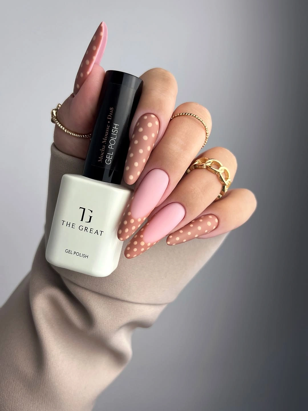
Muted dusty-pink almond nails become more interesting here because the pale dots are not scattered with equal force across every surface. They gather lightly over several long tapered tips while one nail stays comparatively plain, so the eye lands on a soft pattern before returning to the pink base. That restraint is what keeps the detail from reading like a novelty print, even though the individual dots are clearly visible.
The almond taper matters as much as the dot pattern, since its narrowing end gives the repeated circles a direction instead of a flat grid. A reader who likes matte fall nails with design but does not want dense artwork could keep the same low-contrast pairing and place dots only on two nails. Leaving a solid nail beside them creates a pause, which makes the dotted ones look more intentional rather than more numerous.
For a shorter version, fewer dots with slightly more space between them would preserve the same relaxed effect. Tiny marks packed onto a compact nail can quickly lose their clean rhythm, especially against a dusty base where contrast stays gentle. The practical appeal is that the color remains the main choice, while the pattern behaves like a quiet adjustment rather than a separate statement.
Shimmering Magenta Points in One Color Family
The pointed silhouette gives these purple-pink nails their drama, yet the shifting magenta, berry, and orchid tones prevent the length from becoming one solid block. Fine sparkle catches across every nail, while the closely related shades create a controlled change from finger to finger. Because no unrelated accent color interrupts that progression, the result reads as tonal movement rather than a mixed-color challenge.
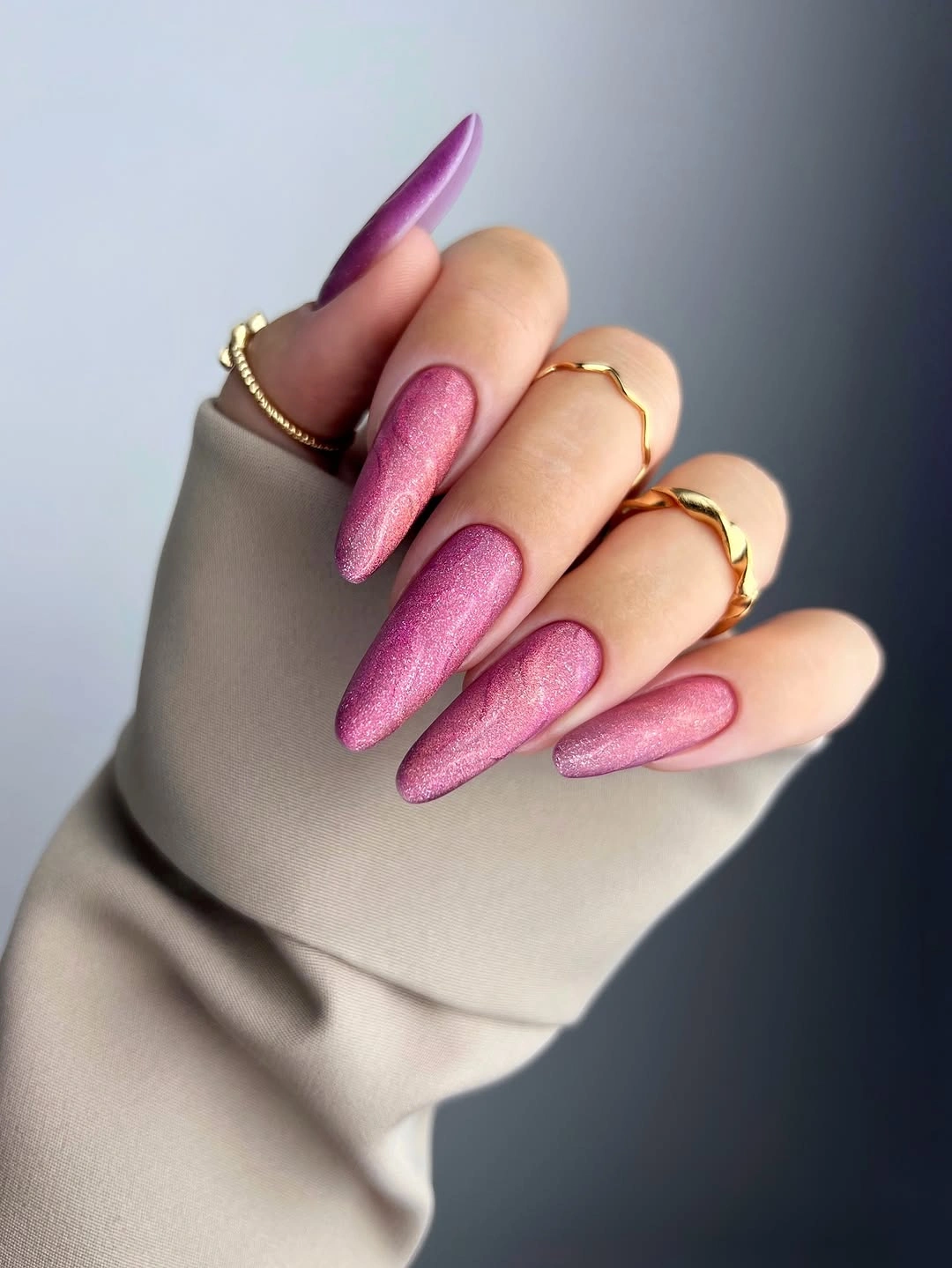
What makes the palette work is the decision to repeat one intensity across several nearby hues. A darker berry nail can sit beside a brighter pink when both carry the same visible shimmer and share the same sharply tapered outline. If the full stiletto length feels too demanding for daily routines, moving this exact color direction onto a medium almond shape would reduce the visual volume without losing the vivid mood.
There is a real tradeoff in pairing fine sparkle with very long points: every tip becomes a focal point, so uneven lengths or a mismatched shade would show immediately. Keeping the colors within the same purple-pink range gives the hand a reliable structure even when the surface has a lot of light play. It is a strong choice for someone who wants brightness, but prefers color continuity over a random rainbow effect.
Graphic Color Blocks Framed by Black and White
Black and white provide the framework for this long abstract manicure, allowing turquoise, pink, yellow, and purple segments to appear sharp rather than chaotic. Each nail carries a different arrangement of stripes, rectangles, or divided fields, but the dark-and-light contrast repeats often enough to connect them. The most consequential detail is not a single bright color; it is the repeated graphic outline that gives those colors somewhere to sit.
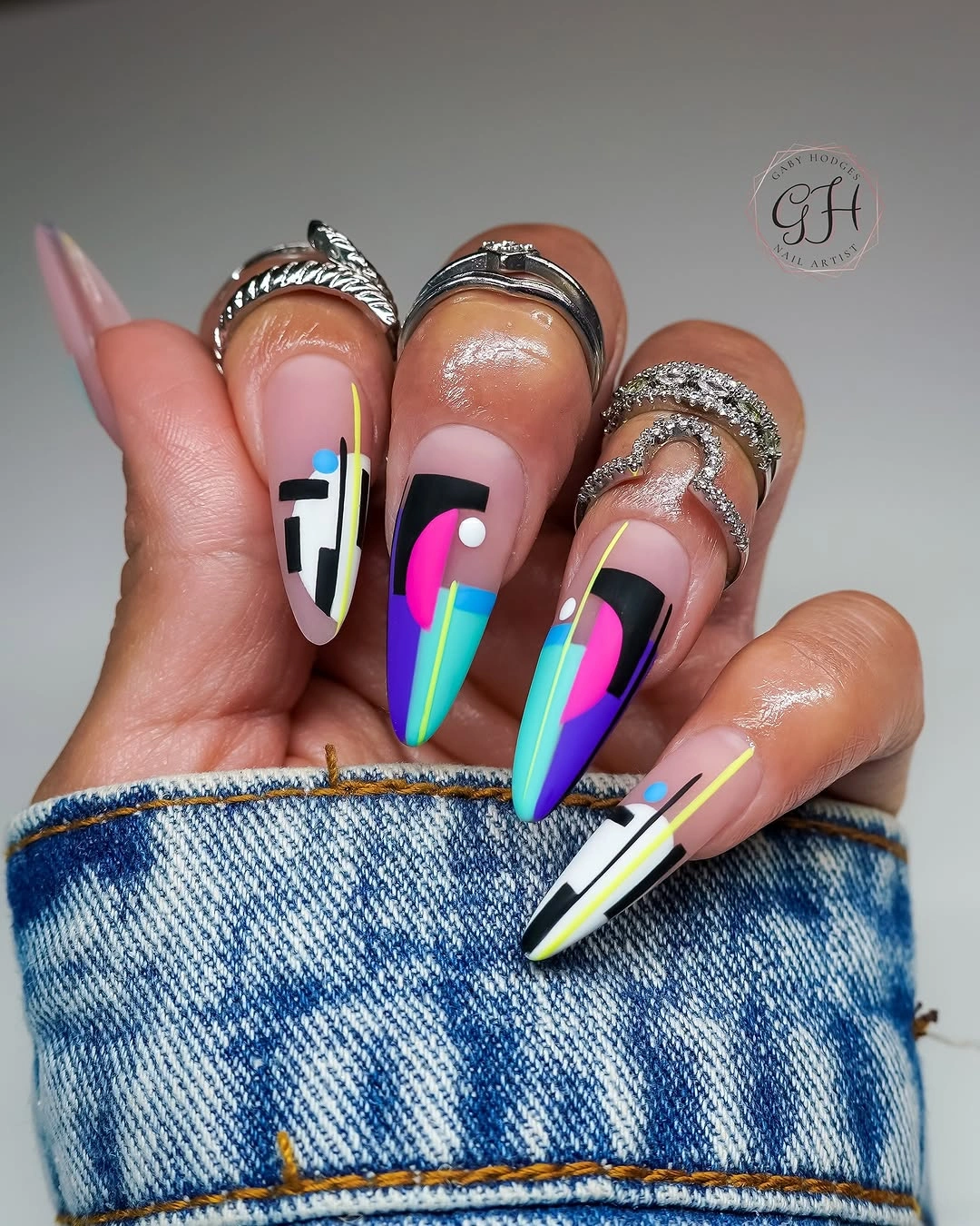
A high-contrast layout like this benefits from editing the number of competing signals. The thin lines make some bright pieces feel smaller than they are, while the white sections offer relief between the black blocks and saturated accents. Someone drawn to nail art but hesitant about the full intensity could choose black, white, and one bright color, then preserve the varied placement instead of copying every hue.
The long almond shape stretches the geometry into a vertical composition, which is why the narrow stripes remain legible rather than cramped. On shorter nails, broad color blocks would likely read more clearly than several tiny sections, and the black framework should be simplified rather than made thicker. The lesson is that detail needs a repeated organizing rule, especially when every finger has a different design.
Violet Squares With Two Focused Interruptions
Soft violet occupies most of the short square nails, giving the mixed palette a stable center before mint and leopard-style print enter the conversation. The print appears on only one nail, and the pale mint appears once as well, so neither interruption can overpower the violet field. That uneven distribution is more useful than making every nail a different color, because it preserves a clear visual hierarchy.
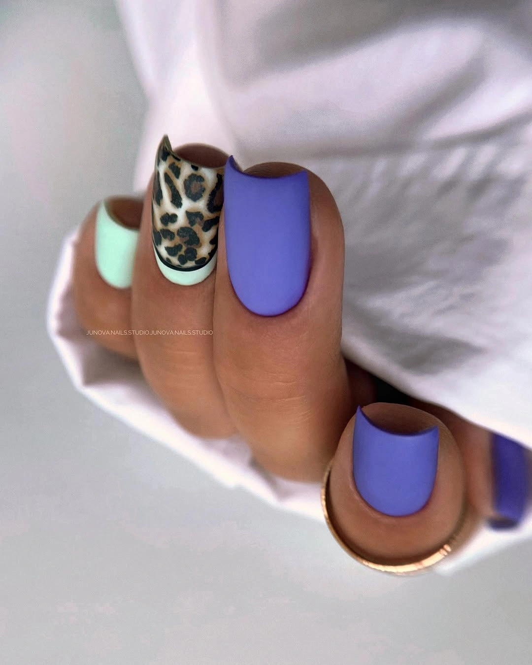
Short squares make the design feel practical even with a patterned accent, since the compact edges prevent the three-color idea from becoming too theatrical. A single patterned nail also lets the reader test an animal-inspired motif without committing the whole manicure to it. If the mint feels too fresh beside violet, replacing it with a pale neutral would keep the same placement logic while making the contrast quieter.
The apparent low-reflection finish supports the color blocking by making violet look broad and even, rather than reflective and constantly changing. Because the leopard-style marks already have a strong shape, adding more tiny details elsewhere would weaken the focused effect. The best maintenance-minded choice is to keep the print to one accent nail, where slight visual variation remains part of the design instead of a distraction.
Orange Squares Balanced by White Wave Panels
Bright orange carries a lot of visual weight on long square nails, so the white accent panels are doing more than adding a second color. Their thin orange waves repeat the main shade without covering the light background, creating a deliberate interval between the saturated tips. The result has energy, but the white areas keep the length from reading as an uninterrupted wall of orange.

Negative space is the most useful detail here because it gives the wavy lines room to move. Rather than filling every accent nail with an orange design, the lines stay narrow and let the white surface remain visible around them. For a simpler fall matte nails design idea, one white accent with a single curved orange path could deliver the same relationship at a lower level of detail.
Long square tips naturally make color blocks feel wide, which can be striking but also makes the manicure harder to soften with small changes. Keeping orange solid on several nails and graphic on only two creates a clear difference in texture without claiming a different material or technique. If the reader wants less visual upkeep, a shorter square shape would preserve the palette while reducing the amount of orange that must look perfectly even.
Sage Green Squares That Let Shape Lead
Nothing competes with the sage-green color on these short, softly squared nails, which makes their consistent length and rounded corners unusually important. The muted green sits between a pale neutral and a deeper forest tone, so it feels calm without disappearing against the hand. With no accent nail or line work to distract from it, the manicure depends on an even silhouette and a clear cuticle outline.
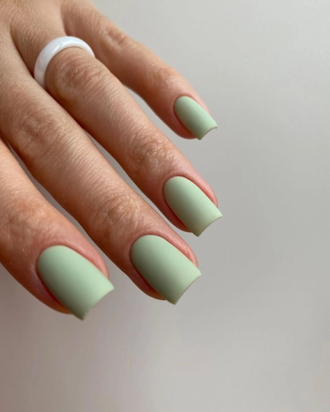
A plain finish can be a more revealing choice than a decorative one because each edge stays visible from every angle. Readers looking for matte green fall nails design inspiration can take the undertone rather than the exact surface treatment: choose a softened green, keep the length compact, and let the color do the work. The lack of artwork is not an absence of intention here; it makes proportion the central design decision.
This direction is especially useful when a darker seasonal shade feels too formal or a pastel feels too airy. Sage has enough grayness to look grounded, yet it leaves more light around the fingertips than deep olive or brown would. Consistent shaping deserves attention over time, since a solid color gives no pattern to hide irregular lengths, but that same simplicity makes small touch-ups visually easy to judge.
Forest Green Swirls With Tonal Movement
Deep green solid nails frame the lighter organic curves in this almond manicure, so the patterned accents feel connected to the base rather than pasted onto it. The pale green lines resemble leafy or marbled movement, but their value comes from staying within the same color family. Instead of introducing a bright contrast, they create a second layer of green that follows the length of the nails.
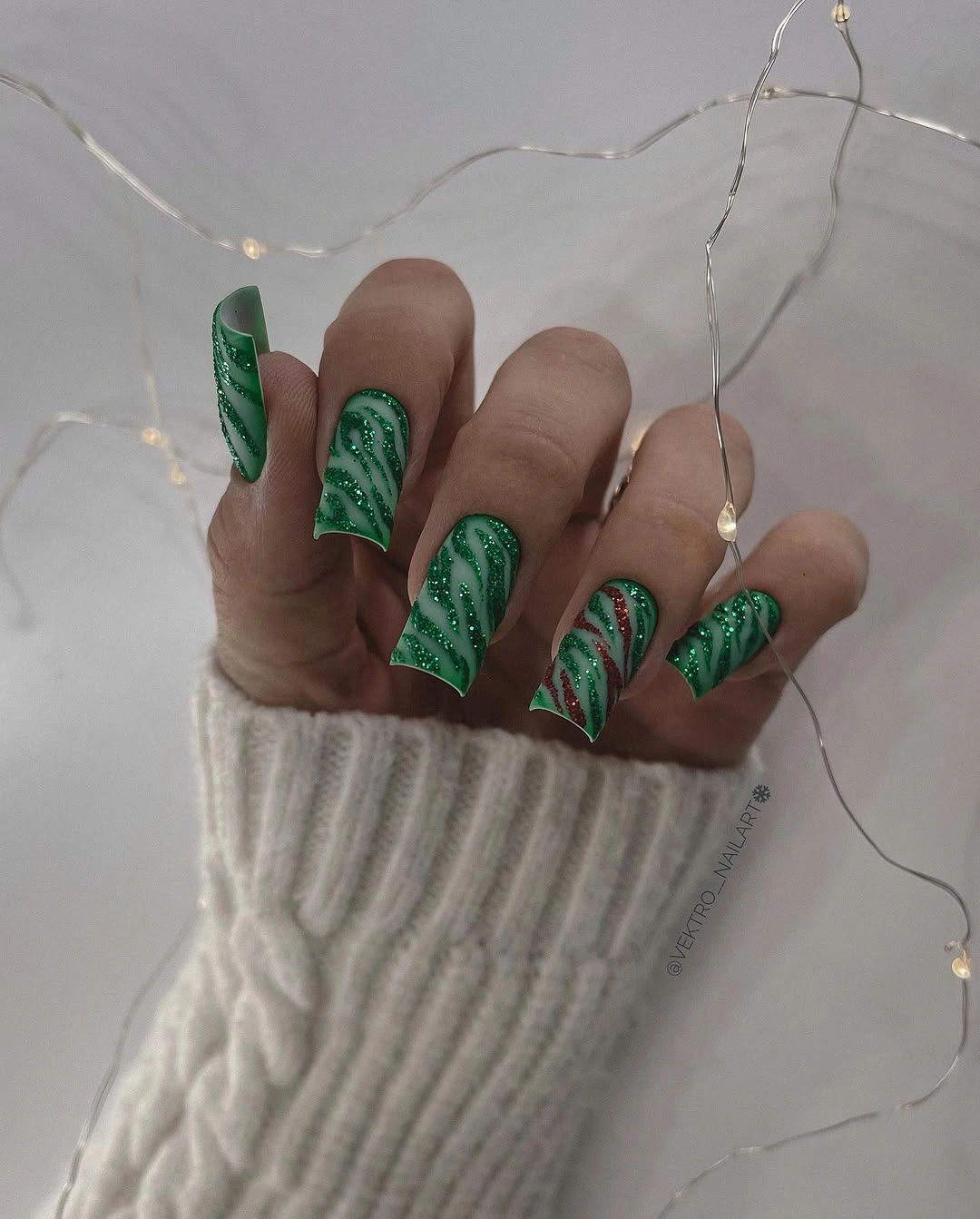
The two accent nails are enough to establish the motif because the darker solids offer visual silence around them. If every nail carried the same curving detail, the layered lines could start to blur together at a distance, particularly on an almond shape with pointed ends. Keeping the pattern concentrated gives a reader an adaptable formula: use deep green as the anchor, then reserve movement for selected fingertips.
Organic line work has a softer effect than a strict stripe because it changes direction and thickness as it travels. That makes it a good companion to rounded almond tips, while a squarer shape might call for fewer curves and more open space. The tradeoff is precision: the lighter marks need to remain distinct from the base color, otherwise the manicure could look visually muddy rather than deliberately tonal.
Deep Red Edges Around a Milky Base
The dark red appears as a narrow edge around pale almond nails, which changes the usual balance of a deep color manicure. Most of the surface stays milky white, while one fully red nail gives the outline enough weight to feel purposeful. That single solid accent prevents the perimeter detail from becoming so delicate that it fades when viewed from farther away.
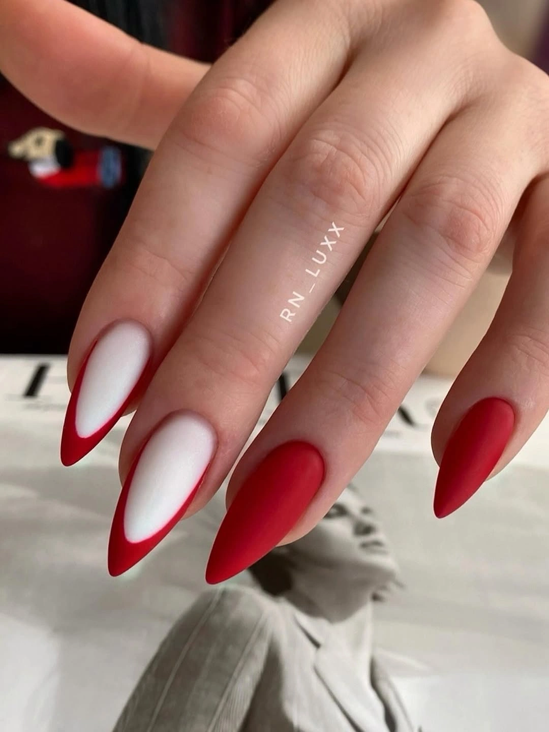
Color at the border behaves differently from color across the whole nail: it sharpens the shape first and adds mood second. A reader testing burgundy fall nails design can keep the same idea by using a slim colored rim over a pale base, then deciding whether one solid nail is needed for contrast. The light center creates negative space, so the red feels precise instead of heavy.
Outlined tips can require more visual attention as the natural growth area becomes visible, because the edge placement is the feature the eye notices first. That does not make the design impractical, but it rewards a clean, narrow line rather than a wide dark band. The best adjustment for a quieter version would be to skip the solid accent nail and let the perimeter remain the only concentrated detail.
Small Hearts on a Milky White Structure
The tiny outlined hearts are deliberately secondary to the white-and-nude structure of these square nails. They sit in open areas rather than covering the tips, so the soft contrast between milky white and sheer-looking nude remains the main visual cue. That scale matters: the hearts add a personal note without asking the reader to treat every nail as a separate illustration.
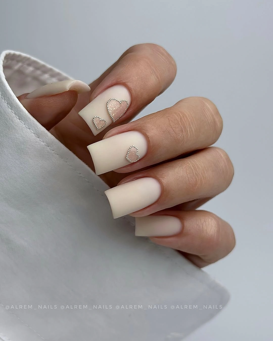
Because the motif is small, it needs a quiet base to stay readable. The light palette creates enough space around each heart, while the squared shape provides a stable panel for the white sections and rounded edges. Anyone who prefers a simpler interpretation could keep just one heart per hand and let the remaining nails rely on the white-and-nude contrast alone.
Romantic details often become more wearable when their placement is limited, especially if the rest of the manicure has a clear repeated structure. Here, the hearts do not need stronger color or extra sparkle because their outline already interrupts the pale surfaces. Shorter squares could carry the idea well, but the heart should be placed away from crowded tips so it does not lose its small, considered effect.
Cool Gray Leaves Against a Lavender Base
Muted gray-lavender solids make the pale line-art nails feel like a controlled change in temperature rather than a completely separate idea. The leaf-like curves on the accent panels are fine enough to read as texture from a distance, while the cool base color keeps the overall mood restrained. Their placement on only two nails gives the organic marks a clear boundary and prevents them from overtaking the shape.
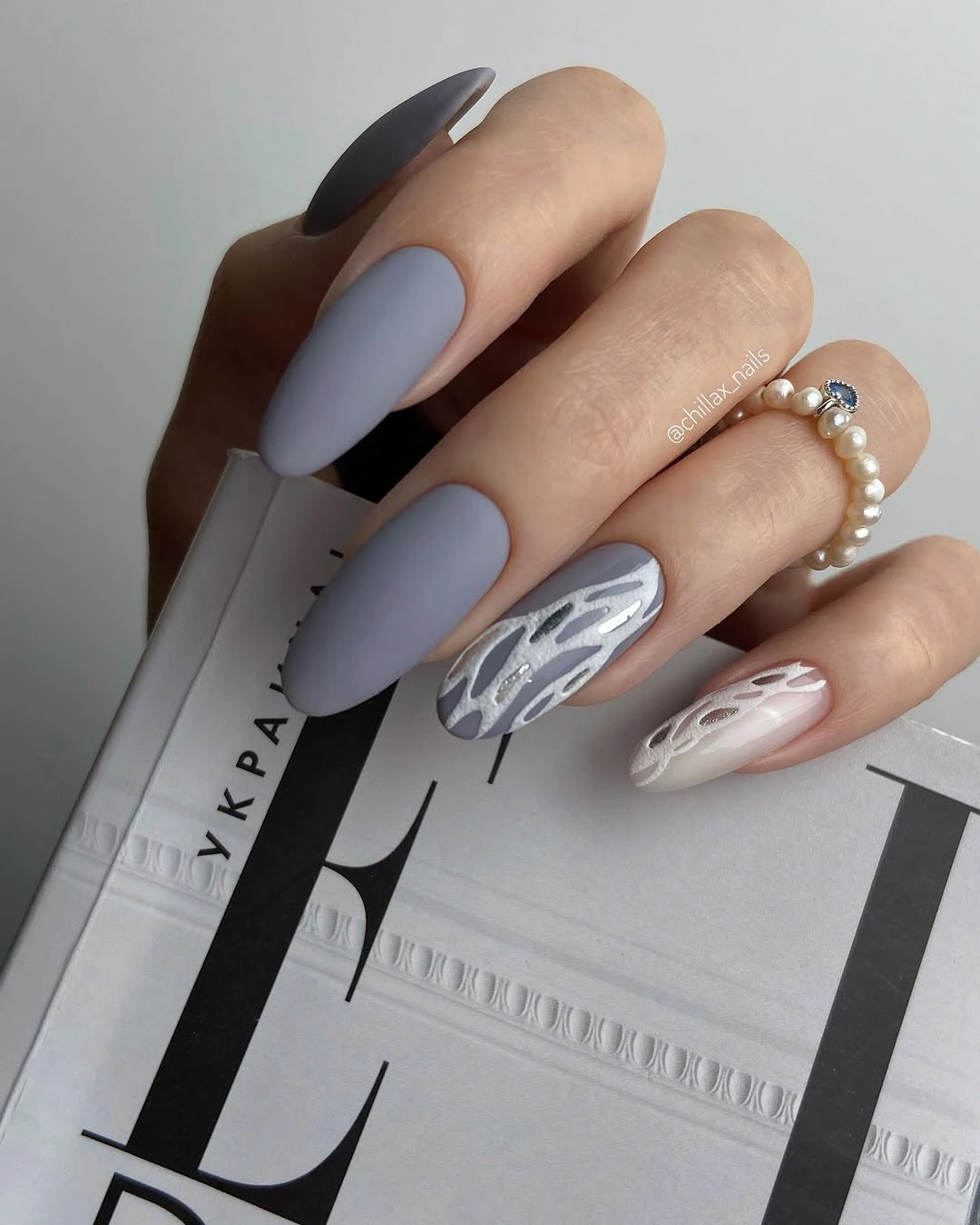
Fine botanical-looking lines work best here because the base palette does not compete with them. A brighter green or gold could have shifted the manicure into a different direction, but charcoal and pale marks keep the contrast close and editorial. For an easier version of matte fall nails designs, one accent nail with a single curved leaf-like line would retain the same detail-first idea without repeating the entire panel.
The cool undertone is a useful alternative when warm brown and burgundy colors feel too expected for fall. It makes the solid nails carry a quiet presence, while the pale accents add only the amount of motion the hand needs. Since the line work is delicate, reducing its density rather than adding more leaves is the safer adjustment if the nails are shorter or the reader wants a lower-maintenance visual.
Nude Almonds With Fine Burgundy Contours
These peachy nude almond nails prove that a dark fall shade does not need to arrive as a full block of color. Slim burgundy contours travel along parts of the nails, leaving the nude surface largely visible and making the lines feel like placed marks rather than filled tips. Their delicacy depends on that unequal relationship: the base remains broad, and the dark color behaves as a narrow interruption.
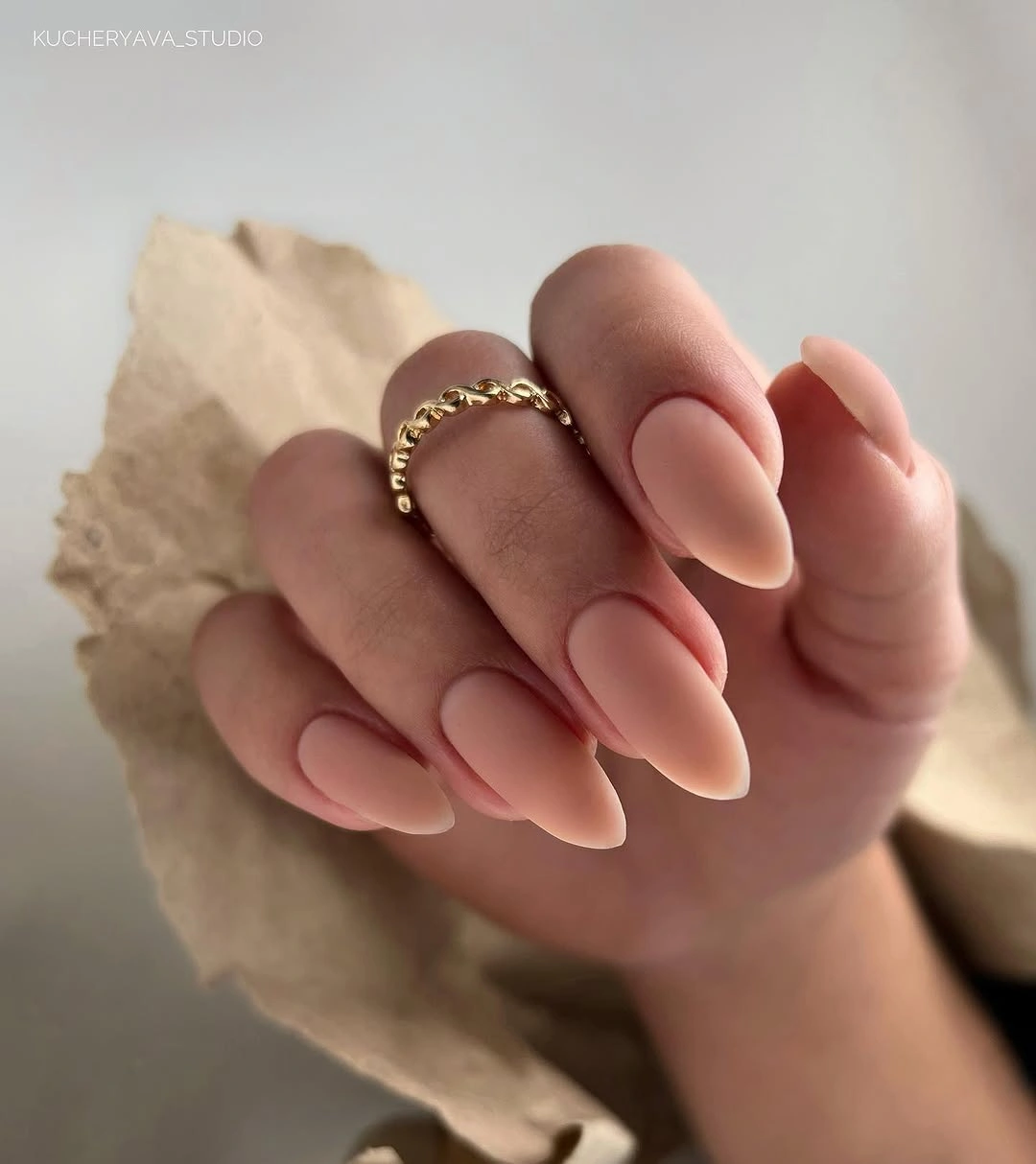
The most effective choice is the width of the line, not simply its color. If those burgundy paths were doubled or widened, the airy nude field would shrink and the manicure would feel much more assertive. Readers who search for burgundy almond ideas can borrow the contrast while changing the placement, perhaps tracing one side of a nail instead of repeating a full contour across every fingertip.
Fine detailing calls for restraint because its charm comes from what it leaves untouched. The almond points help the curves travel naturally toward the tip, whereas a short square could benefit from one abbreviated line rather than a long sweeping outline. This is a good design for someone who wants a seasonal shade in view, but prefers the visual lightness of a neutral manicure.
Blush Squares With a Graphic Black Frame
Bold black borders turn the pale blush centers into small framed panels, making this short square manicure feel graphic without covering every nail in dark color. The black is strongest at the tips and side edges, where it defines an arch around the softer base. That placement matters because the nude center acts as negative space, keeping the contrast crisp rather than dense.
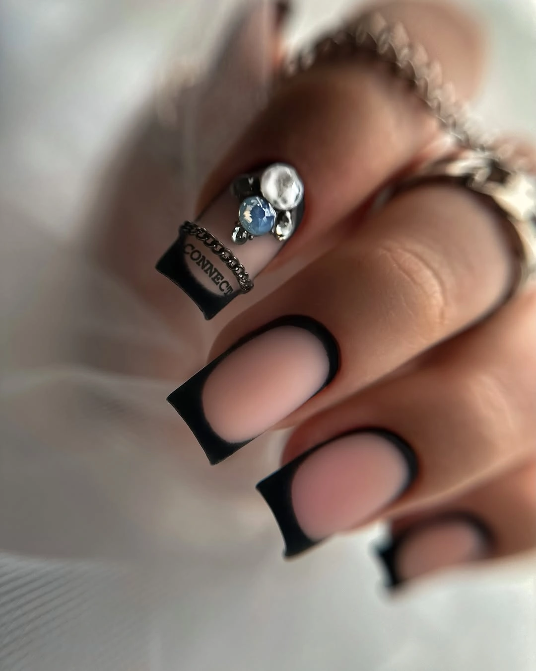
On a short length, a dark frame can create more intention than a full dark surface because it emphasizes the outline the nails already have. The blush center softens the black and gives the eye a place to rest before it follows the curved border again. Anyone adapting the look for a calmer routine could use the frame on two accent nails and leave the rest in the same pale tone.
The tradeoff is that black edges are visually exacting: an uneven border becomes noticeable because the entire design is built around symmetry and contrast. Keeping the square shape compact helps, since the dark outline has less area to dominate than it would on a longer tip. This is a strong direction for readers who want a clear graphic detail but still need visible nude space around the fingertips.
Fine Botanical Marks on White Squares
Small brown stems and muted green leaf-like marks sit lightly over a white square base, giving the manicure a botanical mood without turning it into a dense floral pattern. The thin lines are unevenly placed and some nails remain more open than others, which lets the white background keep its clean role. One angled striped detail adds another fine texture but does not change the color hierarchy.
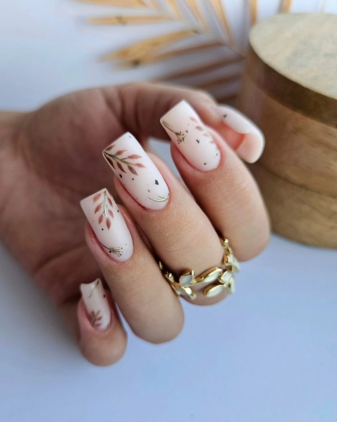
Scale is the key feature here. The markings are small enough that the nail shape still reads first, while the botanical accents reveal themselves only after the eye moves closer. A reader who likes leaves but finds literal motifs too elaborate could preserve this approach by limiting branches to two nails and using a white base to keep every line visible.
Short squares suit this kind of detail because they provide neat little panels without adding too much length to a delicate pattern. The marks would become crowded if every available space were filled, so leaving a few nails nearly plain is part of the design rather than an unfinished step. That balance makes the seasonal reference feel quiet and usable, even when the line art remains the most distinctive element.
Mauve Nails With Sparse Gold-Colored Flecks
The muted mauve-berry base stays calm because the tiny pale flecks are scattered rather than packed into a solid sparkle layer. Their scale is closer to a light dusting than a confetti pattern, so they change the surface only when the hand moves or comes closer. That subtle placement lets the color remain the main story, with the flecks functioning as small points of contrast.
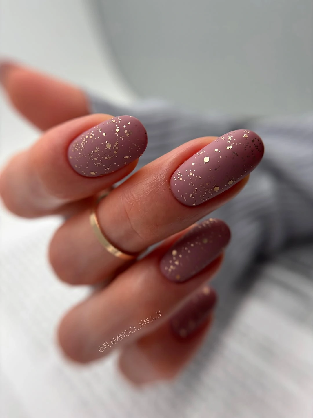
For a darker fall manicure, this is a useful reminder that brightness can be concentrated in very small areas. The warm flecks lift the mauve tone without requiring a second full color or a large accent panel, which keeps the oval nails looking cohesive. Someone who wants less detail could reserve the flecks for one or two nails, allowing the rest of the hand to stay entirely berry-toned.
The visible finish appears low in reflection, so the small highlights have more impact than they would over a very shiny background. Adding a dense glitter-like surface would change the entire balance and obscure the soft character of the base color. The restraint is practical as well as visual: sparse marks give the eye a focal shift, but they do not demand that every nail carry identical detail.
Nude Nails Anchored by One Orange Accent
One orange, grainy-looking accent nail carries nearly all the seasonal warmth in this otherwise soft nude manicure. Its concentrated texture-like surface stands out because the surrounding short nails are plain and light, not because the hand is covered in orange. The placement makes the accent feel deliberate, especially beside the rust knit background that echoes its warm direction.
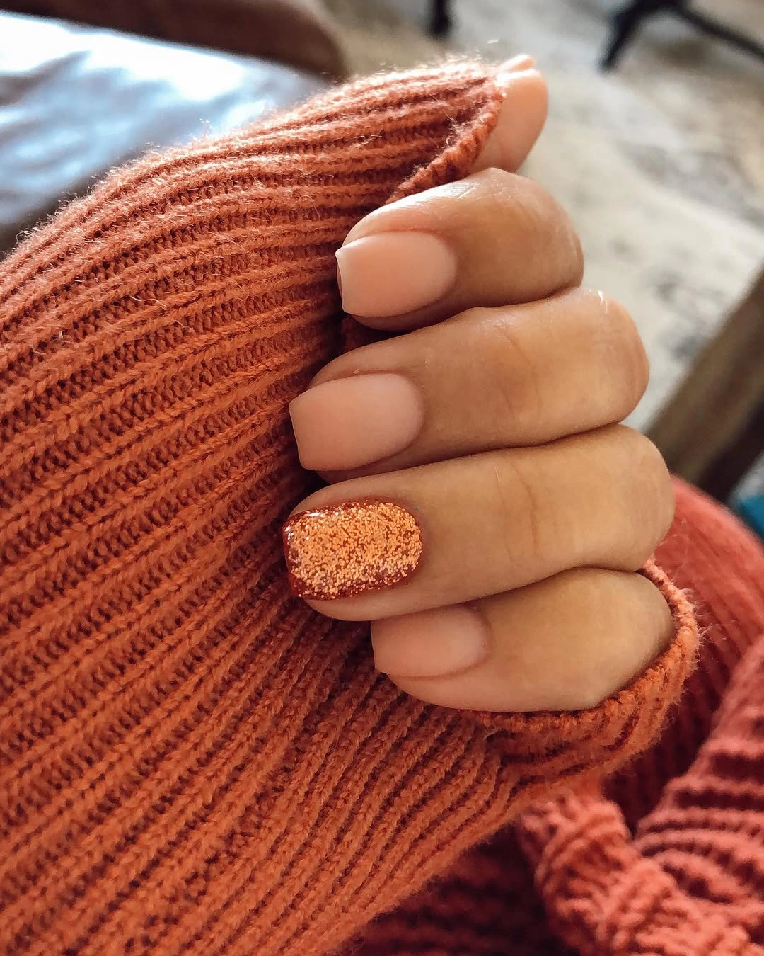
A single focal nail is often enough when the color has this much visual energy. Keeping the other nails nude means the orange does not need a matching stripe, dot, or second accent to justify itself, and that gives the compact shape a relaxed appearance. For a flatter interpretation, the same warm orange could be used as a simple solid accent while preserving the one-nail placement.
Texture-like detail brings a tradeoff because it reads strongly even at a distance and may draw attention to any unevenness in the accent. That is why isolating it works better than repeating it across all five nails. Readers who want an autumn cue without a full orange manicure can use the same decision: choose one concentrated surface change, then let a quiet nude base provide relief around it.
Terracotta Waves With Open Nude Space
Muted terracotta and cream curves travel over a long nude base without covering it, turning each nail into a small flowing composition. The waves shift position from nail to nail, but open nude areas remain between them, so the pattern has movement instead of visual crowding. That repeated gap is the feature that keeps the warm colors light, even across a longer squared silhouette.
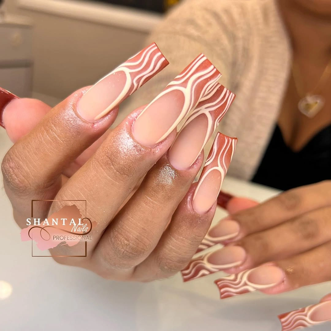
Line work benefits from a visible base because the empty areas show where the eye should pause. Here, the nude surface separates the warm curves and makes their irregular paths feel deliberate rather than tangled. A shorter version would need fewer waves or a single edge-following curve, since compact nails leave less room for several lines to remain distinct.
The palette offers a softer route into fall color than a full brown or burgundy manicure, particularly for readers who prefer a light foundation. Cream acts as a bridge between nude and terracotta, reducing the contrast so the lines can be layered without looking severe. The practical limitation is scale: as the nail becomes shorter, simplifying the number of paths matters more than changing the color itself.
Chocolate Neutrals With Marble-Like Veining
A deep chocolate nail gives this beige and cream mix an anchor, while the brown-veined accent panels repeat that darkness in a more fluid form. The pale nails would look separate without the near-black brown, but its presence creates a clear tonal range from light neutral to rich depth. Because the veining stays in the same brown family, it reads as texture rather than an unrelated decorative color.
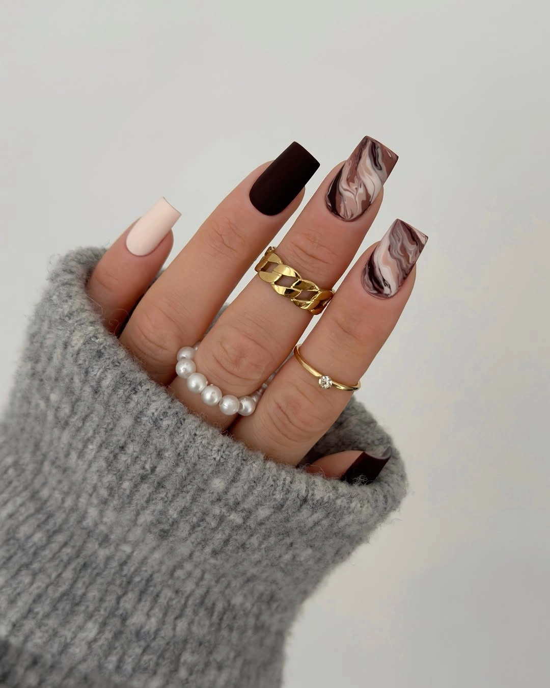
The most useful detail is the decision to limit the marble-like movement to selected nails. Solid beige and dark brown blocks give the eye a stable pattern, then the veined panels add a softer irregular note between them. For a simplified matte brown nails design fall direction, one veined accent next to two solids would preserve the contrast while reducing the amount of line work.
Mixed neutrals require a clear dark anchor so they do not blend into a single indistinct beige field. The medium square shape helps each color panel remain legible, while the gray knit background reinforces the subdued palette without becoming the subject. If the reader prefers less visual upkeep, keeping the light nails plain and placing all organic marks on one or two panels will make the design easier to read as it wears.
Black and Pink Blocks With Speckled Relief
Solid black and pale pink create the main tension in this square manicure, but the white nail with scattered dark speckles prevents the color blocking from becoming too rigid. A half-black, half-pink panel repeats the same contrast in a divided form, giving the composition another rhythm without introducing a new major shade. The result is playful, yet it remains organized around a strict three-color limit.
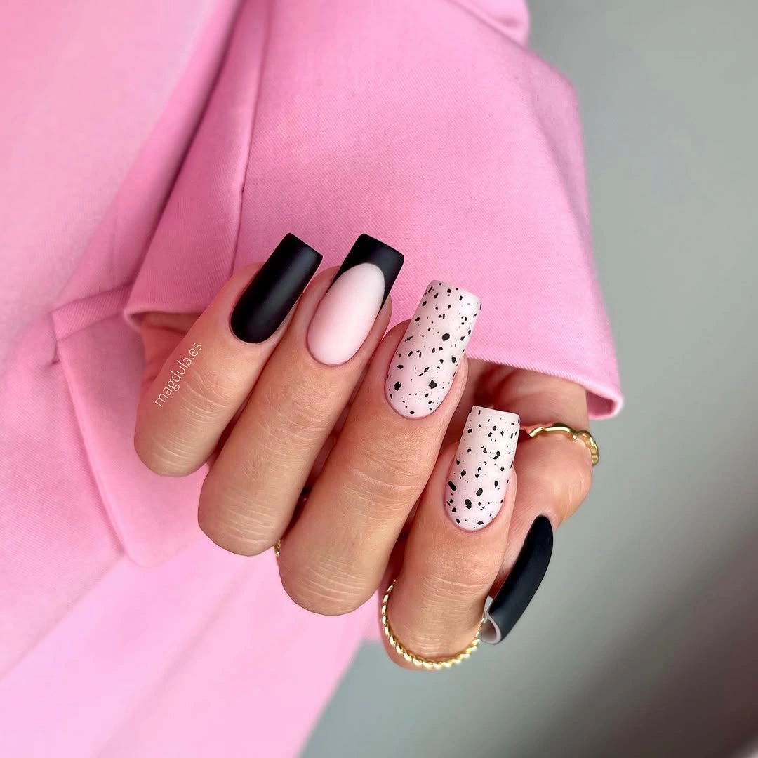
Contrast is doing the work here, so the speckled accent needs to stay isolated rather than spread across every nail. Its irregular dots soften the hard division of the black-and-pink blocks, acting as relief instead of a second pattern system. Someone who wants a more restrained version could keep the pale pink and black solids, then replace the speckles with one plain white nail for the same pause.
The squared tips make the divided colors feel especially graphic because each nail has a broad, straight-ended panel. That can be appealing for a reader who likes visible design choices, but it also means extra colors would quickly overwhelm the small layout. Maintaining three colors and one speckled focal point gives the hand enough variation while keeping the contrast easy to follow.
Neutral Speckles With Asymmetrical Dark Accents
Warm beige nails with fine dark speckles receive their edge from off-center brown and charcoal placements rather than a conventional matching tip. The dark areas sit unevenly along sides or short edges, leaving much of the neutral base visible and making the asymmetry feel intentional. That choice gives a quiet manicure a graphic element without relying on a broad black border or a full dark nail.
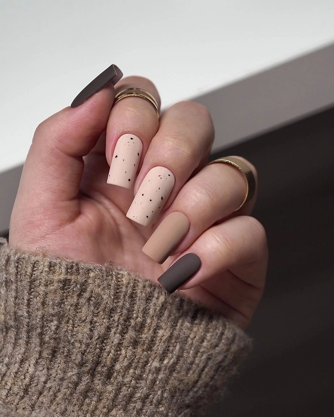
Asymmetry works best when the palette stays narrow, which is why the beige, cocoa brown, and charcoal relationship remains controlled. The little speckles echo the dark accents at a smaller scale, joining the nails without making every fingertip identical. A reader who prefers an even simpler version could keep the beige base and place one dark side accent on only two nails, skipping the dots entirely.
Light neutral surfaces make small marks visible, so this design rewards neat placement and avoids overfilling the base. The uneven dark accents are appealing because they use less color than a full French-style edge, but their balance should still feel deliberate from hand to hand. It is a good middle ground for someone who likes brown fall nails designs yet wants the color to appear as a detail rather than a dominant field.
Deep Olive Squares With No Extra Distraction
Deep olive green is the only visible design decision on these short rounded-square nails, and that simplicity gives the earthy color real presence. With no line work, accent panel, or secondary shade, the eye notices the compact shape and the even, low-reflection surface immediately. The color feels more grounded than the earlier sage direction because it carries more depth and less pale grayness.
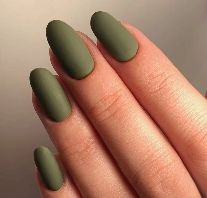
Plain dark color can look especially effective when the outline is kept short and softly squared, since the shape stops the rich tone from becoming overly formal. For matte green fall nails design, the useful adaptation is not more decoration but cleaner proportion: choose a compact length, consistent corners, and a shade that stays close to olive rather than bright grass green. The result depends on disciplined restraint, not added art.
Because every nail shares the same surface, uneven edges or inconsistent lengths would be easy to notice, so regular shaping is the practical consideration. That visibility is also the advantage: a solid olive manicure does not need a pattern to explain itself and can sit comfortably beside more detailed clothing or jewelry. When color has enough depth, leaving it uninterrupted can be the most precise visual choice available.