
The fun part of polka dots is that one tiny circle can change a plain color without asking the whole nail to become a pattern. Polka dot fall nails 2026 feel freshest when the dots have a clear partner: a clean white field, a vivid tip, or an open nude center that gives every mark room to register. Scale matters more than the number of colors, because a small dot can look quiet or graphic depending on the space around it.
Start by choosing where the dots should live before deciding how many to add. A compact oval can carry an all-over field of tiny marks, while a long square often looks better with dots contained inside a broad tip panel. If the palette already includes a saturated red, blue, or black, use neutral space to calm it; if the base is soft, let one brighter dot or edge create the color moment.
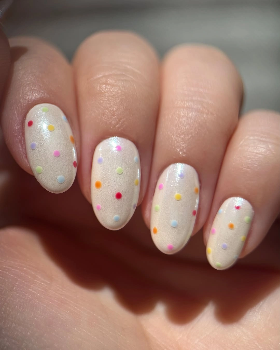
Pastel Confetti Dots on Milky White
Milky white short ovals make the yellow, pink, lilac, orange, and green dots look light rather than loud. The tiny circles are spaced widely enough that the white base still reads first, then the scattered colors appear as a playful second layer. This is the fun option for someone who likes several shades but does not want any single color to dominate the hand.
The restraint comes from dot size, not from reducing the palette to two colors. Each mark is small enough to behave like a point of texture, while the pale base keeps the multi-color idea from turning into a dense print. For a quieter version, choose three pastel shades and leave a few nails with fewer dots instead of making every surface equally busy.
Short oval nails suit this arrangement because their rounded outline echoes the circles without adding sharp geometry. Large dots would quickly take over the compact panels, so the small scale is the practical decision that keeps the effect airy. The result stays cheerful because the white background supplies enough visual calm around every bright little mark.
Black Dots Along White Almond Tips
Black dots sit inside white French-style tips, leaving the pale nude almond base almost untouched. Containing the pattern at the end of the nail gives the motif a neat boundary, while the black contrast makes even tiny marks visible from a distance. The tip placement is doing most of the organizing work, not the dots alone.
A white panel gives black circles a crisp surface, and the nude center prevents the design from feeling like a full monochrome pattern. Readers drawn to polka dot fall nails almond can keep two dotted tips and use plain white or nude nails elsewhere for a lower-detail approach. The repeated tip edge keeps every variation connected even when the number of dots changes.
The almond taper helps the dotted area narrow naturally toward the sides, which makes the pattern feel softer than it would on a wide square. Dense black dots need generous white space between them or they begin to read as a dark block. Preserving those small gaps is what allows the playful detail to remain clean and polished.
Fuchsia Solids Beside Blush Dot Panels
Vivid fuchsia nails give the pale blush dotted accents a confident color anchor, making the black circles feel more intentional than they would on a fully pastel hand. The hot pink is solid and glossy, while the softer panels carry the pattern, so each visual job has its own place. That split between color and motif creates lively contrast without adding too many different designs.
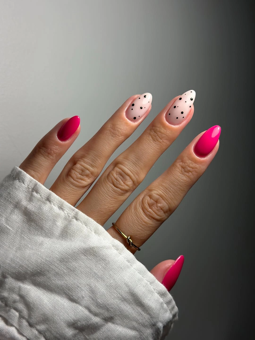
Using one bright solid beside a quieter dotted base is a useful way to make polka dots feel grown-up rather than overly sweet. The fuchsia supplies intensity, and the blush panels give the black dots enough room to stay distinct. A reader who wants less punch can replace two fuchsia nails with a matching blush solid, keeping the same layout but lowering the color temperature.
The dots do not need to cover every pale nail because the hot pink already supplies a strong focal shift. Leaving one blush surface nearly plain would make the remaining dotted accents look even more deliberate. The color decision that holds everything together is repetition of pink in two values, not a larger number of decorative marks.
Even Black Dots Across Dusty Pink Ovals
Dusty pink short ovals carry a full field of small black dots, and the pattern works because the circle size and spacing stay remarkably consistent. Unlike a tip-only design, the dots cover the whole visible surface, so the soft pink becomes an active background rather than a quiet base. The compact shape keeps that repetition tidy instead of overwhelming.
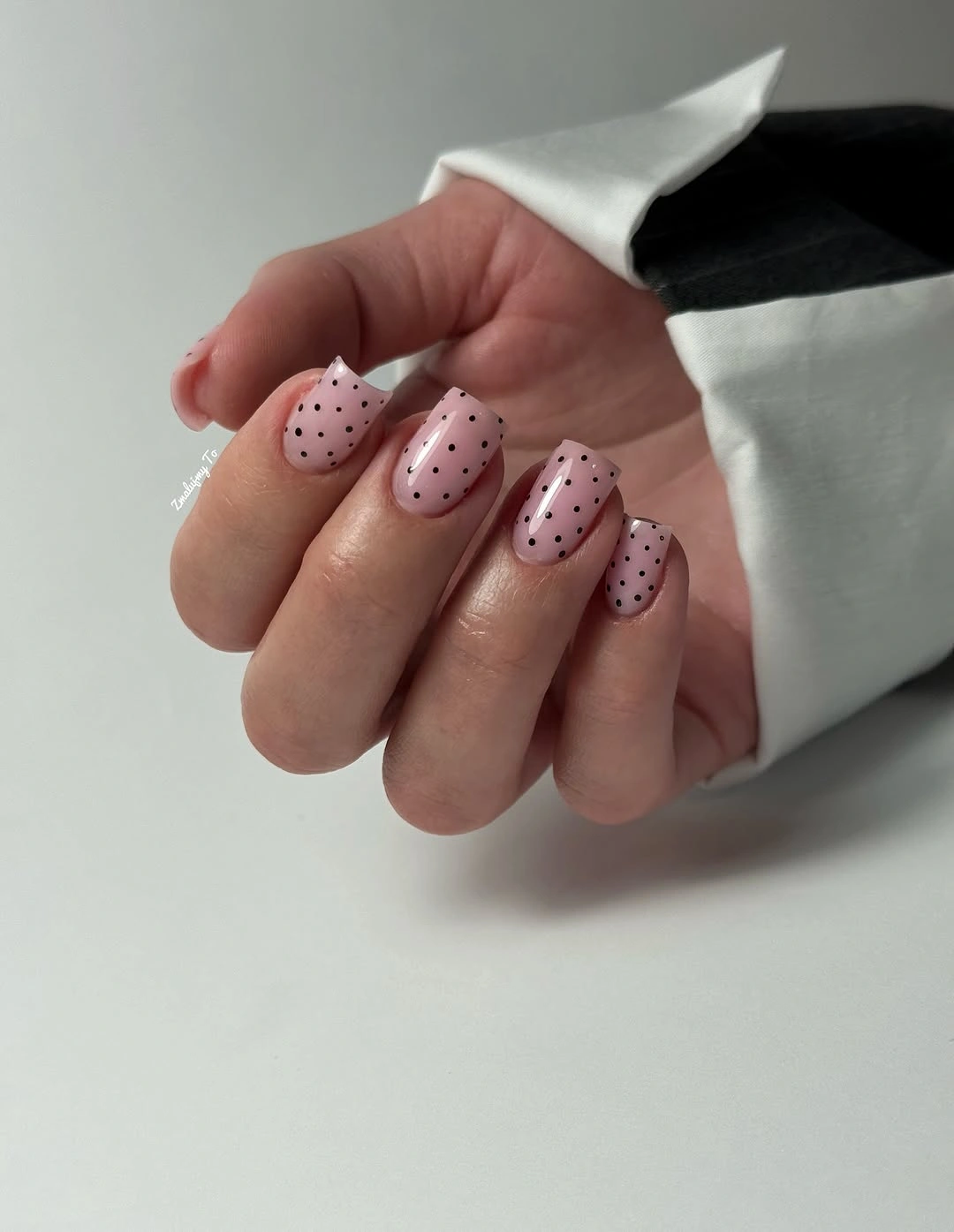
All-over polka dots need a calmer palette than a mixed-color version, which is why black and muted pink make a strong pair here. The contrast is clear, but the pink has enough softness that the dark dots do not feel severe. For a more minimal option, reduce the dot density on one or two nails rather than changing the color relationship.
Consistent spacing becomes part of the manicure’s visual maintenance, since an uneven field would be obvious when every nail follows the same pattern. Short ovals are forgiving because their curved edges relate naturally to circular marks and leave no broad corners to fill. The repeated black dots remain the only pattern, which is precisely why the result reads cleanly.
Cool Blue Tips With Tiny Black Dots
Pale blue tip sections give black dots a cooler setting than white or blush, while the nude almond base keeps the color limited to the ends. The blue is soft enough that the dots remain visible, yet it creates a distinct color shift before the pattern even begins. That contained contrast makes the manicure feel playful without losing its calm open center.
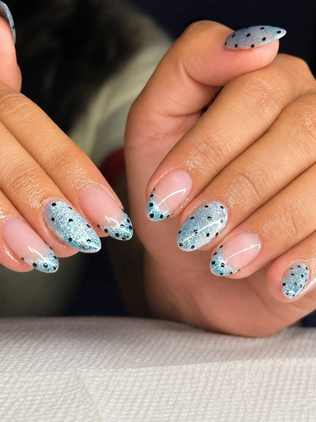
Tip placement is especially useful when a reader wants blue in a fall design but does not want it across every nail. The black circles add texture to the blue panels, and the nude base stops the three-part palette from feeling crowded. A simpler version can use blue tips on two fingers and keep the remaining nails nude with only one dotted accent.
The blue sections need a clear curved boundary so the dots do not drift into the nude area and blur the composition. That edge makes the motif look placed rather than scattered. Keeping the blue pale is the choice that lets the black dots stay crisp while still giving the hand a fresh, cooler color note.
Pastel Tips United by Black Dots
Pale yellow, mint, pink, and white tips all appear over nude almonds, yet the repeated black dots make the varied colors feel like one coordinated idea. Every tip changes hue, but the dot scale stays similar, so the pattern becomes the common thread. It is a bright approach that remains organized by repetition rather than by matching every finger exactly.
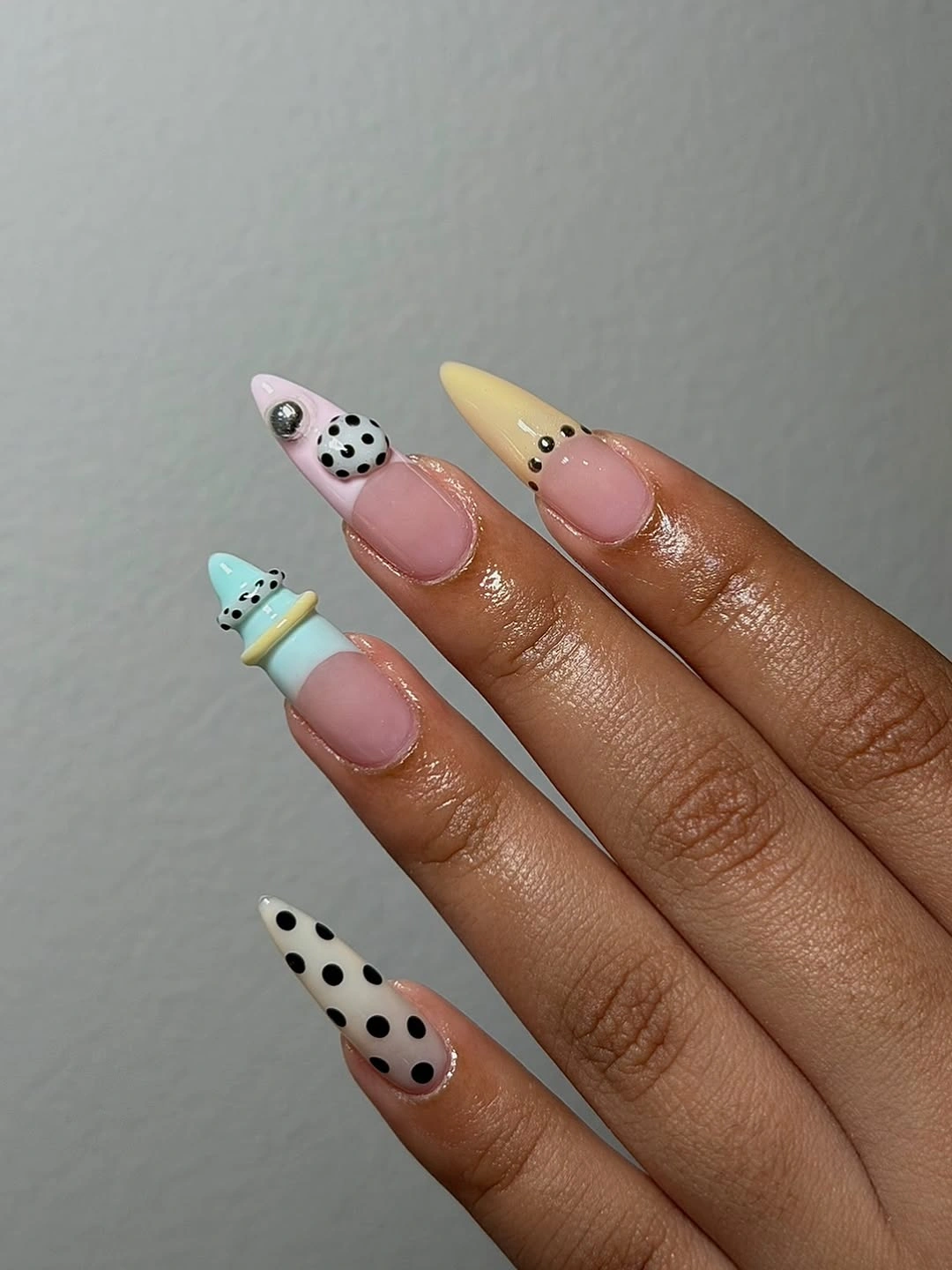
When several pastels are involved, the simplest repeated detail becomes more important than another accent color. Here, small black dots give the eye a familiar element to find on each tip, while the nude centers create a large neutral pause. Readers can narrow the palette to two pastels and still keep the same lively structure if four colors feel like too much.
The almond outline softens the different tip colors because each one follows the same rounded curve. Avoiding dots on the nude base keeps the pattern visually contained and preserves a clean division between color and skin-toned space. That separation is why the multicolor idea remains cheerful instead of looking like unrelated mini manicures.
Red Pointed Tips With White Dot Trails
Deep red pointed tips become lighter when small white dots trace their edges over a nude almond base. The red has enough saturation to feel seasonal, but it occupies only the tip area, leaving the center of each nail open and pale. White dots sharpen the color boundary while adding a soft circular rhythm to the otherwise pointed shape.
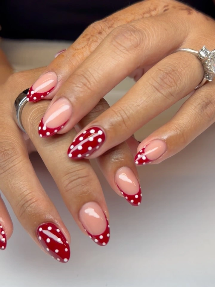
The contrast works because red and white have distinct jobs: red creates the directional point, while white breaks its edge into smaller, friendlier details. For polka dot fall nails red, keeping the dots near the color boundary is more effective than spreading them across the nude base. A single red dotted tip can also work as an accent if an all-hand version feels too bold.
Pointed color needs enough nude space around it to avoid looking heavy on an almond silhouette. The dot trail supplies detail without widening the red section, which is the important visual tradeoff. Leaving the remaining area plain lets the red tip remain the strongest feature while the white circles offer only a quick bright interruption.
Subtle Pale Dots Over Soft Nude
These nude almond nails use pale white-toned accents and very small dots so quietly that the overall effect stays close to minimal. The contrast is low, and the dots appear only in selected areas near light tips, giving the hand texture without a strong pattern statement. This is useful when the reader wants a nod to polka dots but prefers a nearly neutral manicure.
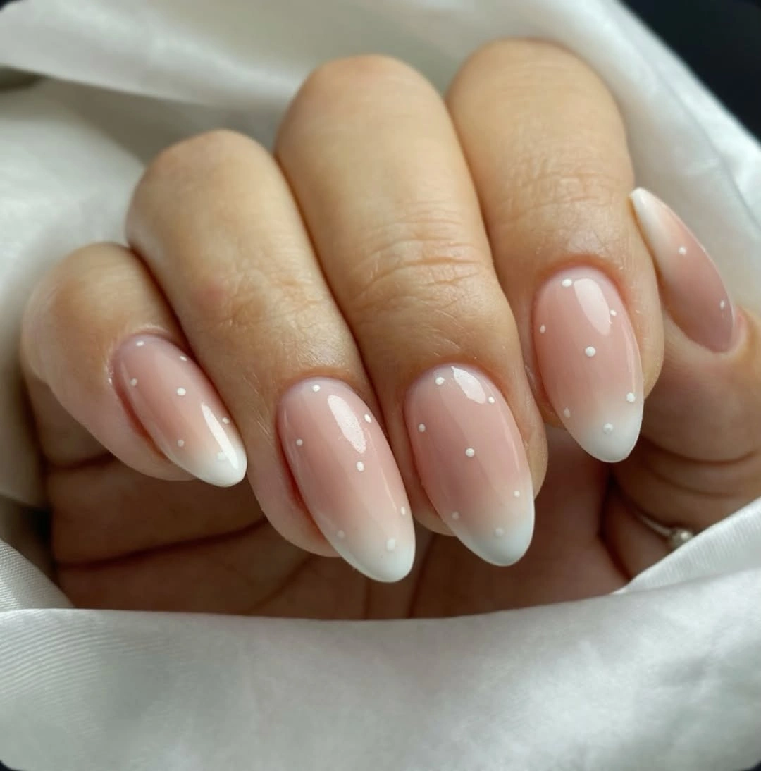
Low-contrast dots succeed when their spacing is generous, because crowding would make the pale marks look accidental rather than subtle. The nude base remains the main visual field, while the tiny light details reveal themselves only after a closer look. A more visible version could use one slightly brighter white tip but should keep the dots just as restrained.
The soft almond shape supports the delicate palette by avoiding hard corners that might demand a stronger graphic edge. Nothing here needs extra color to feel finished; the small dotted texture is enough to alter the surface gently. The quiet consequence is a manicure that reads polished from afar and playful only when the details come into view.
Wide White Panels for Long Square Dots
Long nude squares provide broad white tip panels where fine black dots can sit clearly without crowding the natural-looking base. The straight-ended silhouette gives the pattern a crisp frame, and the white field makes every small dark circle easy to see. Because the dots are contained at the tips, the extended length does not become visually heavy.
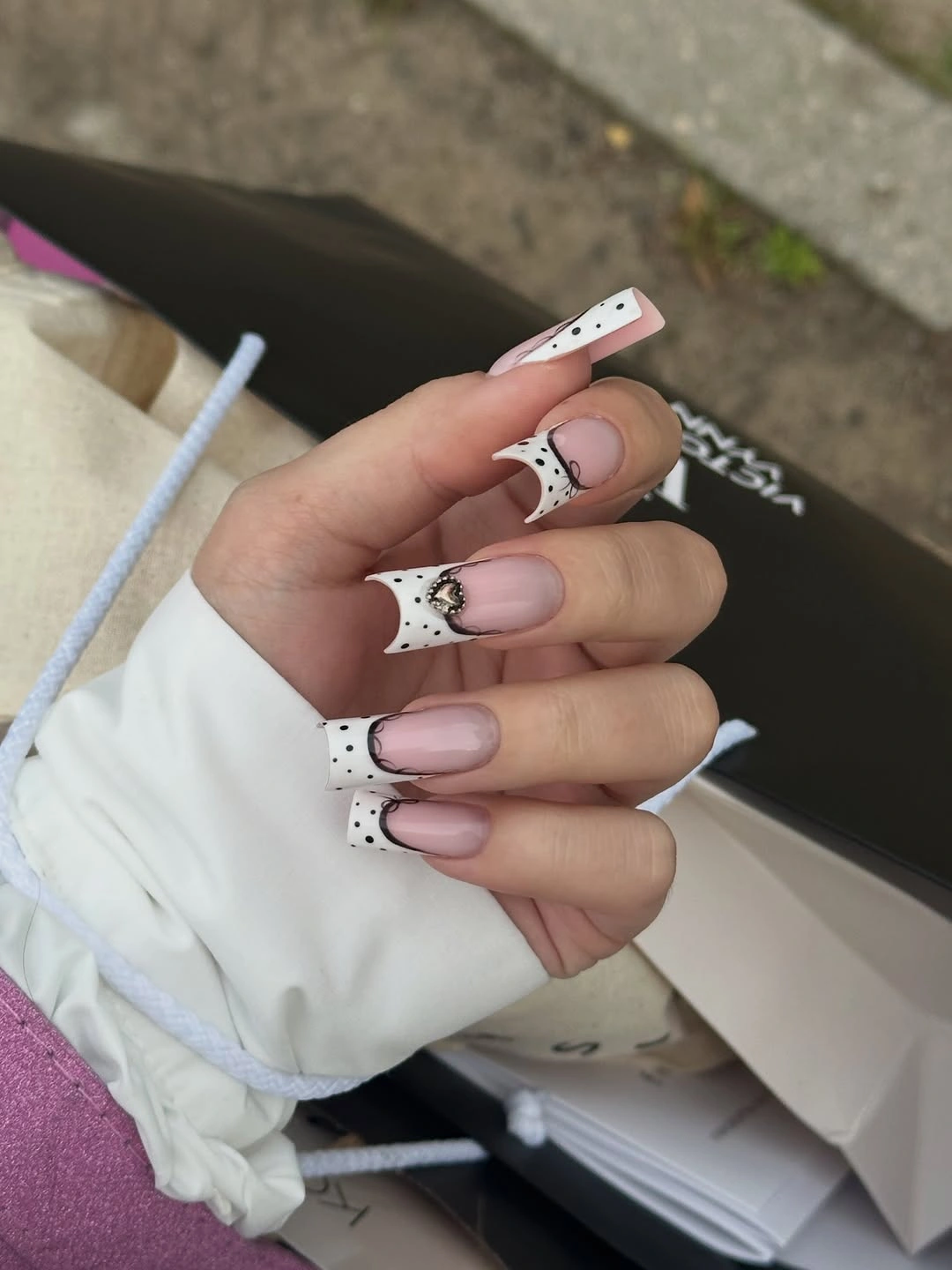
Polka dot fall nails square often need a defined panel like this because long flat tips offer more space than a compact oval. The white area acts as the canvas, while nude remains a stabilizing neutral below it. Readers can reduce the visual width by using dotted tips on only two nails and leaving the others with plain white edges.
Angular transitions can make the design feel sharper, so it helps to keep the dot size small and the white surface uncluttered. Adding a second full pattern would compete with the broad tip geometry. The clear white boundary is what makes the black dots look precise rather than scattered across an oversized nail.
Cobalt Dot Accents on a Nude Base
Cobalt blue appears as small dots and a vivid accent tip against pale nude and white areas, giving the manicure a stronger color pulse than a fully pastel version. The saturated blue is not spread across every nail, which keeps it from overwhelming the soft base. That focused color use lets the dotted motif remain visible even when the hand is seen from farther away.
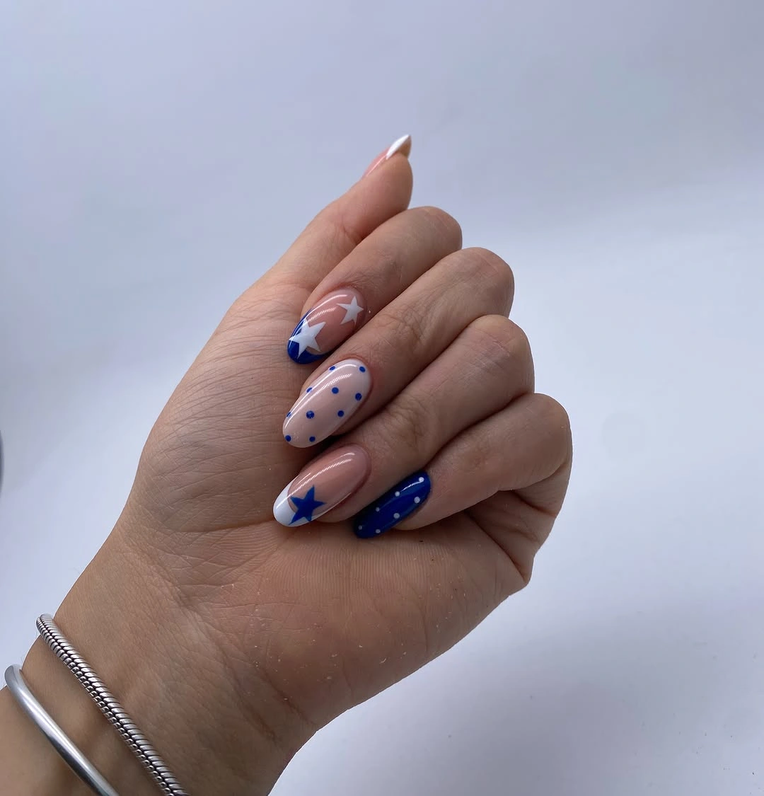
A single saturated shade can make a neutral dot pattern more memorable without requiring several bright colors. The blue circles echo the blue tip, creating a repeated cue that joins the accents together. Someone who prefers a calmer result can keep only the cobalt dots on one nail and replace the strong tip with a white panel.
The nude background is doing essential work because it gives blue enough contrast to feel punchy while leaving the rest of the hand quiet. Adding black dots beside cobalt would make the palette more crowded, so the decision to let blue carry the visible color is sound. The effect stays playful through repetition, not through additional ornament.
Lilac Almonds With Soft Dotted Edges
Soft lilac and pale pink almonds make their dots feel gentle because the colors share a similar lightness and the small accents remain close to the edges. The lilac nails create a calm color block, while tiny pale dots bring a little texture without creating harsh contrast. This is a more tonal way to use the motif, with color harmony taking priority over graphic impact.
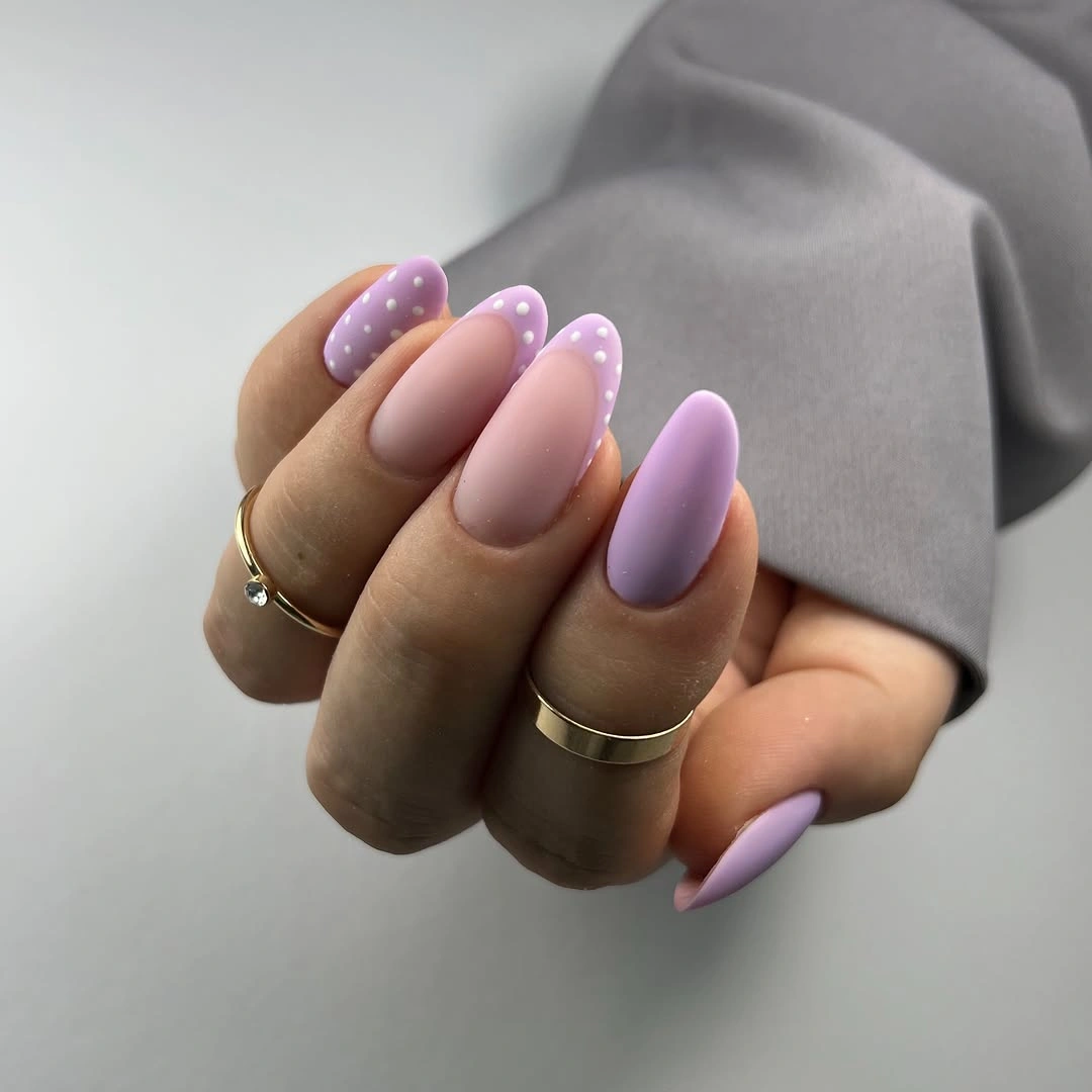
When dots are meant to be subtle, choosing related base shades is more useful than simply reducing their number. The pale pink breaks up the lilac, yet it does not introduce a new visual temperature or compete for attention. Readers can simplify further by keeping lilac on most nails and adding dotted detail only where the edge needs a little brightness.
The almond taper prevents the soft palette from feeling flat, since each rounded point gives the dots a gentle direction. Darker spots would alter the whole mood, so the light detail is the right scale for these colors. The manicure remains lively in a quiet way because the dots create texture while the undertones keep everything composed.
Yellow Detail Inside Black and White Dots
Black polka dots over white nails create a classic high-contrast base, then one small pale yellow floral-looking detail shifts the palette into something warmer. The yellow is used only once, which prevents it from competing with the dominant black-and-white rhythm. Its placement works as a tiny color surprise rather than a new pattern layer repeated across every finger.
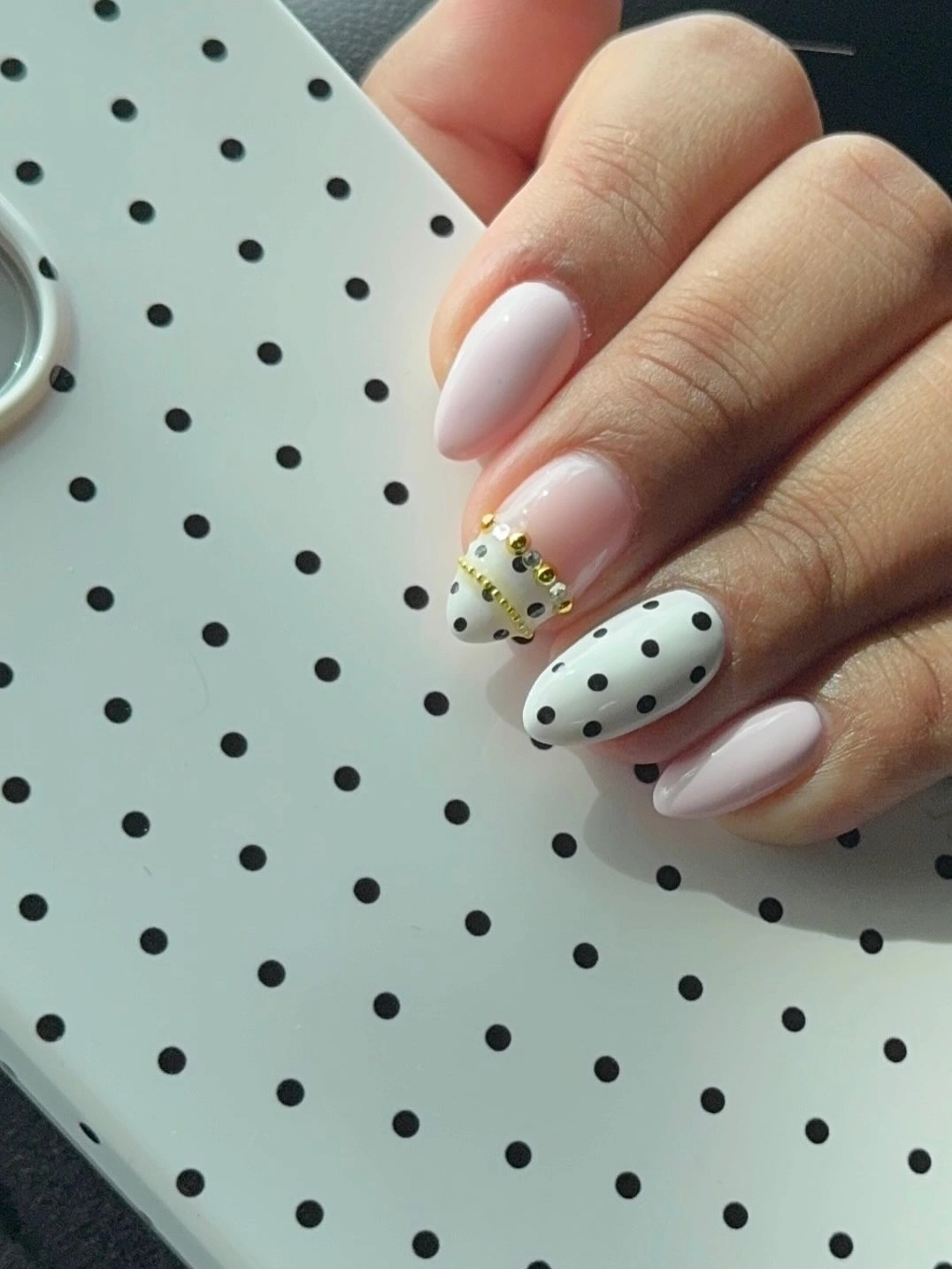
Adding one warm note to monochrome dots is a useful alternative to changing the whole base color. The yellow accent can remain small because white already gives it strong visibility, while black dots keep the hand visually connected. If the flower-like element feels too detailed, a single yellow dot cluster would preserve the same color adjustment with less ornament.
The black circles need room to remain separate, especially near the warmer accent where too many marks could obscure the shape. White space is therefore as important as the dots themselves. Keeping the yellow confined to one nail lets the surrounding black-and-white panels stay graphic, and the small warm detail becomes a focused visual reward.
Warm Mixed Nails Joined by Dotted Details
Gold-colored reflection, brown patterning, white with black dots, and a small orange flower-like accent create several warm ideas across these short nails. The black dots are the detail that ties the different surfaces together, because their simple circular form returns beside more ornate-looking panels. Rather than matching every finger, the manicure uses one repeated mark to make variety feel intentional.
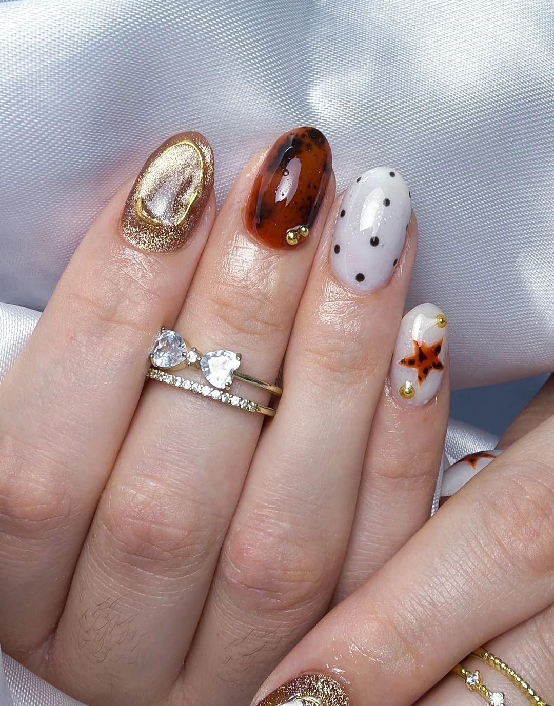
A mixed manicure needs one quiet rule, and here it is the recurrence of dots alongside a restrained warm palette. Readers could reduce the number of distinct looks by choosing a brown solid, a white dotted nail, and one orange accent, then skipping the reflective-looking piece. That edit would retain the same autumnal energy while making the hand easier to read.
Short shapes help the varied colors stay compact, but they also leave little room for several dense patterns on one nail. Keeping each finger assigned to one visual job prevents the decorative details from merging together. The most practical takeaway is to repeat a small dot or a single warm shade rather than trying to repeat every motif in the mix.
Oversized Black Dots on Pale Pink
Large black circles turn pale pink oval nails into a much bolder pattern than the fine-dot styles seen earlier. Their spacing remains open, so each dot reads as a distinct graphic shape rather than merging into a dark surface. The contrast is simple and immediate, with no extra linework needed to make the manicure feel playful.
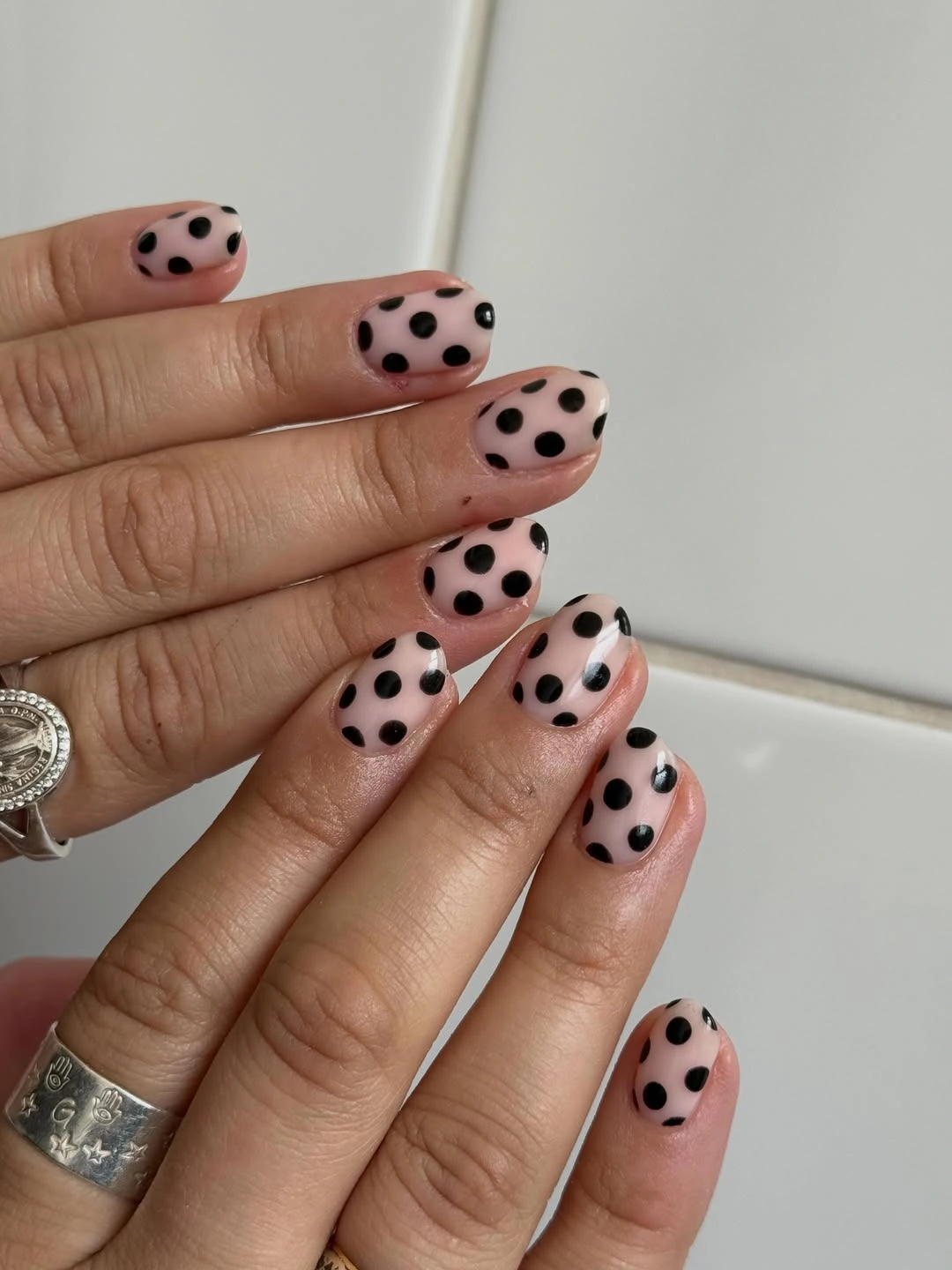
Dot scale is the whole story here: larger circles need more empty pink around them or the pattern begins to feel crowded. The soft base prevents black from looking too severe, while the oval shape adds a rounded echo to every mark. For a lower-key option, use large dots on two accent nails and keep the others pale pink without pattern.
Because the dots are visually strong, adding another color would weaken the clean graphic relationship. The hand looks organized precisely because pink and black do all the work. Maintaining open spacing is the consequence that keeps the oversized pattern cheerful and controlled instead of turning it into an all-over dark print.
Ornate Black Panels Beside Nude Space
Long nude squares carry dense black lace-like and dotted panels on selected tips, allowing the intricate dark detail to stand out without covering every surface. White areas and soft pink bases create breathing room between the ornate-looking marks, which keeps the long shape from feeling overloaded. The pattern has visual weight, so its limited placement is a major part of the balance.
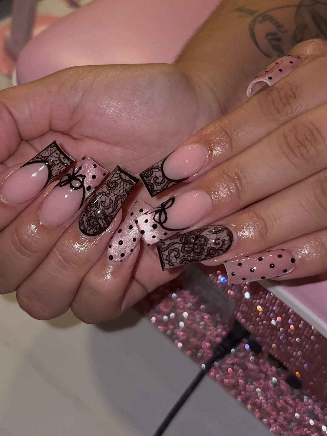
When black detail becomes this dense, the simplest adjustment is to reduce how many nails carry it, not to add a competing bright color. Nude space makes the fine lines readable and gives the eye a pause before it reaches the next patterned tip. A reader could use one ornate nail and two smaller dotted accents for a version that feels more practical at a long length.
The squared outline offers a broad panel for the dark work, but that advantage also means every extra mark is visible. Keeping the design close to the tip helps the nail retain a light lower half. The coherence comes from the nude-and-black contrast, while white and dots act as supporting details rather than separate visual themes.
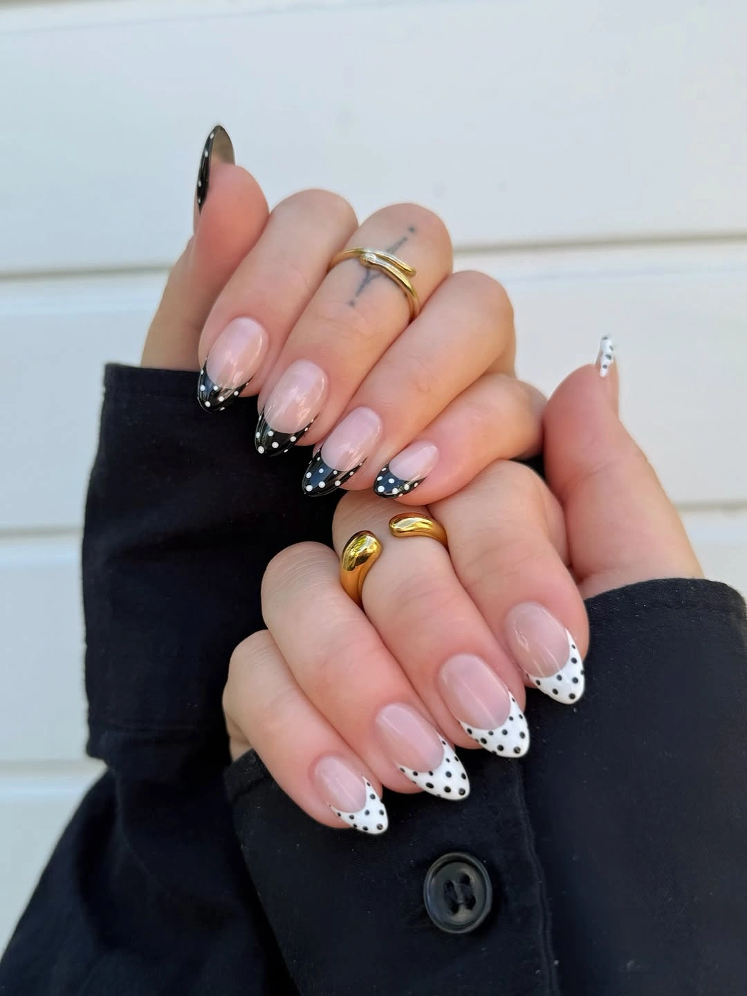
White Dots Softening Black Almond Tips
Black French-style arcs become less severe when tiny white dots sit along their curved boundary over a nude almond base. The dots interrupt the dark edge into small points of light, giving the tip a more playful finish without changing its strong color contrast. Their exact placement follows the arc, which makes the pattern feel integrated with the shape instead of scattered on top.
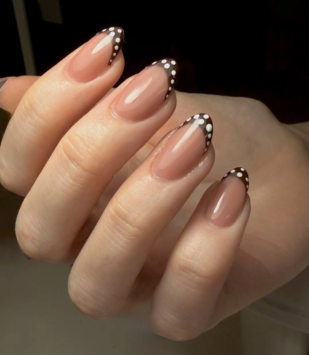
White dots are especially useful over black because they can soften a dark panel without requiring another broad color field. A reader who wants to make the design quieter can use the dotted border on two tips and leave the rest in plain nude or a simple black edge. The almond curve remains the organizing feature, so the edit will still feel complete.
The dots must stay small enough that the black tip remains visible between them; otherwise the border loses its clean dark shape. That proportion creates a visual conversation between solid and pattern. The final effect is graphic but not harsh, because the repeated white circles add a gentle rhythm to the darkest part of the nail.
Long White Tips With Crisp Black Dots
Broad white tips on long nude squares leave generous room for small black dots, creating a high-contrast pattern that stays contained above the pale base. The wide panel means the dots can spread out rather than bunching together, and the soft transition into nude keeps the length from looking too rigid. It is a clear example of how extra nail space can support a pattern when the boundary is well defined.
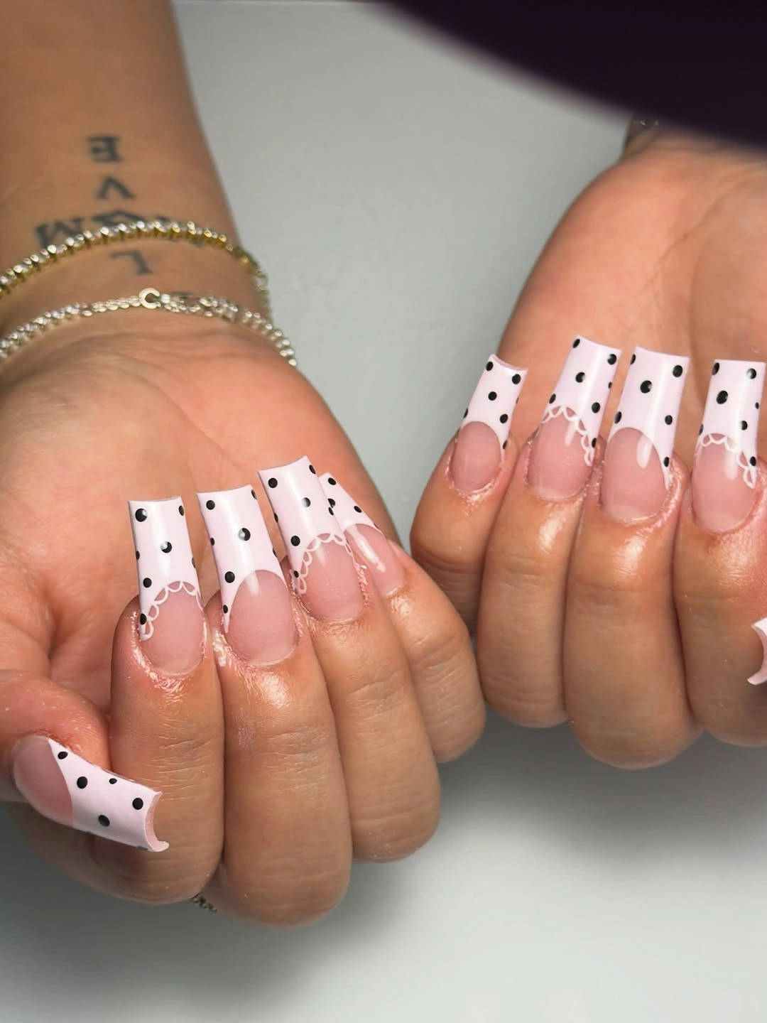
The white tips already act as a strong graphic element, so black dots should be the only additional motif. Readers can vary the density from finger to finger, but the dot size should remain consistent to preserve order across the broad panels. Keeping the lower half nude is what makes the long design look balanced instead of visually top-heavy.
Square tips are well suited to this contrast because their flat ends create a stable field rather than a narrowing point. If the dots drift too close to the nude transition, the white panel loses its clean edge and the manicure begins to look less precise. Letting the white surface remain visibly open around each circle is the choice that keeps the pattern sharp.
Black Tips With a White Dotted Arc
Long pink-nude squares use black tips and a line of tiny white dots to create a repeating arc across every fingertip. The white circles sit at the boundary of the dark sections, so they highlight the curve without turning the nails into a full dotted field. This version feels more graphic than a pale tip because black carries the stronger visual weight.
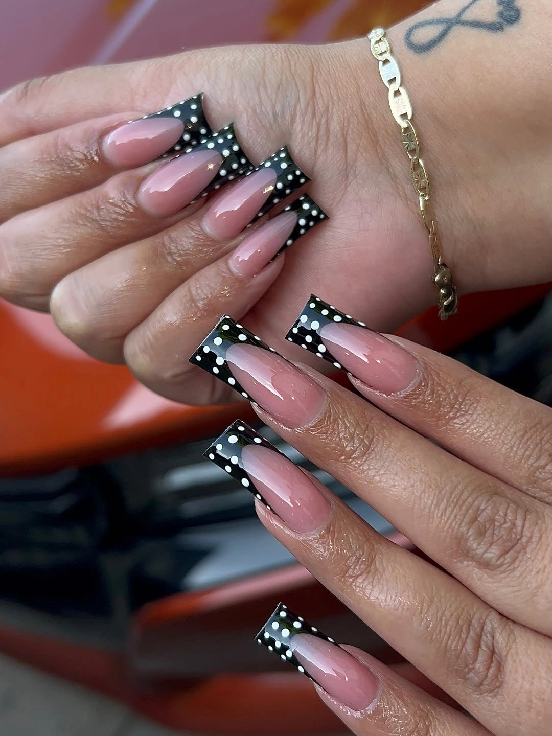
Tip-only contrast is what keeps this design usable at a long length. The nude lower area gives the eye a large calm space, while black and white concentrate the pattern near the ends where it can read clearly. A softer alternative would replace black with deep burgundy but keep the same dotted arc and open base.
Repeating the white dots in a single row creates structure, but they should not become so numerous that they form a continuous white stripe. Small gaps let the black still appear as a clean panel and make the circle motif visible as individual marks. That precise spacing is the detail that turns a high-contrast tip into a coherent pattern.
Coral Accent Beside Black and White Dots
Black-dotted white tips gain a lively interruption from one bright coral translucent-looking tip, while the surrounding nude almond base holds the palette together. Coral appears only once, which lets it work as a warm flash beside the more familiar black-and-white dots. Small gold-colored pieces add another tiny highlight, but the dot-and-tip structure remains the main design.
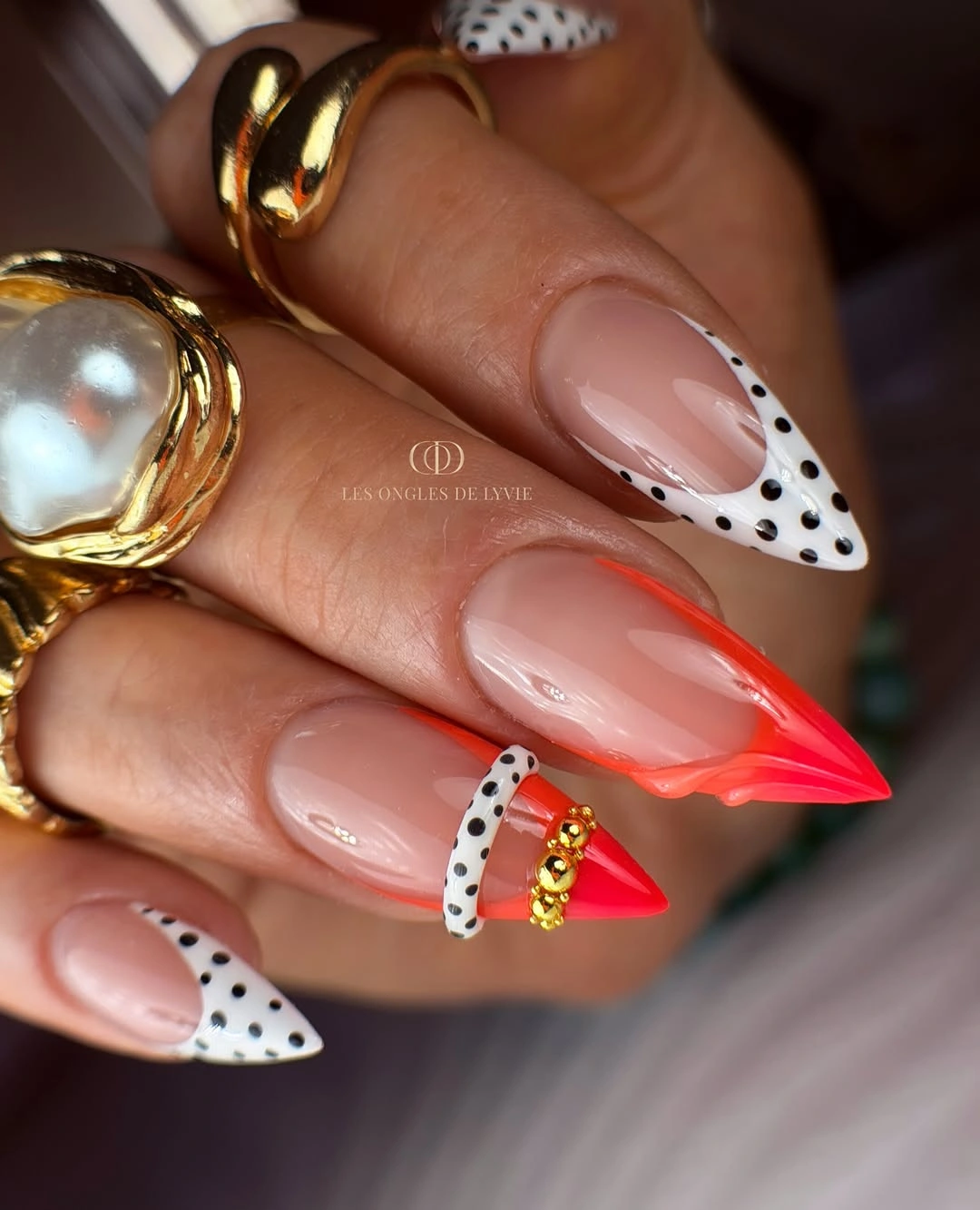
A single coral accent is enough because it changes the temperature of the whole hand without competing with every dotted panel. Readers can remove the small warm details and still retain the color story by keeping just one coral tip among black-and-white accents. The nude base ensures that all three colors have room to appear separately rather than blending into one busy surface.
Coral has more visual energy than the neutral dots, so concentrating it is the practical way to keep the manicure balanced. The white tips make the black circles crisp, while the coral adds a short bright answer to that cool contrast. The final palette feels playful because each color has a different location and no shade is asked to do every job.
Burgundy Dots on Short White Edges
Small burgundy dots and heart-like curved outlines give these short pale nails a warmer fall direction than black polka dots would provide. White tips or panels make the wine-colored marks easy to notice, while the nude base keeps the compact squares from looking overly decorated. The rounded burgundy details echo one another without becoming a dense all-over pattern.
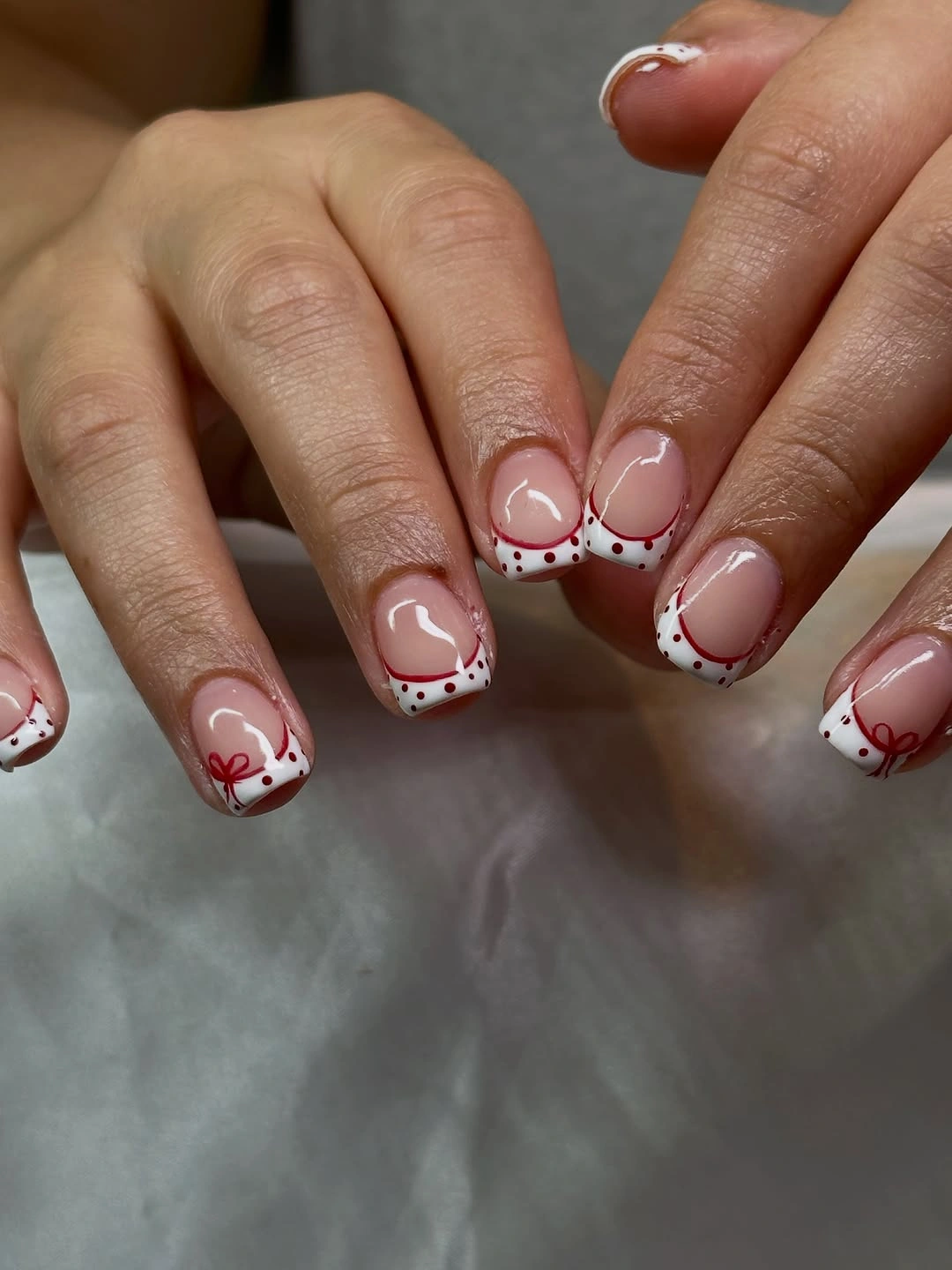
Warm dots are useful when a reader wants a seasonal adjustment without committing to a full dark maroon manicure. Keeping the burgundy near the white edges gives it a clear setting, and the small curved outlines add a little personality beside the circles. A simpler version could use burgundy dots alone and skip the heart-like detail, leaving the color relationship unchanged.
Short squares need each decorative mark to earn its place, so the limited burgundy palette is more effective than adding another bright shade. The white panels provide contrast, the nude surface supplies calm, and the warm dots carry the fall note. That three-part balance lets a playful motif feel precise enough for an everyday compact manicure.