
Medium length is the awkward middle where a manicure has enough space to show intention but still has to behave like part of everyday life. When the nail is neither tiny nor dramatically long, every edge, curve, and dark area changes the balance of the hand. The goal is not to make the design louder; it is to decide where the eye should pause so the silhouette stays calm from across the room and considered up close.
Use the phrase fall medium length nails 2026 as a filter for proportion, not as a demand to copy a seasonal look. Check whether the tip, sidewalls, and finish support the way you actually use your hands, then choose one controlled contrast and let the rest stay quiet; similar proportion questions come up in fall short almond nails. That small test separates a design that photographs well from one that remains comfortable, coherent, and manageable after the first few days.
Sheer Blush Almonds With Chocolate Edges
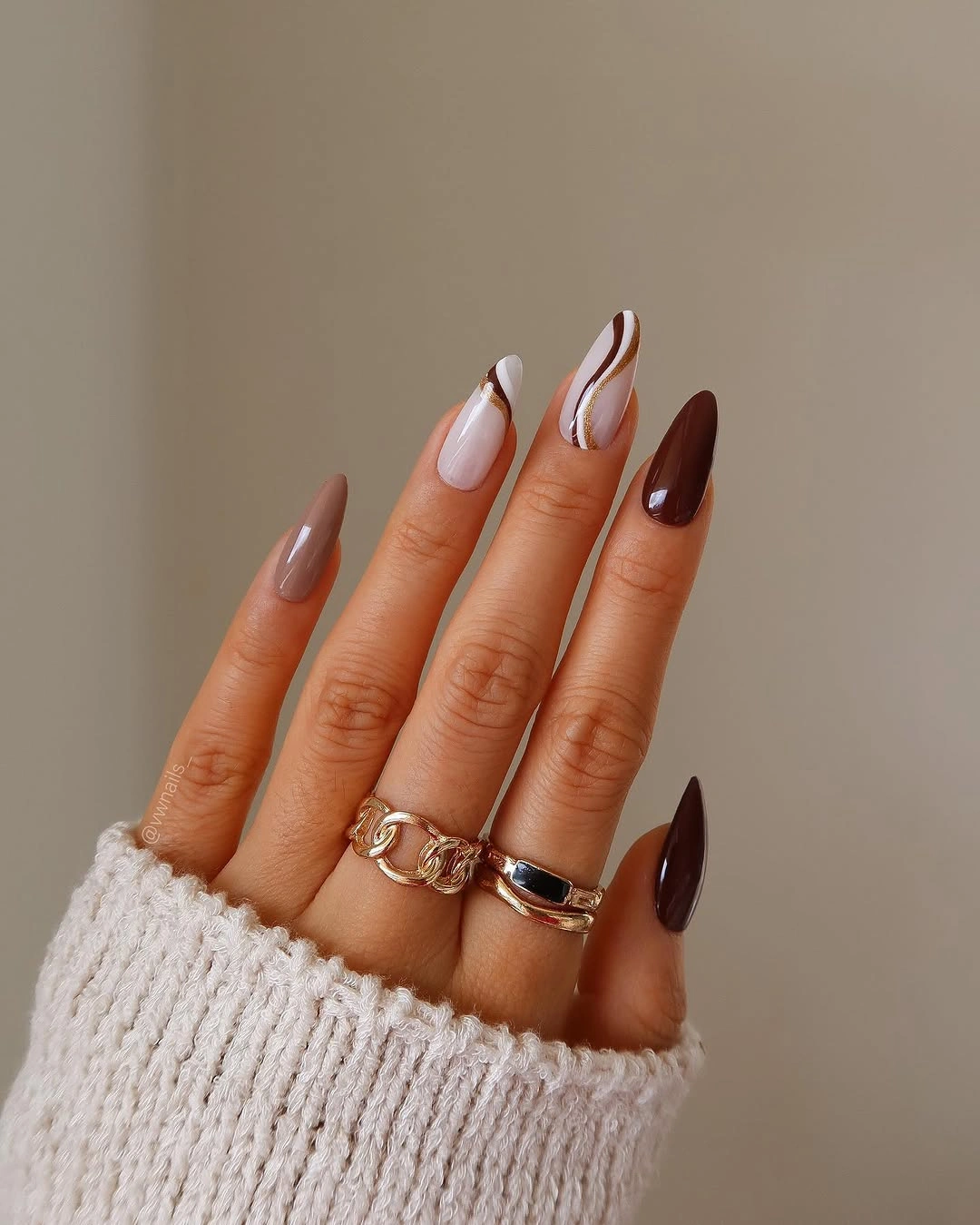
The first decision is the narrow chocolate French edge, not the pale base. Translucent blush keeps the center of each medium almond quiet, while the dark curved tips follow the taper and make the silhouette look deliberate. Fine white contour lines add a small interruption inside the brown, so the manicure has more dimension than a plain two-color French design without losing its clean negative space.
This balance works because the strongest color is concentrated at the end of the nail. You can keep the blush sheer, use a warm cocoa rather than a near-black brown, and ask for the light line only on two or three fingers. On a shorter shape, a thinner tip will preserve the same directional effect; a wide band would take over the small nail plate and make the hand look visually denser.
The pointed almond profile gives the design a polished after-dark energy, but it also makes uneven growth easier to notice. If your routine is hands-on, soften the point slightly and keep the white detail sparse so the design still reads when the tips are shorter. The practical appeal is the way one deep line carries the whole manicure while the open blush keeps it wearable with knitwear, denim, or a simple dark coat.
Mustard And Wine With Botanical Pauses
Here the fall story is built from alternating weight: mustard yellow and wine carry the color, while white, brown, and pale nude give the eye somewhere to rest. The medium almond nails do not repeat one motif on every finger; a small orange botanical mark appears beside solid color, and that difference keeps the set from reading like a single printed surface. The palette feels seasonal because the warm shades are connected, not because every nail is decorated.
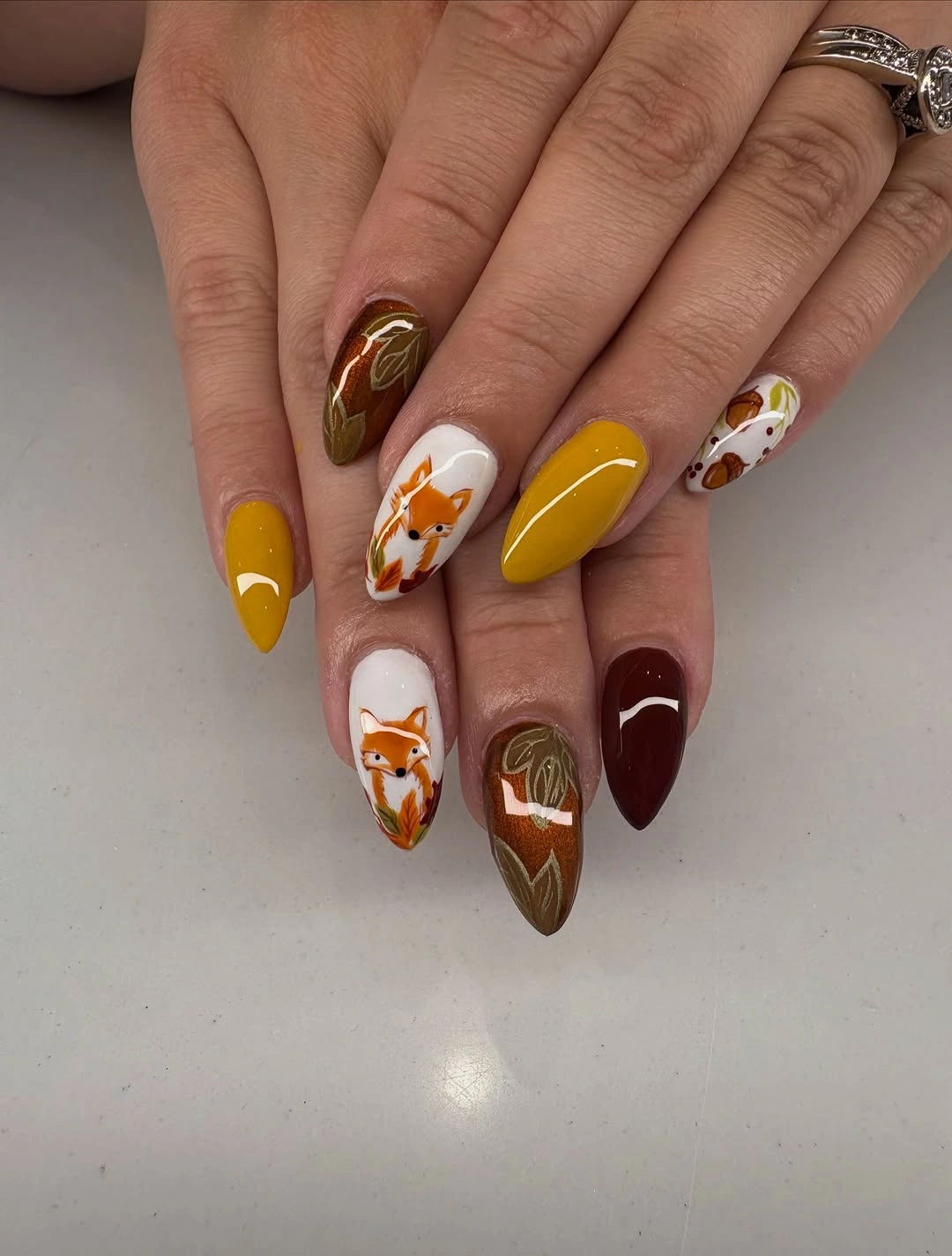
For a wearable adaptation, choose mustard on one accent finger, a deep brown or wine on two, and a pale base for the botanical detail. That preserves the original contrast while reducing the number of small decisions a technician has to place on a medium nail. If you prefer a quieter result, keep the orange leaf-like mark near the tip instead of spreading it across the center, where it can compete with the solid color.
The tradeoff is clear: the mixed palette has personality, but repeating mustard, wine, orange, brown, and white with equal intensity can make the manicure feel crowded. Let one shade act as the anchor and use the others as supporting notes. A clean glossy finish will connect the varied fingers, while a slightly shorter almond will make the bright colors feel less costume-like and easier to pair with neutral fall clothing.
Olive Bronze And Plum With Raised Points
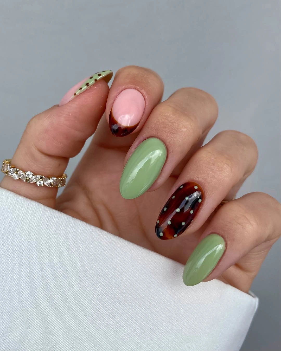
The defining feature is the tactile-looking contrast between muted color and small rounded accents. Olive green, bronze-brown, plum, and dusty pink move across medium almond nails, while tiny raised-looking dots catch light on selected fingers. Because the base shades are close to autumn earth tones, the dots create rhythm without requiring a sharp graphic pattern; the manicure feels dimensional through placement and finish rather than through a single loud motif.
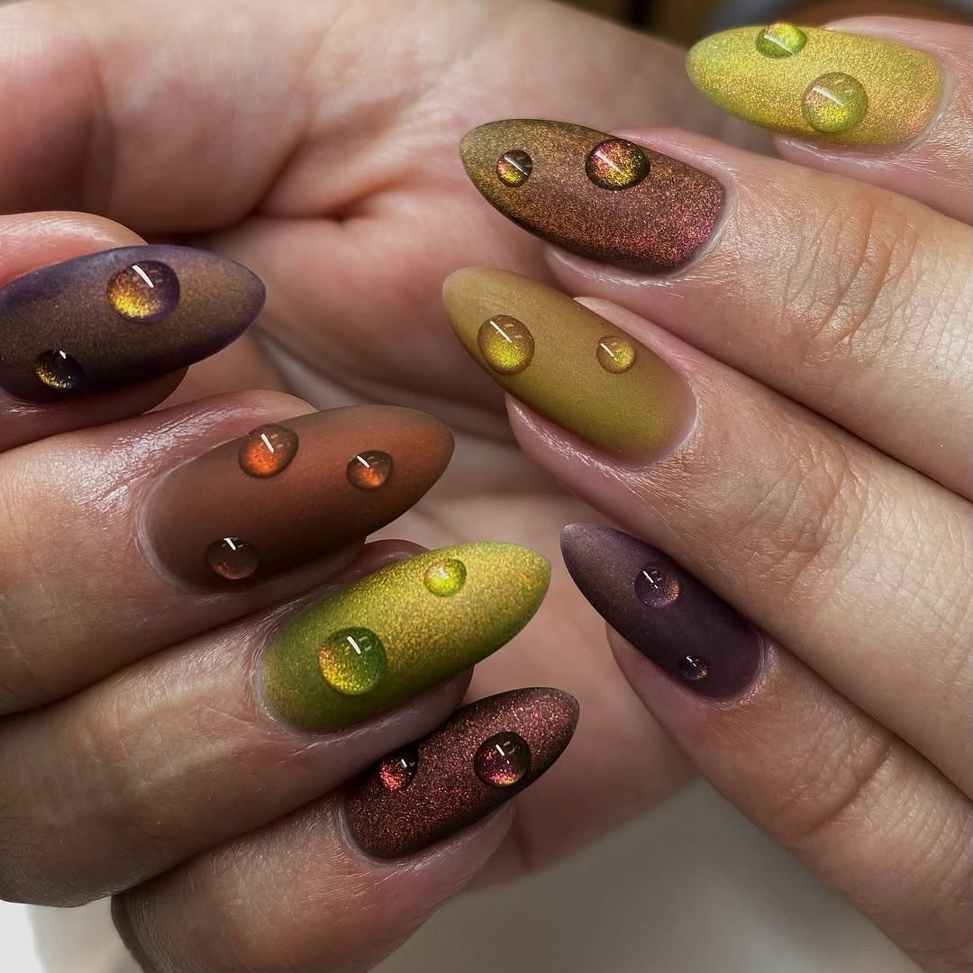
Keep the color blocks fairly broad if you adapt this idea to a shorter nail. Olive and plum can remain the main pair, bronze can appear on one finger, and the dotted detail can be limited to a single accent so the surface does not become crowded. A reader who likes texture but wants less drama could also use a smooth glossy finish on the solid nails and reserve the reflective points for the ring finger.
The visual payoff depends on light moving across the surface, so the manicure may look calmer in a dim room than it does in a close view. That is not a flaw; it is the realistic limit of a finish-led design. Keep the grow-out plan in mind, because raised details and several dark shades will show more change than a simple nude. The strongest version lets the dots punctuate the palette instead of becoming the whole story.
Rust And Turquoise In Abstract Almond Curves
Warm rust and orange meet a cool turquoise in loose curved shapes, giving these medium almond nails their tension. The design does not rely on a uniform stripe or a repeated flower; dark brown and black areas frame the brighter color, while each finger shifts the placement slightly. That irregular rhythm makes the set feel hand-painted and keeps the tapered silhouette visible beneath the graphic surface.
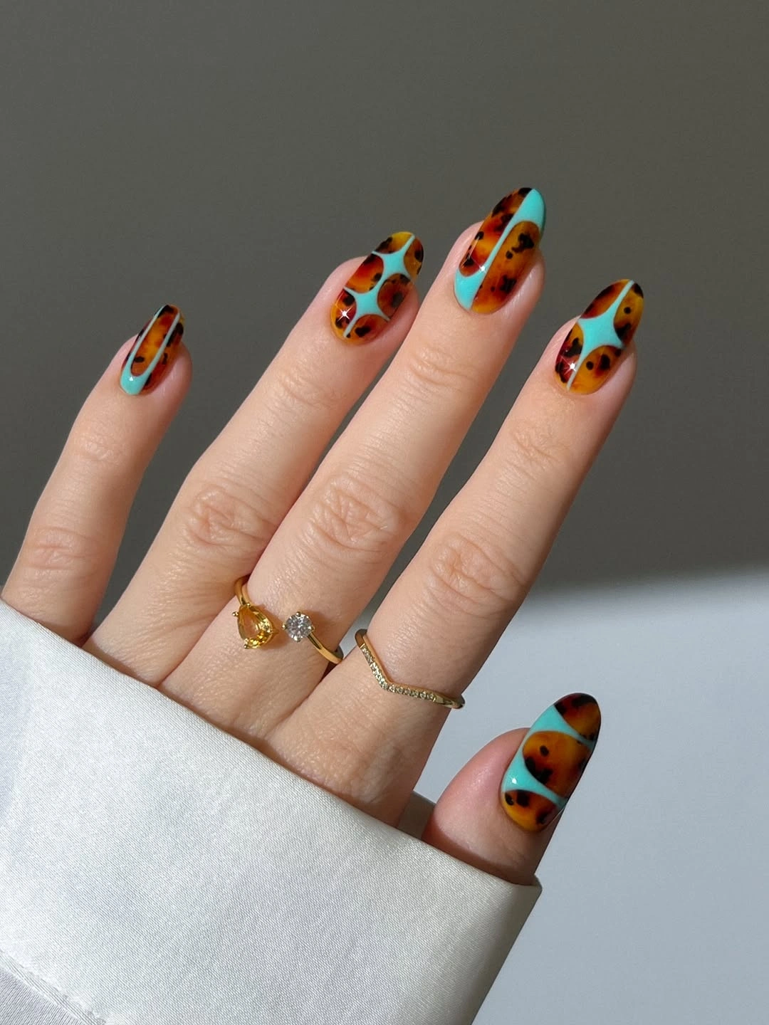
If the full contrast feels too loud for daily wear, make turquoise the single counterpoint and repeat rust, brown, and a muted nude across the remaining nails. On a shorter almond, use one curved sweep rather than several small shapes so the color remains readable from a distance. The same idea can also be softened with a satin finish, though a glossy surface will make the cool and warm sections separate more clearly.
This palette works best when the eye can find one repeated anchor, so let the dark framing color appear on more than one finger. Without that anchor, turquoise, orange, and rust may compete instead of moving together. The practical limitation is not the color itself but the small canvas: dense abstract marks can close up as the nail shortens. Keep a little bare or quiet space and the design will retain its atmospheric contrast.
Olive And Amber With Reflective Dot Details
Several earthy shades share the same medium almond silhouette, but the small rounded details change how each nail catches light. Olive green, amber, mauve, brown, and a muted plum appear in separate blocks, with glossy dot-like accents sitting above or within the color. The result is a fall palette with movement: the eye travels from one tone to the next, then pauses where the reflective point interrupts a solid surface.
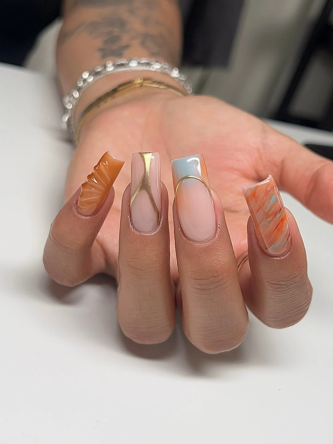
A practical version can keep olive, warm brown, and one amber accent, then place the dots only on the darkest nail. That reduction keeps the original idea of color variation while giving the hand a clearer visual hierarchy. For shorter nails, choose fewer shades rather than squeezing every color into a smaller area; a calm taupe or nude can replace the mauve if you want the set to feel less saturated.
The reflective details are the quiet risk here because they need light to show their shape. In flat lighting the manicure may read mostly as a mixed earthy palette, which is still useful and wearable. Keep the finish consistent across the solid nails, and let the dots stay small enough to support the color instead of making the manicure look raised everywhere. The best version feels collected, not overloaded.
Golden Yellow With Black Botanical Contrast
Bright yellow and orange set the temperature of this manicure, while one white nail with black leaf-like art creates the pause that makes the color feel intentional. The nails run medium to long with a tapered shape, and a raised-looking yellow detail adds another layer on one finger. That combination gives the set a clear focal point: warm color first, botanical contrast second, texture last.
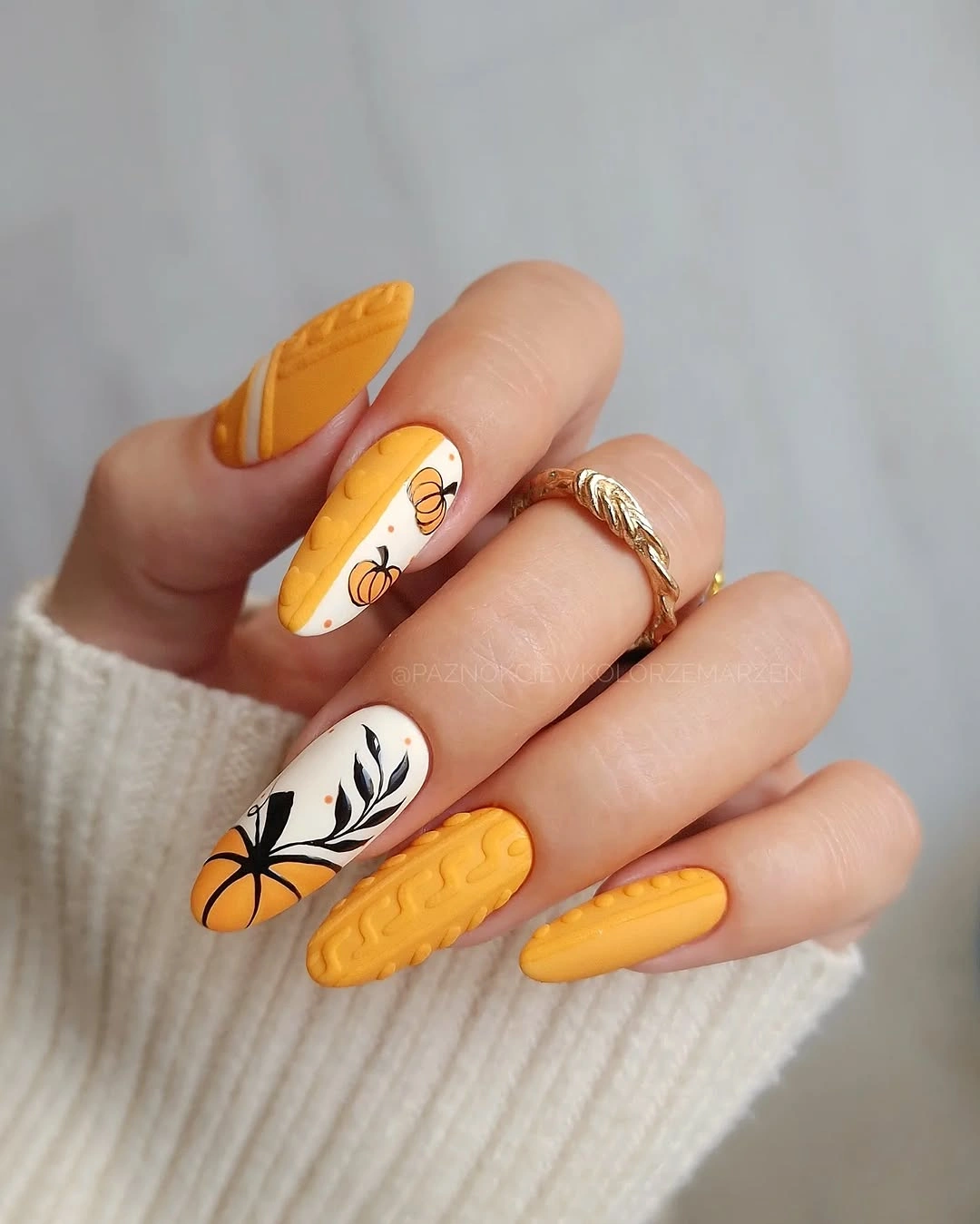
To adapt the idea without losing its fall character, keep the white botanical nail and use solid yellow or orange on the surrounding fingers. If the length is shorter, replace the raised-looking pattern with a simple stripe or a second solid shade so the surface does not become crowded. A warm gold accessory can echo the palette, but the manicure already carries enough contrast to stand on its own.
The saturation is the honest tradeoff. These colors attract attention and may compete with a busy print or equally bright jewelry, while the black art becomes the sharpest line in the set. Use a medium almond rather than an exaggerated point if you want the color to feel more everyday. The design is strongest when the white accent remains a clean breathing space, not another place to add every available detail.
Pink Base With Multicolor Curved French Lines
A soft pink base gives these medium almond nails room for several thin curved lines in mint, black, white, and muted coral. The colors do not cover the whole nail, so the eye still sees the pale center and the repeated arc at the tip. That repeated curve is the organizing decision; it lets two hands carry playful variation without turning each finger into an unrelated design.
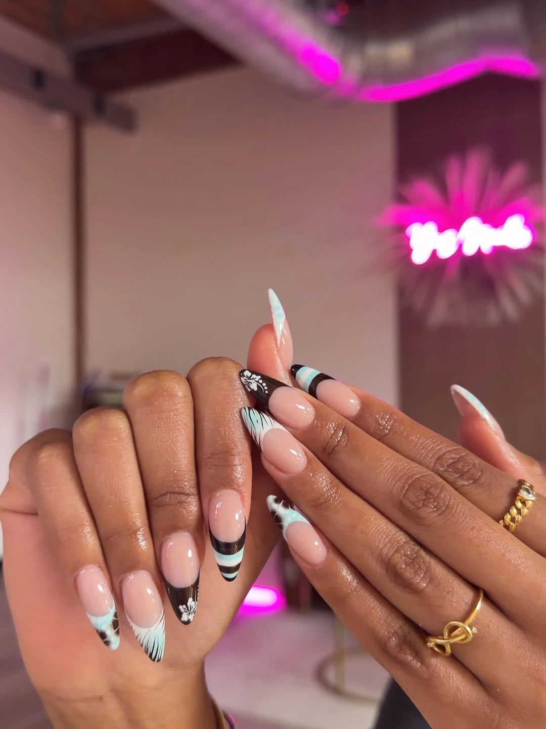
For a more restrained appointment, keep the pink base, repeat a brown or black tip, and use mint on only one accent nail. On shorter nails, one broad curved stripe will read more clearly than three narrow bands, especially if the nail bed is small. You can also move the color lower toward the side edge for a little negative space, which keeps the design light while preserving its graphic rhythm.
The appeal is the balance between decoration and openness, but the limitation is spacing. If the lines sit too close together, they merge as the nail grows and the careful contrast disappears. Ask for consistent curves rather than identical colors on every finger, then let the finish stay smooth and glossy. The manicure works with a sweater or a plain shirt because the pale base keeps the multicolor tips from becoming the only thing visible.
Chocolate Almonds With A Leopard Accent
Deep chocolate does most of the visual work here, and one warm taupe-brown leopard accent keeps the manicure from becoming a single dark block. The medium-to-long almond shape gives the solid color a tapered, elegant direction, while the printed nail supplies a small change in scale. A softly translucent brown finger adds another layer without introducing a new bright color, so the set remains controlled.
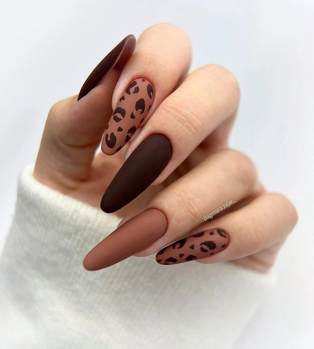
The easiest adaptation is to keep chocolate on four nails and place the leopard detail on the ring finger with a warm nude-brown base. If your nails are shorter, round the edge slightly and keep the spots larger and fewer so they remain readable. A glossy finish will make the dark color look richer, while a satin or matte surface can make the same palette feel quieter and less formal.
Dark polish shows chips and uneven edges clearly, so the low-detail design still benefits from careful maintenance. The point is not to add more art but to keep the one printed accent clean enough to stay a focal point. This manicure pairs naturally with denim, cream, and brown layers, much like the warmer palette in brown fall nails. Let the chocolate remain deep, and the leopard mark will feel like a deliberate interruption rather than a competing theme.
Brown Pink And Blue Striped French Tips
These medium almond nails use a soft pink base as a blank field for curved stripes in brown, white, pale blue, and muted pink. Some fingers are darker and dotted, but the repeated French placement keeps the variation connected. The detail is not only the colors; it is the way each band follows the tip and leaves the center open, creating a playful pattern with visible breathing room.
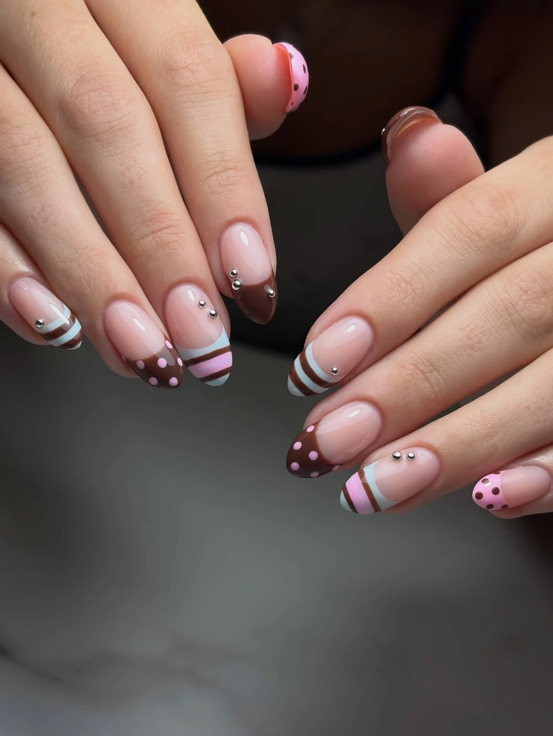
On a shorter shape, choose the brown edge and one light stripe, then omit the smallest dots. That preserves the contrast and makes the manicure easier to maintain when the free edge is less pronounced. If you want the set to lean more autumnal, swap pale blue for a muted sage or dusty teal rather than adding another warm shade; the cool interruption is what keeps the pink and brown from blending together.
The design depends on line separation, so the practical limit is surface area rather than color choice. A broad band can make the nail look shorter, while too many fine stripes can merge during grow-out. Keep the curves clean, allow the pink base to show, and use the darker dotted nail as a small anchor, the same placement logic that makes fall French nails feel edited. The result stays expressive but does not ask every finger to carry the same amount of information.
Neutral Length With Metallic Framing Lines
Long tapered nails make the silhouette the first statement, while pale nude, taupe, brown, and black keep the palette grounded. The distinctive accents are slim metallic bands and framed sections, not a full surface of decoration. That placement gives the hand a graphic edge without covering the neutral base, so the design moves between quiet negative space and sharper dark points.
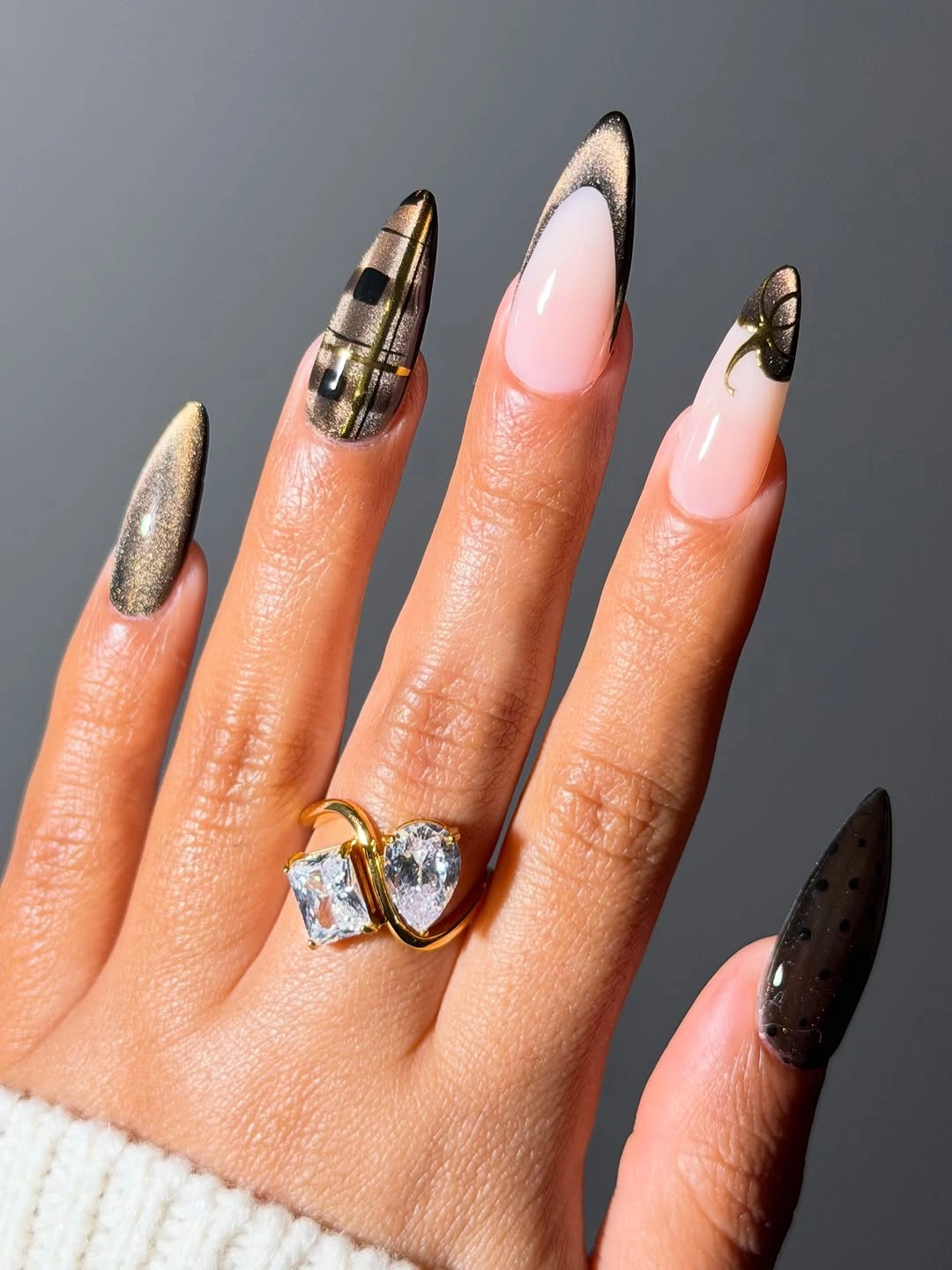
If you want the same idea at medium length, keep the nude foundation, use one metallic line, and choose a single dark accent tip. A softly tapered almond will preserve the direction of the original shape with less commitment than a very long point. The palette also adapts well to a warmer wardrobe: bronze can replace a cool metallic, while the neutral base keeps the change subtle.
The long shape gives every line room, but it also raises the everyday tradeoff. Extended tips can be less convenient for typing or hands-on tasks, and a dark point makes growth easy to see. Simplify the framing instead of adding more detail, then let the length and contrast carry the design. Its strongest quality is the tension between a light open base and a few precise marks that sharpen the outline.
Mauve Cocoa And Glitter With Fine Gold Lines
Muted mauve and cocoa create the depth, while glitter, nude panels, and thin gold lines prevent the set from becoming visually flat. The nails are medium to long and tapered, with each accent placed inside the same subdued family rather than introducing a bright contrast. A small reflective point on one finger is enough to change the rhythm, especially beside the quieter nude areas.
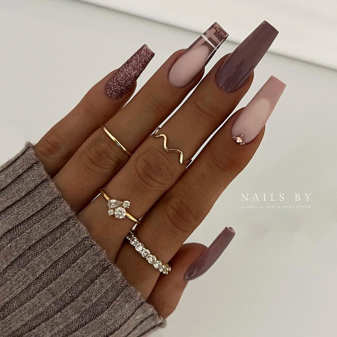
For everyday wear, make mauve and cocoa the main colors, keep glitter on one nail, and use gold linework on a nude accent. That arrangement retains the original balance but gives the eye a clearer resting place. On shorter nails, choose one gold line rather than several, because the difference between an intentional frame and visual clutter becomes smaller as the available surface shrinks.
The mix of shimmer and fine detail needs a focal order. If every nail receives glitter, foil, linework, and a nude panel, the palette loses its quiet depth and starts competing with itself. Let the solid cocoa or mauve fingers do the grounding, then use the reflective accents sparingly. A consistent glossy finish will connect the different surfaces and keep the set readable under both soft indoor light and brighter fall daylight.
Glossy Burgundy On A Soft Square Shape
There is no extra motif here, which makes the relationship between burgundy, shine, and shape impossible to hide. The medium nails are squared with a gentle taper, and the rich wine color covers each surface evenly. That restraint gives the manicure a steady, confident presence; the shade looks deep because it is uninterrupted, not because the design relies on multiple decorative layers.
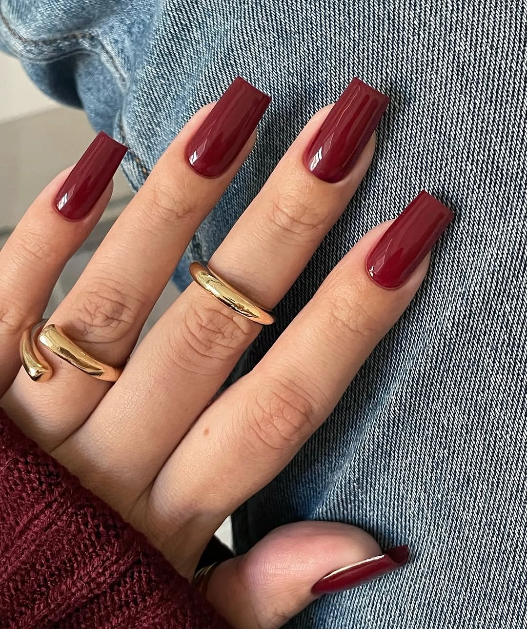
If the square edge feels too firm for your hands, soften the corners without changing the color. A medium length keeps the burgundy substantial while making it easier to wear than an exaggerated extension, and a warm wine undertone can feel less stark than a blue-black red. The most useful adaptation is simply to keep the coverage clean and let the finish provide the contrast.
Solid dark color has a practical clarity: it is easy to coordinate and simple to refresh, but chips and uneven edges show quickly. That makes maintenance part of the visual design rather than an afterthought. Keep the cuticle area neat, avoid adding a competing accent, and allow the square silhouette to stay visible. The quiet drama comes from the color remaining readable from every angle.
Mint Lavender And Leopard In One Palette
This set gains its energy from color changes rather than one repeated motif. Mint green, lavender-blue, pale nude, deep brown, and black-and-white leopard details share medium-length nails, with the printed accents appearing only on selected fingers. The cool shades make the palette feel bright, but the darker neutral gives the eye a place to stop and keeps the mix from floating apart.
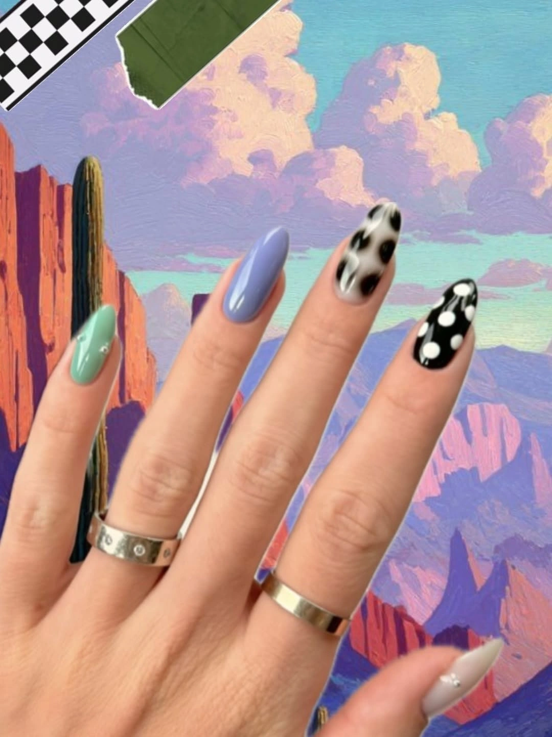
To make the idea easier to wear, keep mint and nude as the main pair, add one lavender accent, and place the leopard detail on a single finger. On a shorter nail, fewer colors will show more clearly than tiny blocks of every shade. A glossy finish can connect the mismatched surfaces, while a neutral ring or bracelet will echo the dark accent without competing with it.
The eclectic quality is the appeal and the limitation at the same time. If every finger has a new color and a new pattern, the manicure can lose its rhythm; repeating one cool shade or one dark anchor solves that problem. Keep the leopard marks open and simple so they do not swallow the base. The result stays playful because the contrast is deliberate, not because the palette is allowed to run unchecked.
Brown Botanical Details On Warm Neutrals
Caramel, brown, nude, and black make a calm ground for small floral and leaf-like marks. The medium almond nails vary between solid surfaces and fine botanical accents, with a few metallic-looking details adding a quiet glint. The decoration is concentrated rather than spread across every finger, so the warm neutral palette remains the first impression and the art rewards a closer look.
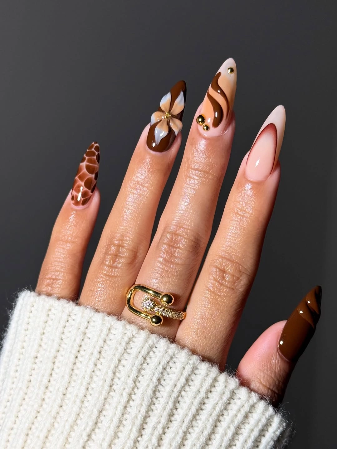
A practical version can use caramel and nude as the solids, then place the botanical drawing on two fingers with one thin dark line each. That keeps the motif visible without requiring a full illustrated manicure. If you prefer a stronger fall effect, deepen the brown on one nail rather than adding more leaves; a change in value creates focus more cleanly than extra marks.
Fine botanical lines need space and contrast, so they may lose definition on very short nails or after visible edge wear. Keep the shapes simple and give the surrounding nails a smooth finish so the details do not fight with texture. The set works especially well with cream knits, denim, and brown layers because its warmth is built into the palette. It feels considered when the accents remain small enough to support the neutrals.
Berry Olive And Pink Swirl Movement
Translucent berry, olive, and pink flow into soft swirled or marbled areas across medium almond nails. Instead of a crisp French edge, the color appears layered and slightly fluid, with the glossy surface helping one shade melt into the next. The defining choice is the open movement inside the nail: the design has depth because the base remains visible beneath the color.
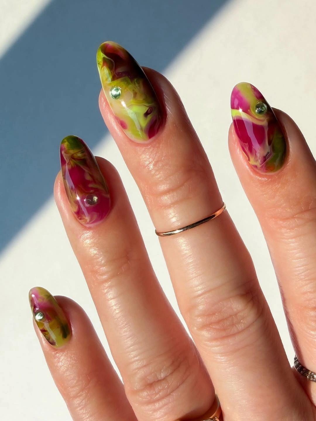
For a calmer adaptation, use berry and olive as the main pair and keep the pink as a translucent base or one accent swirl. On a shorter almond, larger curves will read better than several small marbled strokes, so ask for broad movement rather than tiny veining. A soft glossy finish supports the layered effect, while a matte finish would turn the same palette into something more graphic and subdued.
The tradeoff is consistency. Blended shapes can vary from nail to nail, which is part of their appeal, but too much variation may make the set feel accidental. Choose one repeated direction for the swirls and leave a little clear or pale space around them. That preserves the airy quality and lets the fall colors deepen the manicure without turning every nail into a dense panel.
Pink Squares With Dark Line-Art Accents
Pale pink and nude bases keep these long square nails open, while dark leaf-like lines, cool reflective details, and small accents sharpen selected tips. The contrast is strongest where a dark drawing sits against a light surface, and the square silhouette gives those marks a clear frame. The manicure feels graphic because the linework is concentrated, not because the whole nail is covered.
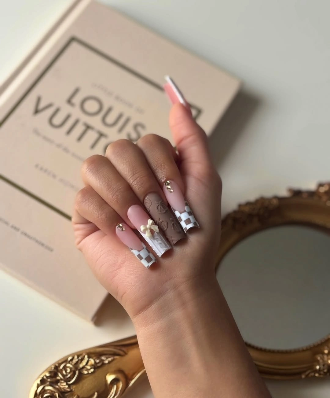
At medium length, keep the pale base on most fingers and choose one dark line-art accent plus one cool reflective detail. A softly shortened square will make the design more practical while preserving the clean frame around the drawing. If the palette needs a warmer fall shift, bronze or muted brown can replace black, but keep the line thin so the light base remains the dominant space.
The long square shape supplies room for precision, yet it can also make the manicure feel more formal and less flexible. Shortening the tip reduces that tension without removing the contrast. Avoid adding a motif to every finger; the empty pink surfaces are what let the darker marks feel intentional. The quiet strength of the set comes from a light field being interrupted only where the eye is meant to pause.
Pink Coral And Wine In Solid Blocks
This medium square manicure uses color sequence instead of nail art: soft pink, peach, coral, and deep wine move from light to dark across the hand. The glossy surfaces keep the simple design lively, and the square shape gives the warm shades a stable, compact frame. Because no motif competes with the palette, even a small difference in undertone becomes part of the visual rhythm.
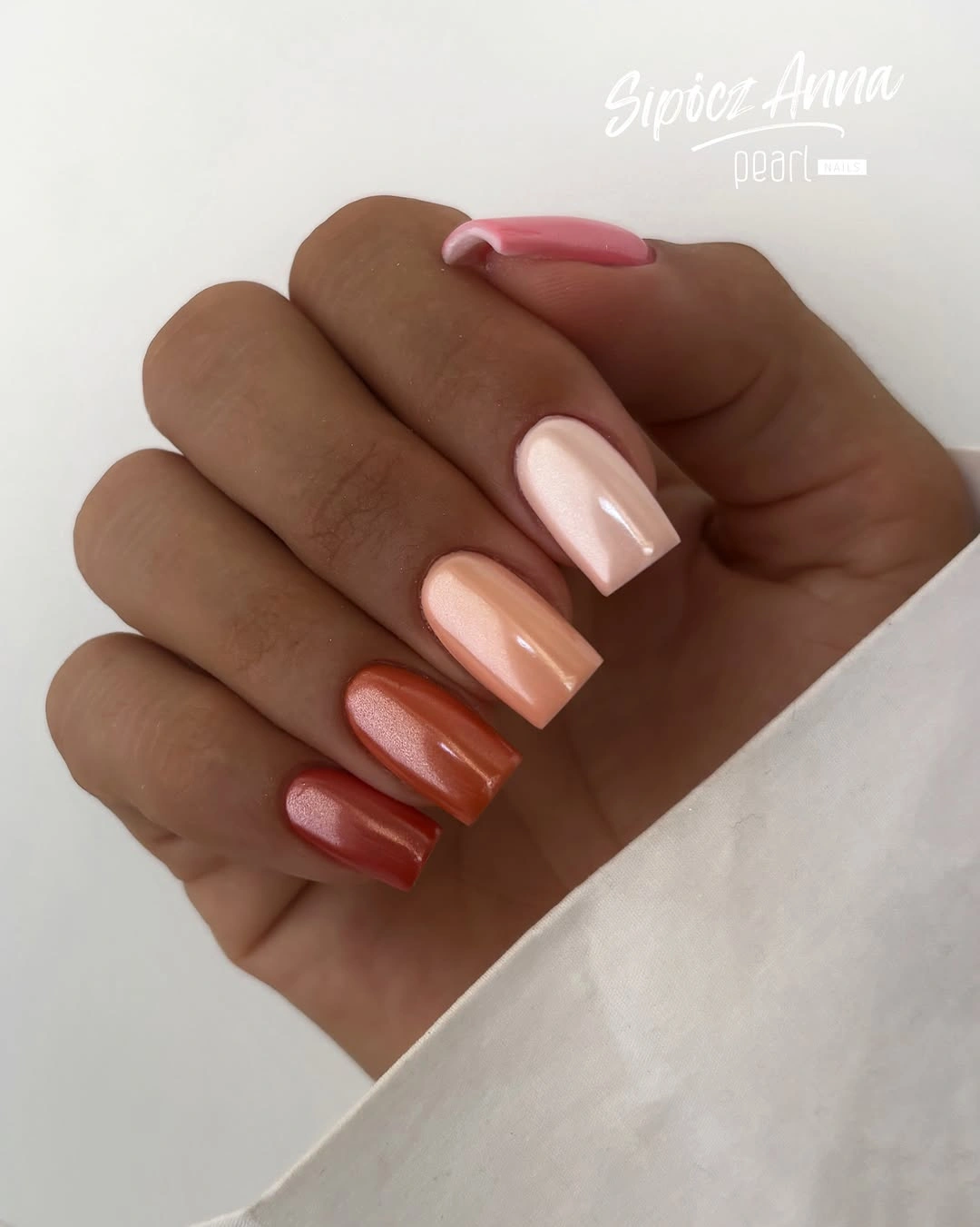
Choose three shades if you want an easier version, with wine on one or two nails and pink or peach carrying the rest. A slightly rounded square will keep the color blocks from feeling too rigid on a shorter nail. You can also use a muted terracotta instead of bright coral when the goal is a more grounded fall palette; the sequence still works as long as the values move clearly.
The low-detail structure is useful because it is easy to coordinate and refresh, but it also puts coverage and edges under a spotlight. Uneven color will be more noticeable than it would be beneath a busy pattern. Keep the finish smooth, place the deepest shade where you want the visual weight, and resist adding a random accent just to create novelty. The manicure is strongest when the progression is allowed to stay simple.
Glossy Warm Shades With A Pearly Shift
Pale pink, soft nude, and coral-red alternate across medium square nails, but the surface is not completely flat. A subtle reflective or pearly quality catches the light as the hand turns, giving the simple palette a small change in emphasis. The design works through quiet variation: the color blocks are familiar, yet the finish prevents them from appearing ordinary.
For a practical adaptation, keep coral on one or two fingers and use the pale pink-nude shades elsewhere. The same medium square shape will feel softer if the corners are lightly rounded, while a consistent glossy finish keeps the color sequence connected. If your wardrobe is already warm, a dusty rose can replace the brighter coral without losing the contrast between soft and saturated tones.
The pearly shift may disappear in flat indoor light, so the palette needs to stand on its own without relying on reflection. That makes the color choices more important than the finish alone. Keep the lighter nails clean and the coral even, then let the subtle surface change act as a bonus when light reaches it. The set feels polished because it does not demand attention from every angle.
Plum Glitter On Medium Almond Tips
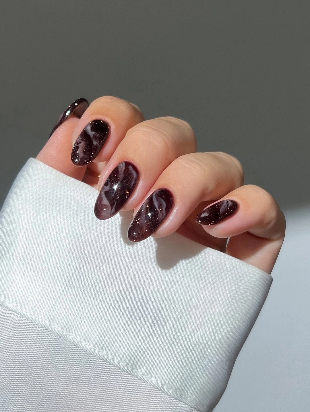
Deep burgundy and plum cover the medium almond nails, with fine glitter adding a restrained sparkle across the dark surface. The pointed silhouette and the reflective particles work together, but neither needs a separate motif to create depth. In a lighter setting the manicure reads as a rich wine shade; when light moves across it, the small shimmer becomes the secondary detail.
Choose a medium almond rather than a very long point if you want the same evening character with easier daily movement. You can also leave one nail smooth and glossy, using the glitter on the remaining fingers so the finish has a clear rhythm. A slightly warmer berry tone will soften the contrast, while a cooler plum will make the set feel sharper against pale clothing.
The dark glitter can appear heavier than expected on an extended tip, and any chip will interrupt the reflective surface. That is the realistic upkeep note, not a reason to abandon the palette. Keep the shape balanced, avoid stacking another pattern on top, and let the fine sparkle deepen the color. Its quiet drama comes from the darkness remaining readable instead of turning into a flat black mass.
Leopard French Tips In Orange And Black
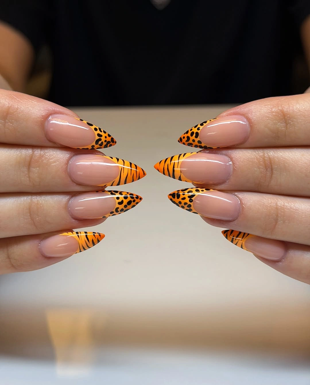
A pale nude base leaves the center of each long almond nail open, while pointed French tips use orange and black leopard-like marks. The print follows the end of the nail instead of spreading across the entire plate, so the design keeps the familiar lightness of a French manicure. The fall effect comes from the warm orange edge and the irregular black pattern working inside a clear silhouette.
On medium length, make the orange edge thinner and use fewer black spots so the base remains visible. A softer almond will preserve the directional tip without making the pattern look too sharp, and a muted rust can replace bright orange if you want a quieter color. Keep the print on the same area of each nail; consistency in placement is what makes the varied spots feel purposeful.
The pointed shape emphasizes length, while a dense print can make the tip look wider if the marks are too thick. That is why the open nude base matters as much as the pattern. Clean edges and a restrained border will keep the design wearable with simple layers, denim, or a brown coat. The manicure makes its statement at the end of the nail and lets the rest stay clear.
Burgundy Patchwork With Plaid And Dots
The final set treats each long squared nail as a small panel within one wine-and-nude palette. Burgundy, mauve, brown, white, and pale pink appear as solids, dots, a spotted print, a bold light block, and plaid-like lines. The motifs differ, but the repeated deep red and soft neutral colors keep the patchwork from becoming a random collection of accents.
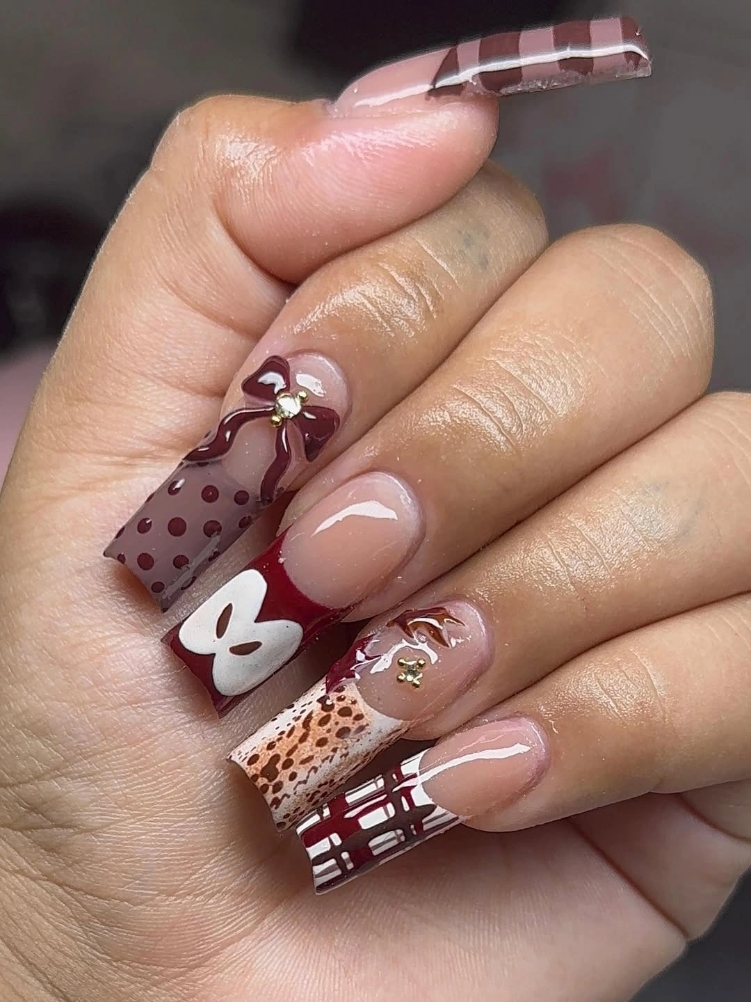
To adapt the idea for medium length, keep the burgundy solids, one dotted nail, and one plaid or striped panel. The busiest spotted or white block can be simplified into a single warm accent so the smaller surface does not lose its hierarchy. If you want less contrast, use mauve and nude as the base and reserve burgundy for the darkest patch rather than repeating it across every finger.
Patchwork art has a natural tradeoff: its charm comes from variety, but equal emphasis on every motif can make the hand look crowded. Let the solid burgundy nails provide relief and keep small details separated by quiet color. A squared shape gives the panels structure, while a slightly shorter edge makes the set easier to wear. The finished effect stays expressive because the palette holds the pieces together.