
Good nail art has an internal grammar, even when the finished hand looks playful. Shape establishes the sentence, spacing controls the pause, and one repeated relationship tells the eye how to move from one nail to the next. When those decisions are clear, decoration can stay small without making the design feel unfinished.
To test a design before adding anything else, choose the relationship you want remembered and remove one supporting detail. Check whether the silhouette, the empty area, and the focal mark still agree when the hand is viewed from a normal distance. If they do, the close-up details are earning their space rather than merely filling it.
Alternating Green Orange and Black Establishes the Theme
Medium almond nails use black, white, orange, and green in a clear alternating system, with ghost and pumpkin-like figures supplying the subject. The palette is immediately recognizable, but the set remains organized because the colors repeat rather than appear as isolated surprises. Shape provides a stable container for the small illustrations.
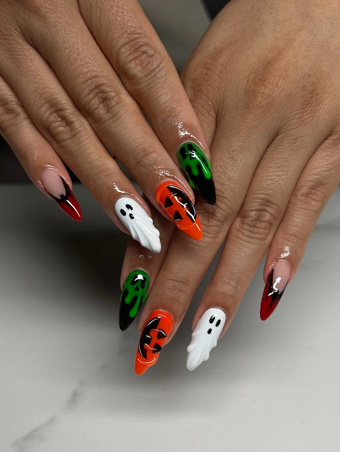
The useful design move is to assign each color a role: black creates depth, white opens space, orange supplies warmth, and green provides a sharper interruption. On shorter nails, keep the palette to two accents and repeat one figure instead of compressing every symbol. The structure will remain legible if the color relationships stay distinct.
High contrast makes the manicure easy to read but leaves little room for uneven edges. Check the white and orange panels first, because small smudges there will change the apparent balance of the hand. Removing one minor figure is the cleanest repair when the nail bed cannot support the full collection of marks.
One Tiny Accent Sits Inside Polished Pink
Glossy pink almond nails keep their surface mostly calm, with a small pale Halloween character-like mark adding a seasonal interruption. The design depends on proportion: the accent is noticeable because the surrounding nails do not repeat its scale. Pink remains the dominant field, so the theme feels embedded rather than applied across every finger.
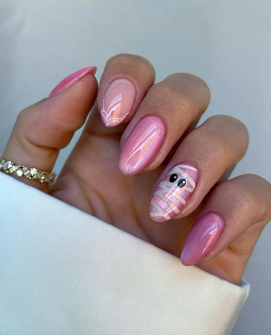
That proportion makes the look easy to translate to a shorter shape. Keep one small icon on the nail with the most open space and let the other fingers stay sheer pink or glossy mauve. A tiny black contour would increase definition, while a pale white mark would preserve the soft, almost hidden quality.
Minimal decoration leaves the base exposed, which makes a clean cuticle line and even shine more important than extra art. As growth shifts the accent away from the center, resist filling the new space with another symbol. The design stays coherent when its restraint remains visible through the entire wear period.
Black Tips Frame Varied Halloween Linework
Long square nude nails use repeated black tips as a frame for orange, white, and black Halloween line art. The dark edge links figures that might otherwise feel unrelated, while the nude centers keep each drawing separate enough to read. The square silhouette supports the horizontal border and gives the composition a clear grid.
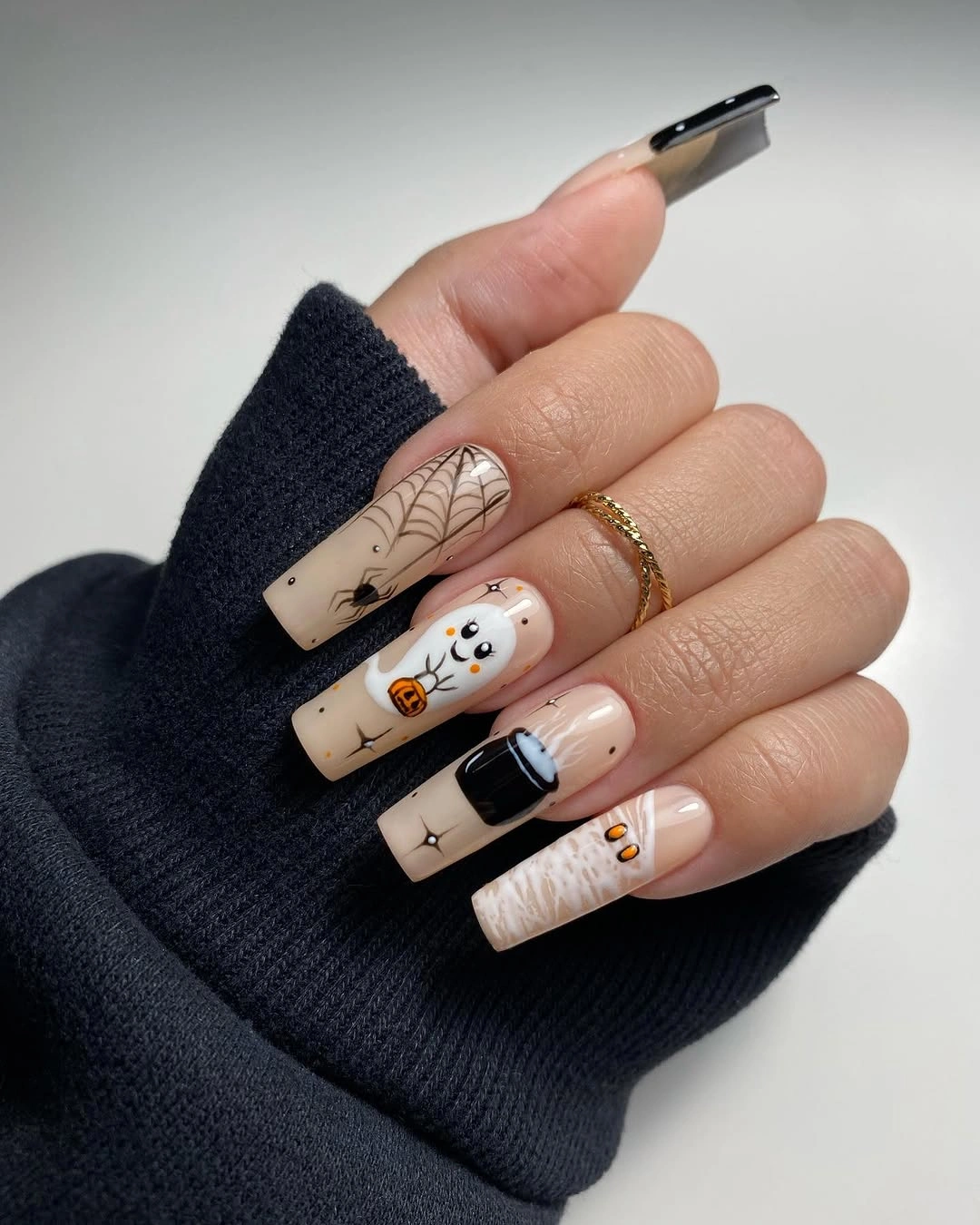
The frame is the strongest reusable idea, so a medium square version can keep the black edge on two nails and simplify the drawings beside it. One orange accent and one white figure will create enough variation without compressing several motifs into a narrow space. A charcoal tip would soften the contrast while keeping the same system.
Repeated borders demand consistency because one uneven edge can make the whole set look misaligned. Check the sidewalls before adding interior marks, then leave the centers open enough for the drawings to breathe. If a line chips, repairing the frame should come before refining any small character detail.
Neon Green and Warm Sparkle Change the Contrast
Pale pink and nude almond nails are interrupted by neon green accents, gold-like glitter, and small spooky illustrations, creating a deliberate cool-bright and warm-shimmer relationship. Green supplies the sharpest visual break, while sparkle softens it with reflection. The design feels fresh because the strongest colors occupy different jobs rather than competing inside one motif.
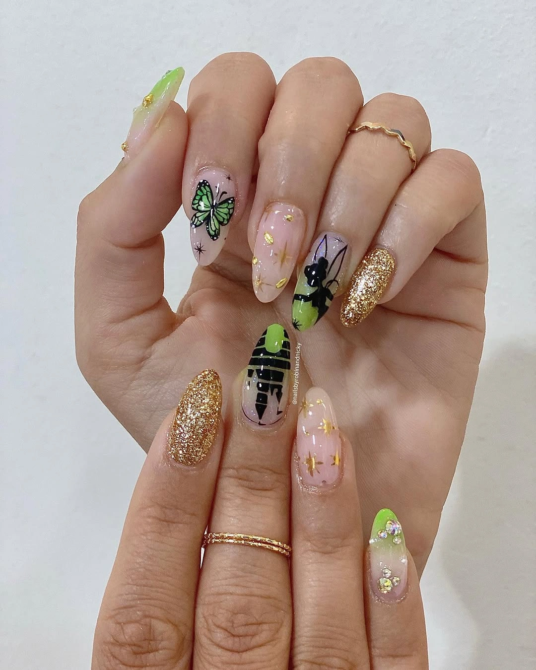
Use the green on one accent nail and move the glitter to another if you want the composition to stay readable on a medium length. The remaining nails can stay nude with one tiny dark mark, preserving the space between the two high-energy surfaces. Olive and bronze would produce a quieter version with the same temperature contrast, much like the accent discipline described in fall trendy nails.
Glitter and bright tips can wear differently from the smooth nude base, so the finish relationship needs occasional checking. If the set begins to feel crowded, remove a small illustration before reducing the color contrast. The palette is already doing enough visual work; the line art only needs to clarify the seasonal idea.
Pink Bases Buffer Sharp Black and Red Graphics
Long almond nails use pale pink as a buffer between black, white, and red graphic accents, allowing the set to feel dramatic without becoming visually hard. The pointed shape adds direction, while the red marks supply a controlled jolt of intensity. Pink is not background filler here; it is the surface that spaces the stronger colors apart.
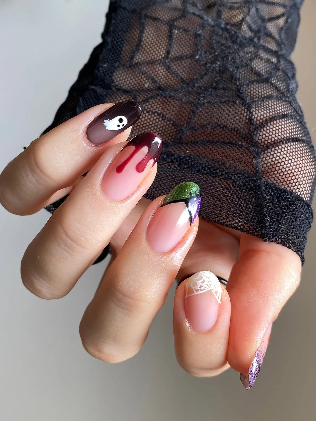
A shorter adaptation can keep the pink on most nails and concentrate black and red on one graphic accent. White can remain as a small relief mark rather than another full panel. If the palette feels too sharp, replace bright red with berry, but keep enough separation between the dark contour and the soft base to preserve the graphic clarity.
Long almond gives the linework room, yet the pointed edge increases the practical cost of a dense design. Keep the most important graphic away from the tip so a small chip does not erase its meaning. The pale companion nails should stay quiet enough that the focal accent can be repaired without disturbing the overall sequence.
Neon Green Tips Simplify Short Halloween Art
Short rounded nude nails use neon green at the tips and only a few black or white marks across the pale surface. The colored edge is the structural feature, giving the manicure a clear boundary while the small symbols provide a seasonal note. This is a compact design system rather than a reduced illustration set.
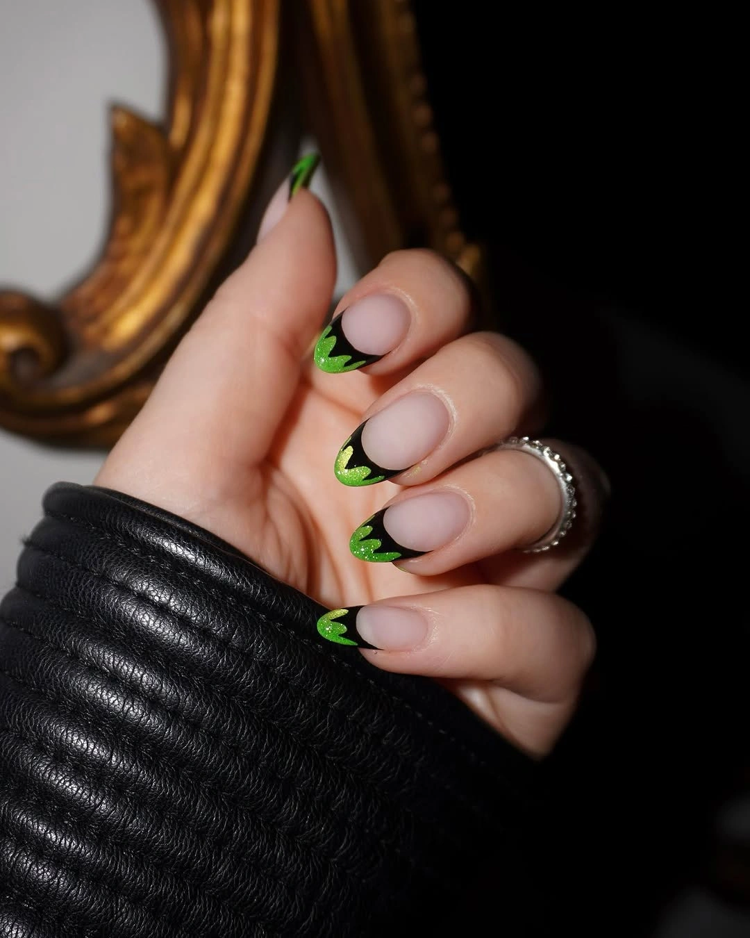
The tip can remain bright on two nails while the rest stay nude, or the green can be softened to olive for a less electric version. Keeping the art small protects the short shape and makes the design readable from a normal distance. A single black dot or tiny figure will support the edge without competing with it, a useful restraint to compare with simple fall short nails.
Bright tips make chips immediately visible, especially where the green meets the free edge. A narrow curve is easier to maintain on a short nail than a wide block, and a neutral base helps soften growth near the cuticle. Refreshing the tip cleanly will preserve more of the idea than adding a new symbol after wear appears.
One Metallic-Looking Spider Sets the Focal Scale
Very long stiletto nails use nude and black as a quiet field for one large spider and web-like embellishment with a reflective-looking finish. The focal motif is deliberately larger than the surrounding details, creating a scale relationship that tells the eye where to begin. Length extends the shape of the web and makes the central accent feel architectural.
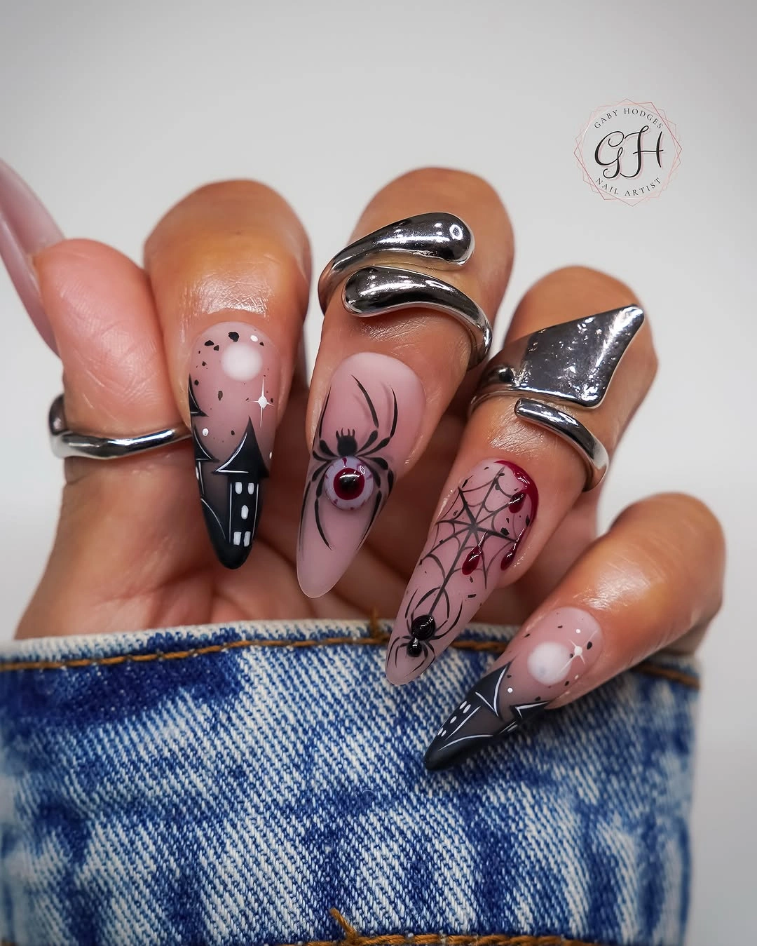
On medium almond nails, keep one spider-like shape or one web and remove the extra embellishment around it. The surrounding nails can stay nude with short black lines, allowing the focal scale to remain clear. Silver-like detail heightens the reflection, while charcoal would make the same structure quieter and more graphic.
Large embellishment and extreme length require more attention than flat line art, so the focal nail should not be surrounded by equally delicate details. Check the raised-looking area for snagging and the pointed edge for damage. If simplification is needed, remove the smallest nearby marks first and keep the main spider readable.
Pink and White Turn Halloween Icons Friendly
Short rounded pink nails use white and orange seasonal icons with a few dark marks, creating a friendly rather than gothic interpretation of Halloween. The pale base controls the contrast, and the compact shape keeps the drawings close to the hand. The set works through softness of scale as much as through its recognizable motifs.
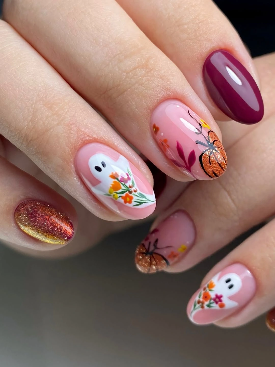
A two-accent arrangement would keep one white figure and one orange mark while leaving the other nails glossy pink. That reduction gives each icon more room and makes the manicure easier to read on a small nail bed. Pale peach or lavender could replace the pink without changing the light relationship between base and motif.
Small figures need crisp edges, but a short rounded shape limits how much internal detail can be shown. Keep the outlines simple and avoid placing the smallest mark directly at the free edge. As the nails grow, a centered icon will remain more recognizable than a narrow strip of decoration along the tip.
Long Stiletto Length Becomes a Graphic Canvas
Very long stiletto nails use red, black, white, and pink in dense character and stripe panels that behave like small posters. The extreme length is part of the composition because it gives each graphic enough vertical space to retain its lines and color blocks. Direction comes from the pointed silhouette and from the repeated panel shapes.
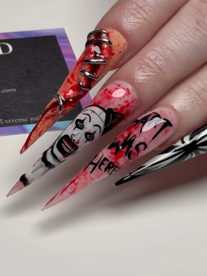
For a wearable version, keep one striped panel or one illustrated accent on medium almond nails and remove the secondary graphics. Let the remaining fingers repeat only one color from the focal panel so the set still feels connected. A nude base would create more relief, while black would make the chosen panel feel denser.
Dense art on a long point has a practical limit: a chip can interrupt several lines at once, and the length can make ordinary hand movement less comfortable. Keep the main graphic away from the most exposed edge and inspect the tip before refining the interior. Removing information is the strongest repair because the canvas is already carrying plenty.
Nude Space Keeps Black White Linework Precise
Medium almond nude nails use black and white web-like lines, small bow-like details, and pale figures while leaving the base visible between each mark. The composition feels precise because the negative space separates the motifs and keeps the contours from merging. Rather than building intensity through color, the set builds it through interval and repetition.
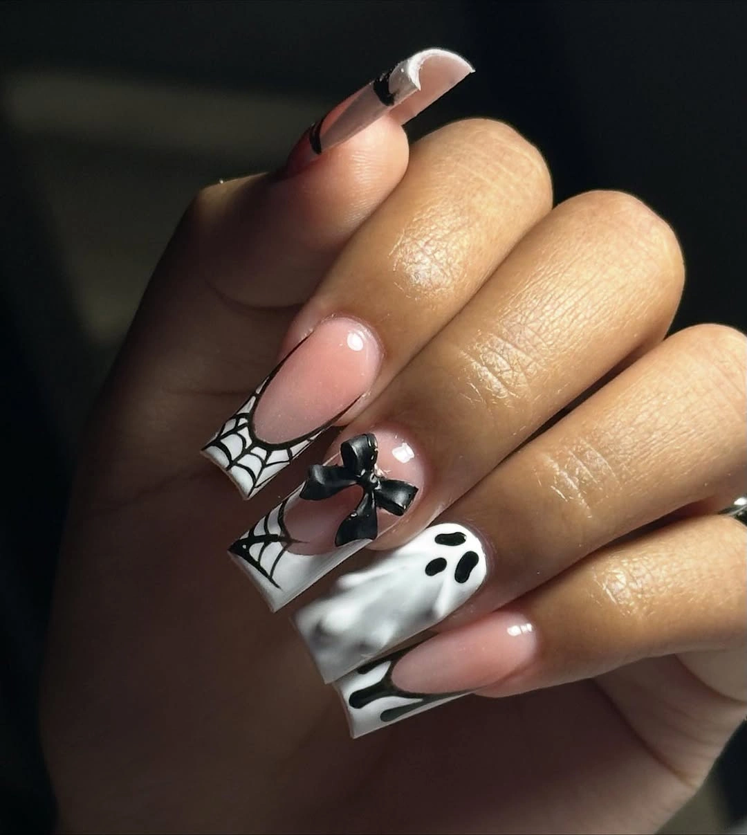
Keep one web and one white accent when adapting the design to shorter nails, then let the rest of the hand return to nude. A warm beige would make the lines softer, while cool blush would increase the graphic edge. The key is preserving enough open surface for each motif to remain a distinct shape.
Line-led designs reveal small spacing problems, so check the distance between the outline and the sidewall before adding a second mark. If the design begins to look crowded, erase the least important bow-like detail and keep the web structure. The empty area is what makes the remaining black and white elements feel intentional.
Red and Blue Web Geometry Breaks Tradition
Long square pale pink nails use red, blue, and white web-like geometry instead of the usual orange-black pairing. The strong primary colors make the lines read as a graphic system, while the pink base keeps the surface from becoming too stark. Repetition of the web structure gives the unusual palette enough continuity to feel deliberate.
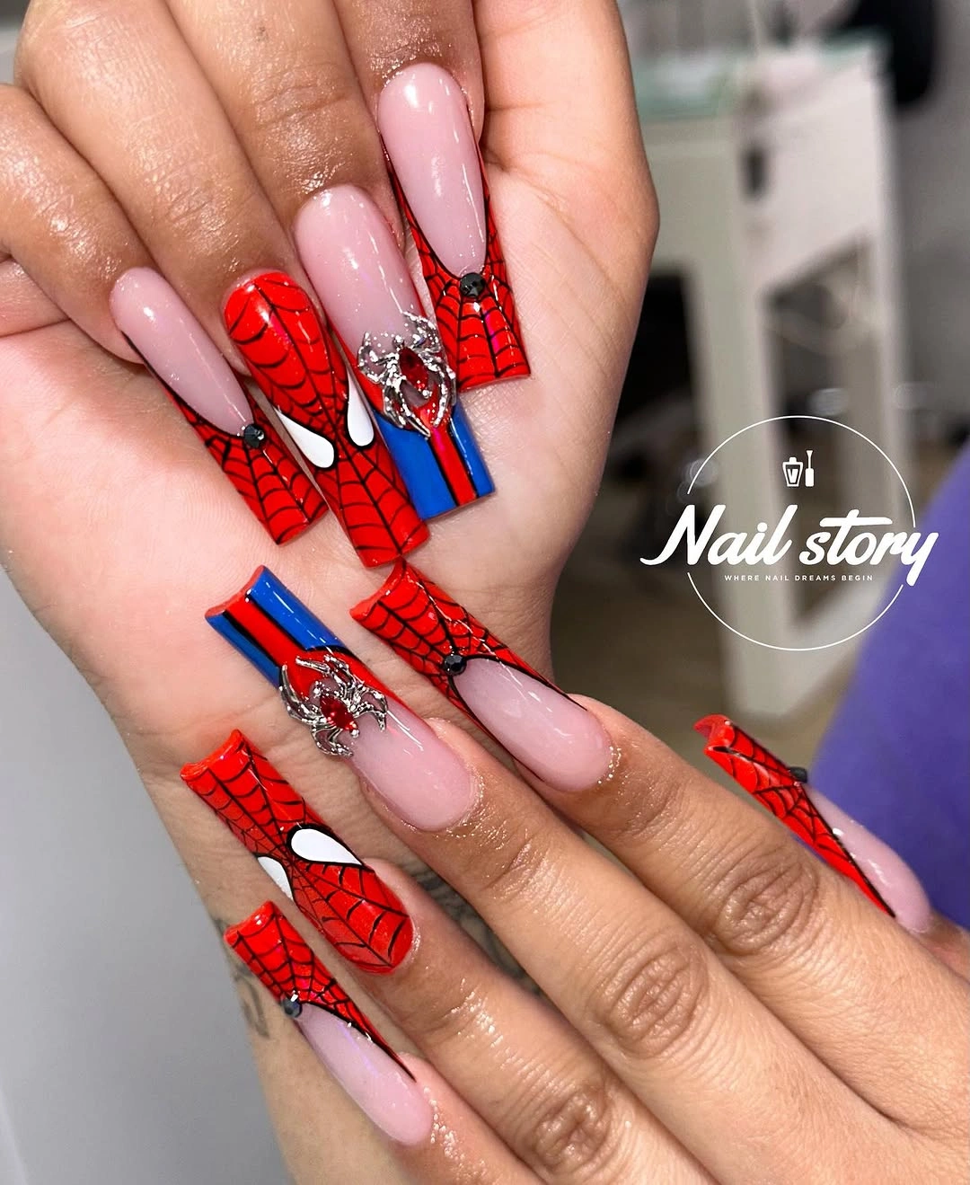
The color count can be reduced to one red web and one blue accent on medium square nails. White lines will keep the geometry open, while a nude base would create more contrast than the pale pink. If you want a moodier version, replace blue with deep navy but keep the red as the warmer counterpoint; the broader autumn nail color ideas guide follows the same principle of controlled contrast.
Geometric lines look strongest when the intervals are consistent, and long square edges make irregular spacing easy to detect. Leave the web marks broad enough to remain legible after growth, then check the corners for chips. A single clean geometric accent will say more than several compressed panels that lose their structure.
Pastel Faces Share a Consistent Scale
Medium almond nails use pastel pink, orange, white, yellow, and blue to create a series of small seasonal faces. Each nail carries a different expression or color detail, yet the faces remain connected because their scale and placement are similar. Consistency, rather than a single dominant motif, is what keeps the multicolor set coherent.
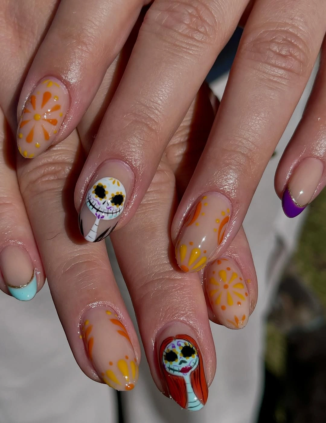
Choose two base colors when adapting the idea to a shorter nail bed, then keep the face size consistent across the accents. A white face on a colored base can provide the clearest focal point, while the remaining nails use simple dots or curves. The palette can stay cheerful without keeping every color in the original arrangement.
Small faces lose their character quickly when squeezed into narrow space, so remove secondary features before shrinking the whole design. Leave a clear border around each expression and check whether the eyes or outline still read after growth. The set is strongest when the repeated scale remains visible even if the number of faces is reduced.
Dripping Lines Pull the Eye Down Long Coffin Nails
Long coffin nails use pale pink, black, white, and red-pink marks with dripping and web-like lines that move vertically along the squared length. The direction of the marks echoes the straight sides of the shape, producing a controlled downward flow. The design feels graphic because the line movement is more consistent than the motif vocabulary.
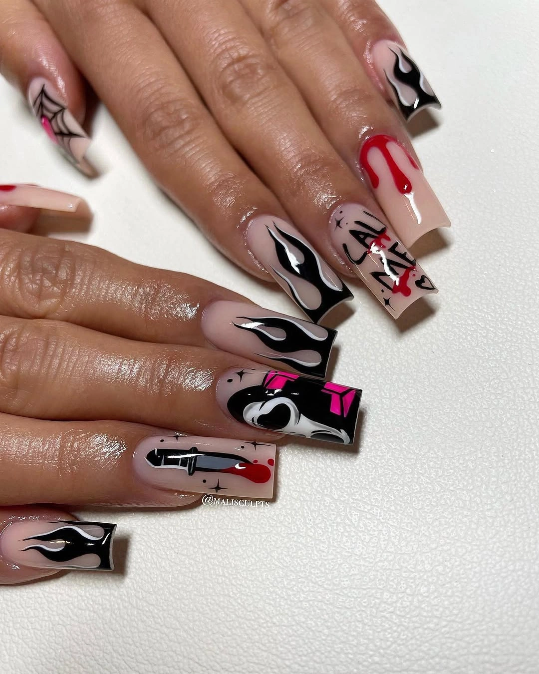
Keep one drip or one web on medium coffin nails, then use pale pink on the remaining fingers to retain the vertical contrast. A deeper red would add weight, while black alone would make the lines sharper and less playful. The useful adjustment is reducing the number of directional marks, not removing their downward movement.
Drips need a clean starting edge and enough space to lengthen before they become a crowded shape. Squared corners can show wear, especially when the graphics meet the free edge, so inspect that junction first. If the composition feels too dense, shorten the drips and leave the webs open rather than stacking more linework.
Small Colorful Characters Work on Short Nails
Short rounded nails use pale blue and nude bases with compact colorful character-like illustrations, showing how a small canvas can still hold a clear theme. The shape keeps the hand approachable, while the limited number of accents prevents the background from competing with the figures. Color is used as a small signal, not as a full field.
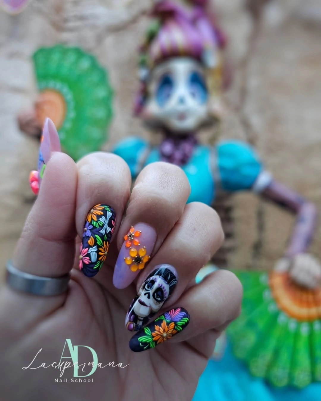
One character-like accent is enough for a shorter version, with pale blue or nude repeated across the companion nails. If the illustration needs more definition, add one dark contour rather than extra color. A soft lavender base would keep the playful mood while changing the contrast slightly for a cooler wardrobe.
Small illustrated details can become indistinct when the nail bed is narrow, so the outer silhouette matters more than tiny interior marks. Keep the figure away from the sidewall and use the center of the nail as its visual boundary. The restrained surface also makes a worn accent easier to replace without changing the whole hand.
Black Framing Makes Neon Panels Read Clearly
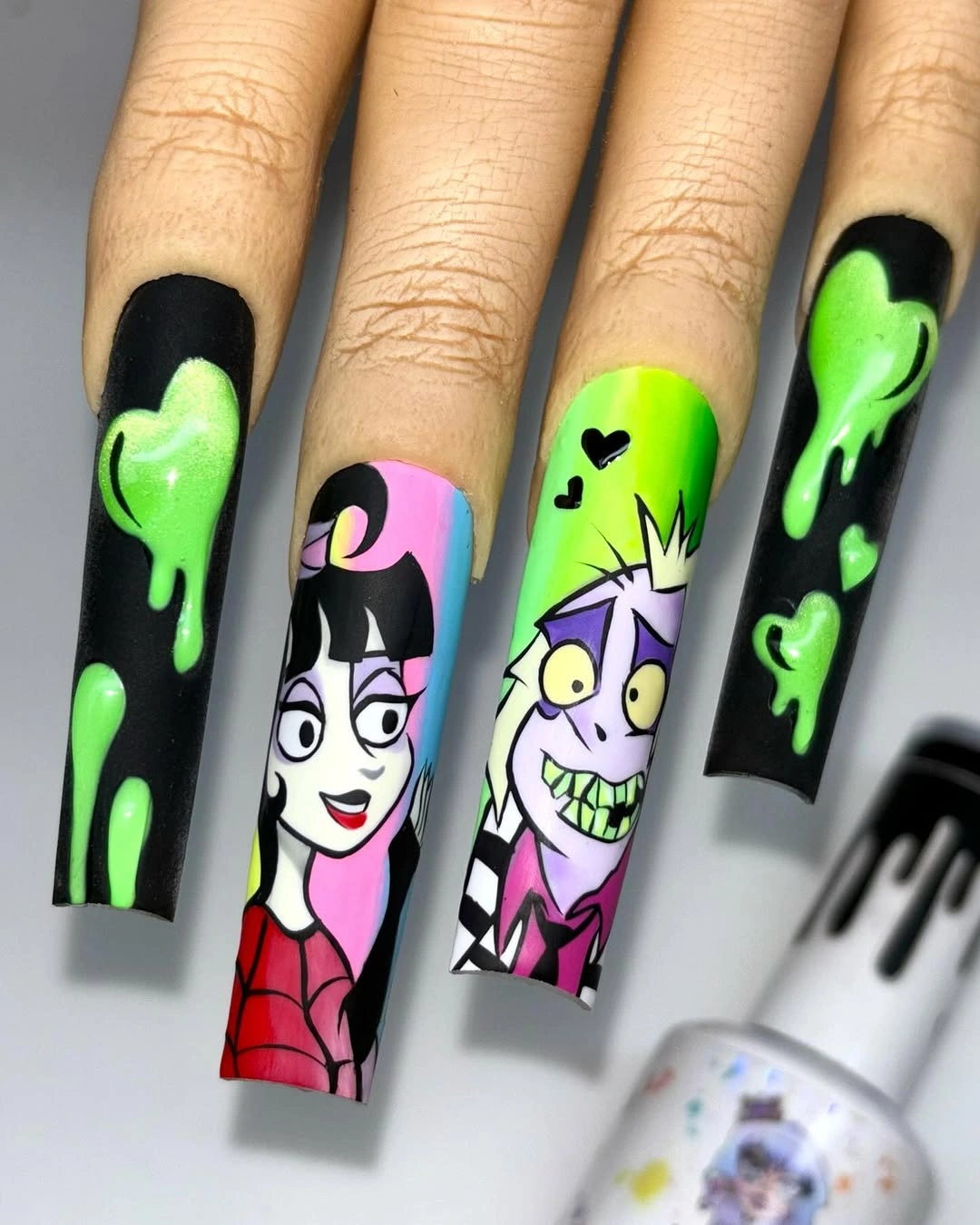
Very long square nails use black and neon green as a frame for bright pink, purple, and white character panels. The dark border keeps the saturated colors from spreading into one loud field, while the square shape gives each panel a defined edge. The system is bold, but it is not random because the framing repeats.
On medium length, preserve the frame on one accent nail and place one bright figure inside it. The other nails can use black, nude, or muted green so the panel remains the focal surface. Keeping neon to one or two colors will make the composition easier to read without taking away its graphic energy.
High-saturation panels and long square edges show wear quickly, and small faces can lose clarity if too much information is compressed. Remove secondary color blocks first when simplifying, then check the border for a clean continuous line. The repeated frame should remain visible because it is what turns loud color into a design system.
Repeated Pointed Motifs Create a Delicate Fan
Medium almond pale pink nails use black contours around white and lavender pointed motifs, creating a repeated fan-like pattern across the hand. The forms are ornamental rather than character-led, so the set feels delicate even though the outline is dark. Repetition establishes the rhythm, while the pale base provides enough relief between each shape.
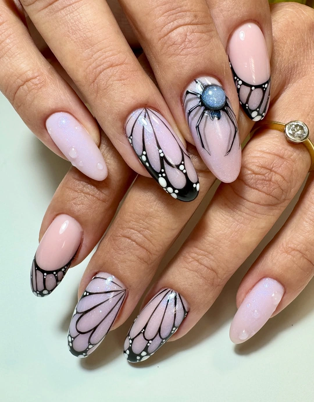
The fan structure can be simplified to two accent nails with the remaining fingers left glossy pink. Keep the inner lavender or white shape large enough to remain visible, and use a charcoal outline if black feels too severe. The idea survives when the repeated form remains recognizable, even if the number of panels is reduced.
Fine contours need a steady edge and enough distance from the sidewall to avoid collapsing into one dark patch. Check the repeated shapes as a group rather than correcting each nail in isolation. If the hand begins to look busy, remove one inner line from every motif so the overall rhythm stays consistent.
Pale Green Gives Tiny Ghosts a Fresh Lift
Short rounded white, pink, and pale green nails use tiny orange and dark seasonal accents, letting the light green serve as a fresh shift in an otherwise gentle palette. The symbols remain small enough that the base colors still dominate, while the green prevents the set from reading as a standard pink-and-orange arrangement. Scale keeps the color change controlled.
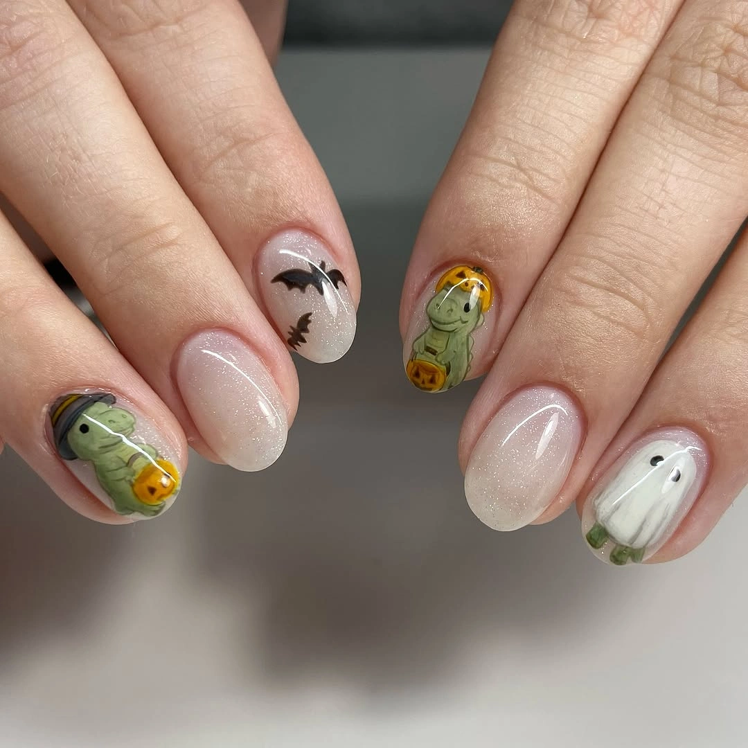
Keep pale green to one nail and move the clearest orange mark to another if you want the design to feel more edited. A soft sage would deepen the palette without adding saturation, while mint would make it brighter and more playful. The short shape benefits from simple marks that do not require a large drawing area.
Light colors show smudges, so the clean surface around each tiny symbol is part of the finished composition. Use the green as a block rather than filling it with extra art, then check whether the orange accent still has enough contrast. Removing a small mark will protect the airy color balance better than adding a darker outline everywhere.
White Focal Panels Clarify Black Pink and Red
Medium square nails combine black, pink, white, and red with web, ghost, and drip motifs, but a bright white panel gives the hand a clear visual pause. The dark and saturated blocks feel more legible beside that pale surface, while the square shape supports the panel arrangement. Contrast is controlled by alternating dense and open areas.
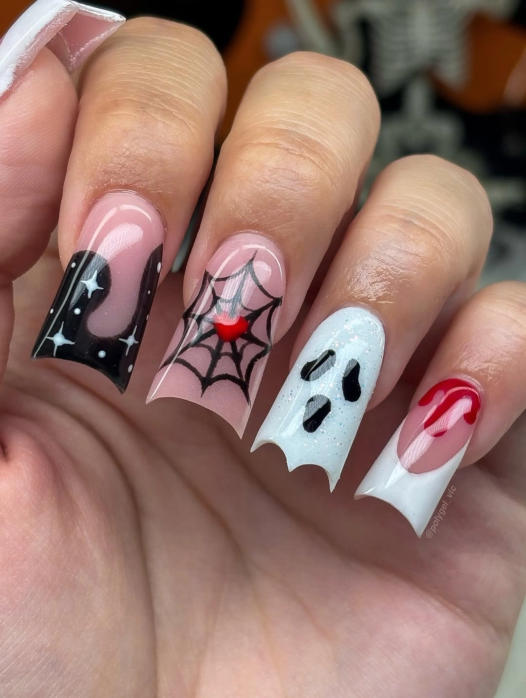
Use one white focal nail and one darker web nail on a shorter square shape, leaving the remaining fingers pink or nude. The red drip can stay small so it adds direction without becoming the dominant surface. A pale lavender panel would soften the contrast, while white keeps the graphics crisp and immediate.
White panels need a clean perimeter because any smudge weakens the relief they provide. Inspect the red and black elements where they meet the pale surface, then remove a secondary mark if the boundary looks crowded. The design depends on the focal pause, so keeping that panel open is more valuable than filling every available space.
Lavender Makes Orange Feel Unexpected
Medium almond lavender and pink nails use black, orange, and small colorful illustrations to place a warm focal detail inside a cool setting. Lavender changes the expected Halloween temperature, while pink keeps the contrast from becoming severe. The design reads as intentional because the warm accent is concentrated instead of scattered across every nail.
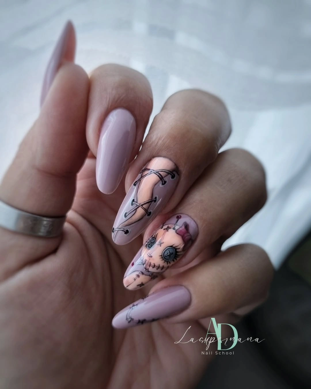
Keep lavender on most nails and place the orange detail on one accent when adapting the set to shorter length. A small black contour can connect the two temperatures without adding another bright shade. Dusty rose would make the palette warmer, while pale blue would push the cool contrast further. Giving the warm mark a clear border of lavender is what allows the color shift to remain intentional.
Warm motifs can disappear if the cool base is too close in value, so leave a clean halo of lavender around the orange mark. The almond shape provides enough room for a small illustration, but a short rounded nail may need only a dot or curved symbol. The composition improves when the focal accent has visible space on all sides.
Nude Almond Nails Read Like Small Autumn Jewelry
Long almond nude nails carry tiny black, green, and reflective-looking illustrations that feel more like scattered jewelry than a full character theme. The neutral base provides a calm field, while the small accents create a refined seasonal signal. The design depends on close viewing, with detail density kept low enough for the silhouette to remain graceful.
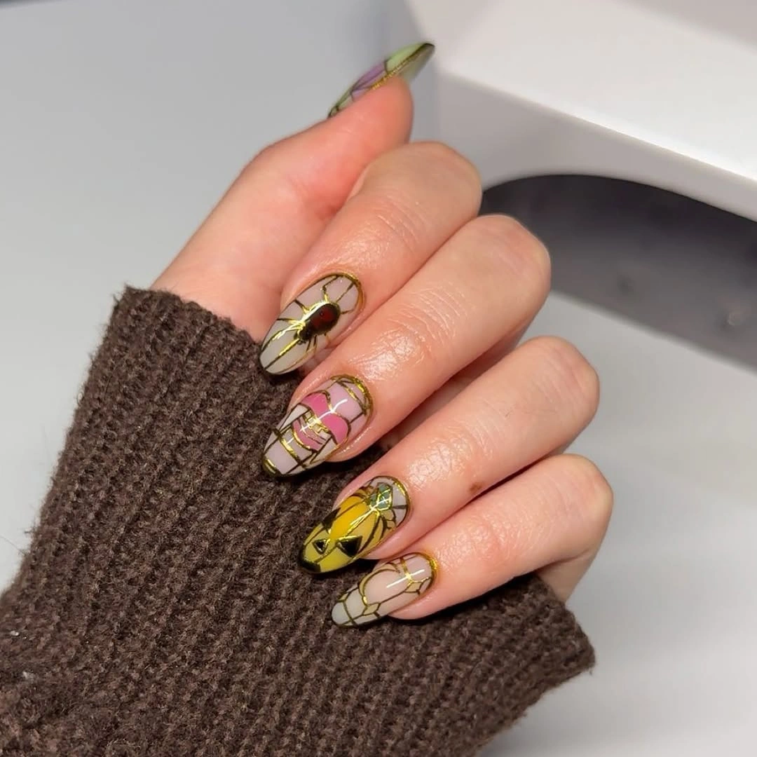
Two illustrated nails are enough for a medium almond adaptation, with the remaining fingers kept nude and glossy. A small green mark can become the focal point, while black linework supplies the connection. Warm taupe or cream would maintain the jewelry-like quality without changing the scale of the details.
Fine accents placed near the center are less vulnerable to tip wear than edge-led graphics, but growth will still change their spacing. Keep the details distinct rather than merging them into a larger panel. The neutral base is doing the quiet work, so preserving its open surface will keep the set refined through wear.
Black and Hot Pink Build Playful Pop Art
Long almond pale pink nails use black and hot pink character-like graphics to create a pop-art Halloween direction. The soft base gives the saturated marks room to appear sharp, while the repeated almond shape keeps the hand from becoming too blocky. Contrast is strongest where the dark contour meets the bright pink accent.
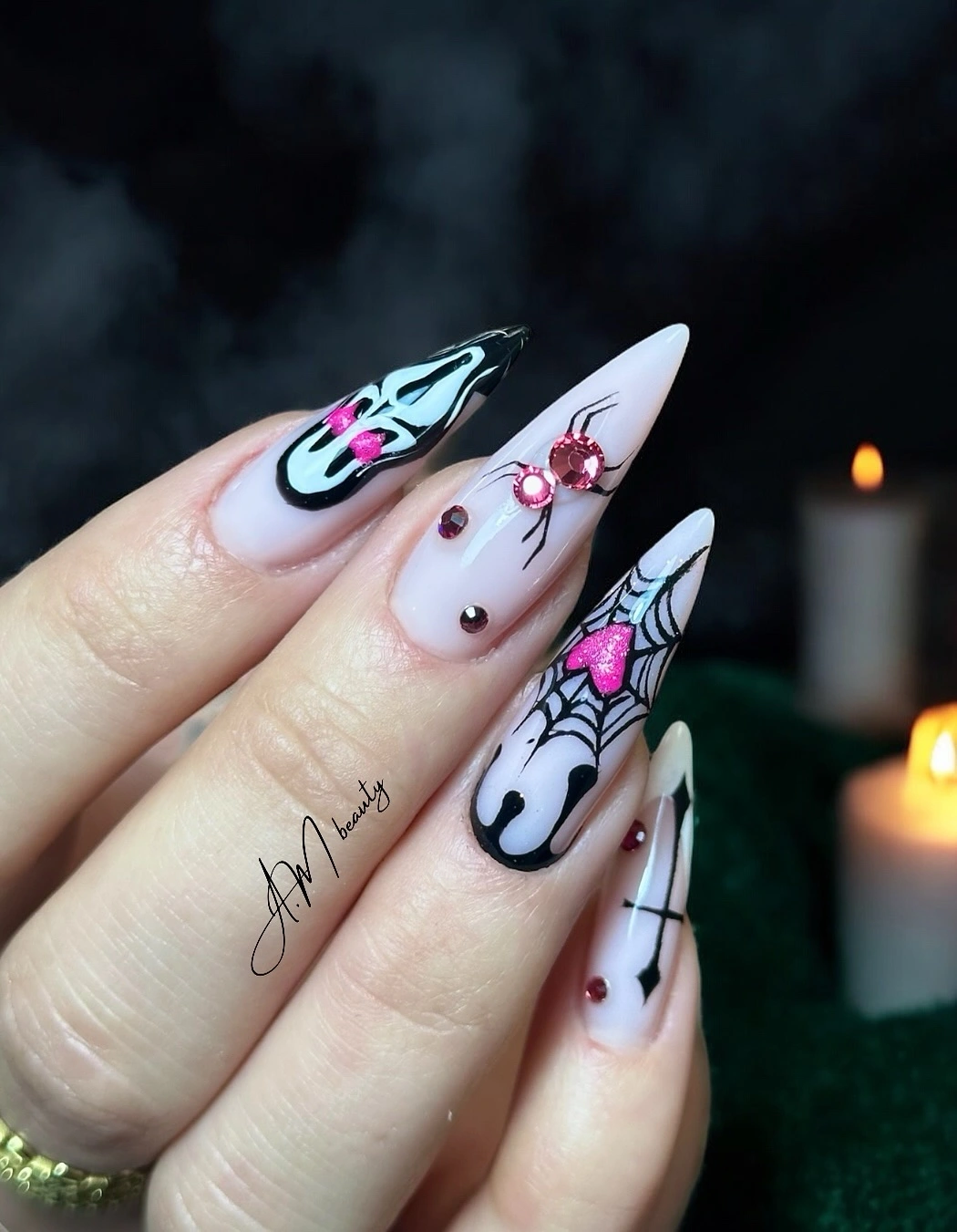
One graphic accent on a medium almond nail would preserve the pop-art relationship with much less density. Let the remaining nails stay pale pink and use one black curve or dot to echo the focal outline. Berry or magenta could replace hot pink if you want the same energy with a deeper autumn register.
Long points and saturated linework make small repairs visible, so keep the most important graphic away from the exposed tip. If the composition feels crowded, remove an interior mark before reducing the outer silhouette. The playful effect comes from a clear contour and one bright interruption, not from filling every surface.
Warm Nude Leaves Room for Quiet Symbols
Short rounded warm nude nails use only a few black, orange, and pale seasonal symbols, allowing the base to remain almost neutral. The small figure-like accent carries the Halloween cue, while the surrounding surface keeps the hand understated. This is a design about controlled omission: the empty nails are part of the message.
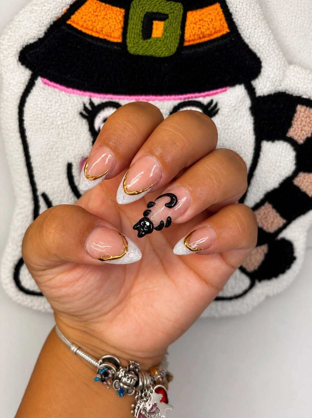
Keep one black symbol and one orange mark if you want a practical two-accent version, then let the remaining fingers stay warm nude. A soft brown line would make the result even quieter, while black gives the small motif clearer definition. Short rounded shape supports the sparse arrangement because it does not need extra length to feel finished.
Tiny symbols can soften during grow-out, so place them away from the edge and avoid relying on intricate interior details. The warm base makes minor wear less conspicuous than a stark white surface, but the edges still need a clean finish. Removing a mark is the right repair when the composition starts to lose its open, quiet character.