
The difference between a manicure that feels deliberate and one that feels overworked is often less than a millimeter. A line that stops before the edge, a single accent placed slightly off center, or a quiet nail left untouched can change how the whole hand reads. Detail is not decoration added at the end; it sets the pace before the eye has time to name anything.
Start with the nail that has the least visual space and decide what must remain clear there. Choose one strongest decision, then remove anything that competes with it, especially when a small surface makes every mark look louder. If the design still reads after that edit at arm’s length, the close-up details will feel intentional rather than crowded.
Miniature Pumpkin Marks Keep Short Nails Balanced
The short rounded nude-pink base gives these nails an easy starting point, while miniature orange and dark seasonal marks add interest without changing the compact silhouette. Because the decoration is scattered in small doses, the eye reads a gentle pattern rather than one oversized centerpiece. That scale is the important decision here, not the number of symbols.
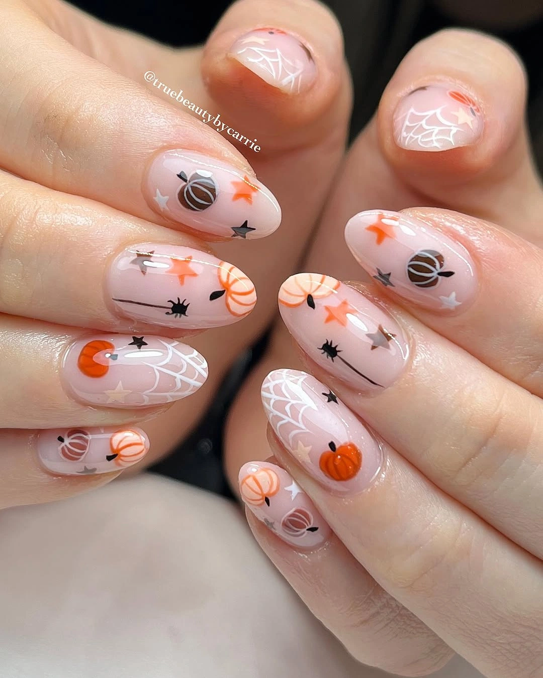
Open base space keeps the tiny drawings legible and prevents the pale color from feeling crowded. On a shorter nail bed, copying the same idea with one orange accent and two small dark marks would preserve the visual rhythm while making the artwork easier to place. A sheer pink, warm beige, or soft peach base could all support the same restrained relationship.
The practical limit is the fine linework, because small marks can soften as the nail grows and can look uneven if the surrounding edge is not clean. Keep the most detailed symbol near the center and let the neighboring nails carry simpler dots or stars. That small hierarchy helps the set stay intentional after a few days of ordinary wear.
Burgundy Edges Sharpen Soft Almond Pumpkin Nails
Long almond nails in a mauve-pink tone become more defined when a deep burgundy curve traces the free edge. The darker tip acts like a frame, so the little seasonal details and metallic-looking accents do not float on an undefined surface. That edge is what turns a gentle color story into a more graphic fall manicure.
The pale center and dark perimeter create a useful contrast that can be adjusted without losing the idea. A medium almond shape would keep the burgundy framing while reducing the pointed length, and a narrow tip would make the set feel less formal. Readers who want a softer result can trade the deep edge for cocoa brown or muted plum.
Long almond length gives the small details enough room, but it also makes the tips more exposed during everyday tasks. Watch the dark edge for chips first, since even a small break in a continuous frame changes the balance of the whole set. Keeping the art sparse is a strength here because it leaves space for a clean repair rather than forcing a full redesign.
Rosy Patterning Makes Seasonal Details Feel Light
The glossy rosy base carries repeated tiny red-orange and dark marks that feel closer to a hand-drawn pattern than a set of separate illustrations. Short rounded nails keep that pattern friendly and practical, while the pale pink ground stops the seasonal symbols from taking over. Repetition supplies the cohesion that a single large motif would normally provide.
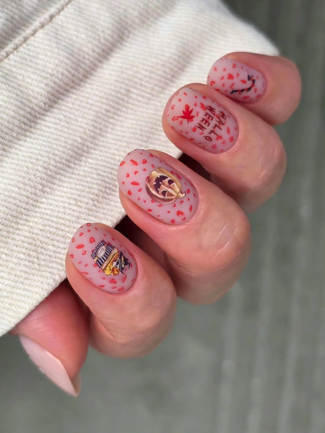
What makes the look work is the consistent scale of the marks across the hand. A calmer adaptation would keep the pattern on two nails and leave the rest sheer pink, or repeat only one symbol in different positions. That change preserves the playful surface while giving the eye a few quiet spaces to rest.
Light backgrounds are forgiving when the artwork is small, but they also reveal smudges and edge wear quickly. Choose a base with enough opacity that the pattern still looks deliberate after the free edge grows out. If the nail beds are very short, reduce the number of marks rather than squeezing the same cluster into a smaller area.
One Marbled Accent Carries the Stiletto Drama
The long stiletto silhouette is already assertive, so the strongest move is concentrating the contrast on one dark marbled nail. Pale pink companions and a small raised-looking orange detail keep the set from becoming uniformly heavy, while the black-red accent supplies the visual stop. The manicure works through focal placement more than through equal decoration.
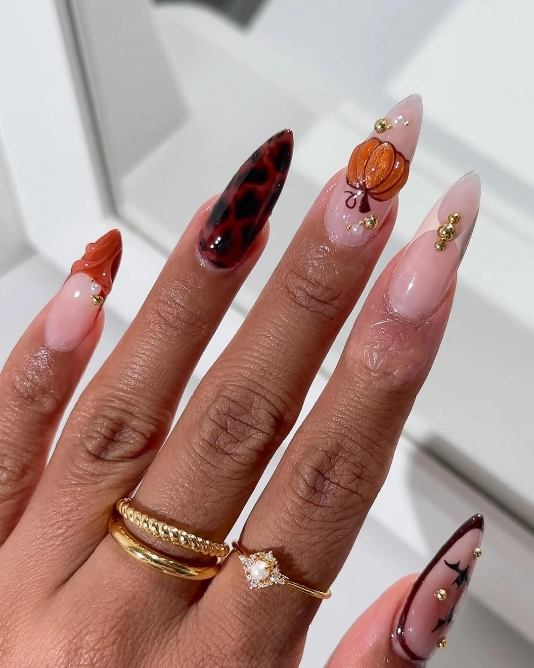
That single dark nail gives the hand a clear direction: the eye lands there, then moves back through the lighter nails. On medium almond nails, the same strategy could use one burgundy swirl or black-red accent while the remaining nails stay pink and mostly plain. A smaller focal area would make the idea easier to wear without removing its contrast.
The tradeoff is tied to both the point and the density of the accent. Very sharp tips need more care around clothing and daily handling, while a crowded focal nail can show damage more noticeably than a pale companion. Keep the surrounding nails quiet enough that a small repair to the statement nail does not require repainting the whole hand.
Black Web Lines Give Pink Nails Definition
Soft pink short nails can look almost romantic until black curved linework introduces a web-like movement across the set. The lines are more important than any tiny seasonal symbol because they give the pale surface direction and connect separate nails visually. Their irregular placement also keeps the manicure from feeling like a rigid uniform pattern.
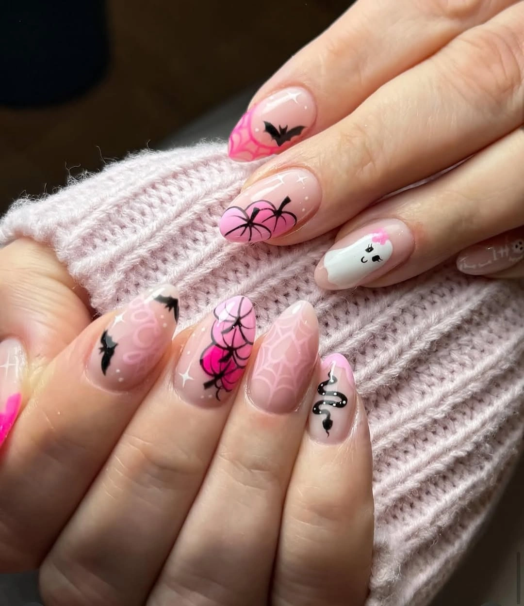
The contrast stays controlled because the black does not cover the entire base. One or two web accents would be enough on a shorter version, with the remaining nails left glossy pink or given only a small dot. A mauve, blush, or warm cream base could shift the mood while keeping the same line-led structure.
Thin lines have a practical weakness: they need a tidy border to look purposeful, and small breaks can make the design feel accidental. Place the longest curve where the nail has the most open space, then let shorter marks echo it nearby. Keeping the rest of the decoration minimal makes maintenance more forgiving as the edges begin to grow out.
Textured Green Adds Weight to Pastel Accents
A muted green nail with visible ribbed-looking texture changes the balance of the pink and mauve illustrated nails beside it. The green does not need another large motif because its finish already behaves like a visual accent, giving the set a grounded point. That contrast between tactile-looking surface and small drawings creates more variety than adding another color would.
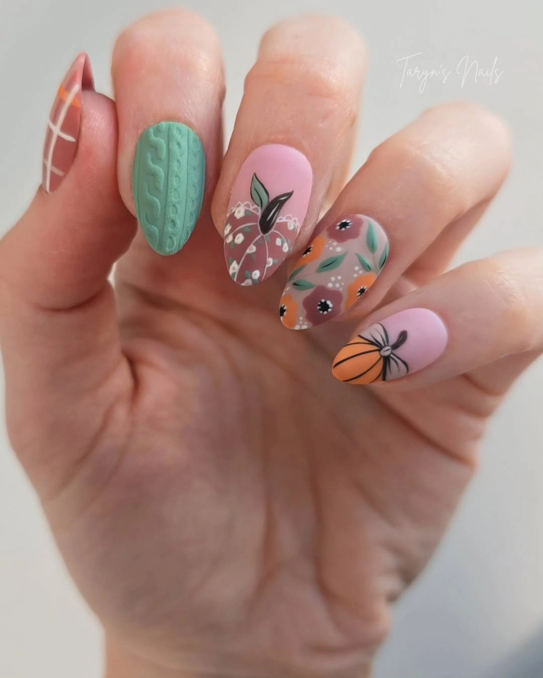
Keeping the textured green to one nail is what preserves the lightness of the palette. A shorter adaptation could use a solid olive or sage nail in the same position, then retain the illustrated pink accents on two fingers. The result would lose some surface contrast but keep the useful idea of one anchor among softer colors.
Texture can make the manicure feel more dimensional, yet it may also make grow-out and surface wear easier to notice. Check the green accent when deciding whether the set still looks balanced, because a rough-looking edge will draw attention faster than a small chip in a pale nail. The fewer raised-looking details elsewhere, the cleaner this anchor remains.
Yellow and Pink Brighten the Halloween Palette
Bright yellow and pink shift the seasonal mood away from deep autumn and toward a cheerful Halloween palette. Dark curved tips and small warm accents add definition, but the bright base colors remain the first thing the eye notices. That ordering makes the design feel lively rather than traditionally spooky, even with a few darker marks in the mix.
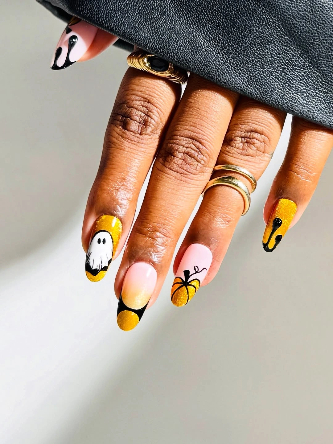
The color blocking is the easiest element to adapt because it does not depend on a large illustration. On medium almond nails, place yellow on one or two fingers, keep pink as the main base, and repeat one dark curve to connect them. A muted mustard or dusty rose would make the same arrangement more autumnal and less neon. The existing fall trendy nails guide follows the same useful logic of letting one strong accent carry the decision.
High-saturation colors show chips clearly, especially along long pointed edges where the eye expects a smooth curve. If daily work makes the length impractical, preserve the yellow-pink relationship on short rounded nails and remove the smallest accents. The manicure will remain expressive because the color contrast is doing most of the visual work.
Muted Blue Gray Lets Warm Accents Speak
Muted blue-gray bases create a cool, denim-like field for small warm accents and botanical-looking marks. The seasonal feeling arrives through those restrained details rather than through a dominant orange or black block. That makes the design particularly useful when you want fall color to feel transitional, and the site’s autumn nail color ideas offer another way to think about warm accents against quieter bases.
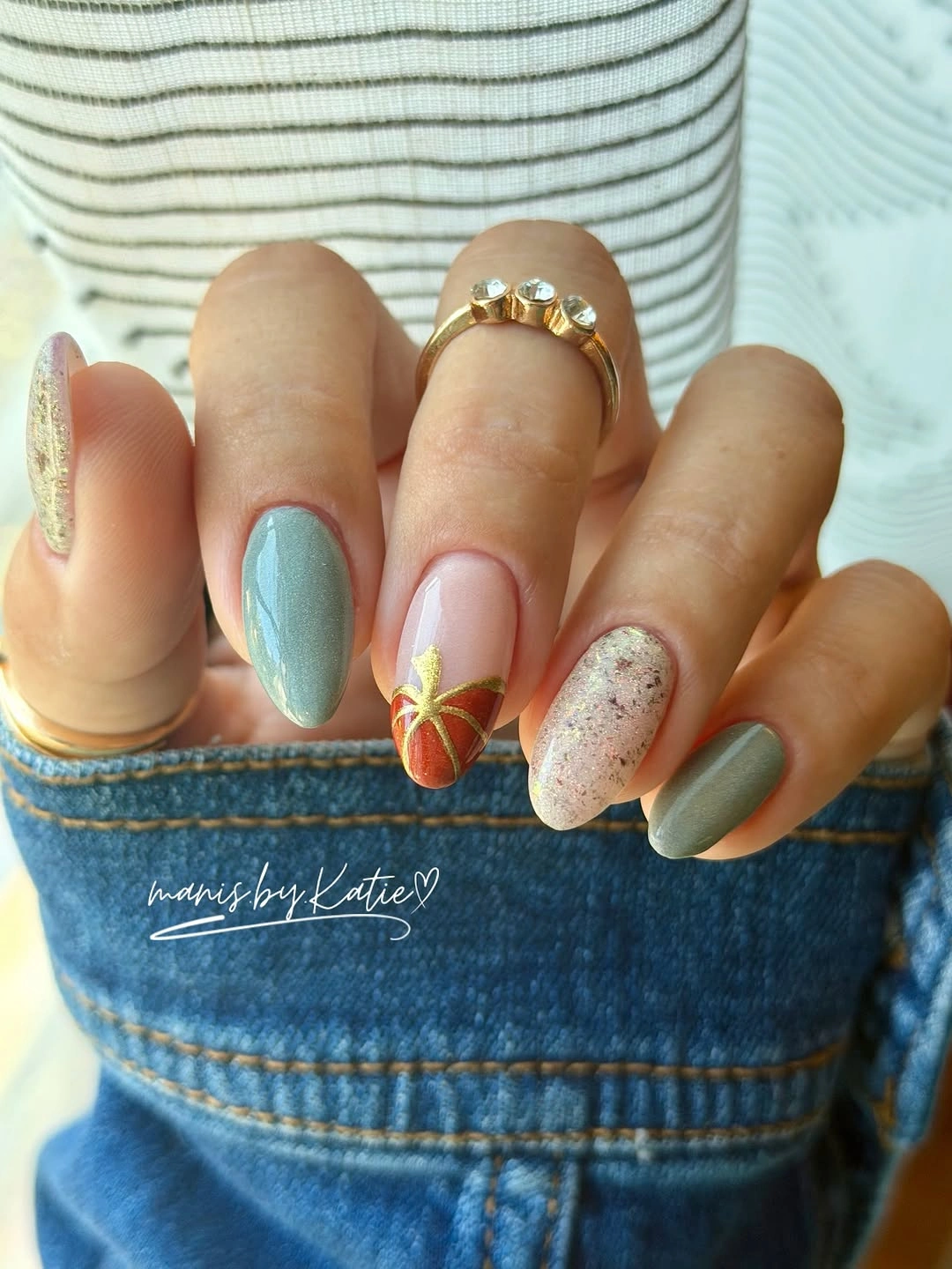
Cool color keeps the hand calm while a warm mark becomes more noticeable by comparison. A shorter set could keep the blue-gray on most nails and move the illustrated detail to one finger, or replace the gray with a soft taupe for a warmer wardrobe. The important relationship is the temperature shift, not a specific shade name.
Small art can disappear when the nail bed is extremely short, so leave enough open base around each mark to protect its shape. The muted colors are forgiving beyond Halloween, but a worn edge will stand out more on a solid cool base than on a busy print. A simple glossy finish helps the limited palette keep its clarity.
Fine Plaid Frames a Single Pumpkin Accent
Pale pink almond nails become more seasonal when narrow orange and dark lines form a small plaid beside a single orange pumpkin-like accent. The plaid is not spread as a heavy blanket; it acts as a linear frame that gives the motif a setting. That difference keeps the design detailed without making every finger compete for attention.

Alternating a thin grid with an open nail creates an easy hierarchy: the pumpkin is the focal point, while the plaid supplies structure. On shorter almond nails, keep the grid to one nail and use a small orange mark on another. Brown, olive, or cream lines could shift the palette while preserving the same framed relationship.
Even spacing matters more than the exact number of lines, because uneven plaid can make the nail look crowded very quickly. Use wider gaps when the nail bed is narrow and let the neighboring nails stay plain. That restraint also helps the design age better as the free edge grows, since the fine grid is not carrying the whole manicure.
Open Pastel Space Keeps Tiny Marks Playful
Soft pink and lilac bases leave generous open areas around tiny dark stars and seasonal marks, so the design reads as a light collection of doodles. The short rounded shape reinforces that ease, while the glossy surface keeps the pastel colors connected. Nothing needs to become a large focal point because the spacing itself supplies the mood.
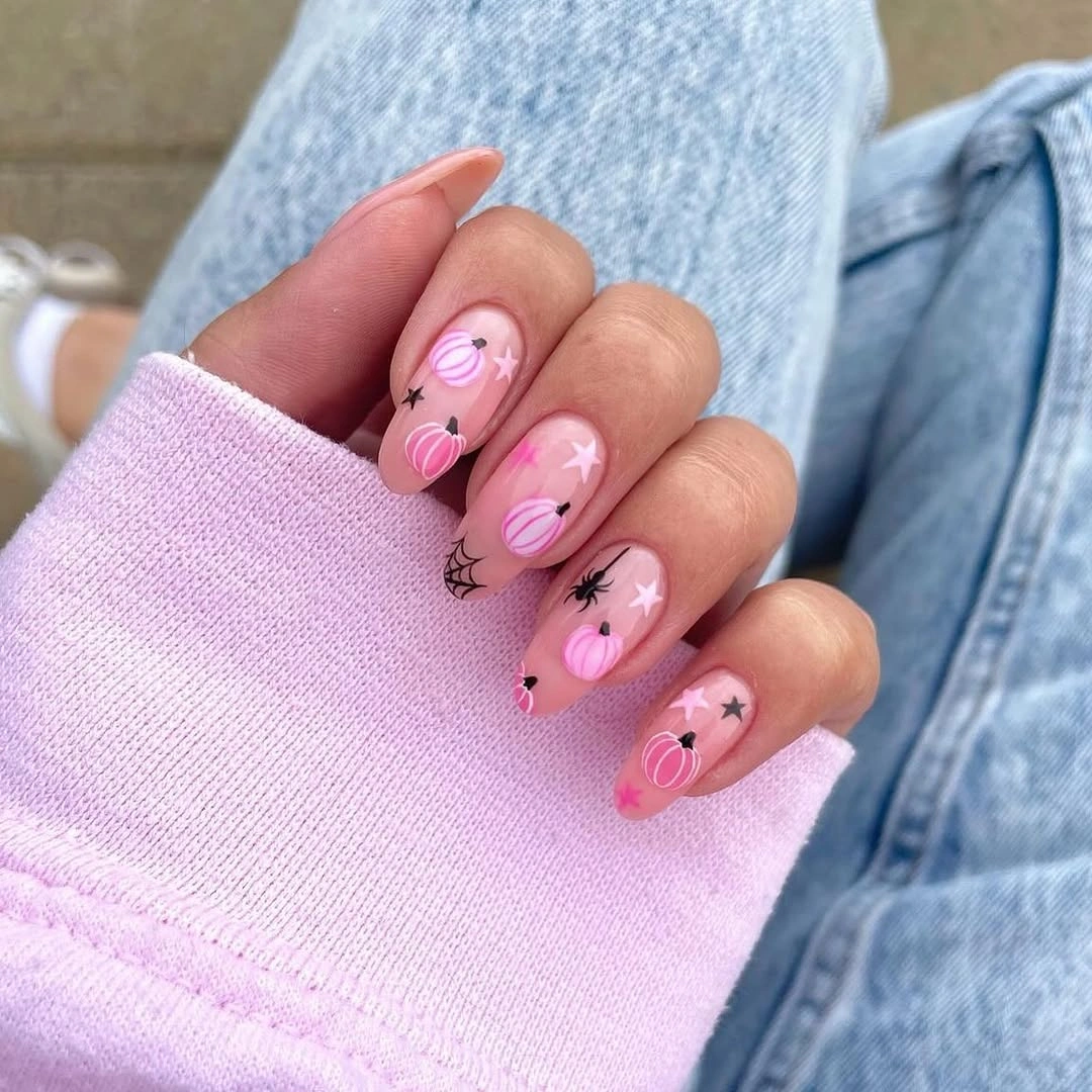
Keeping the marks small allows the manicure to work with everyday clothing instead of matching only a costume palette. A simpler version could place the star-like detail on two nails and leave the rest plain lilac, or swap the lilac for a warm beige. Either adjustment protects the open space that makes the set feel calm.
Pale color is visually gentle but can reveal staining, scuffs, and growth faster than a darker base. Leave a little breathing room around each mark so a minor touch-up does not erase the composition. The design is strongest when the hand still looks mostly pastel from a distance and only reveals the seasonal note up close.
Bronze Glitter Deepens a Saturated Orange Set
Bright orange oval-almond nails already carry a strong pumpkin-season message, so the bronze glitter accent is a useful interruption rather than extra decoration. Its warmer sparkle breaks the solid color field and gives the hand a deeper point to look toward. Small green and darker details can then remain secondary instead of competing with the base.
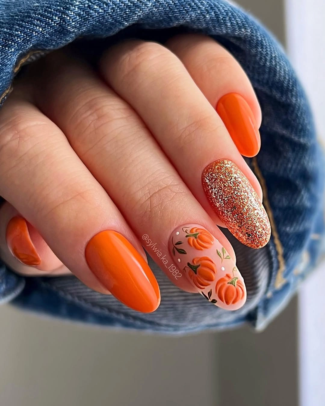
One glitter nail is enough to make saturated orange feel layered, and that decision translates well to a shorter shape. Keep orange on two or three fingers, move the glitter to one accent, and use a muted nude for the remaining space if the full color feels intense. Terracotta would soften the result while keeping the warm relationship.
Orange makes the free edge highly visible, which means chips can change the impression faster than they would on a neutral base. The glitter accent may also catch texture or wear differently from the smooth orange nails, so it deserves its own quick check. Because the art is limited, a clean base and even shape matter more than adding another motif.
One Outlined Pumpkin Becomes the Entire Accent
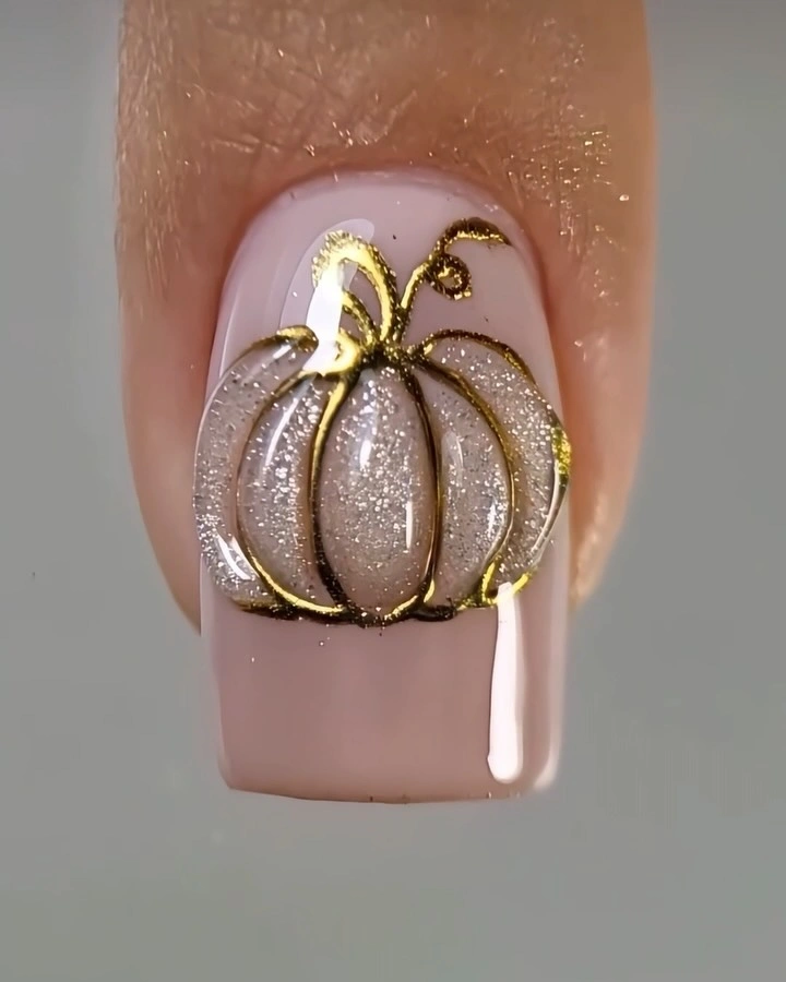
The macro square nail is almost completely calm except for one large pumpkin outline placed in the center of a glossy nude-pink base. That centered drawing has enough scale to be read immediately, while the short square edge keeps the idea practical. The design shows how a single well-placed symbol can replace a crowded seasonal set.
Symmetry gives the outline a quiet emblem quality, so placement must remain deliberate. Use one accent nail and keep the remaining nails sheer, or repeat a smaller outline on two fingers if you want a little more connection. A cocoa, olive, or soft rust line could change the mood without changing the clean composition.
Fine metallic-looking lines are visually effective but less forgiving when they fade or break. Since the central motif carries the entire manicure, a touch-up should restore the outline rather than adding more decoration around it. The simple base also makes this a useful design when growth is expected, because the background does not create a hard visible boundary.
Cool Gray Motifs Quiet a Pink Almond Set
Long almond nails in soft pink use pale gray and dark line art instead of the expected bright orange, creating a quieter autumn reading. The cooler motifs sit close to the base in tone, so the pointed shape and repeated outlines provide the structure. Seasonal mood comes through the subject matter, while color remains controlled and wardrobe-friendly.
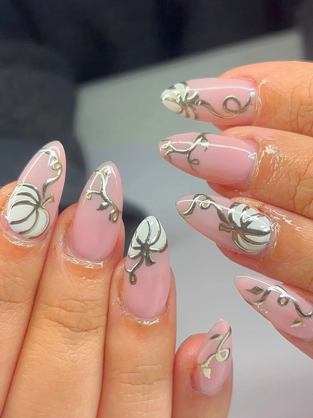
Low contrast makes the set easier to wear with neutral clothing, but it also means the drawings need enough separation from the pink surface. A medium almond version could keep the gray on two accent nails and use a taupe or charcoal line for clearer definition. The goal is not more color; it is a slightly firmer edge around the existing detail.
Long almond gives fine illustrations room, yet the length increases the amount of free edge that needs attention. Check whether the gray marks still align with the shape after growth, especially if the design uses several small outlines. Quiet decoration is helpful here because it leaves the eye able to notice a small adjustment without making the whole hand look patched.
Lilac and Violet Shift Halloween Toward Moonlight
Lavender and violet bases move the manicure toward a moonlit Halloween mood, while pale outlined figures keep the design from becoming heavy. The medium almond length offers enough room for the white and dark motifs to stay distinct, and the purple family creates continuity across the hand. Color is the main seasonal decision, with illustration working as support.
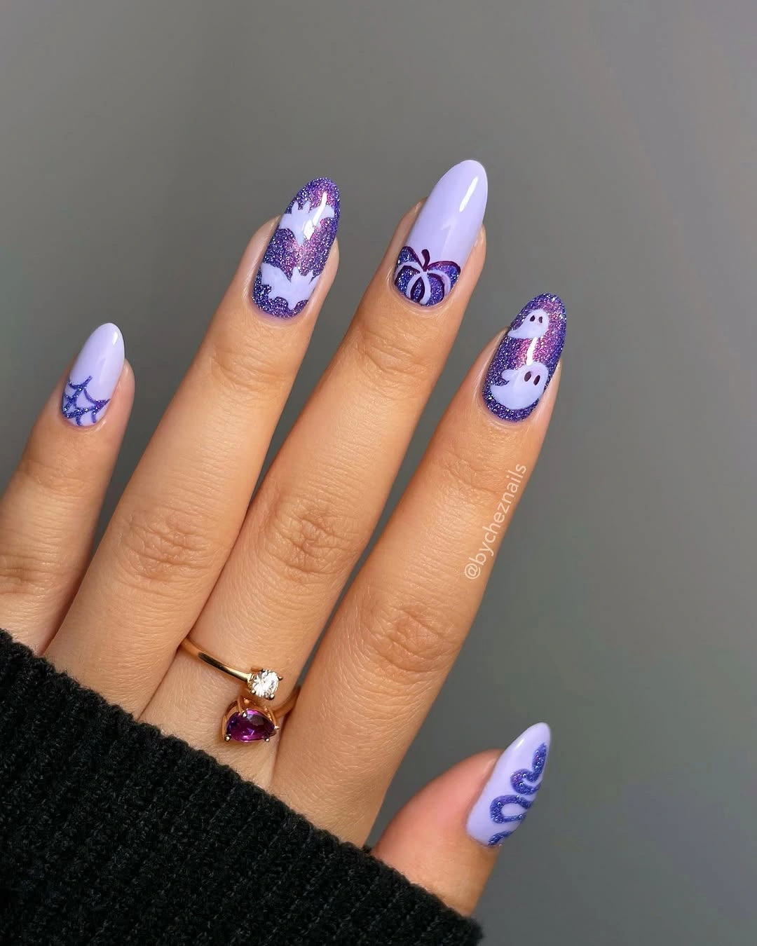
Using two related purples gives a stronger system than mixing several unrelated bright shades. A shorter set can keep violet on one accent and use lavender or sheer pink elsewhere, with one white outline for contrast. Deep plum would make the result moodier, while a pale blue-violet would keep the moonlit quality softer.
White details need a clean boundary to remain crisp against purple, especially when the design includes small outlined shapes. If the lines start to soften, remove one minor mark rather than thickening every contour. The set works because the palette is controlled, so preserving that space is more valuable than trying to rescue every tiny detail.
Soft Red Details Keep Pink Nails Seasonable
Blush-pink almond nails carry small red, warm, and floral-looking marks that suggest autumn without announcing Halloween immediately. The base remains the dominant impression, while the accents add a seasonal change in temperature and rhythm. That softer interpretation is useful when you want the hand to move easily between ordinary days and themed occasions.
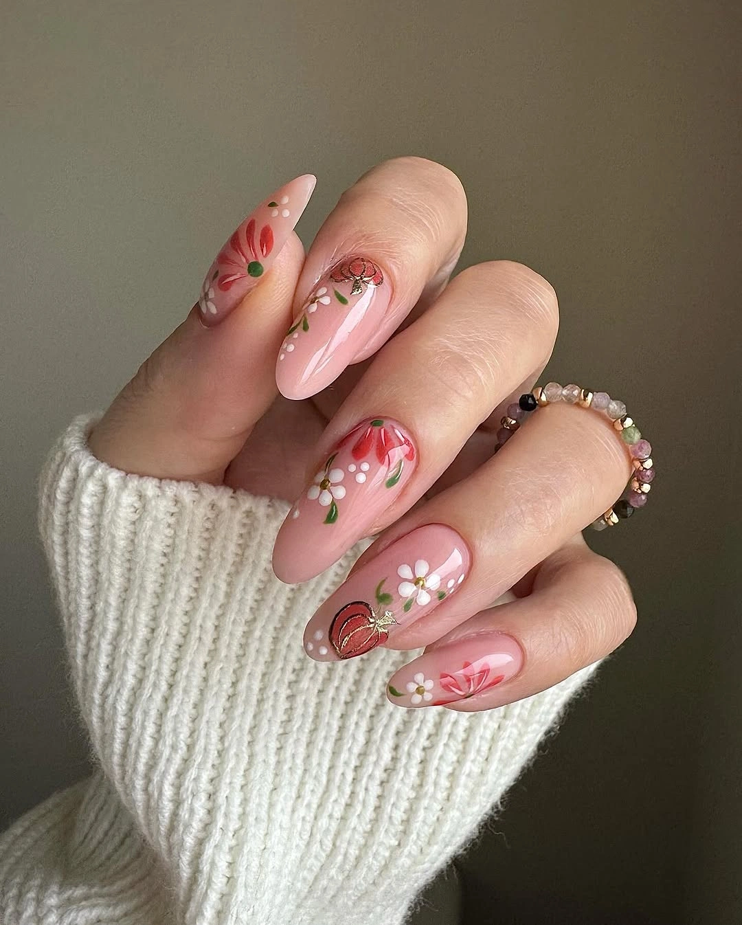
Concentrating the warmer details on two nails would make the set even easier to wear and would give the eye a clear stopping point. A muted brown, brick, or terracotta could replace the red while maintaining the relationship between a gentle base and warmer marks. Keeping the almond length moderate would preserve the delicate feeling without demanding a sharp point.
Fine accents look refined only when the pale base remains clean, so this design benefits from careful edge maintenance. As growth changes the spacing near the cuticle, the tiny symbols may appear farther from the center than intended. That is a reason to keep the marks simple and distinct, not to add more detail to fill the new space.
Spotted Texture Breaks Up Black and White
Short square nails use a black solid nail, white and nude companions, and one spotted tan accent to create a graphic fall composition. The spotted surface introduces texture-like variation between high-contrast blocks, while small black linework keeps the seasonal feeling connected. Each element has a defined job, so the set does not need a shared motif on every finger.
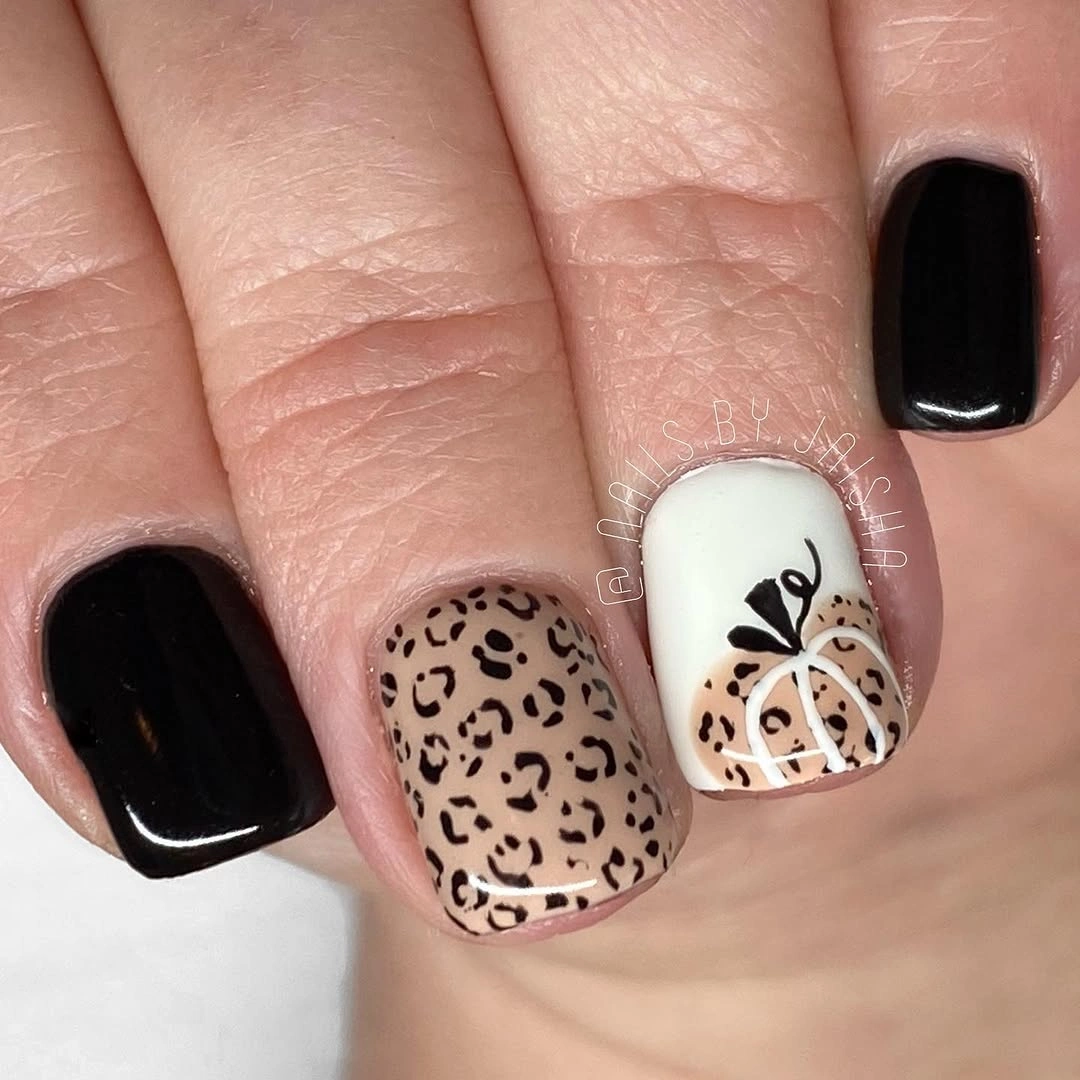
The look works because the print is contained rather than repeated across the whole hand. On a shorter version, keep the black solid nail and one spotted accent, then use a clean nude base for the rest. A warm brown spot could make the palette feel more autumnal, while gray would sharpen the editorial contrast.
High contrast reveals uneven borders, so the solid black nail and the spotted accent should receive the most attention during touch-ups. If the print begins to look busy, removing one small line detail will create more relief than adding a new color. Short square edges support the graphic blocks, but they also make corner wear easy to notice.
Orange Tips Make Short Nails Feel Autumnal
Short rounded nude nails use orange at the tips, allowing the seasonal color to sit at the edge rather than cover the entire surface. That placement keeps the base quiet and makes the hand look simple from a distance, while a few darker accents add a small Halloween suggestion. The shape and tip carry more weight than the decoration.
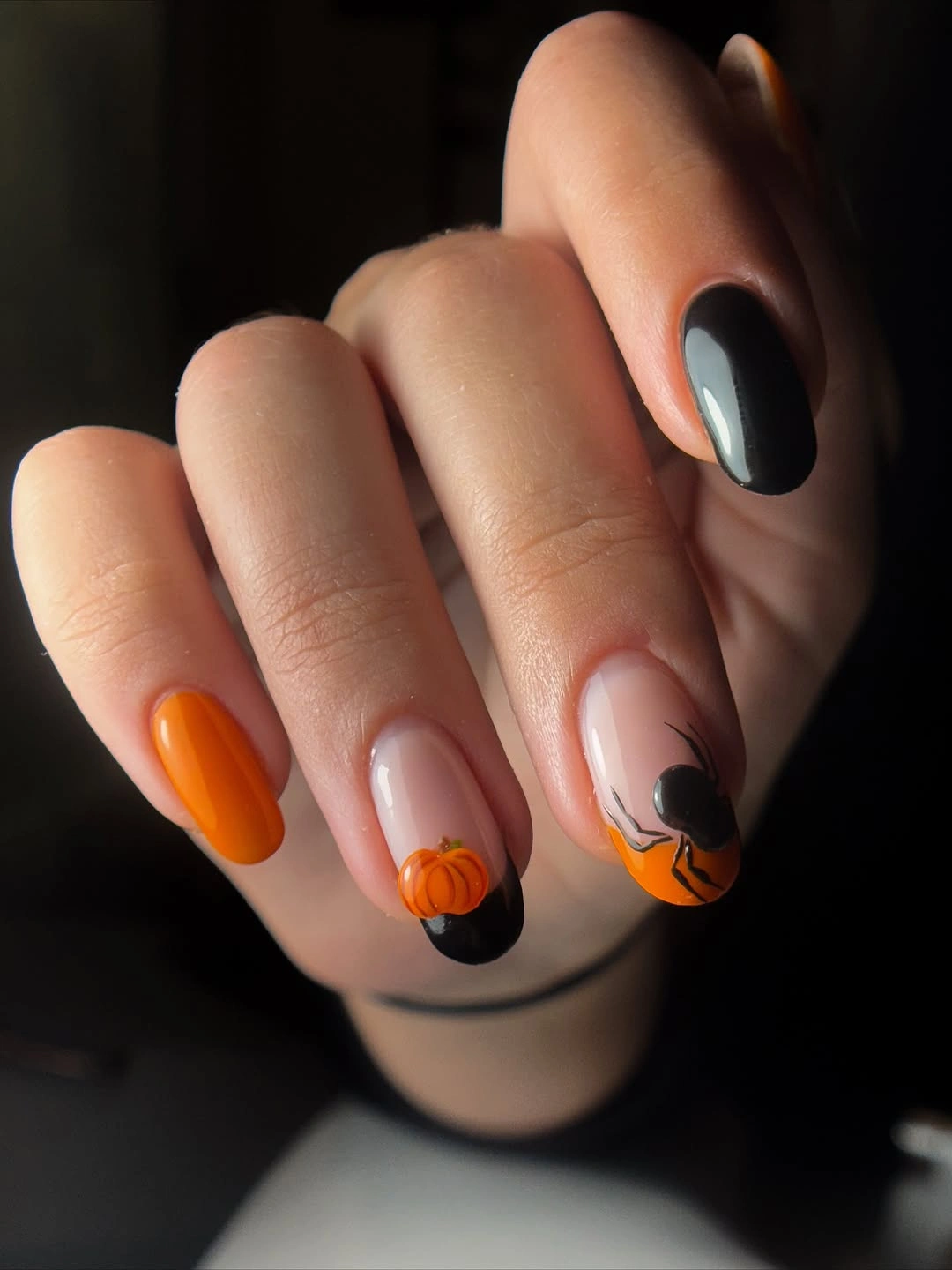
An orange French-like edge is easy to adapt because it does not depend on a large illustration. Keep the tips narrow on very short nails, add one small pumpkin or dot if desired, and leave the other fingers plain. A burnt orange, rust, or muted cinnamon would make the design feel more autumnal without changing its low-density structure.
Tip color grows out visibly and can chip along the free edge, so the neatness of the curve matters. A nude base helps soften the growth line, which is one reason this structure is more forgiving than a full orange nail. If the edge becomes uneven, refresh the accent rather than layering extra symbols over it.
Dark Borders Organize Small Pumpkin Motifs
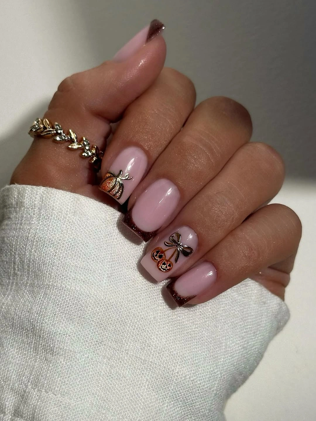
Short square nails combine sheer nude centers with dark edges, orange pumpkin-like accents, and a few pale seasonal figures. The repeating border creates a shared frame, so the different motifs still belong to one manicure. That consistency is especially useful on a small nail bed, where unrelated symbols can otherwise feel scattered.
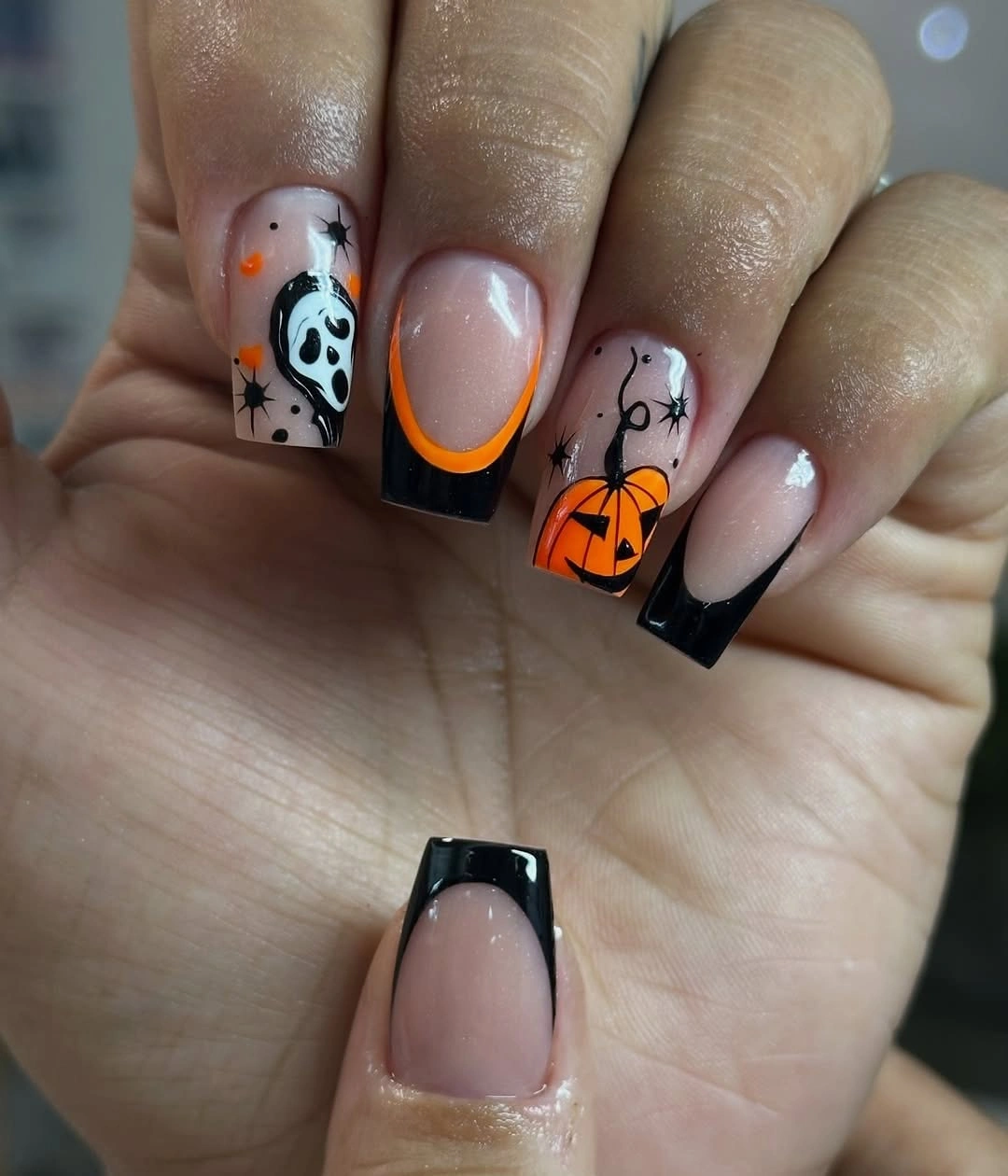
The border sets the visual rhythm first, then the orange accents supply the seasonal punctuation. A practical adaptation could keep the dark edge on two nails and use one orange accent elsewhere, giving the hand more open space. If black feels too stark, deep brown or charcoal would keep the framing effect while softening the contrast.
Dark lines are precise by nature, so a small wobble at the sidewall can change the shape of the whole set. Leave the center motifs simple and check the edges before adding any final details. The design will remain readable through growth when the border is narrow enough that it does not crowd the nude center.
A Green Anchor Changes Pastel Nail Balance
The green textured nail repeats the finish contrast from the earlier pastel design, but its placement is worth reading on its own. Surrounded by pink, mauve, and small illustrated accents, it works as a single anchor that stops the hand from becoming uniformly sweet. The strongest visual change comes from where the green sits, not only from its color.
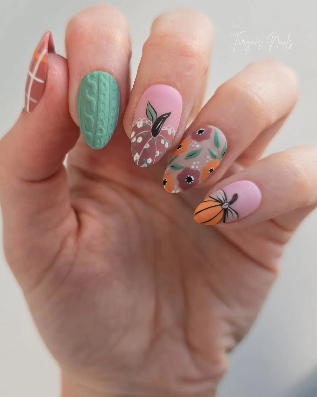
If you want to borrow the balance without repeating every detail, keep one muted green nail and give the neighboring nails plain pink bases with one small warm symbol. A solid finish will be easier to maintain than a ribbed-looking surface, but the color position will still organize the composition. Moving the green to the ring finger would make the focal point feel more conventional.
Because this is a repeated visual in the folder, the useful lesson is placement and finish rather than novelty. A textured accent can attract attention even when its artwork is quiet, so the rest of the hand should stay edited. Watch the anchor for surface wear and let the surrounding pale nails provide the clean space that makes it noticeable.
Concentric Lines Add Rhythm to Long Stilettos
Long stiletto nails use orange and black curved lines that resemble concentric circles or repeated targets, creating a strong graphic rhythm along the pointed silhouettes. Pale nude space keeps the pattern visible, while the curves echo the sharp direction of the tips. The manicure feels autumnal through color and movement rather than through a literal pumpkin on every nail.
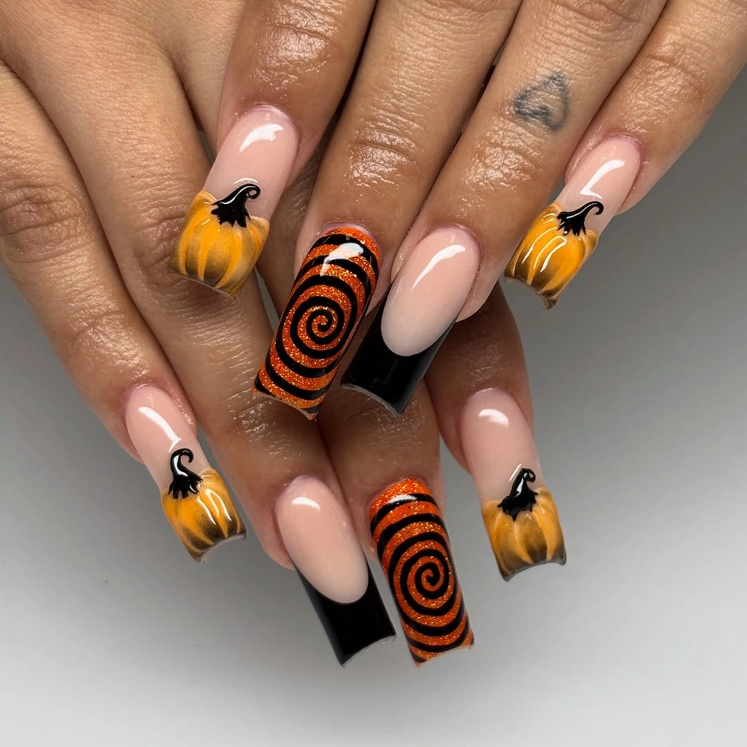
Repeated curves are the element to preserve when adapting the look. On medium almond nails, place one orange-black swirl on a single accent and keep the other nails nude or lightly outlined. A brown and cream version would feel calmer, while rust and black would keep the stronger seasonal contrast without requiring the same length.
The pointed shape gives the lines room to stretch but raises the practical cost of the design. Long tips can catch during ordinary tasks, and a broken curve will be more visible when the pattern has a strong repeat. Limiting the graphic to one or two nails makes maintenance easier while keeping the rhythm clear enough to read.
Tiny Autumn Stamps Share a Calm Neutral Base
A soft cream-pink base lets many small orange, brown, and black autumn symbols share the hand without creating a dark overall impression. The medium almond shape gives each mark room, but the calm background prevents the varied accents from fighting one another. The set succeeds because the neutral surface acts as a quiet page for the details.
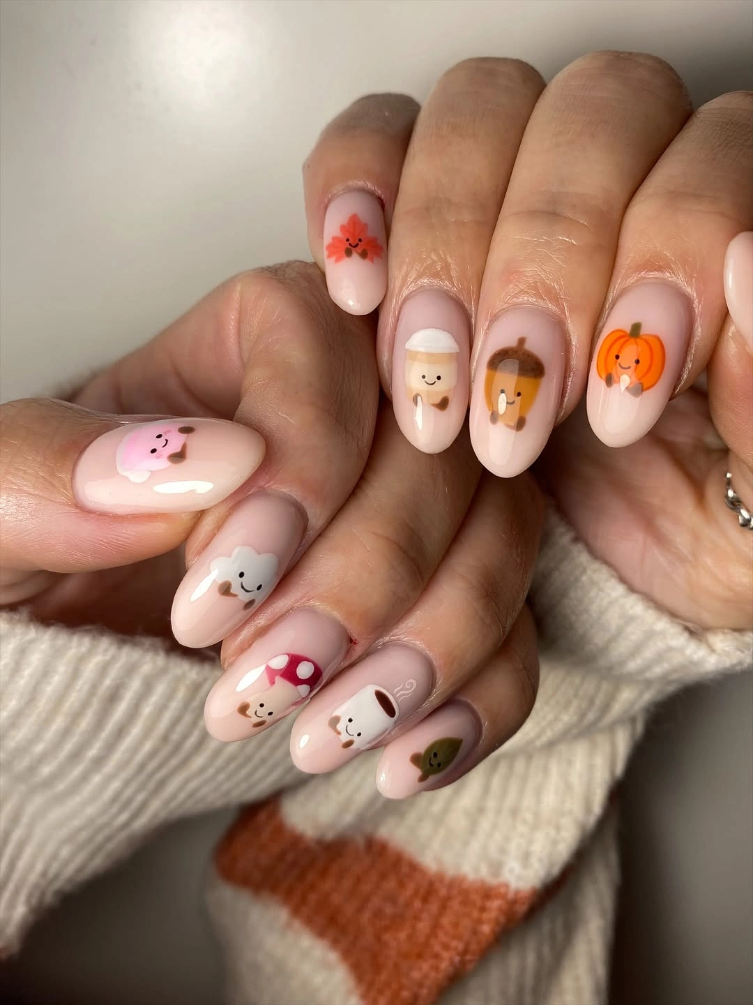
When several motifs appear together, a calm base is more useful than another accent color. A shorter version could keep two illustrated nails and make the rest sheer cream, or choose one pumpkin-like symbol and one leaf-like mark for a cleaner pattern. Warm beige and pale taupe would maintain the same containing role.
Small stamps depend on spacing, especially as growth changes the distance between the mark and the cuticle. Leave enough open area around each symbol and resist filling any empty nail just because it looks quiet. That empty space is what keeps the varied details readable and gives the set room to age without visual congestion.
Alternating Plaid and Pumpkin Accents Create Rhythm
Long almond nails alternate narrow black-and-white plaid with orange pumpkin accents and fine dark linework, so the set reads as a sequence rather than a group of unrelated drawings. The plaid brings structure, while the pumpkin nails provide warmer focal points. Length helps the linear details breathe, but the rhythm is the main design decision.
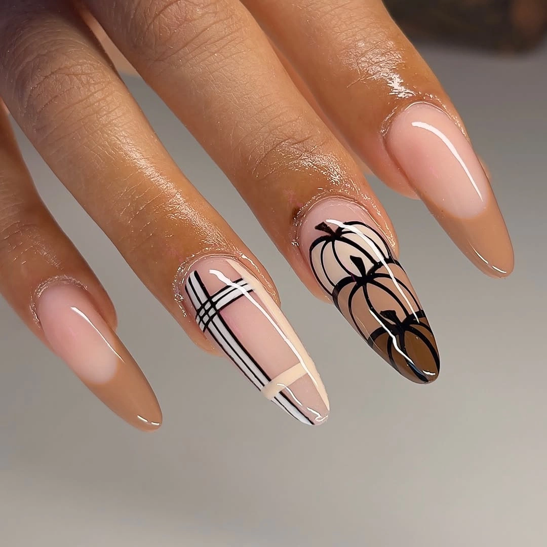
Shorter almond nails can keep the same sequence with one plaid nail, one orange accent, and plain nude companions. That reduction preserves the contrast between a pattern and a motif while cutting the amount of linework that must fit on the nail bed. Brown and cream plaid would soften the set, whereas black and white keeps it graphic.
Fine plaid needs consistent spacing, and long almond edges make any irregularity easier to notice. Check the grid before adding extra decoration, then leave the pumpkin accents comparatively open. If the pattern begins to wear, simplifying one plaid nail will restore the intended rhythm more effectively than repainting every surrounding detail.
Centered Mini Accents Keep Short Pink Nails Quiet
Short rounded pink-nude nails use tiny orange and dark seasonal marks placed near the center, leaving the edges and most of the base uncluttered. That central placement gives the symbols enough breathing room to remain readable without making the manicure feel themed from every angle. The quiet effect comes from both scale and location.
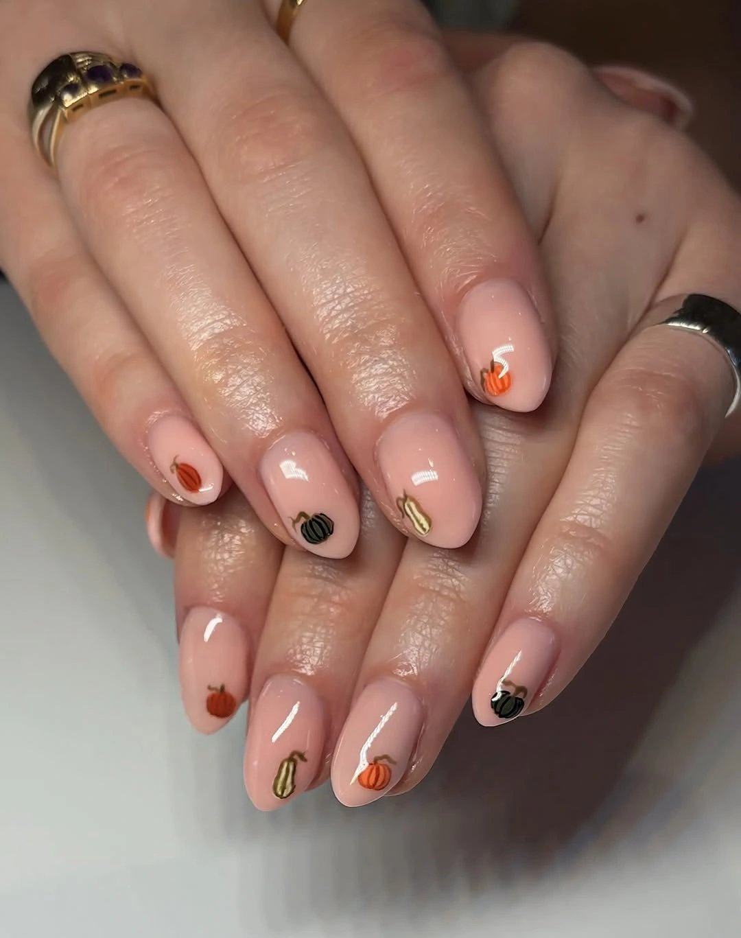
A single accent nail would make the idea even more practical, while two small marks could keep a little visual connection across the hand. On a slightly longer rounded shape, the same centered placement could support a small outline rather than a dot. Keep the base glossy and calm so the limited decoration remains the intentional feature.
Because the motifs sit away from the edge, normal tip wear is less disruptive than it would be on a French design. Growth can still shift the visual center, so watch the spacing near the cuticle before deciding whether a refresh is needed. The design is strongest when the hand remains mostly pink and the seasonal note arrives as a quiet interruption.
Long Stiletto Nails Hold a Full Fall Composition
The very long stiletto set uses orange pumpkins, plaid, leaves, checkerboard, and black-white linework across a large illustrated canvas. Each pattern family adds a different kind of movement, yet the restricted orange, brown, black, and white palette keeps the composition connected. Here, the length is not an afterthought; it is what allows the density to stay legible.
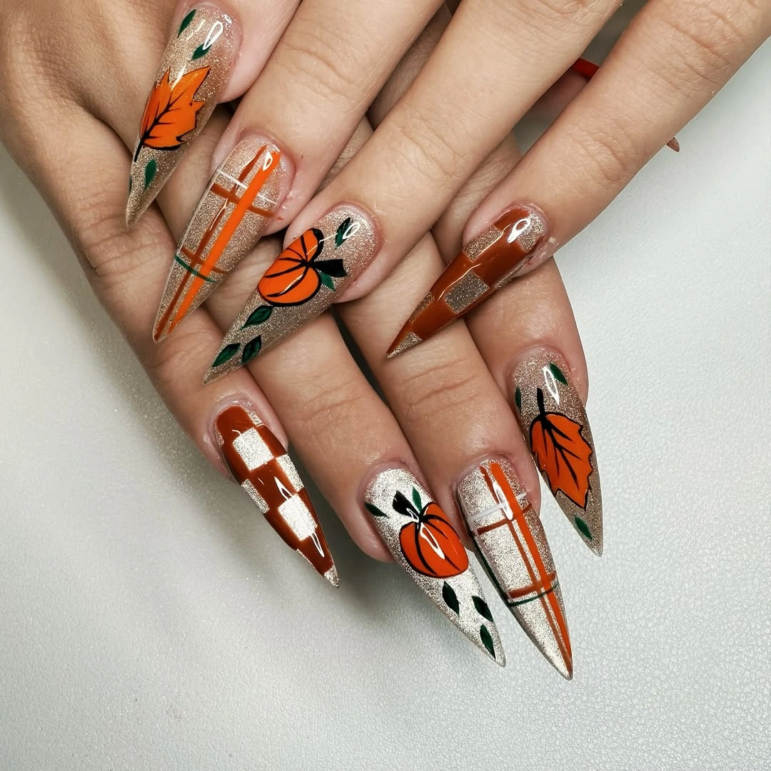
For everyday wear, borrow one pattern relationship rather than the entire arrangement. A shorter almond set could pair one orange pumpkin with a single plaid nail, or use checkerboard on one accent while leaving the rest neutral. Removing two pattern families would create relief without weakening the autumn message carried by the colors.
High detail and extreme points create an honest maintenance tradeoff: the design needs space, and the space demands careful handling. Chips, snags, or a broken tip can interrupt several neighboring patterns at once, so regular edge checks matter. The strongest practical lesson is to preserve the hierarchy and remove whatever does not support the chosen focal motif.