
Dark polish is easy to make heavy, but weight is not the same as depth. A surface becomes convincing when the eye can find a little relief inside it, whether that relief comes from a clean edge, a change in reflection, or a pause that lets one mark stay legible. Drama works best at the boundary where the dark field gives something back.
When a manicure feels flat, look for the place where light should enter before adding another detail. Preserve one clear focal point, give it enough surrounding space to register, and let the quieter areas stay quiet. If the result still holds together when the hand is viewed from a distance, the closer view will feel layered instead of overloaded.
Warm Brown Framing Keeps Halloween Art Wearable
Warm nude and brown bases give the opening manicure a grounded depth, while tiny black and orange illustrations keep the seasonal message visible. The dark sleeve reinforces the palette, but the nails remain the focus because the lighter surfaces hold the small marks apart. Brown creates atmosphere without turning every finger into a black silhouette.
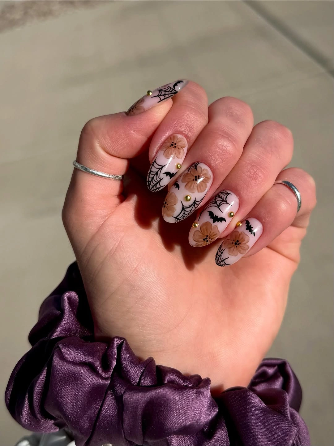
The design works through a restrained relationship between warm color and fine linework. A shorter rounded adaptation could keep brown on two nails, place one tiny orange motif on another, and let the rest stay nude. Deep cocoa would make the set quieter, while terracotta would bring the same warmth closer to harvest color.
Small illustrations need a clean base and enough separation to stay readable when the hand moves. If the art begins to blur, remove a minor mark rather than thickening every outline, because the open nude space is part of the depth. Medium almond provides room, yet a shorter edge would make daily maintenance easier without losing the moody center.
Black Web Lines Sharpen a Pink Halloween Set
Short rounded pink nails take on a darker character through black curved web-like lines placed across the glossy surface. The black is selective, so the rosy base still reflects light and keeps the mood from becoming severe. What reads first is not a literal figure but the movement of the lines as they cross the pale color.
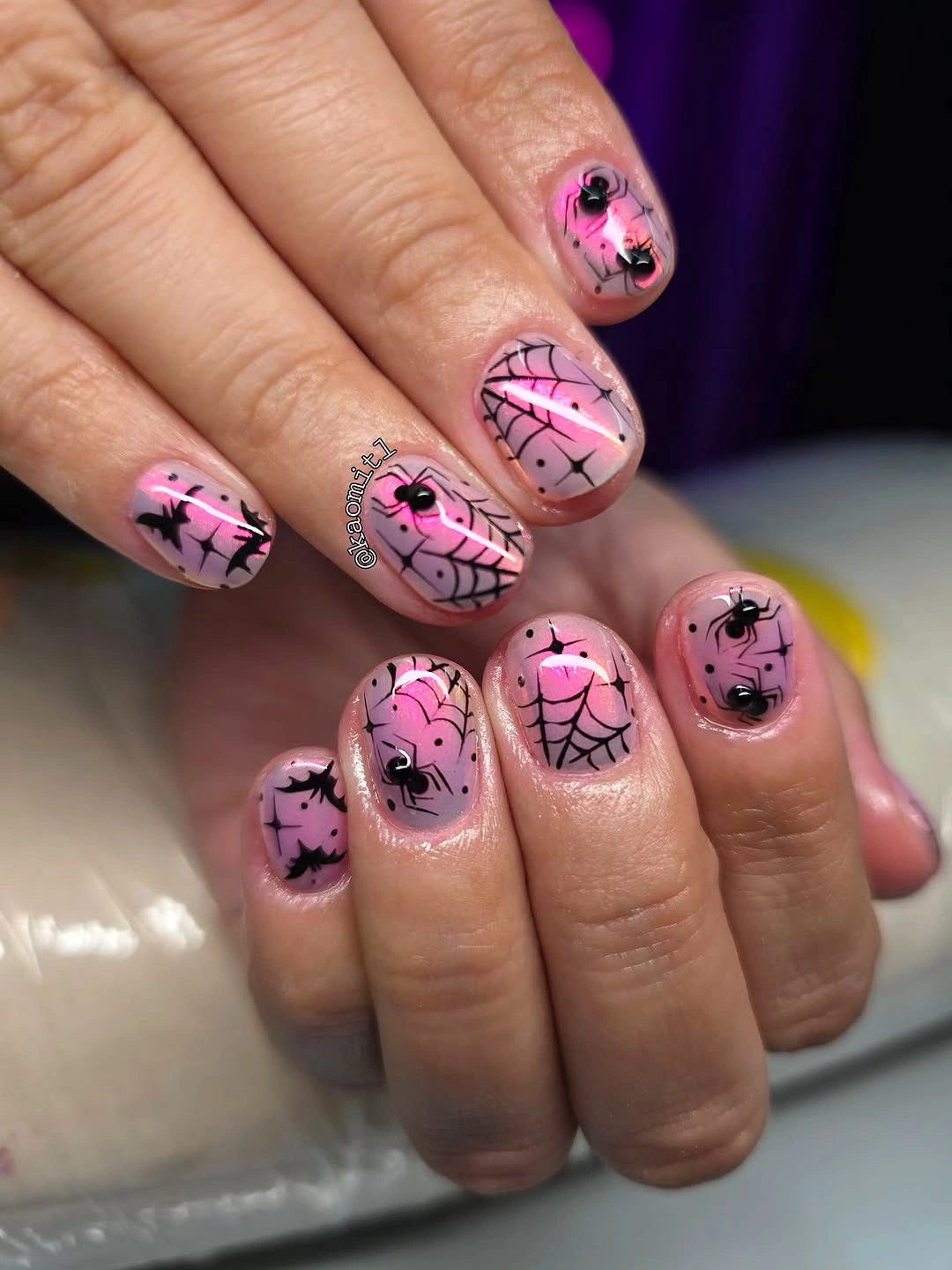
Line placement supplies the drama, which makes the idea simple to adapt. Keep one web on the ring finger and repeat only a small black curve elsewhere if you want more breathing room. Mauve, sheer beige, or a cool blush could replace the pink while preserving the same dark-on-light tension. The lighter base should remain visible enough to keep the black detail sharp rather than muddy.
Fine web lines show every uneven edge, especially on a compact nail where the curves have little space to settle. Let the longest line sit in an open area and keep neighboring marks shorter, so the set does not become a mesh of competing strokes. Gloss helps the pink base hold light, but it also makes scratches on the dark detail easier to notice.
Checkerboard Panels Give Cute Motifs Structure
Medium square nails combine black, white, orange, and pink with checkerboard panels and small Halloween figures. The checkerboard creates a repeating beat between the illustrated nails, giving the playful symbols a controlled setting instead of leaving them to float independently. Square width supports that geometry because the pattern has room to remain legible.
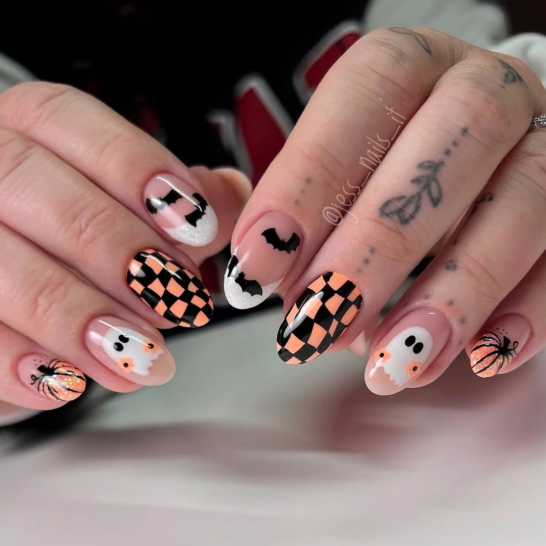
The strongest contrast is between the strict grid and the softer character-like details. For a shorter set, keep the checkerboard on one nail and use a single illustrated accent, leaving the other fingers clean. Orange and black can stay dominant, while pink or nude becomes the relief that keeps the design from feeling too dense.
Small checks demand more patience than a broad color block, and squared corners can make any spacing error stand out. If the grid begins to look crowded, widen the checks or remove one panel instead of adding another motif. The pattern is doing the organizational work, so it should remain crisp enough to lead the eye through the set.
Pink French Edges Soften Fine Web Details
A short square blush-pink manicure uses brighter pink curved tips and delicate web-like lines to create a Halloween cue without a heavy base. The tip gives the hand a polished edge, while the thin dark marks add a quieter layer of tension. The result feels sleek because the seasonal detail is contained inside a familiar structure.
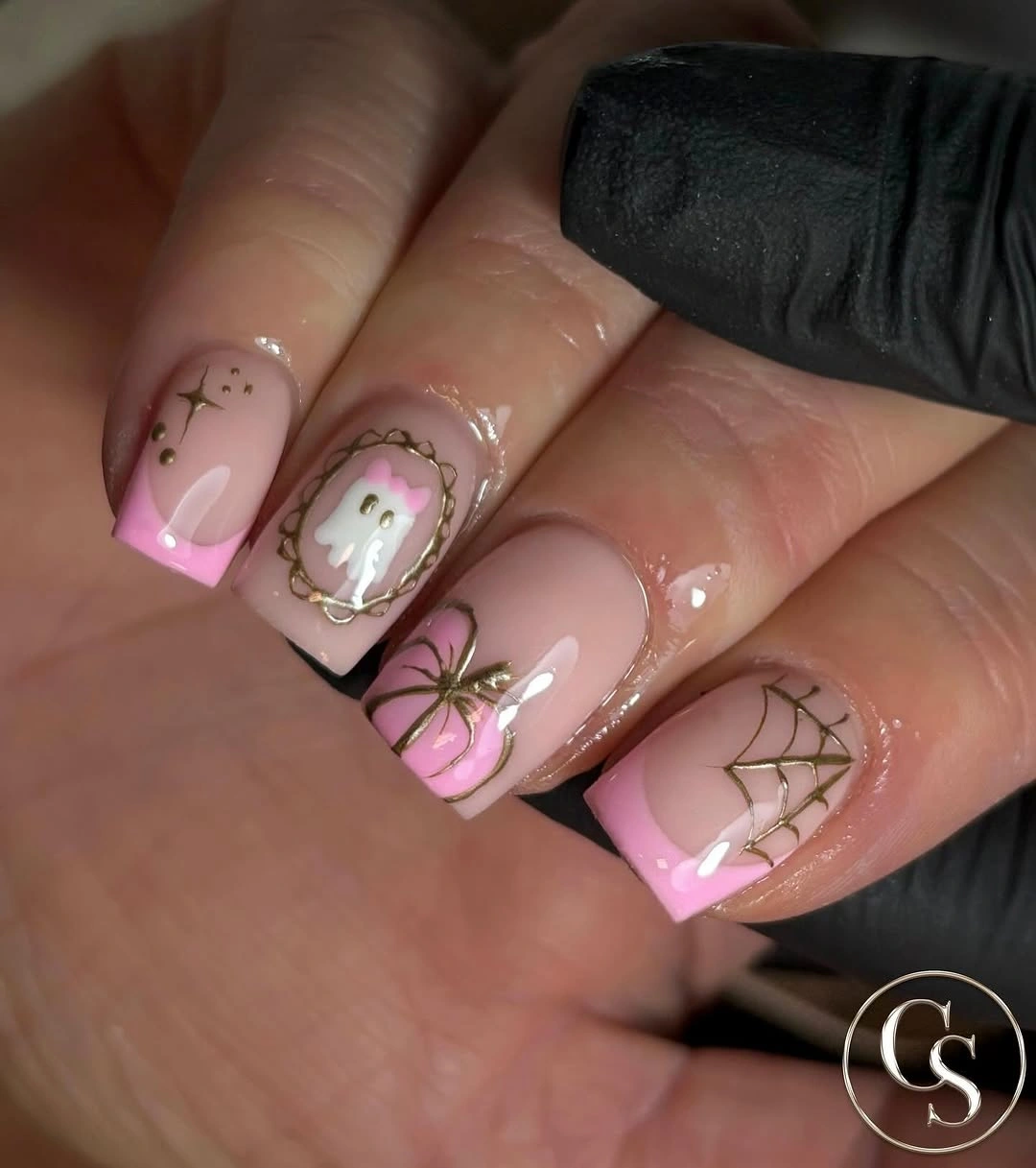
The colored edge is the easiest feature to carry into another palette. Use mauve tips for a muted version, or switch to nude with a single bright pink accent if the full French edge feels too sweet. Keeping the web lines on two nails allows the pink curve to remain the main repeated signal. That division gives the eye a clean border first and a seasonal note second, which is why the short shape stays polished.
Small web marks need a clean border and enough space from the tip to avoid merging with the colored edge. A short square shape is practical, but the corner line can show wear quickly because it forms a visible frame. Refreshing the tip neatly will usually restore more of the design than repainting every tiny web.
Striped Panels Coordinate Character-Led Details
Medium almond nude nails use narrow stripes, red and black figures, and pale face-like details that resemble a sequence of small illustrated panels. The nude base keeps the story readable, while the striped nails add a vertical rhythm that prevents every surface from carrying the same type of information. The set feels coordinated because each nail has a different job.
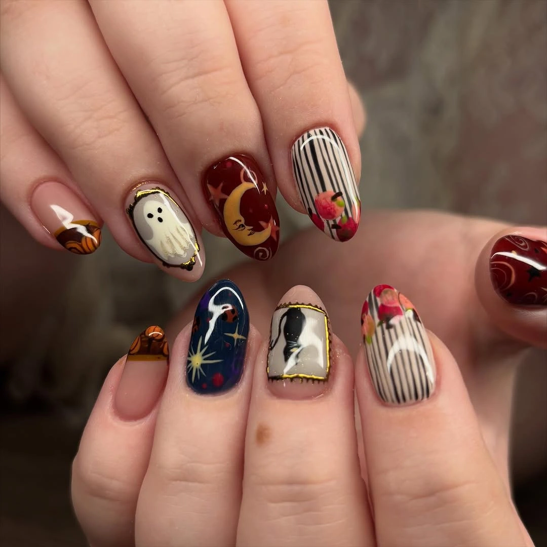
Panel art needs enough surface area to preserve its small features, so a shorter adaptation should keep the stripes and one figure rather than compressing the full sequence. Use a simple nude or soft gray base for relief and let the red accent appear only where the eye should stop. That change keeps the narrative feeling without making the nails crowded.
Illustrated details can lose clarity as the free edge grows, especially when several marks sit close together. Check the largest figure first and allow the surrounding nails to remain comparatively open. The design benefits from contrast between dense and quiet panels, so removing one tiny symbol can improve readability more than adding a brighter color.
Neon Green Points Keep Dark Stilettos Dimensional
Very long stiletto nails build a dark field from black, gray, and translucent surfaces, then interrupt it with small neon green points and web-like lines. Those green marks function like controlled light in a shadowy composition, giving the eye somewhere to land. Without that counterpoint, the embellishment and dark palette would read as one dense mass.
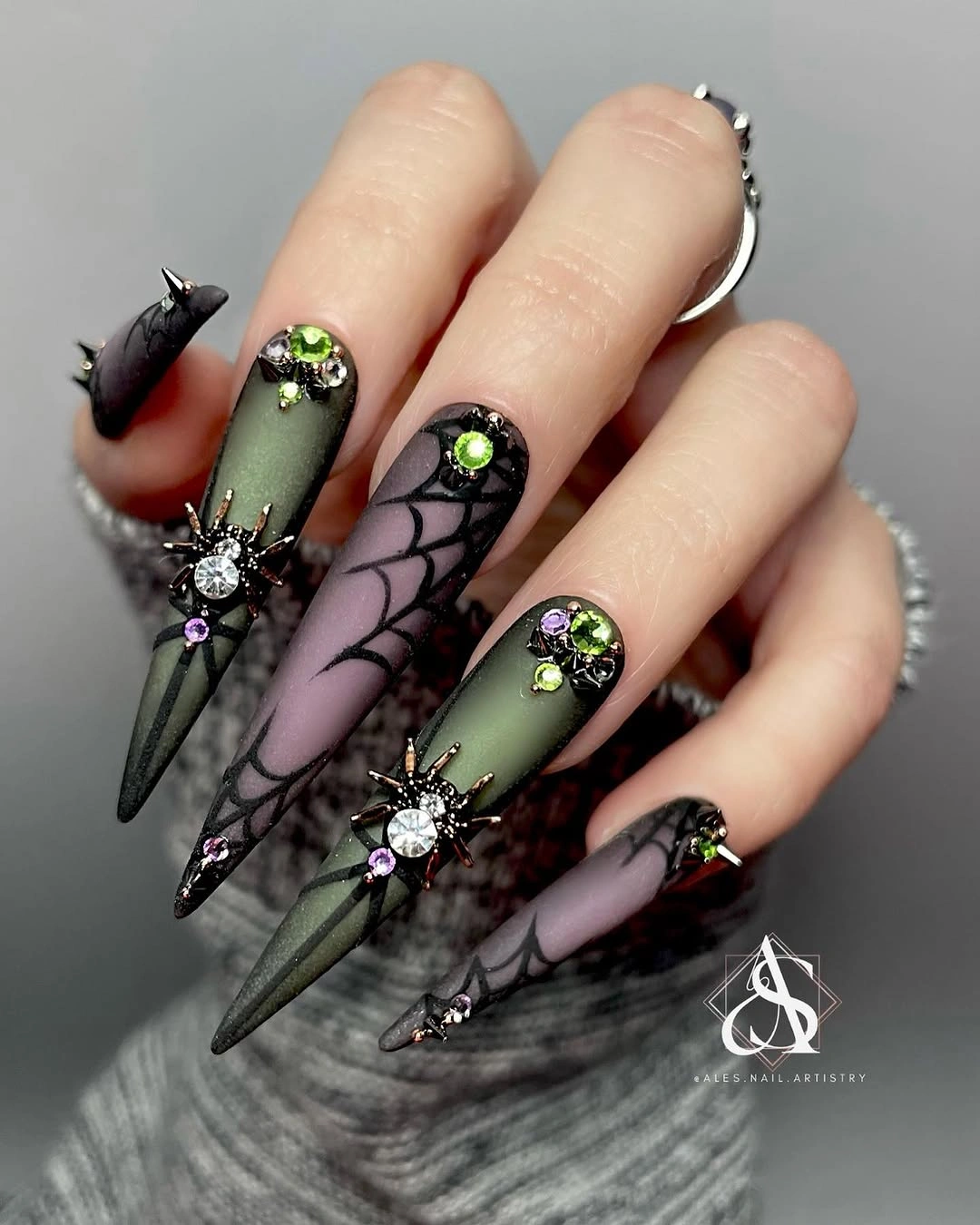
The visual logic is easy to simplify: keep one green focal accent, reduce the web lines, and let medium almond nails replace the extreme point. A smoky gray base would preserve depth, while a single pale nail could supply additional relief. The drama comes from the interruption, not from repeating the neon on every surface. For a quieter finish, the discussion of fall matte nails is a useful comparison because it treats surface weight as a design decision.
Long pointed length and visible raised-looking details create a real maintenance cost, especially around clothing and daily hand movement. If the dark surface begins to wear, repair the brightest accent first because it carries the contrast. Leaving the companion nails less decorated makes the set more tolerant of small chips and uneven light.
Dark Tips Outline Pale Almond Shapes
Long almond nails use a pale base and deep pointed tips to create a sharp silhouette, with only small blue and warm accents breaking the surface. The design is dramatic through shape and edge rather than through dense illustration. That restraint lets the pale center reflect light and keeps the hand from becoming visually heavy.
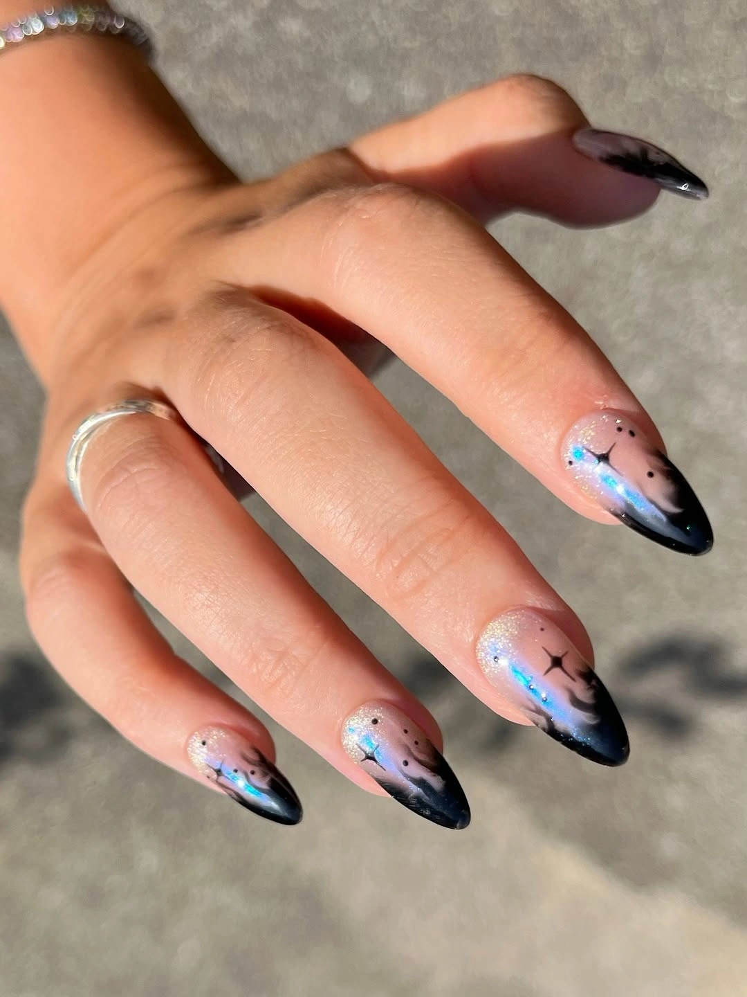
A darker tip acts as a frame, so the same construction can move easily to medium almond or even a short oval shape. Keep the accents on two nails and let the other fingers repeat only the edge color. Black creates the strongest contrast, while deep navy or plum would keep the outline moody but softer.
Pointed tips make the silhouette visible from across the room, yet they also expose chips along the darkest line. Watch the curve where the pale base meets the tip, because a small break there changes the entire outline. The low illustration density is helpful: a neat edge repair can restore the set without disturbing a larger scene.
White Web Lines Soften Pink and Mauve Depth
Pink and mauve almond nails use pale web-like lines and small seasonal figures to create a softer kind of darkness. The light marks sit inside the color rather than cutting across it in black, so the set keeps its reflective, almost hazy quality. Contrast comes from tone and placement instead of harsh outlines.
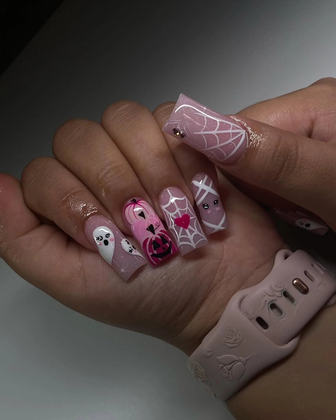
White linework is the detail worth preserving if you want to adapt the look. Put it on one mauve nail and keep the remaining fingers glossy pink, or switch the base to dusty rose for a deeper field. The more muted the background, the more important it becomes to leave space around the pale marks. Letting one nail carry the clearest web keeps the contrast deliberate instead of turning every surface into a faint pattern.
Low-contrast details can fade into the base when the light changes, so avoid shrinking them too far on short nails. A clean glossy surface will help the linework catch a little reflection, but it will also reveal smudged edges. Let the composition stay quiet rather than forcing a darker outline that would change its atmosphere.
Neon Panels Turn Halloween Into Colorful Light
Short square nails use saturated pink, orange, purple, and blue panels with small ghosts, pumpkins, and character-like marks. The bright colors behave almost like lights against the surrounding space, giving each nail a distinct focal note. The compact shape keeps the set playful rather than elongated and theatrical.
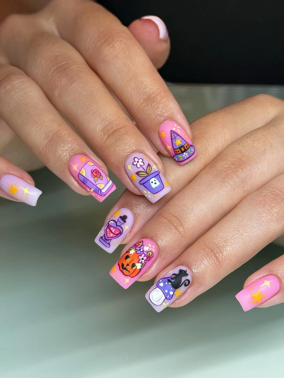
Color variety is the main commitment, so reducing the palette is the cleanest adaptation. Choose two neon shades, place one icon on a third nail, and leave the remaining base pale or clear. A softer version could use bright orange and lilac only, allowing the shapes to keep the same energy with less visual noise.
Many saturated blocks make edge wear easy to spot, especially when every nail has a different color boundary. Keep the panels broad enough that they do not become tiny fragments, and check the brightest surface for scratches first. The design remains successful when the eye can name the color rhythm quickly without needing to inspect every symbol.
Smoky Gray Bases Give Ghostly Figures Depth
Long square nails set pale ghost-like figures and dark linework against smoky gray, nude, and black surfaces. The muted bases absorb some of the brightness, creating depth that lets the white details appear like small figures emerging from shadow. A dark knit background strengthens the mood, but the gray base is what carries the structure.
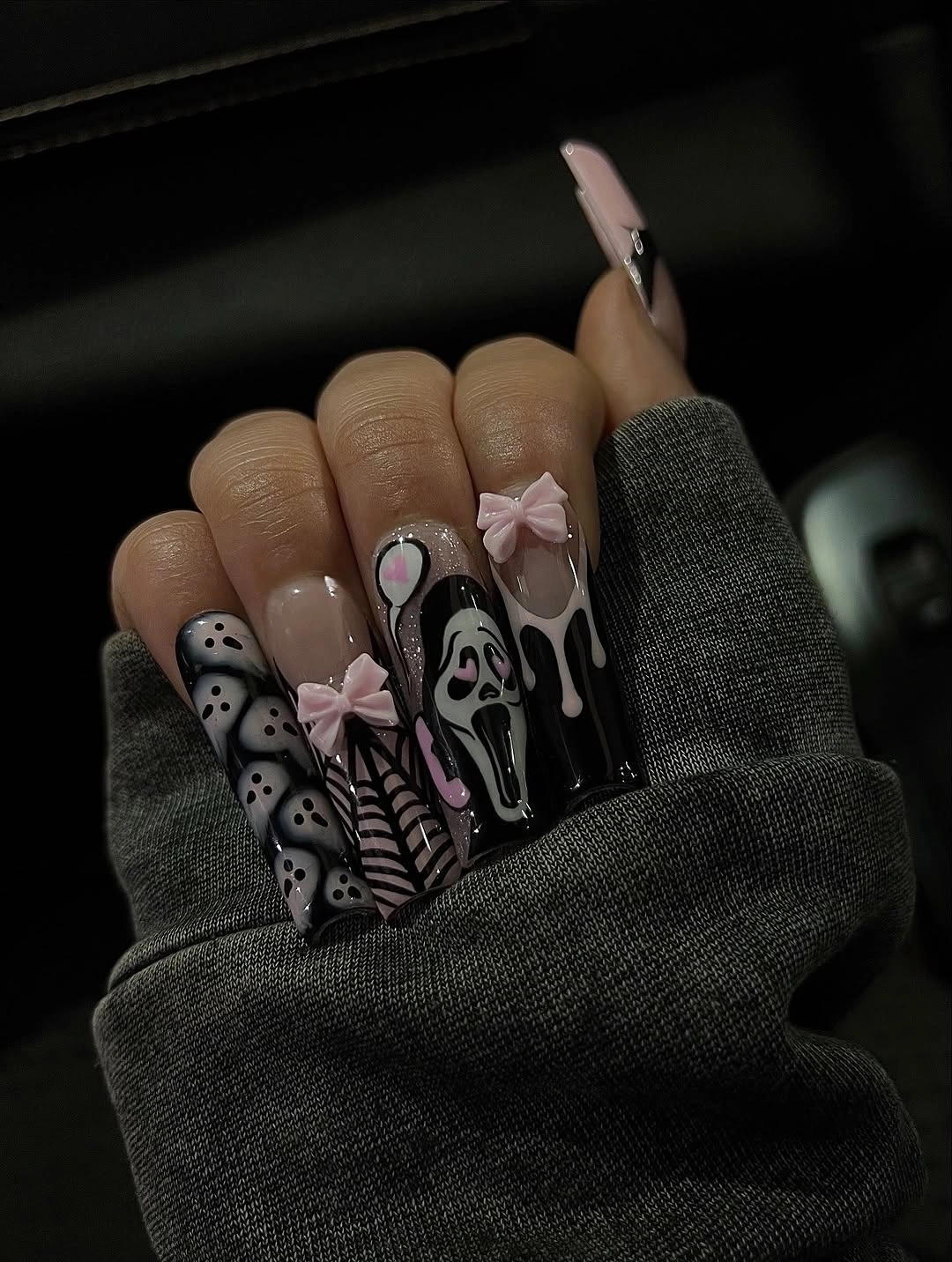
The design is easiest to wear when one illustrated figure becomes the focal panel and the neighboring nails use quieter gray or nude surfaces. Medium square nails would keep the graphic width while reducing the length, and a soft taupe could lighten the composition. Preserve the contrast between pale figure and muted ground rather than adding more characters.
Long square tips give the scenes room, but they also create more edge to maintain and more area for dark wear to show. If the background begins to look flat, a single pale mark can restore depth more effectively than another black line. Keep the details separated so the figures remain readable as the hand moves through different light.
Pastel Blocks Keep Ghostly Line Art Airy
Long almond nails use pale pink, blue, and white blocks with black outlined ghosts and delicate marks, giving the Halloween theme a lighter register. The pastel surfaces reflect enough light to keep the dark outlines from becoming gothic, while the repeated almond shape adds continuity. The mood is playful because the contrast is controlled.
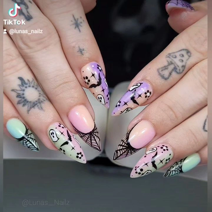
A shorter set can keep the pastel block on most nails and place one outlined figure on the finger with the most surface area. Use two related colors rather than the full range if you want a more edited result. Powder blue and pale pink preserve the airiness, while mauve would deepen the scene without making it fully dark.
Pale surfaces show smudges and small marks, so the clean border around each outline matters. Leave enough empty base for the figure to breathe, especially when shortening the nail. If the design starts to feel too faint, strengthen one outline rather than darkening every nail, because the relief between quiet and defined is the visual point.
One Orange Panel Lights Up Deep Brown Nails
Long square nails use dark brown, black, and nude panels, with one orange pumpkin-like face providing the clearest glow. The orange panel is effective because the surrounding colors stay quiet, allowing the warm detail to function like a small light in a deep scene. A pale ghost and web-like marks support the mood without stealing that focal role.
Keep the orange panel on one nail when adapting the look to medium length, then use brown or sheer nude on the companions. The darker base can remain on two fingers to hold the depth, while a pale nail supplies relief. Choosing one focal color is more useful than adding several brighter symbols to the same hand.
Dark surfaces reveal scuffs and uneven borders, so the brown and black nails deserve a careful edge check. If the orange panel begins to wear, repair its central shape first and leave the supporting marks quiet. The composition relies on a clear center of attention, and protecting that center will keep the mood readable.
White Space Lets Small Ghost Outlines Breathe
Long almond nails use white and sheer nude as a generous field for thin black ghost-like outlines and minimal pale accents. The open base gives the linework a haunted, almost architectural quality without requiring a dark background. Here, the absence of color is not a gap; it is what keeps the seasonal marks visible.
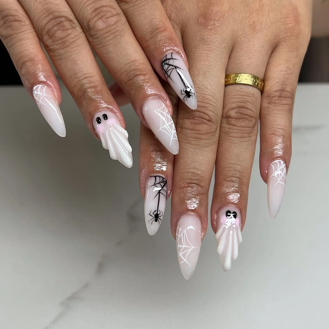
Negative space makes this one of the easiest designs to reduce. Keep one outlined figure and one web-like mark on medium almond nails, then leave the rest sheer or softly white. A pale gray base would make the outlines slightly more atmospheric, while warm ivory would make them feel gentler. The fewer symbols remain, the more clearly each contour can hold its own against the quiet surface.
White surfaces show every smudge, so the appeal depends on a clean perimeter around the sparse details. Do not fill empty areas merely because they look quiet; that space is carrying the contrast. As the free edge grows, the composition can remain calm if the symbols stay away from the border and keep their original breathing room.
Red and Pink Lines Make Webs Theatrical
Very long stiletto nails move into a red and pink palette with white web-like lines and dark graphic marks, creating a theatrical surface without relying on orange. The red provides depth and heat, while the pale lines cut through it sharply enough to remain readable. The pointed shape adds tension before any motif is considered.
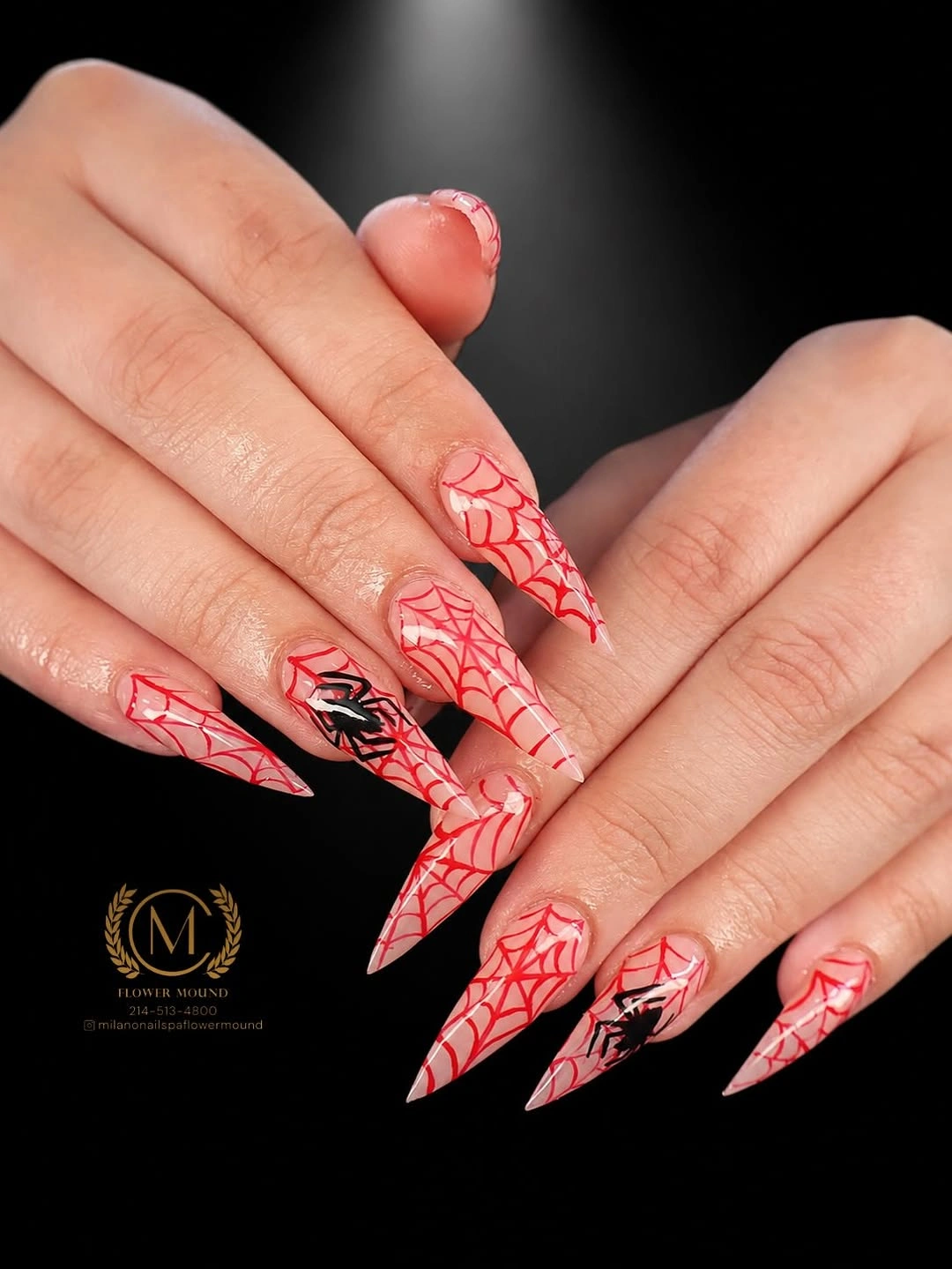
A practical version could place the red on one accent nail, repeat a single white web on another, and leave the rest pink or nude. Medium almond would keep the directional feeling while reducing the risk attached to extreme points. Deep berry can replace the brighter red for a more controlled evening palette, close to the grounded approach in fall burgundy nails with design.
Strong red and white contrast makes every line break visible, while the length increases the chance of snagging during ordinary movement. Check the most exposed point first and keep the graphic simple enough for a clean repair. The design is most effective when the white line remains legible against the red rather than being buried under more embellishment.
Pink Bases Let One Orange Character Lead
Long stiletto nails keep most of the hand pale pink, then place the strongest orange and black character-like detail near the center of the set. That concentrated warmth gives the manicure a focal scene without changing the overall softness of the base. The dark accents around it act as punctuation, not a second competing palette.
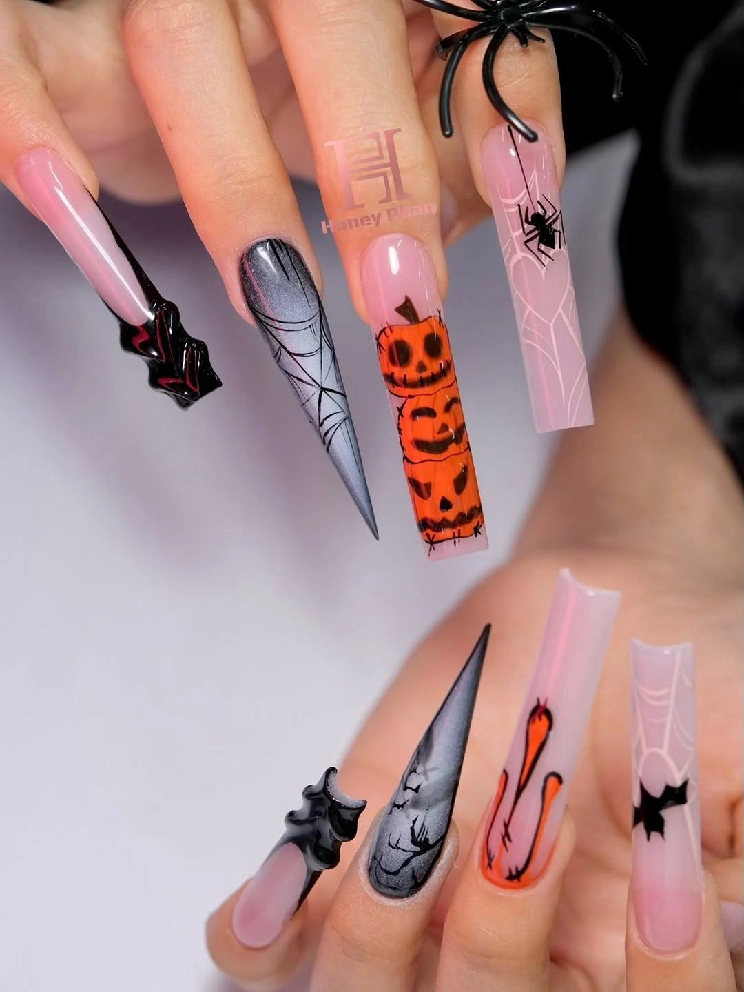
On medium almond nails, keep the orange illustration on one finger and use a smaller black curve or dot on the companions. The pink base can stay glossy, while a muted peach would make the warm focal point feel gentler. If you prefer more darkness, deepen only the accent outline rather than turning every nail black.
Long points make the focal nail dramatic, but they also mean that a damaged tip can interrupt the central scene. Use the surrounding pale nails as visual relief and avoid placing small details too close to the edge. That spacing gives the focal area a better chance of remaining readable as the manicure grows.
Vertical Red Drips Give Square Nails Direction
Long square nails use pale nude and white panels with bold red drip graphics and black character-like marks. The red forms a vertical pull along the squared length, so the hand looks directional rather than simply decorated. That movement gives the design its immediacy, while the pale surface keeps the dark elements from blending together.
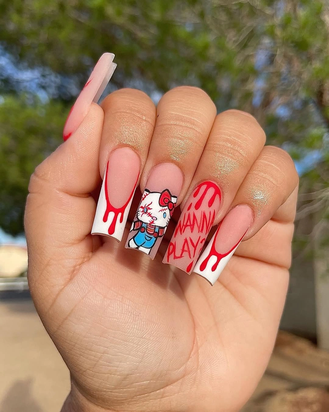
The vertical idea can survive on medium square nails if the drip is kept to one accent finger. Use a plain nude base beside it and reserve black marks for a small supporting detail. Burgundy or dark berry would make the result less bright, while red preserves the sharper Halloween tension. Keeping the companion nails calm also gives the drip enough visual room to look intentional instead of merely busy.
Drip shapes need a clean top edge and enough room to lengthen before they become a crowded blob. Squared corners expose wear, especially when the red meets the free edge, so inspect that transition after a few days. Simplifying one graphic is better than shrinking every mark until the directional idea disappears.
A Tiny Pink Mark Keeps Black Nails Playful
Short rounded nails use glossy black and pale nude-pink surfaces, with a tiny pink seasonal mark providing the only bright interruption. The dark base gives the hand immediate depth, but the small pink detail prevents the look from becoming severe. Minimalism is doing the cinematic work here by making one colored point feel unusually visible.
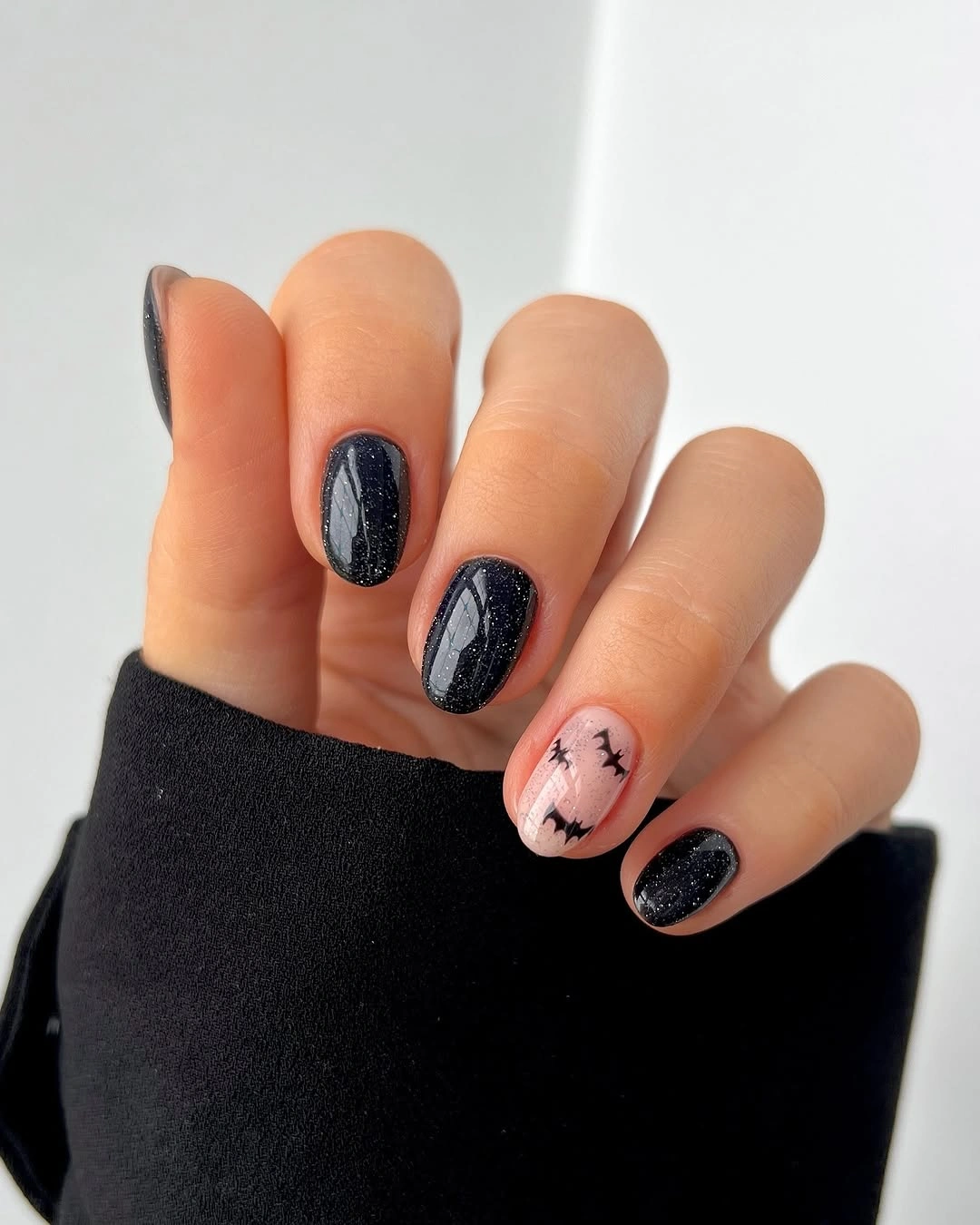
Keep the black on one or two nails if you want a lighter adaptation, then repeat the pink mark on a pale finger. A mauve or red accent would deepen the mood, while a soft gray would create more reflection without adding saturation. The structure stays strong because the accent remains small and deliberately isolated, much like the restrained approach used in simple fall short nails.
Glossy black shows scratches and edge wear faster than a pale surface, so a simple set still needs regular inspection. Do not cover the black with extra art if the nail begins to look flat; restore the shine and let the contrast return. Short rounded length makes the design practical, and the limited decoration leaves room for an easy refresh.
Yellow Bases Make Cute Icons Feel Cohesive
Medium almond nails use bright yellow as a continuous field for white, black, orange, and green ghost or pumpkin-like figures. The yellow ties the varied icons together, so each nail can carry a different character without looking like a separate theme. Its brightness changes Halloween from shadowy to cheerful while keeping the motif language clear.
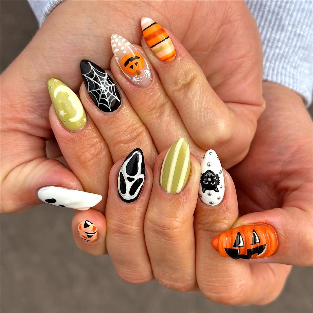
For a calmer version, place yellow on two nails and move the icons onto pale nude or white companions. That keeps the strong base color as a focal note without making the whole hand equally intense. Muted mustard would give the same continuity with a deeper autumn feeling, while lemon yellow keeps the playful light.
Bright yellow reveals uneven coverage and chips, so the broad base needs more care than the tiny motifs. Let the faces stay simple and check the open yellow surface for marks before adding details. The design remains cohesive when the color field is even, because the continuous base is the element holding the characters together.
Neon Yellow Frames Illustrated Panels
Long square nails use neon yellow as a vivid frame around white ghost-like faces and colorful illustrated panels. The bright ground makes each small figure immediate, while the squared length supplies enough width for the panels to feel intentional. Black and saturated accents sharpen the edges so the color does not dissolve into visual noise.
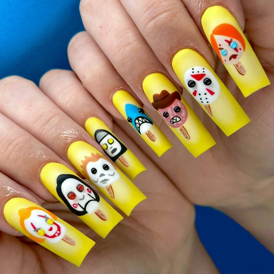
The frame color is the feature worth carrying into a shorter design. Use neon yellow on one accent nail, place a single white figure inside it, and keep the companions nude or black. A pale yellow would reduce the intensity, while lime would increase the electric quality without changing the panel structure.
Panel art depends on surface area, and shrinking it too far can turn faces into indistinct marks. Preserve one clear figure and remove secondary details when shortening the nail. Saturated yellow also exposes edge wear, so a clean border will do more for the finished impression than another small character.
Smoky Embellishment Creates a Purple-Black Focal Point
Very long stiletto nails use smoky nude, black, and deep purple with a dense spider-like embellishment that sits at the center of the composition. The translucent areas provide a little relief, while the dark cluster creates the strongest depth and texture. The set feels atmospheric because the focal detail is concentrated rather than spread evenly.
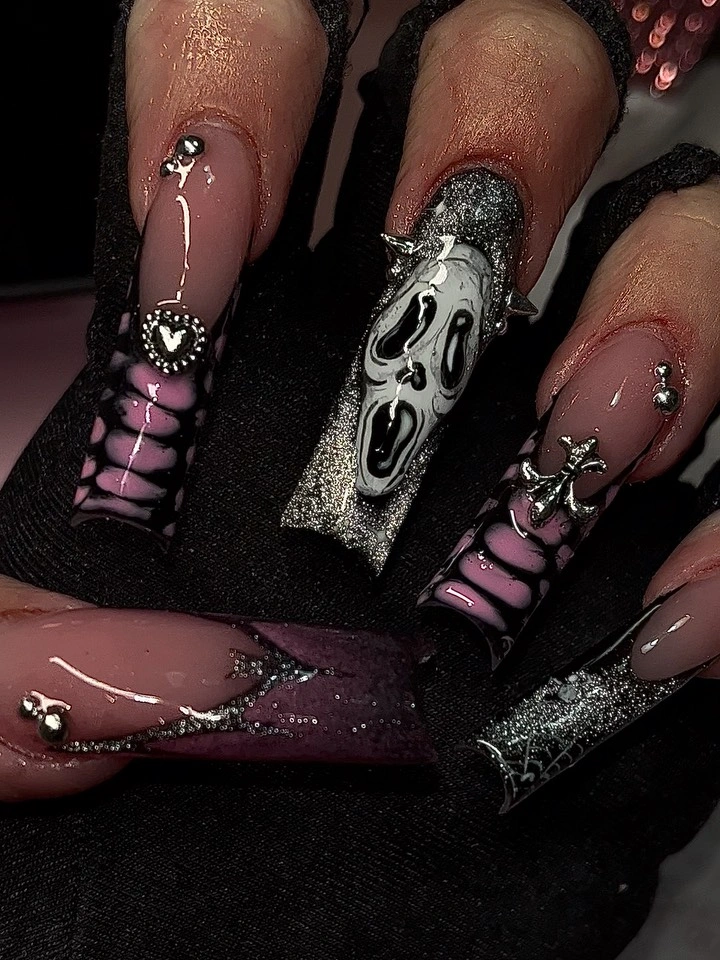
A shorter translation should keep one purple-black web or spider accent and let the surrounding nails remain smoky nude. Medium almond will preserve the contrast while making the point easier to handle. A single reflective detail can replace some of the density, giving the design a hint of shine without recreating the whole cluster.
Raised-looking texture and extreme length bring a higher upkeep cost than a flat line design. Check the focal cluster for snagging and the translucent edges for visible wear, then simplify before adding anything new. The dark detail remains readable when the nearby nails provide relief, so the supporting surfaces should stay restrained.
Black Silhouettes Give Nude Almond Nails Depth
Long almond nails use a nude and black palette with bat-like silhouettes, curved web lines, and small reflective-looking accents. The open base allows the dark shapes to read as clean silhouettes rather than dense illustrations, while the long almond edge gives them a graceful direction. Depth comes from contrast and empty space working together.
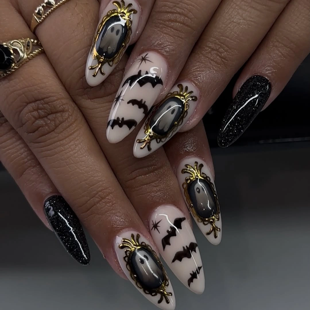
Silhouette motifs are easy to reduce because they do not require a full scene. Keep one bat-like shape and one web on medium almond nails, then let the remaining fingers use nude with a small dark dot. A metallic-looking accent can remain on one nail, but it should support the silhouette rather than compete with it.
The long shape makes the dark marks elegant, yet the points need care and the fine web lines need a clean edge. If the set begins to feel too busy, remove the smallest reflective detail first and preserve the negative space. That leaves the primary contrast intact and makes the design more tolerant of ordinary wear.
Tiny Doodle Ghosts Keep Pink Nails Light
Short rounded blush nails use tiny black, white, and pale seasonal marks that feel closer to doodles than to full character scenes. The open pink background reflects light and keeps the hand soft, while the small symbols provide just enough Halloween tension. The design closes on restraint, proving that a quiet surface can still carry a clear theme.
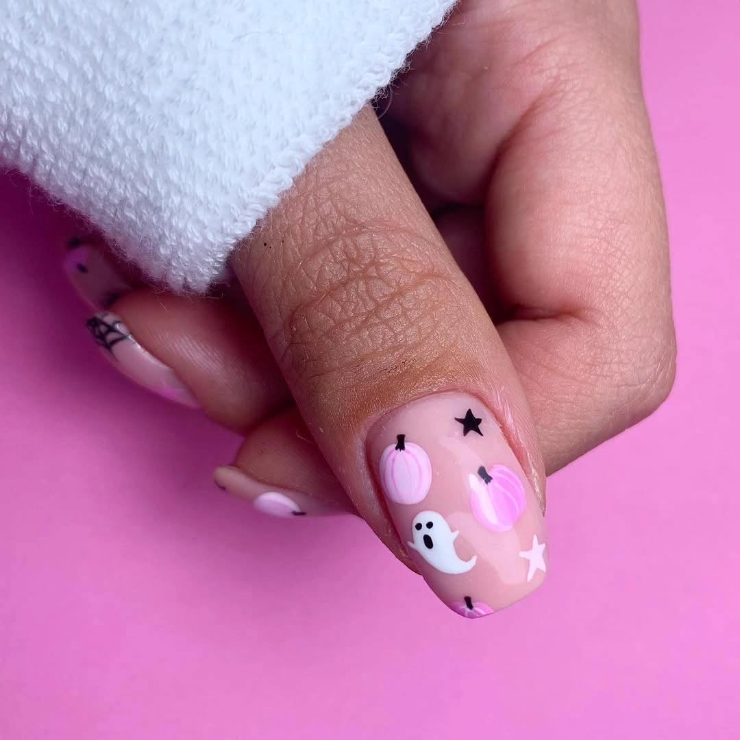
A two-accent version would preserve the visual idea while reducing the amount of detail on a small nail bed. Keep one tiny ghost and one star-like mark, then leave the rest glossy pink or switch one nail to sheer nude. Mauve or pale lilac could deepen the mood without losing the friendly scale. The open nails are not unfinished; they are the relief that lets the little doodles remain readable when the hand moves.
Small doodles may soften as the manicure grows, so their spacing matters more than adding extra symbols. Place them away from the most exposed edge and allow the base to remain visible around every mark. The quiet finish is the advantage here: when the hand moves through darker light, the pale surface still gives the details enough relief to read.