
Square nails make small choices unusually visible: a line that stops one millimeter early, a glitter finish that reaches the corner, or a color block that ignores the edge. That clarity is the appeal. Fall square nails look strongest when one detail is placed with purpose and the rest of the surface is allowed to support it.
Before choosing a design, decide whether the straight tip should feel sharper, softer, wider, or lighter. A dark diagonal can direct the eye, an ombre can reduce visual width, and a thin outline can keep the same form almost weightless. Matching the detail to that job is more useful than adding a motif simply because it is seasonal.
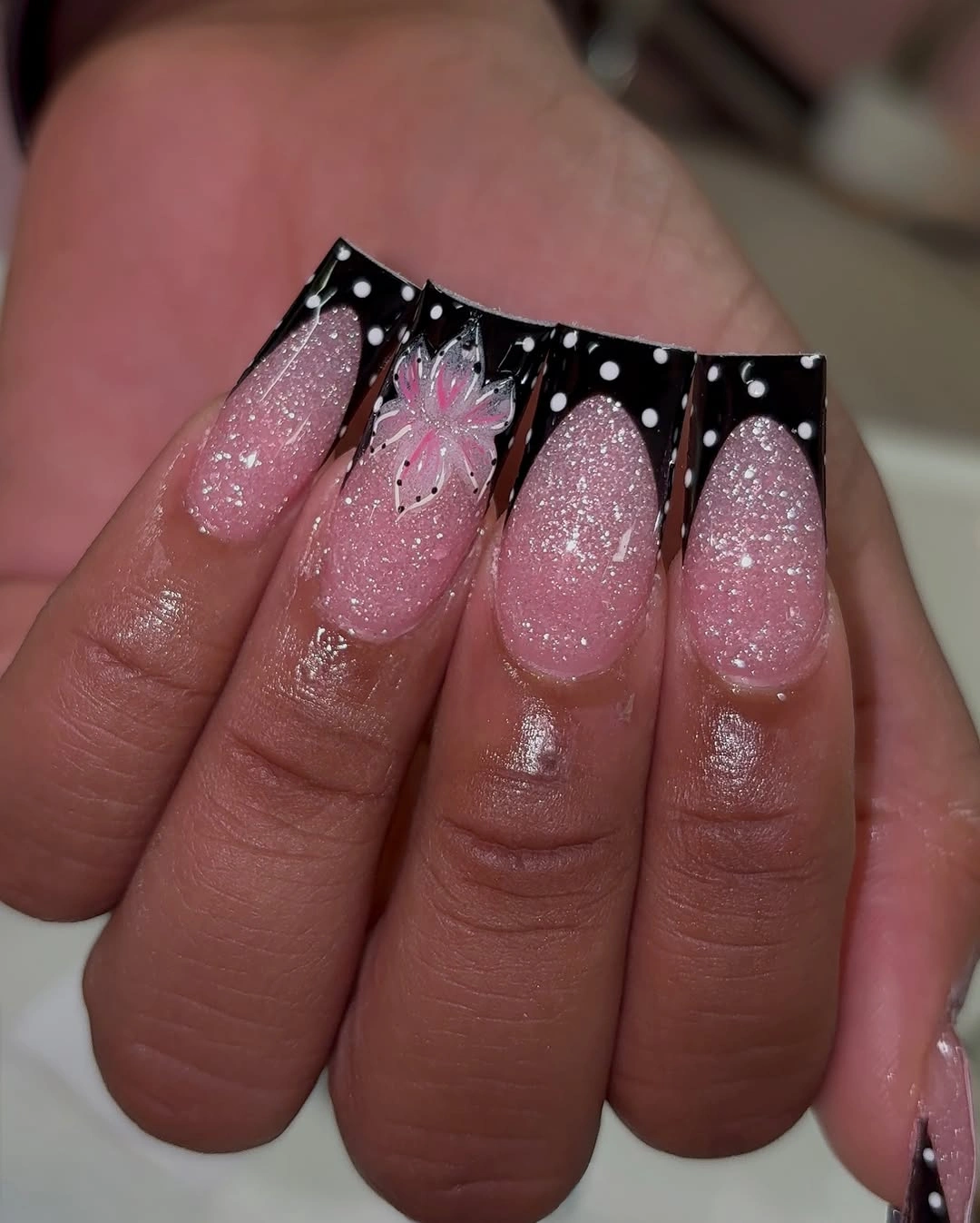
Black Drips Over Pink Glitter Squares
Black pointed drips create the dominant edge on these long pink glitter squares, while the pale centers and tiny light marks stop the top border from becoming a solid cap. The contrast is concentrated exactly where the squared tip is most visible. That placement gives the shape drama without darkening every inch of the nail.
The glitter underneath matters because it softens the transition between the quiet pink base and the very dark border. A flat nude surface would make the black drips feel more severe, whereas the fine sparkle keeps a little light moving through the center. For a cleaner adaptation, remove the pale marks and keep only two or three controlled drips per nail.
Corner placement is the practical detail to watch here. Once the black reaches too far down the sidewall, the square can start to look visually shorter and heavier. Keeping the lowest points slightly varied but similarly scaled preserves the lively effect while allowing the straight free edge to remain the unmistakable feature.
Fine Black Stripes On White Tips
These white square nails use narrow black stripes near the free edges, making the linework more important than any large area of color. The dark marks are thin enough to outline the shape instead of filling it. That distinction gives the design a precise, graphic character even though the palette is limited to black, white, and a pale base.
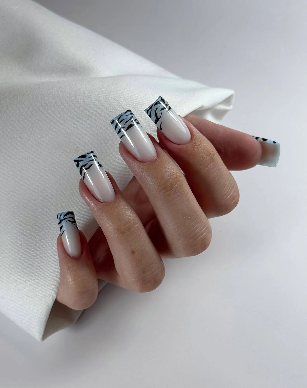
Notice how the stripes gather at the tip rather than spreading evenly across the nail. That decision preserves a generous white field and lets the eye register the squared end before it notices the individual marks. Someone who prefers a less decorated version could use one black line on each nail and save the clustered stripes for a single accent.
Line spacing is the feature that will decide whether this look appears crisp or crowded. The marks need enough daylight between them to read separately, particularly at a shorter length. A thin design like this also makes a useful bridge between a simple white manicure and a higher-contrast black French treatment.
Glossy Ink Navy On Long Squares
A uniform ink navy turns the long square outline into the entire visual statement. There is no separate art competing with the straight sides or flat tip, so the saturated color is allowed to show its full depth. The glossy finish catches light across the surface and prevents the dark shade from looking dull or opaque in a heavy way.
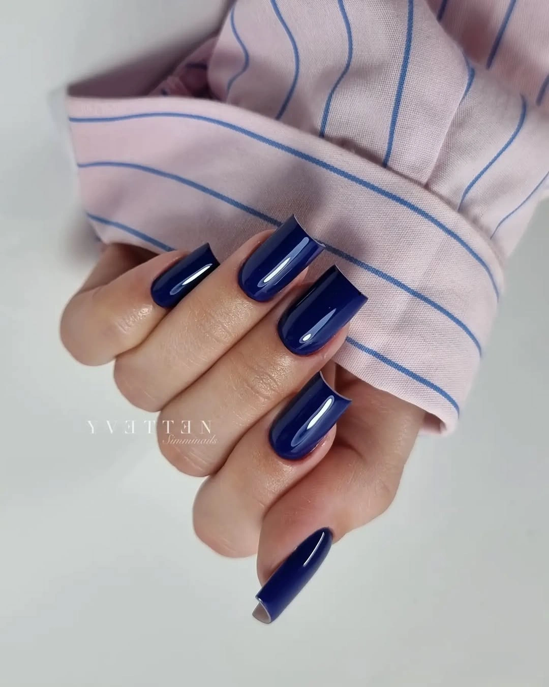
With a solid color, the smallest differences in length become more noticeable than they would under a busy pattern. That is not a drawback; it simply means the set relies on clean corners and a consistent silhouette. Navy offers a fall-minded alternative to black because it still reads deep while carrying a cooler, softer cast.
If you are deciding between a full dark set and a design with accent nails, consider what you want the tip to communicate from a distance. A single strong color makes the square edge appear confident and continuous. Adding a glitter nail would change the focus from shape to finish, which may be welcome but is not necessary here.
Lavender Squares With One Leaf Accent
Dusty lavender and cool gray squares are interrupted by one white nail carrying a small dark leaf-like mark. The accent is modest in size, which lets the surrounding muted colors continue to do most of the work. Instead of turning the hand into a botanical print, the detail functions as a measured focal point.
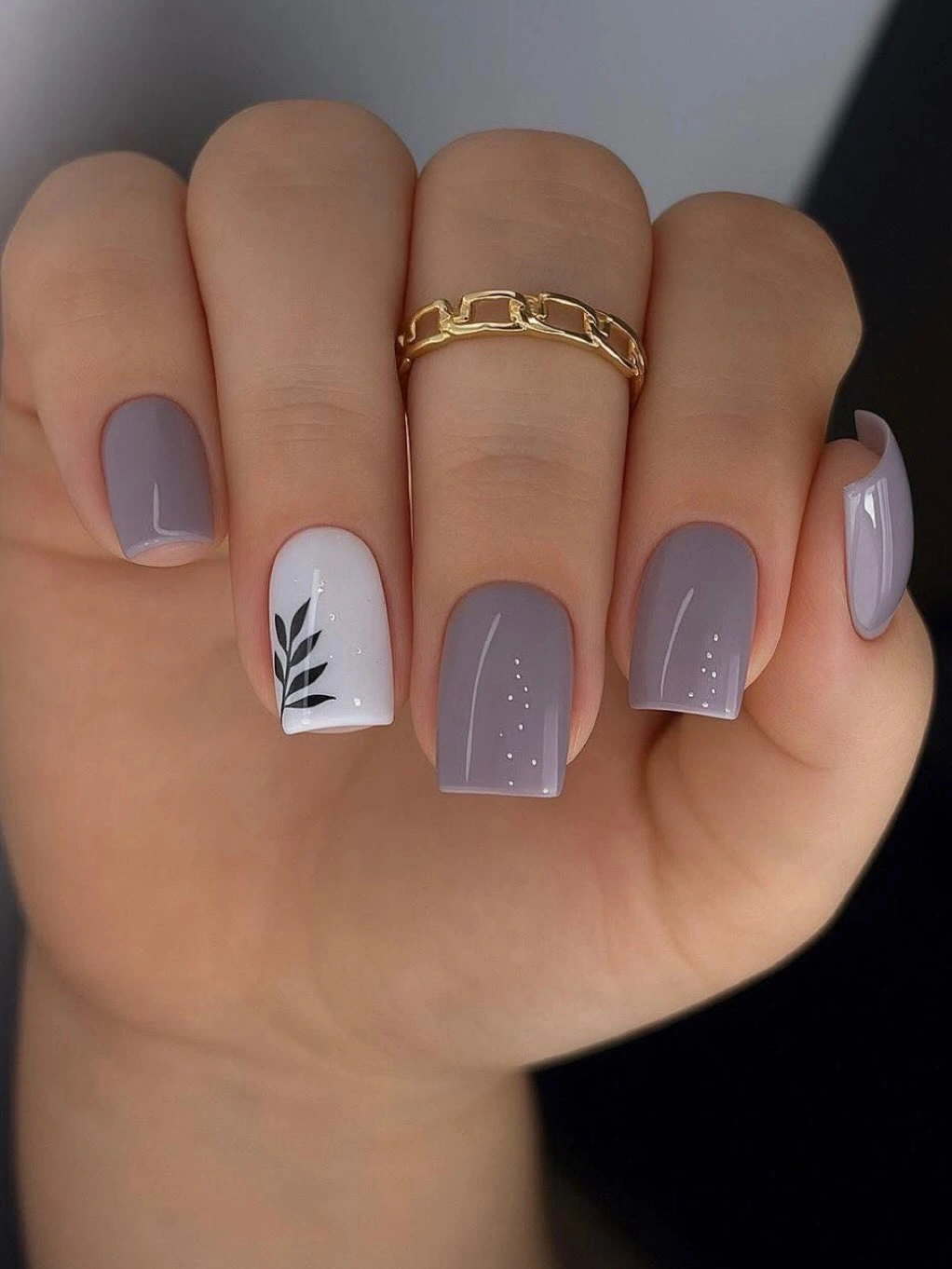
The placement on a white ground is especially effective because the thin dark mark stays legible without needing to be repeated everywhere. A silver-flecked neighbor adds a light texture, but it remains secondary to the botanical nail. This is a useful structure for a short square shape, where one well-chosen accent often has more impact than five different motifs.
For a practical version, keep the leaf on the ring finger and use the lavender as the dominant color across both hands. That makes replacement or touch-up simpler than maintaining detailed art everywhere. The muted base also leaves room to shift the accent from black to deep green or brown without changing the restrained character.
Frosted White Fade On Straight Tips
A gradual shift from nude to frosted white softens the visual width of these long square nails. The pale color reaches the tips without creating a hard, horizontal break, so the edges appear bright but not blocky. It is a small structural adjustment with a large effect on how a wide free edge reads.
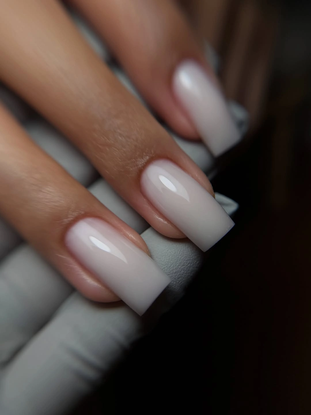
The ombre works because the color is allowed to build slowly instead of beginning at the same height on every nail. That transition gives the eye a route from cuticle to tip and keeps the white feeling airy. A sharper white band would emphasize the flat edge much more aggressively, which may suit a different mood but would lose this softness.
Length remains visible through a pale fade, so matching the squared corners still matters. The benefit is that a soft gradient can look less abrupt as the natural nail grows than an opaque French line. Readers who like lighter seasonal manicures may find this a calm counterpart to the deeper colors in the fall manicure color guide.
Animal Prints Framed By Nude Squares
Leopard-like spots, zebra-style stripes, and warm tiger-inspired marks appear beside calm nude squares, giving several patterns a shared foundation. The plain nails are not empty filler; they are the detail that makes the printed surfaces readable. Without that neutral pause, the different black and brown marks would compete for attention more aggressively.
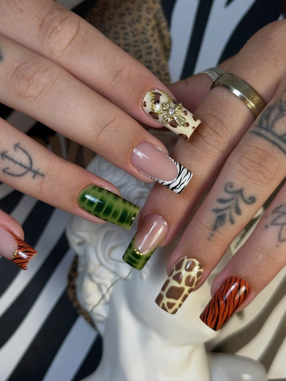
The most useful editing choice is limiting the number of fully decorated nails. The warm amber, cream, and black marks can vary from finger to finger because the nude base repeats often enough to establish order. If you want to simplify the idea, choose only one print family and let a single accent nail carry the pattern.
Square shapes give animal-inspired motifs a broad enough surface to show their irregular edges, but they can also make dense patterning look heavier. Leave an unmarked margin near at least part of the cuticle or tip so the print has room to breathe. That negative space is what helps the set look styled rather than merely covered.
Rose Squares With White Ribbon Lines
Curved white ribbons soften the strict geometry of long rose square nails. The lines move across the tip areas in gentle arcs, while the dusty pink keeps the overall contrast moderate. It is the tension between the flat edge and the rounded line that makes the design memorable rather than the number of colors used.
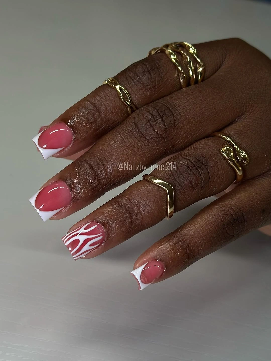
These marks do not need to be identical to work; they need similar visual weight. A curve that is too thick on one nail would take over the square shape, while a very thin neighbor could disappear. Keeping the white lines airy allows the rose background to remain a color field rather than just a frame for graphic art.
A reader who likes soft color but wants more movement than a plain manicure could borrow the curve and change only the base shade. Cream, pale taupe, or muted berry would all alter the mood without changing the design logic. The cleanest version would use one ribbon per nail and resist adding dots, glitter, or another print.
Tiny Dots On Pale Pink Squares
Small black dots give a pale pink short square manicure a quiet pattern without changing its everyday scale. The marks are dispersed instead of packed into a dense field, and that restraint keeps the compact nails looking open. A few soft accent details support the dots, but the pink base remains the first thing the eye notices.
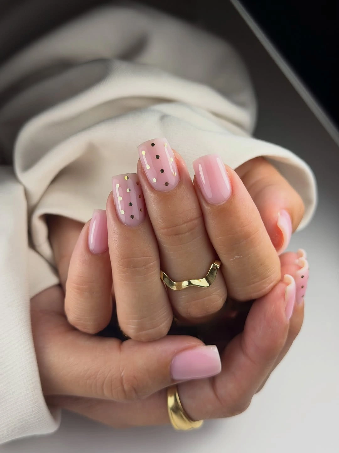
Dot size is the consequential choice here. On a short nail, a slightly larger spot can suddenly look like a full graphic motif, while these small marks behave more like texture. Leaving several nails nearly plain helps the set retain a light rhythm and makes the black feel deliberate rather than randomly sprinkled.
For a more seasonal interpretation, switch the black dots to deep brown or dark plum and keep the count low. The basic structure will remain intact because it depends on spacing, not on a particular shade. This is also an easy example of how fall square nails can feel detailed without needing a large leaf, flower, or heavy French tip.
Bright Red Squares With White Marks
Strong glossy red fills most of these medium-long square nails, while small white outlined details interrupt only a few surfaces. That ratio makes the color read as a confident block before the eye finds the finer marks. The bright finish suits the flat tip because it turns the whole silhouette into a clear, bold shape.
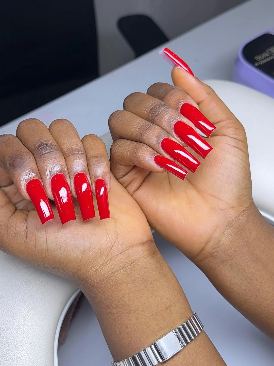
White works here as a highlight rather than a second major palette. It keeps the red from becoming completely uniform but does not dilute the impact of the solid color. A useful adjustment for a quieter version would be to reserve the white linework for one ring nail and keep the rest in uninterrupted red.
Glossy red shows edges and chips quickly, which is why the minimal detail is a smart choice. More art would give the eye additional places to notice unevenness, whereas this layout keeps the important lines limited. The square form provides enough structure that the manicure still feels finished even when the decoration stays sparse.
Coral Squares With Small White Flowers
Warm coral and peach tones give these short squoval nails a lively surface, and the small white flower-like marks keep the color from feeling flat. The pale details remain compact near selected areas rather than spreading into a full illustrated scene. That control allows the warm base to retain a polished, color-first role.
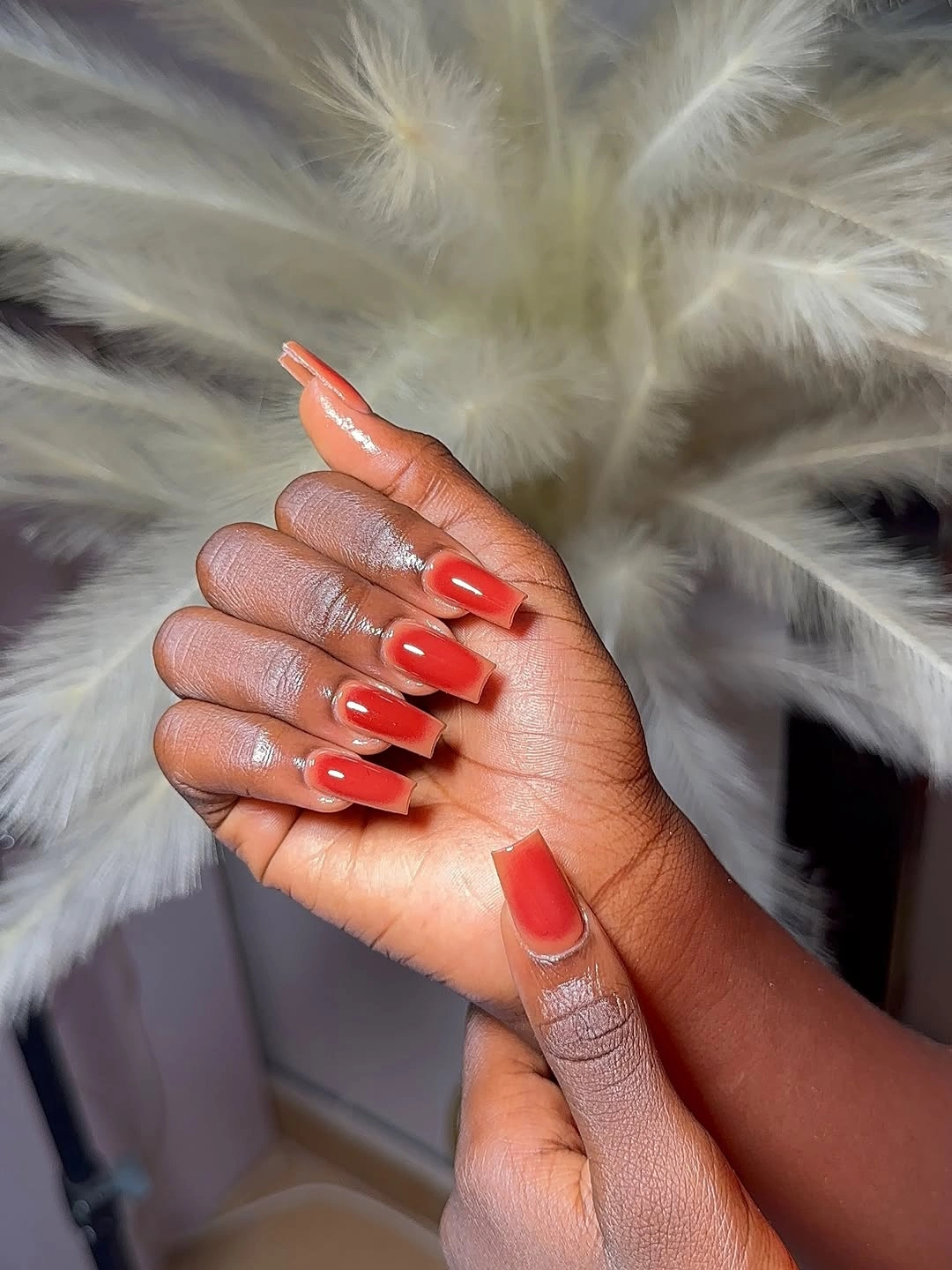
The contrast is gentle because white appears in tiny fragments, not in a large French border. On a short nail, that scale is especially useful: it creates a focal point without shortening the visible pink-coral area. A person who wants an even simpler look could repeat one petal-like mark on just two nails and leave the others solid.
Coral can sit nicely between a soft nude and a true red, making it a flexible choice when darker fall shades feel too heavy. The key is not to overbuild the floral idea with extra leaves or outlines. The little white marks have enough presence on their own once the glossy warm background has been established.
Striped Micro French On Sheer Pink
Several narrow warm stripes sit at the very edge of short sheer pink squares, creating a micro French treatment that is more about line placement than color coverage. Amber, burgundy, and cream stay contained in a small band. The translucent base is therefore still visible, which keeps the tip from reading like a thick multicolor block.
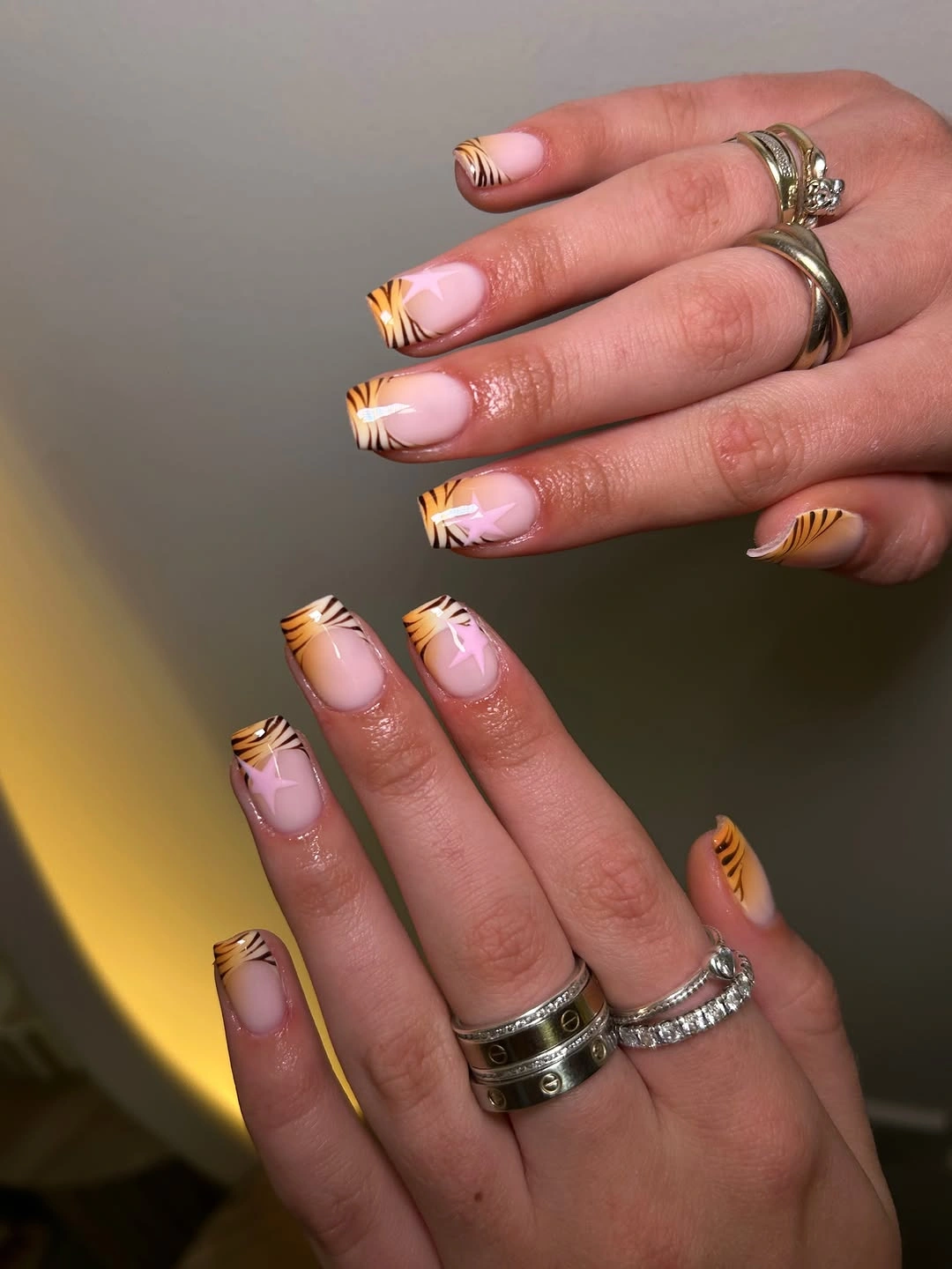
The fine spacing between bands is what gives the design its rhythm. If the stripes merged together, the tip would become visually heavy and the short square would look more compressed. One way to adapt the idea is to choose two lines instead of three, using the darkest color nearest the edge and the lighter one just inside it.
Because the color is concentrated at the free edge, the manicure can carry several autumn tones without sacrificing a calm center. That makes it more flexible than a full nail color mix. Careful line width will matter more than exact color matching; the bands should feel intentional when viewed together, not perfectly identical one by one.
Leopard And Checker On Nude Bases
Warm nude squares hold leopard-like spots, zebra-style strokes, and small checker blocks in one coordinated pattern mix. The base color is repeated beneath the different marks, which gives the eye a stable reference point before it moves through the individual prints. That repeated ground is the reason the maximal idea still has a readable structure.
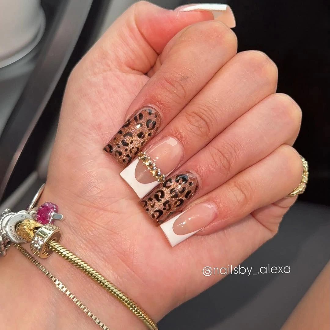
Each pattern has a different edge quality, so the spacing between them is more important than trying to make them all equal in size. The checker can stay compact, the stripes can remain directional, and the spots can gather on a single accent nail. If every nail used all three motifs, the square shape would lose the clean outline that makes it appealing.
For anyone who wants a more edited fall version, choose the warm brown and black palette but reduce the motif variety to leopard and one linear detail. The colors will still signal depth, while the surface becomes easier to follow. A short square can use the same idea only if the print is scaled down and the number of decorated nails is reduced.
Sharp Black Wedges On Pink Squares
Black wedge tips give pale pink square nails a forceful directional edge, while thin curved lines introduce a second, quieter movement. The contrast is concentrated at the corners and tips instead of spread across the center. That placement allows the pink to soften the hard geometry without erasing its graphic effect.
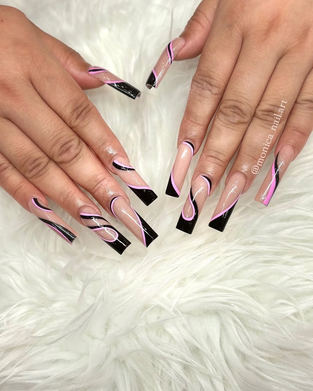
The wedge is doing a different job from a classic French line. It points the eye diagonally across the flat tip, making the square seem more dynamic and slightly less static. A less intense adaptation could place the black wedge on two nails only, then use a narrow black arc on the remaining pink surfaces.
Consistency in angle matters more than matching every line exactly. When the wedges lean in related directions, the set feels designed; when they change abruptly, the geometry can start to look accidental. Keeping the pink center broad also prevents the black from becoming the only thing visible when the hand is viewed at a distance.
Freeform Color On Long Nude Squares
Olive, pale yellow, pink, black, and white appear in small freeform patches across a long nude square base. The details vary from nail to nail, yet the colors return often enough to form a visual thread. That repetition is more important than symmetry in a design that deliberately avoids a strict matching pattern.
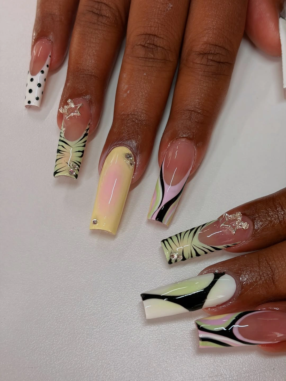
Rather than making every mark a focal point, the strongest parts are balanced by quieter nails and thin supporting lines. One finger may carry a larger green shape, while another uses only a small pale dot or black curve. This uneven distribution gives the surface a relaxed art quality without losing the squared silhouette beneath it.
The adjustment to make first is palette size. On a shorter nail, keep olive and one warm accent, then remove the extra colors so the shapes do not overlap visually. Long squares can tolerate more variety because they offer room for the details to sit apart from each other and from the straight edge.
Olive French Blocks On Nude Squares
Muted olive appears as squared French blocks at the tips, leaving much of the soft nude base exposed. The earthy color makes a clear fall reference, but the open center prevents it from feeling like a heavy full-coverage manicure. Straight borders echo the shape, which gives the design a calm, purposeful finish.
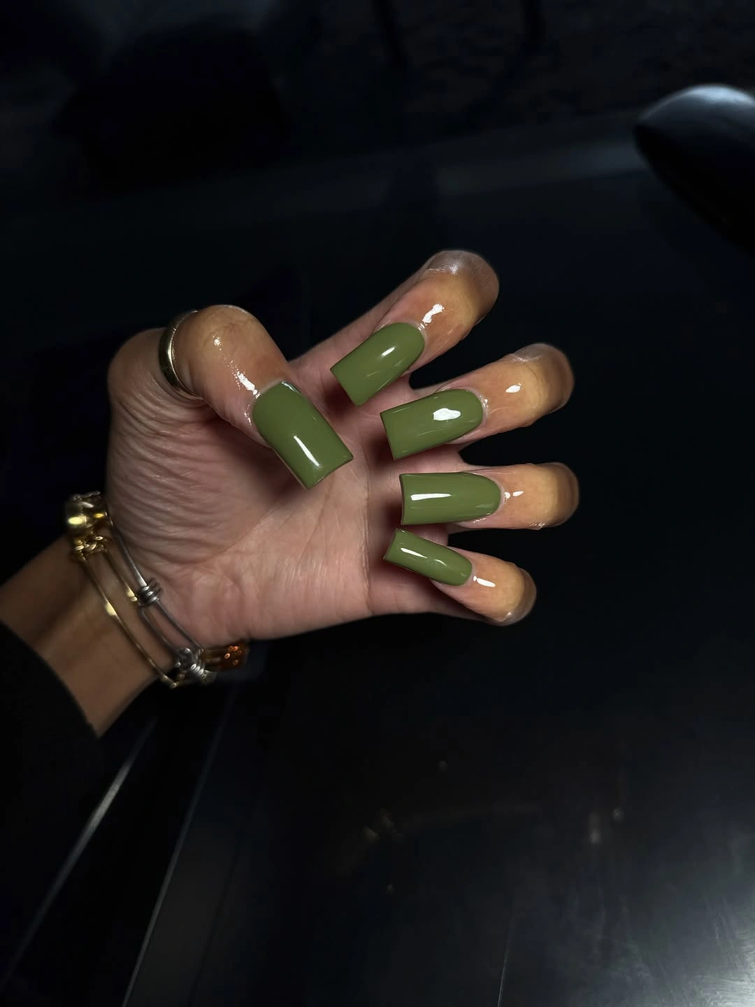
The detail is simple, yet its width is decisive. A very tall olive block would make the nail appear shorter, while a narrow one preserves the proportion of the nude section. Readers comparing green tones can find additional context in the site’s fall manicure colors, where depth and undertone change the mood of a seasonal shade.
For a subtle variation, use olive on alternate nails and keep the others glossy nude. That editing makes the color feel like a selected accent rather than a uniform requirement. Matching the tip height across the hand will do more for the polished result than adding a second stripe or glitter detail.
Pale Pink With Dark Print Accents
Soft pink short squares are given contrast by compact black-and-white animal-inspired accent nails. The pale solids carry most of the hand, so the patterned pieces remain readable instead of creating a wall of dark marks. It is an effective ratio for someone who wants print but does not want every nail to feel equally decorative.
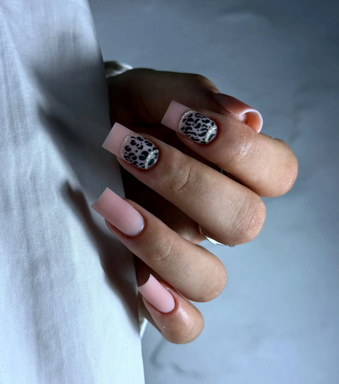
The patterns are strong because they are placed beside quiet color rather than mixed with another large motif. A zebra-like stripe and a spotted accent can coexist when they are separated by pink surfaces. On a compact shape, that spacing is the main design decision, not the exact number of spots or lines within the print.
A useful practical change would be to place the art on a single accent nail per hand and let the remaining squares stay pink. The result would still hold the same contrast, but the upkeep would feel less demanding as edges grow. Dark print works especially well in this restrained layout because it remains a sharp punctuation mark.
Yellow Print Details On Clear Squares
Pale transparent-looking squares provide room for yellow patches, dark spots, and fine linear marks to move across the long surfaces. The bright yellow is the small but consequential detail because it changes the familiar black-and-white print into something more energetic. It is held in check by the calm base and by the generous length available for spacing.
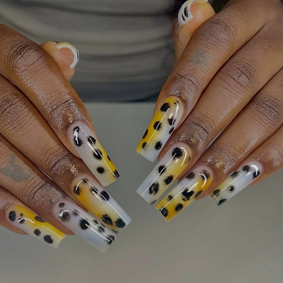
Long squares can carry this density because each motif has a separate zone rather than being layered on top of another. The yellow marks create visual warmth, the black defines the pattern, and the pale base supplies relief between them. A shorter version should not copy every element; one yellow patch and a few dark spots would communicate the idea more clearly.
The square tip gives the print a tidy endpoint, which is useful when the central art is intentionally irregular. Too many marks near the corners could make the form look bulky, so leaving a slim pale margin is a sensible edit. This is a high-detail set, but its success rests on restraint at the edges.
Fuchsia Blocks With Fine Gold Bursts
Fuchsia half-French shapes bring a bright pulse to long nude squares, while tiny gold burst details add a finer point of light. The nude base stays visible across much of each nail, making the pink blocks look placed rather than poured over the surface. That balance lets the gold remain a small supporting detail instead of a competing finish.
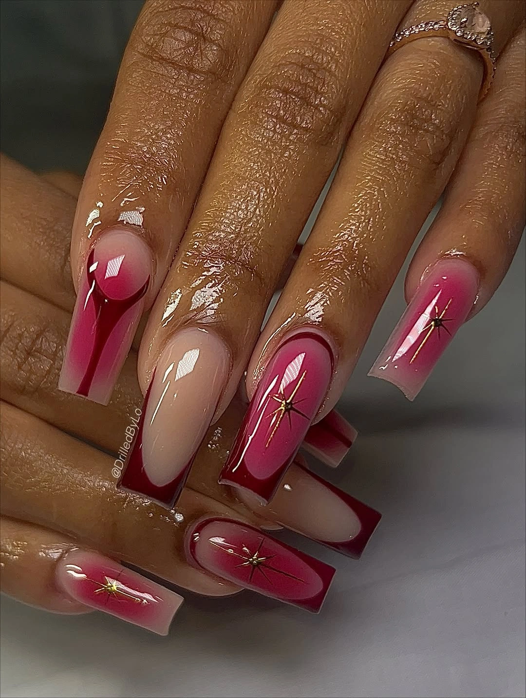
The contrast between broad fuchsia and delicate gold is carefully scaled. One color handles the major shape; the other works as a small interruption that rewards a closer look. If you prefer a quieter approach, use the fuchsia on two nails and add one gold line rather than a full burst, keeping the remaining nails close to nude.
Open space is especially valuable in a design with metallic accents because reflection makes tiny marks appear larger in motion. The long square gives the colors room to separate, but the same finish on a medium length would need smaller blocks. A controlled amount of pink keeps the seasonal energy vivid without turning the set into a single loud surface.
Pink Squares With Mixed Graphic Texture
Rose pink repeats across this long square set, joining tortoiseshell-like patches, black-and-white striping, and thin gold details into one visual family. The repeated pink acts as the organizing detail, not merely a background shade. Without it, the varied patterns would feel much more disconnected from one another.
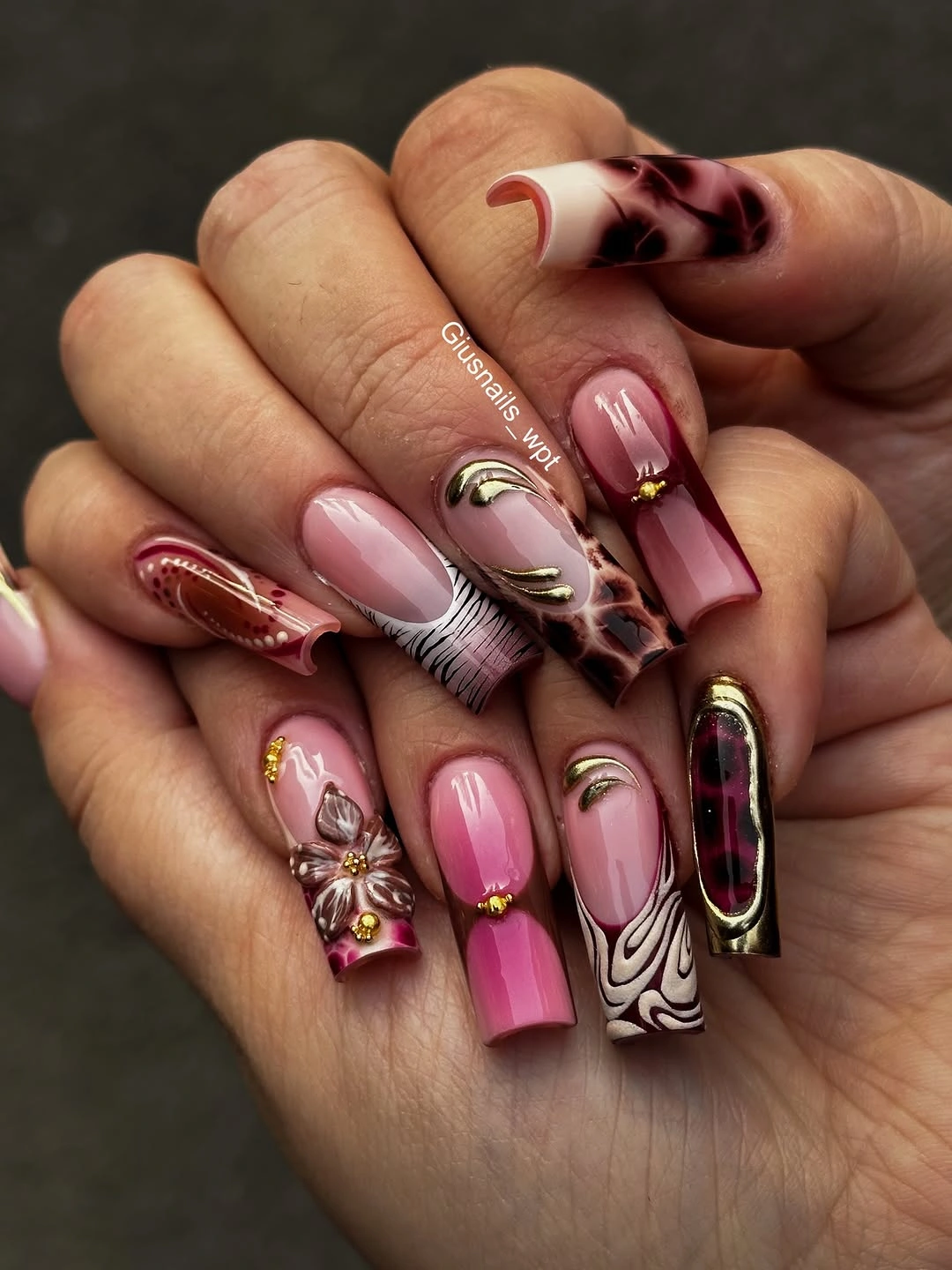
Each motif occupies a different kind of space: the brown-black patches add density, the striped nail adds direction, and the gold introduces a small reflective pause. That variety works because no single pattern is copied across every finger. Someone who wants the color story without the full decoration could keep pink solids and choose just one tortoiseshell accent.
Long squares make this elaborate approach more legible, but the visual limit is close. Adding another large motif or a new color would likely weaken the repeated-pink logic that makes the set coherent. The best edit is always to remove a pattern that duplicates a job already being done by another nail.
Wine Red With Tiny White Edges
Deep wine red covers these medium-long square nails almost completely, with only slim white edge details interrupting the glossy surface. The minimal white is not decoration for its own sake; it keeps the dark color from becoming visually flat near selected tips. That restrained contrast lets the square outline stay strong and polished.
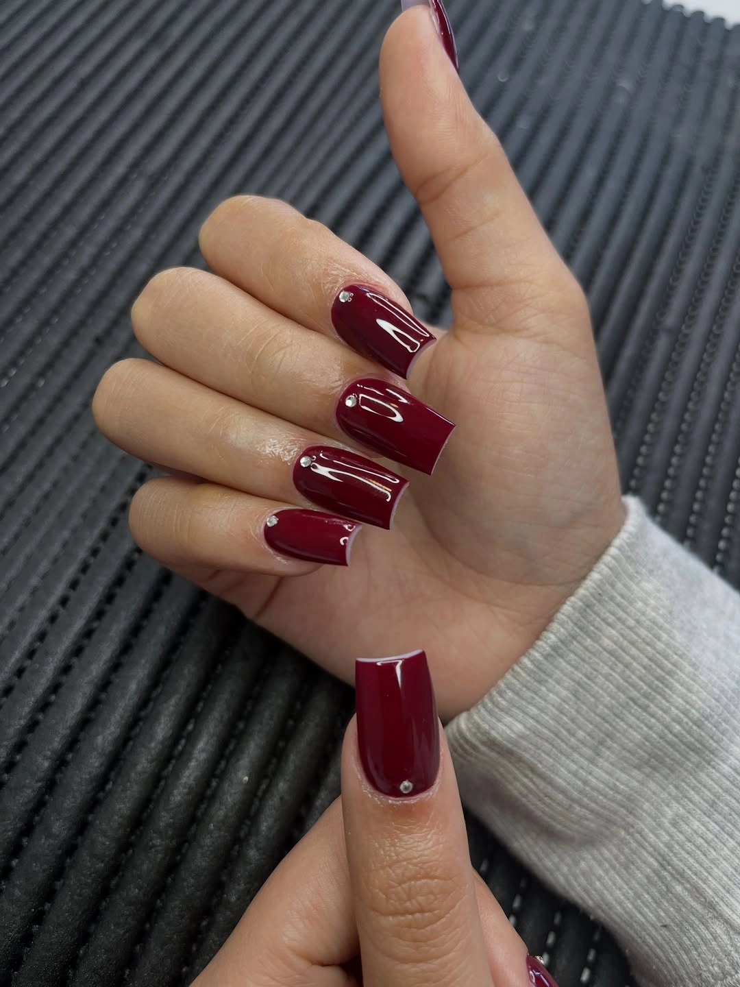
A single dark solid makes every corner and length decision more visible, so the set benefits from neatly matched tips. The white marks are small enough to act as a lift rather than a second design system. For a pure color statement, remove them entirely; for a little more direction, extend one white line only along the thumb edge.
The rich red has more depth than a bright scarlet, which makes it useful when you want a fall shade that feels controlled rather than playful. Gloss adds the final clarity, catching light along the straight free edges. Keeping the accents sparse is what allows that deep color to remain the main event.
Diagonal Black Tips On Milky White
Milky white squares receive diagonal black tips and a few small graphic marks, creating movement across a shape that can otherwise look very straight-on. The diagonal cuts the free edge at an angle, so the eye travels rather than stopping at a horizontal line. That direction gives the black-and-white palette a more energetic structure.
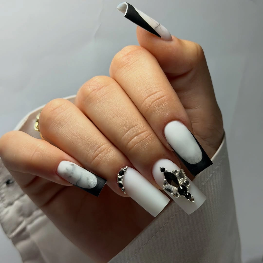
Most of the nail remains light, which is important because black carries considerable visual weight even in a narrow section. The dark diagonals work as a controlled edge treatment, not a full-color takeover. If the contrast feels too severe, keep the black on two nails and use a thin gray diagonal on the others to preserve the same directional idea.
The line should meet the corner cleanly; a poorly placed diagonal can make a square tip seem uneven. That attention to placement is what separates a deliberate graphic manicure from a casual color splash. For other compact ways to let one detail lead, browse the site’s fall accent nail designs after choosing the level of contrast you want.
Green And Pink Outline French
Very thin green and pink outlines define the tips of these pale short squares without filling them in. The color is almost weightless because it sits as a narrow contour rather than an opaque block. Tiny dark dots add a secondary detail, but the main visual decision is the line width at the edge, especially around the squared corners.
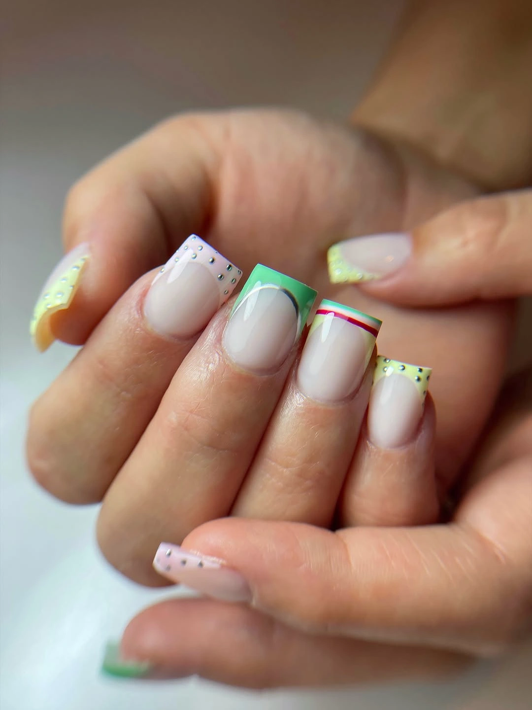
An outline French is especially useful on a compact square shape because it preserves the pale center and avoids making the tip look shorter. Green and pink provide contrast through hue rather than through a dark value, so the result stays light. A more edited version could choose only one outline color and leave the dots off entirely.
The final effect depends on keeping the contour consistently slim around the free edge. Once the line becomes thick, it stops behaving like an outline and begins to compete with the base color. That small distinction is exactly why this minimal finish can feel more precise than a much more elaborate pattern during ordinary daily wear.