
Choosing a manicure color is rarely difficult because there are too few options; it is difficult because a shade has to work with the rest of your visual routine. The hard part is predicting how it will sit against your skin, your usual clothes, and the length you can comfortably maintain. A color can look rich on a swatch yet feel too dense on a short nail, or become beautifully calm once the finish and shape give it enough breathing room.
Treat fall manicure colors 2026 as a question of role: should the main shade soften the shape, sharpen it, or create a quiet point of contrast? Compare the effect in natural light, then adjust finish before adding decoration; the same test is useful when weighing brown fall nails or a deeper option from dark fall nails. A deliberate role makes the final choice easier to repeat, change, and live with after the trend has moved on.
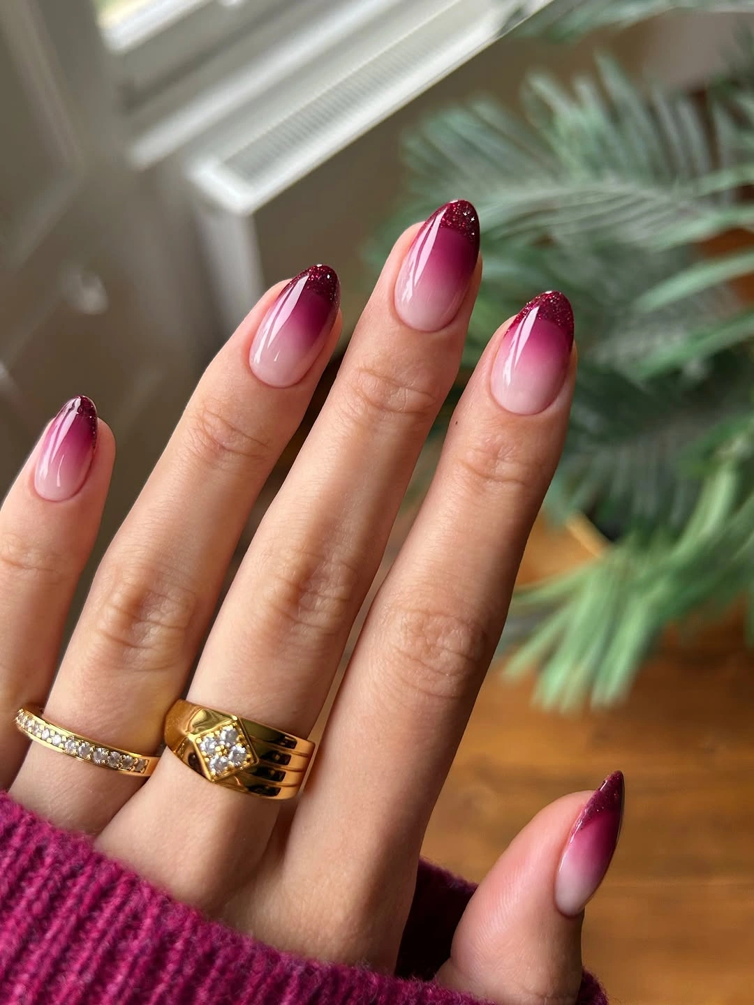
Blush Fading Into A Berry Tip
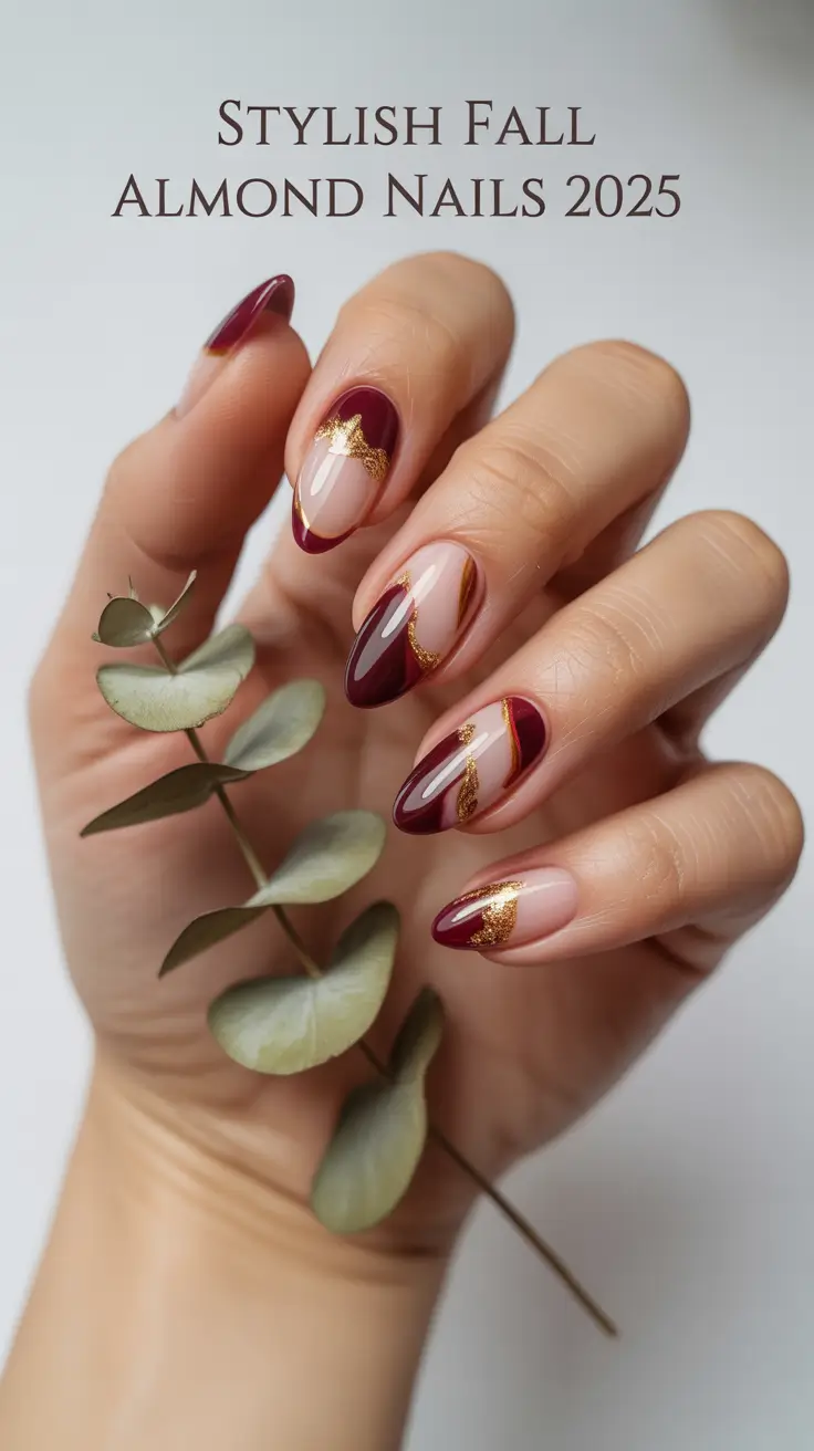
The smallest feature carrying the most weight is the shift from pale blush near the base to deep berry at the almond tip. The color transition lengthens the medium shape visually, while the glossy finish keeps the fade soft rather than graphic. Because the manicure has no separate motif, the edge of the gradient becomes the detail to watch: it is where the light color turns into fall depth.
Keep the fade gradual and let the berry remain concentrated near the pointed end if you want the same balance on a shorter nail. A softly rounded almond will preserve the direction without making the dark tip feel too sharp. If the color looks too strong, use a muted wine or dusty plum, but keep the pale base visible so the shift still carries the design.
Ombre makes grow-out more visible because the base is sheer, and uneven blending can distract more than a solid shade would. That practical limit is part of the choice. Keep the surface glossy and the transition clean, then avoid adding art that would compete with the fade. The manicure works because one change in value creates the entire rhythm.
Cream Chocolate And A Plaid Accent
A creamy yellow nail and a chocolate brown nail already create a warm fall contrast, but the off-white plaid accent changes the balance. Thin brown lines sit inside the light surface, giving the eye a repeatable structure while the solid colors provide relief. The small grid is not the loudest feature; it is the detail that makes the neutral palette feel deliberate rather than simply alternating.
Place the plaid on one finger and keep cream, chocolate, and warm nude as solids if you want an easier version. A medium almond gives the lines enough room, but a shorter shape will need fewer, wider bands so the grid stays readable. If creamy yellow feels too bright, replace it with oatmeal or beige and keep the brown linework as the defining contrast.
The plaid can turn muddy when too many lines are compressed, so it should support the palette rather than occupy every nail. Keep the finish smooth and let the solid chocolate act as the dark anchor. The manicure feels seasonal through the relationship between warm light and warm dark, with one measured pattern carrying more meaning than several competing accents.
Reflective Emerald On A Square Shape
Emerald is a simple color choice, but the reflective finish changes its weight across the medium square nail. In direct light it appears brighter and more metallic; in shadow it deepens toward a cool green. That shift is the small detail that keeps a uniform manicure from feeling flat, while the squared silhouette gives the color a stable, compact frame.
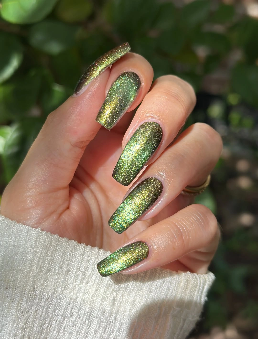
Keep the green solid and let the finish do the work. A shorter rounded square will preserve the reflective surface while making the shape more practical, and a slightly darker emerald will read with more depth when light is softer. If you want an accent, change only one nail to a quieter green or black rather than adding a new motif.
Reflective color does not hold one exact impression in every room, so it is better to choose the green family than to chase a fixed undertone. Surface smoothness matters more than extra decoration. The manicure stays precise because the shape remains visible and the finish gives the color movement without demanding a separate design on each finger.
Burgundy Taupe And Bronze In Almond Blocks
Burgundy supplies the deepest value, taupe and nude brown soften it, and metallic bronze adds a narrow middle note. The long almond shape makes the alternation feel elegant, but the important detail is the placement of the metallic shade between darker and lighter surfaces. It stops the palette from jumping directly from wine to neutral and gives the eye a small reflective bridge.
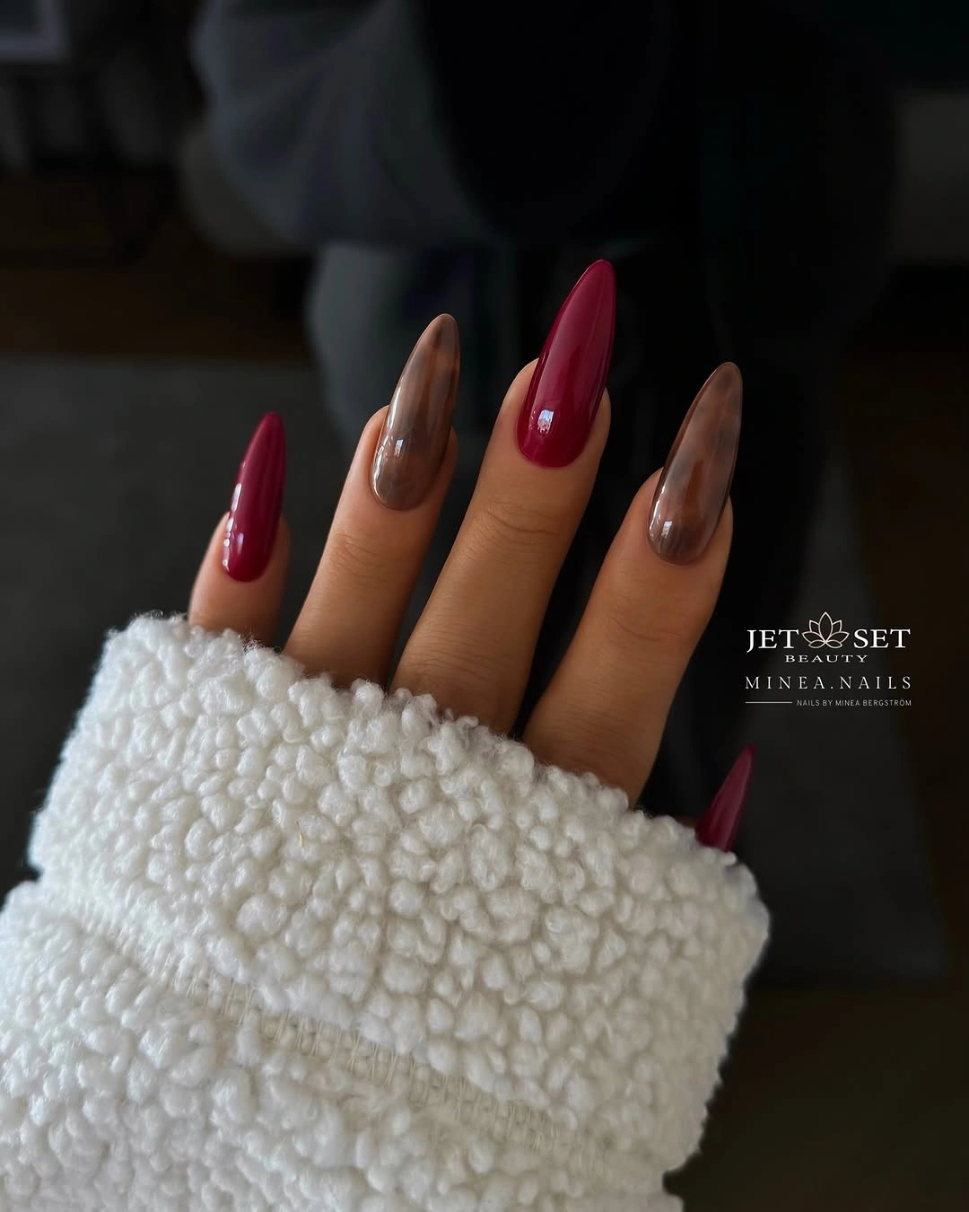
Use burgundy on two nails, taupe on two, and bronze on one for a medium-length adaptation. A softer almond will keep the color blocks directional without the full length, and a warm beige can replace the nude brown if you want less depth. Keep each color mostly solid so the metallic bridge remains visible rather than disappearing inside extra art.
The long silhouette makes the palette feel dressier and may be less convenient for hands-on routines. Shortening the shape is a more useful change than removing the bronze, because the small reflective note is what organizes the colors. Let burgundy carry the focus, taupe provide relief, and bronze connect the two. The set is balanced when no shade has to shout.
Textured Green With Pointed Contrast
Dark green and olive create the main color story, but texture and tiny reflective accents change how the long pointed nails are read. The surfaces do not all look equally smooth, which gives the muted palette depth without introducing more colors. The pointed silhouette carries length, while the textured green makes the manicure feel tactile and concentrated at the tips.
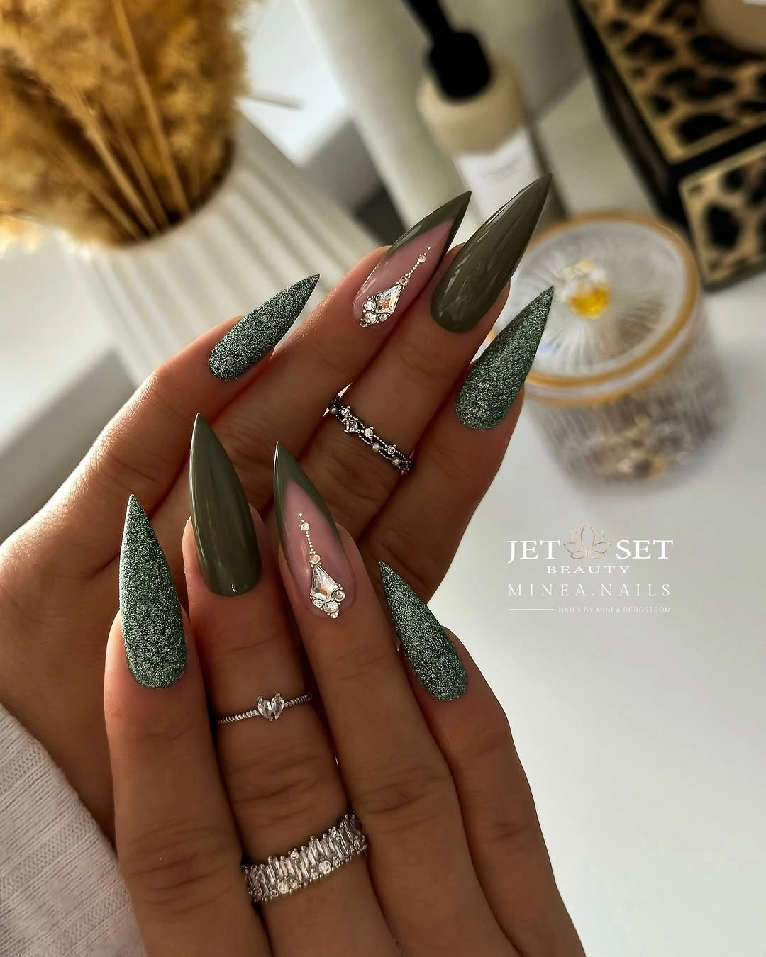
For a more practical version, keep the green texture on a medium almond and use one reflective accent rather than several. Olive can remain on one nail as a softer counterpoint, while the nude or pale pink surface gives the darker colors a little relief. The central idea survives when the shape is shortened because texture still changes the weight of the color.
The pointed length is the largest tradeoff, not the green palette. A stiletto edge can be striking but less convenient, and texture may show wear differently from a smooth surface. Keep the accents small and allow the dark green to remain the main field. The manicure feels intentional when the finish supports the silhouette instead of competing with it.
Sheer Pink With Amber And Black Edges
Sheer pink keeps these long stiletto nails open, while black, brown, and amber panels sharpen the pointed silhouette. The dark accents sit along narrow sections rather than filling the entire surface, so the light base remains visible. That transparent space is the small detail carrying the balance: without it, the warm-and-dark palette would make the long point feel much heavier.
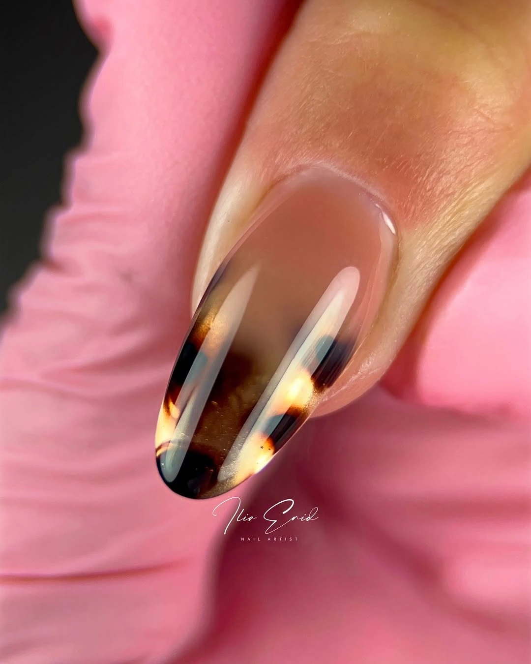
On a medium almond, turn the side panels into one dark tip or a simple amber stripe. The pink base should remain the largest area, and the black can stay on one or two fingers for a cleaner fall interpretation. If you want a softer result, use chocolate instead of black, but keep the edge placement so the shape remains defined.
Narrow panels demand a steady line and can lose symmetry on a shorter nail, while a sharp stiletto point is not equally convenient for every routine. Simplify the accent before changing the colors. The manicure works because the dark marks outline the length and the sheer pink gives them room. It becomes less clear when every open space is filled.
Short Navy With A Glossy Surface
Uniform navy looks straightforward, yet the short rounded-square shape and glossy reflection give the color its character. The deep blue reads almost black in some areas and more visibly blue where light reaches the center, creating a small shift without adding art. That finish change is enough to keep a one-color manicure from feeling static or overly severe.
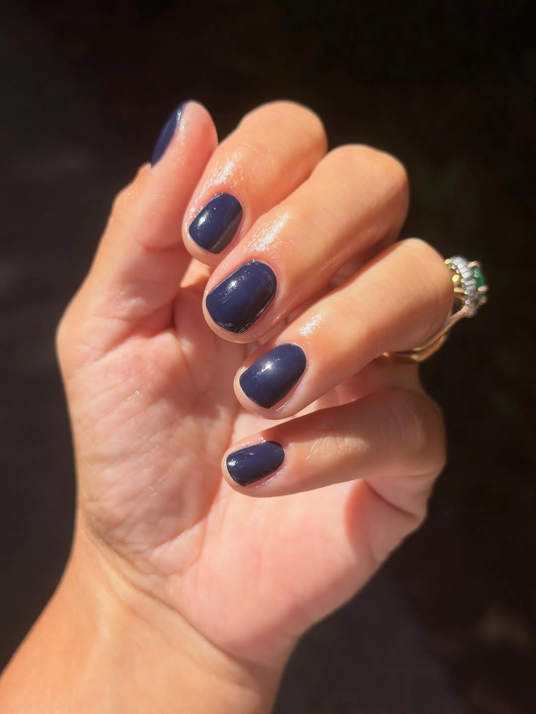
Keep the length short and soften the corners if you want the shade to look practical rather than boxy. A slightly lighter ink blue will remain readable under warm indoor light, while a blue-black version will feel more restrained. If an accent is necessary, change only the finish on one nail and leave the color family intact.
Dark solid polish makes edge wear visible, but it is also simple to refresh because there are no patterns to match. That makes the color a useful choice for a busy routine. Keep the surface even and let the glossy center supply the reflection. The manicure feels seasonal through depth, not through a literal motif or a crowded palette.
Burgundy With Warm Nude Relief
Burgundy and warm nude-brown alternate across long almond nails, with muted bronze adding another quiet value between them. The smallest influential detail is the relief created by the lighter nails; without it, the wine shade would dominate the entire hand. The glossy finish keeps the blocks connected, while the almond silhouette makes the darker color look directional rather than heavy.
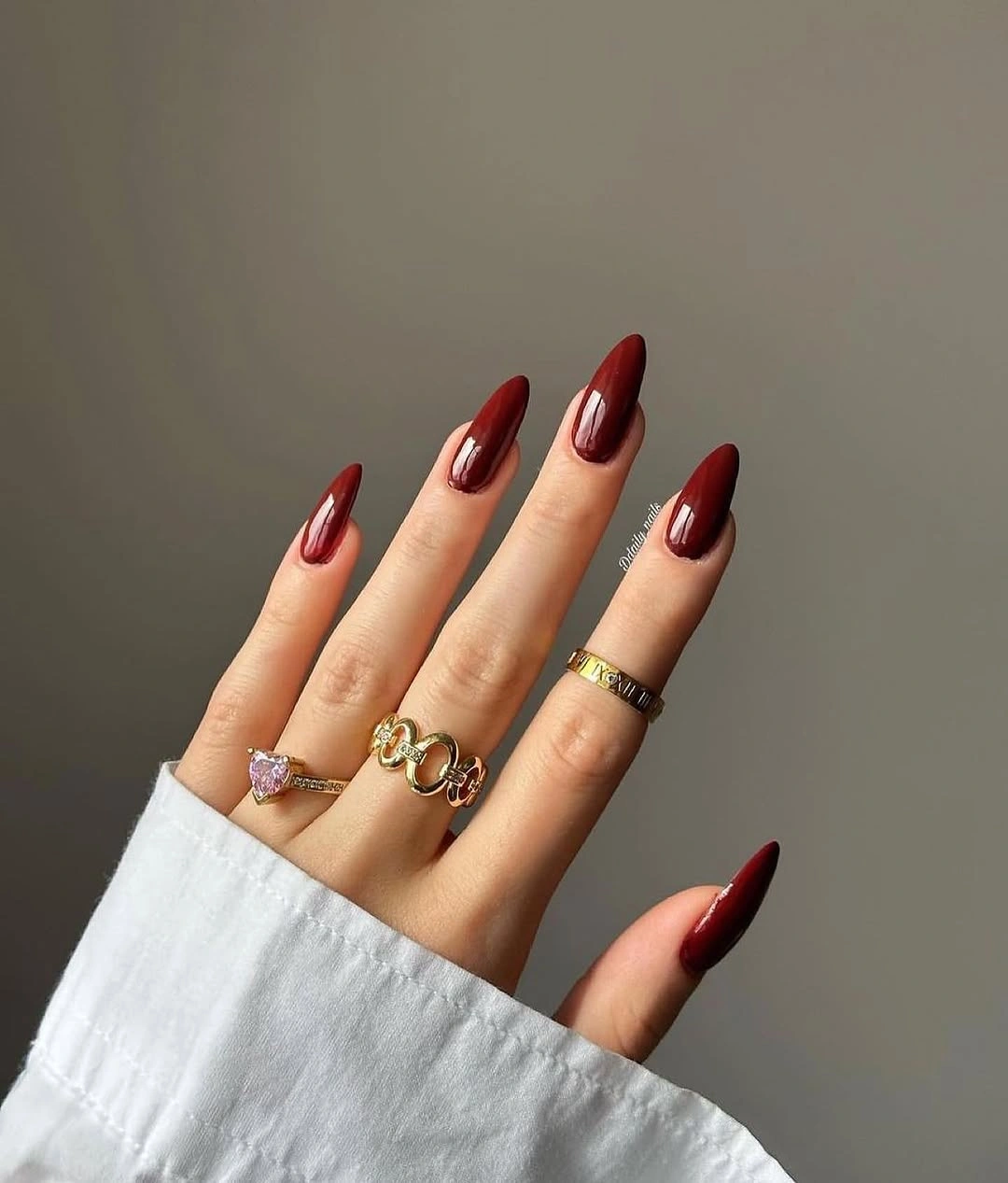
Use one burgundy accent on each hand and keep the remaining nails warm nude if you want a lower-key version. A medium almond will hold the same contrast with less length, and a soft terracotta can replace the bronze when you want the palette to feel more earthy. Keep the colors solid so the light-dark relationship remains easy to see.
The long shape gives the wine color a dressier presence, which may not suit every daily routine. Shortening the edge will change the proportion without removing the strongest detail: the light nail that relieves the burgundy. Let the nude surfaces stay clean and allow the deep shade to repeat. The set works because contrast is concentrated, not because every nail is equally decorated.
Brown Green And White With Marbled Relief
Dark brown and olive green establish an earthy base, while white and translucent marbled surfaces introduce the lightest values. The small feature that changes the balance is the single pale or layered nail: it gives the eye a place to reset before returning to the darker colors. The long almond shape keeps the mixed palette elegant, but the marbled detail prevents it from reading as simple color blocking.
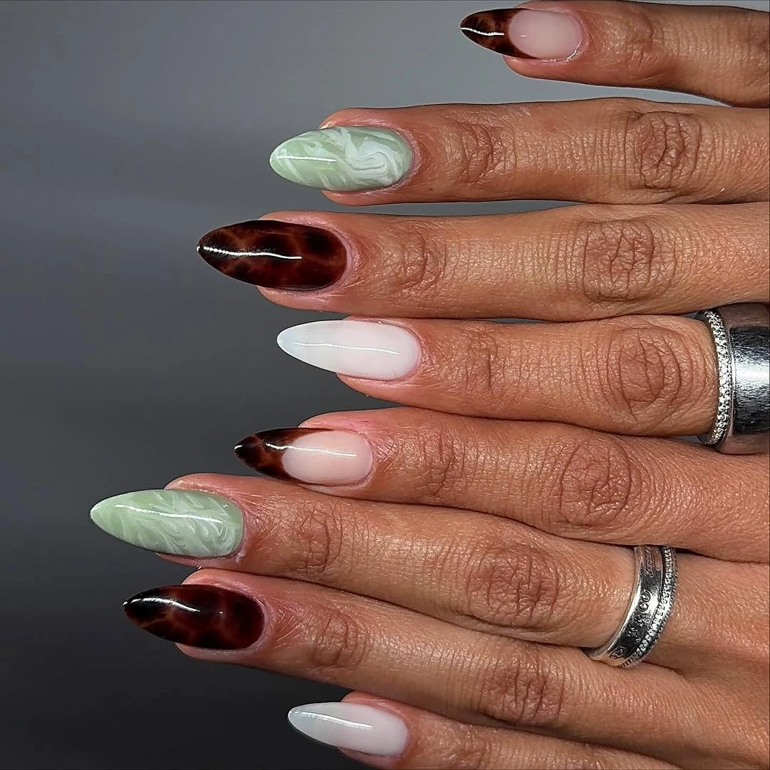
Keep brown and green as the solids and use one white or marbled accent on each hand. A medium almond will preserve the directional shape, while a shorter nail needs broader marbling and fewer layered marks. If the contrast feels too stark, use cream instead of white and keep the green muted so the palette stays grounded.
Layered surfaces can change their impression under different light, so the manicure should not depend on one exact smoky effect. Let the solid colors carry the structure and use the pale accent as relief. That makes the design easier to adapt and less vulnerable to small differences between nails. The smallest light area has enough impact when it is placed beside the deepest brown.
Chocolate With One Cream Plaid Nail
Glossy chocolate covers most of the rounded-square nails, while a creamy accent with thin plaid lines changes the rhythm. The detail is small but consequential: the light nail brings contrast into an otherwise dark neutral set and gives the eye a clear place to pause. Because the plaid stays on one or two fingers, the design remains color-led rather than turning into a full pattern manicure.
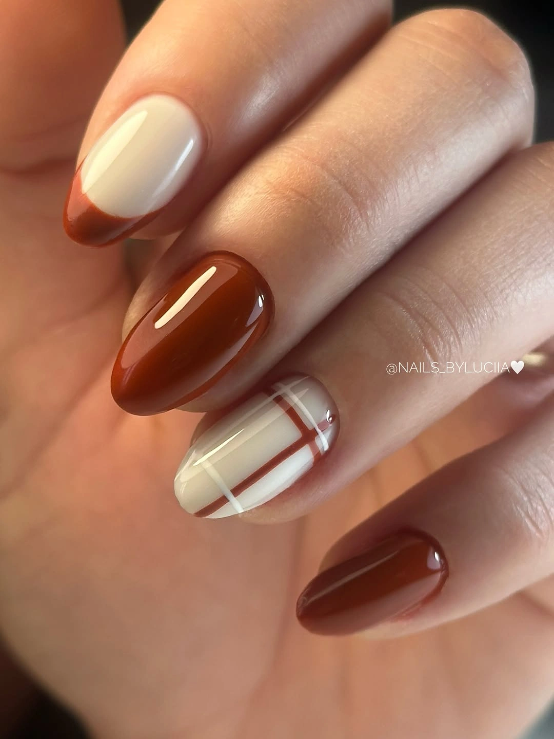
Keep the shape short to medium and place the plaid on the ring finger if the nail plate is small. Use fewer, wider lines so the grid remains distinct, and choose oatmeal or beige if bright cream feels too stark. The chocolate solids should stay glossy and uninterrupted, a balance also visible in brown fall nails; their smooth surface is what makes the light pattern feel intentional.
The cream accent may show stains or edge wear sooner than the brown nails, so it benefits from a clean, simple layout. Avoid adding another motif beside it. The manicure works because the darkest color repeats and the plaid interrupts only once. That controlled change is enough to make a familiar brown palette feel considered and ready for fall.
Deep Plum On Long Pointed Tips
A uniform plum shade gains its impact from the long pointed silhouette and the dark background around it. The smallest visible feature is the way the glossy color follows the taper without interruption; there is no accent nail to dilute the shape. That absence makes the finish important, because reflection is what keeps the deep berry from reading as a flat black block.
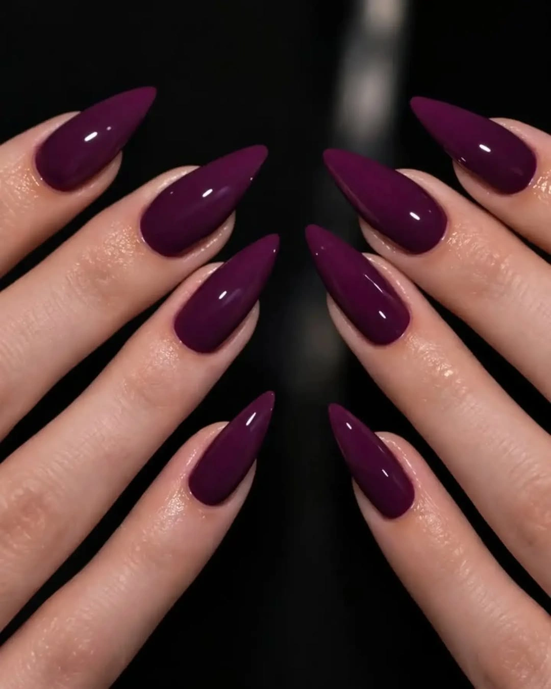
Choose a medium almond if you want to keep the plum while making the manicure more practical. A slightly warmer berry will feel softer, while a cooler purple will make the pointed edge look sharper, a useful distinction when comparing it with dark fall nails. Keep the color uniform and resist adding glitter unless you specifically want to change the visual job from silhouette to sparkle.
The stiletto length is a clear limitation for some routines, and the dark shade will show any tip damage. That is why the simple design benefits from a realistic shape choice. Let the point create the direction and the glossy finish create the movement. The manicure remains strong when the color is allowed to stay concentrated on one decision.
Glossy Red Almonds With No Extra Noise
Glossy red covers the long almond nails evenly, so the important detail is not an accent but the uninterrupted relationship between saturation and shape. The red looks brighter where the finish catches light and deeper along the curved sides, giving a single color enough variation to hold attention. The almond silhouette keeps the shade elegant rather than blocky.
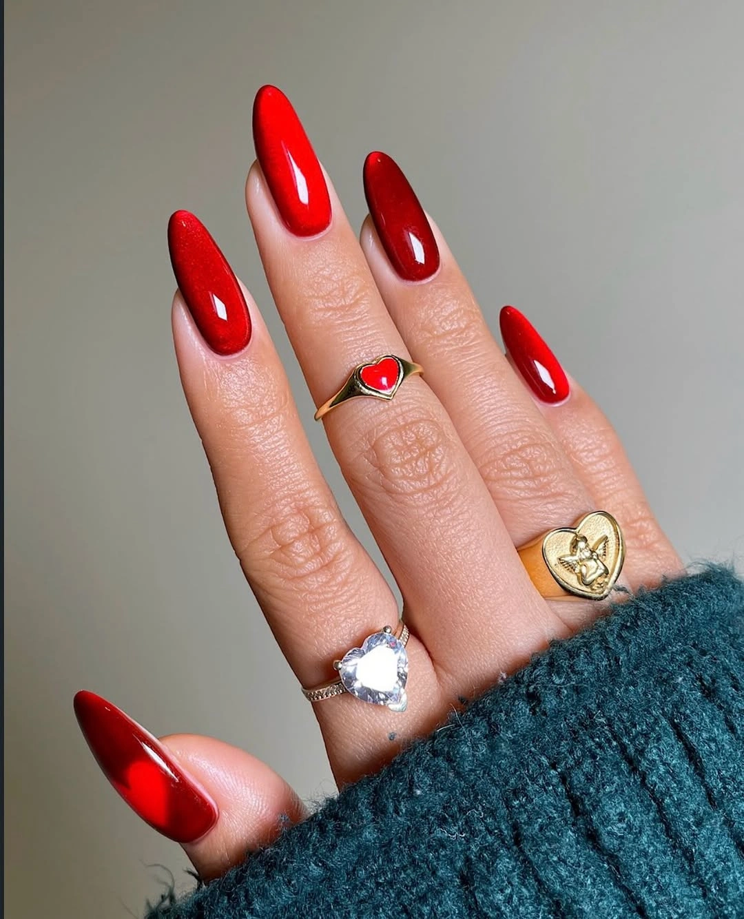
For a medium-length version, keep the red on a softer almond or rounded oval so the color remains the focal point without the full extension. A deeper cherry or warm brick red can shift the mood toward fall while preserving the same glossy surface. Do not add a random accent simply to create variety; the clean field is the reason the shade reads so clearly.
Uniform color is easy to coordinate but leaves no place to hide uneven coverage or a chipped edge. That makes neat application and timely refresh part of the look. Keep the surrounding styling simple if you want the red to lead, and let the reflection change as the hand moves. The manicure feels finished because the saturation is allowed to be enough.
Red Orange And A Pale Leaf Detail
Red and orange create the warm block, but the pale pink nail with black leaf-like linework changes the balance more than the color sequence alone. The light accent breaks the saturated group and gives the dark drawing enough contrast to be read. It is a small detail with a large role: one quiet surface keeps the warm shades from closing in around the hand.
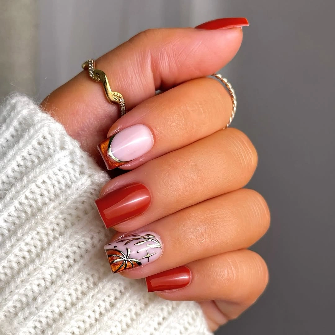
Keep the red and orange as solids and simplify the pale accent to one dark leaf line with a small metallic point. A medium square will preserve the compact color blocks, while softened corners can make the bright shades easier to wear. If orange feels too vivid, replace it with burnt orange and keep the pale nail light enough to remain a visual pause.
The warm colors are strong, so another bright motif would weaken the focus. Give the pale accent clear space and keep its linework thin. The manicure works with cream or denim because the color story is direct, but it may compete with a bold print. The design stays precise when the light nail is treated as relief rather than another place to add color.
Emerald Chrome With A Dark Counterpoint
Reflective emerald green dominates the medium square shape, while one or two very dark nails create the small counterpoint that gives the color a boundary. The metallic surface shifts as light moves, so the green does not need a motif to appear dimensional. The dark accent is useful because it makes the emerald look brighter by comparison and keeps the finish from becoming visually uniform.
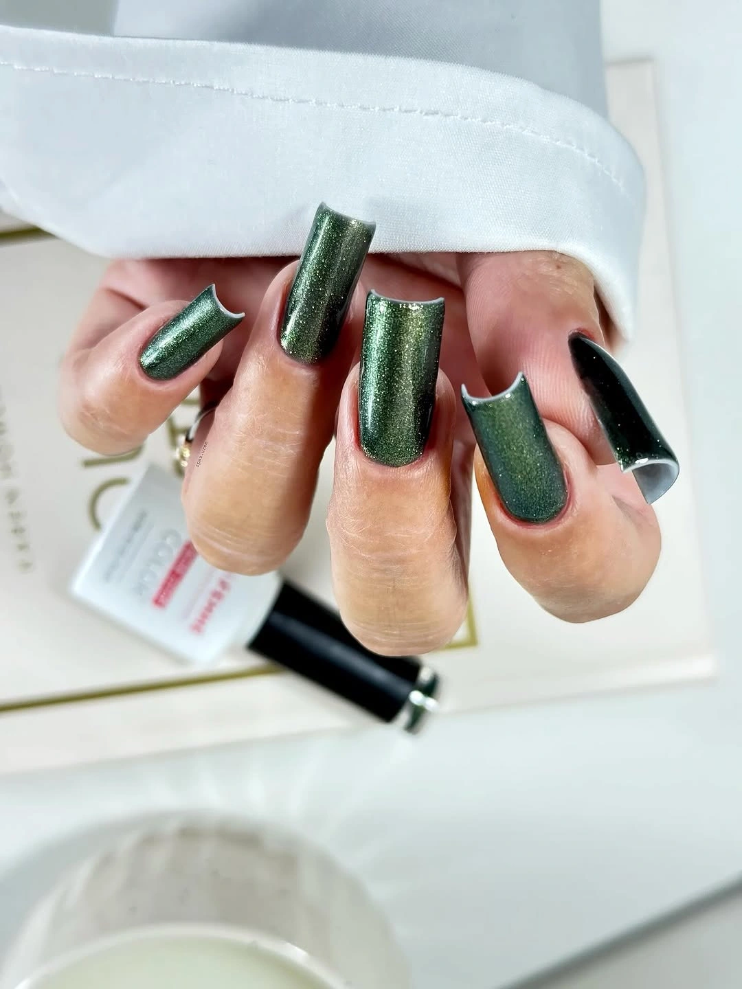
Use emerald on most nails and a single black or deep green accent for a concise version. A shorter rounded square will keep the reflective field practical, and a muted forest shade can replace the brighter chrome if you want less shine. Leave the dark accent smooth; adding art would compete with the finish that already carries the set.
Chrome-like color changes under warm and cool light, so the exact impression will not be fixed throughout the day. That makes the finish the variable and the color family the stable choice. Keep the edges clean and the accent limited. The manicure feels balanced when the dark nail supports the emerald rather than asking the viewer to notice two separate designs.
Blue Green Chrome With Dark Edges
The blue-green surface shifts between a reflective center and darker borders, making the edge the detail that changes the square nail most. There is no separate motif; the color itself appears framed by its own depth. That contrast gives short-to-medium nails a dimensional look while keeping the design compact and easy to understand.
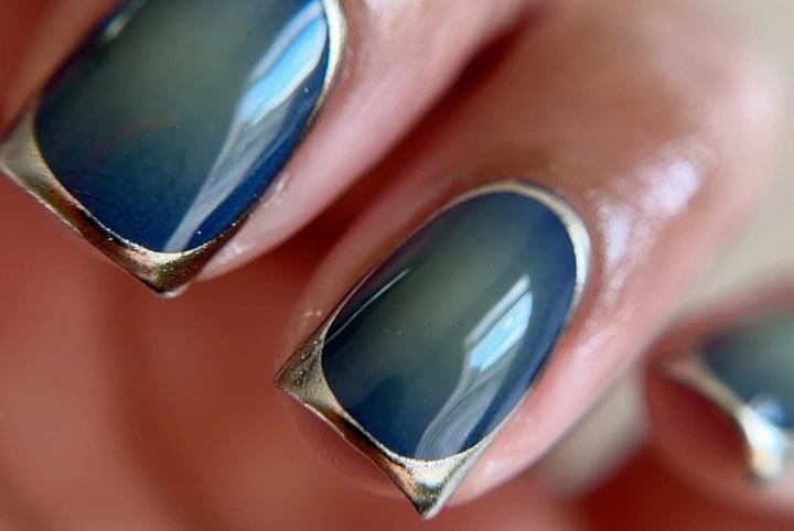
Keep the shape short to medium and soften the corners if the dark border feels too severe. A teal-blue shade will preserve the reflective movement, while a deeper navy-green version will make the manicure more subdued. If you add an accent, vary the finish on only one nail and leave the color relationship unchanged.
Reflective surfaces can look blue, green, or nearly charcoal depending on the light, so a precise color promise would be unrealistic. Let the finish be the point and keep the edges smooth. The design remains clean because the border gives the eye a path around the nail, while the center stays open enough to show the shift.
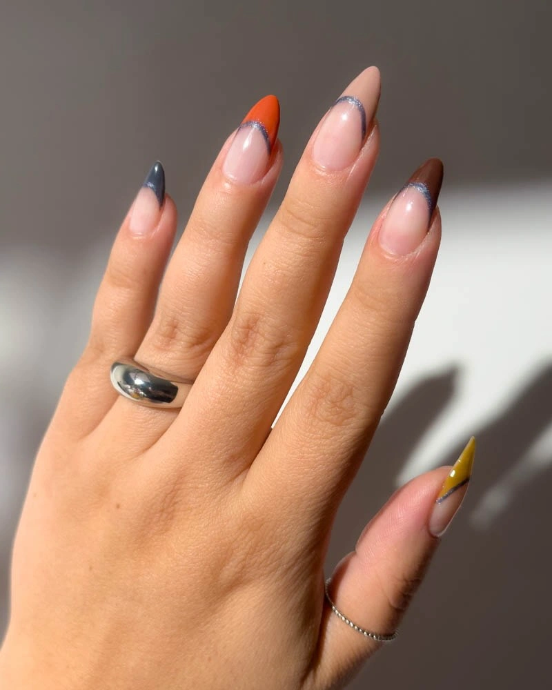
Taupe Cream And Gray With Silver Lines
Taupe, cream, gray, and pale beige create a quiet neutral sequence, while small silver or reflective outlines give selected nails a fine change in emphasis. The detail is not a focal picture; it is a thin edge that keeps the muted palette from flattening. Short-to-medium rounded squares make the colors feel practical and let the small metallic marks stay proportionate.
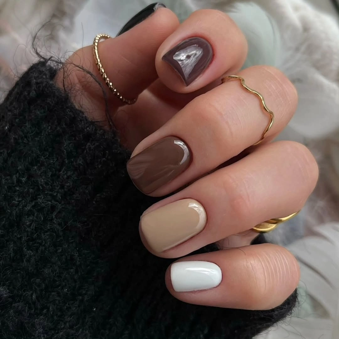
Keep taupe and cream as the main shades and place one silver outline on the ring finger for an understated version. A warm beige can replace the coolest gray if you prefer a softer fall palette, while a rounded edge will keep the neutral blocks from looking too rigid. Avoid adding a large motif; the fine line is enough to change the balance.
The palette is restrained, so a low-contrast finish may make the manicure look flatter than intended. Let the silver detail remain visible and use different undertones rather than more colors to create separation. The set works with textured sweaters and denim because it does not compete with them. Its strength comes from a small edge detail supporting the continuity of the neutrals.
Burgundy Teal Yellow And Terracotta Rhythm
This mixed set moves between deep burgundy, dark teal or black, yellow, and terracotta, with some nails carrying textured or graphic accents. The important detail is the repeated dark anchor: without it, the bright colors could feel scattered. Burgundy and the dark cool shade create continuity, while yellow and terracotta interrupt that line with smaller bursts of warmth.
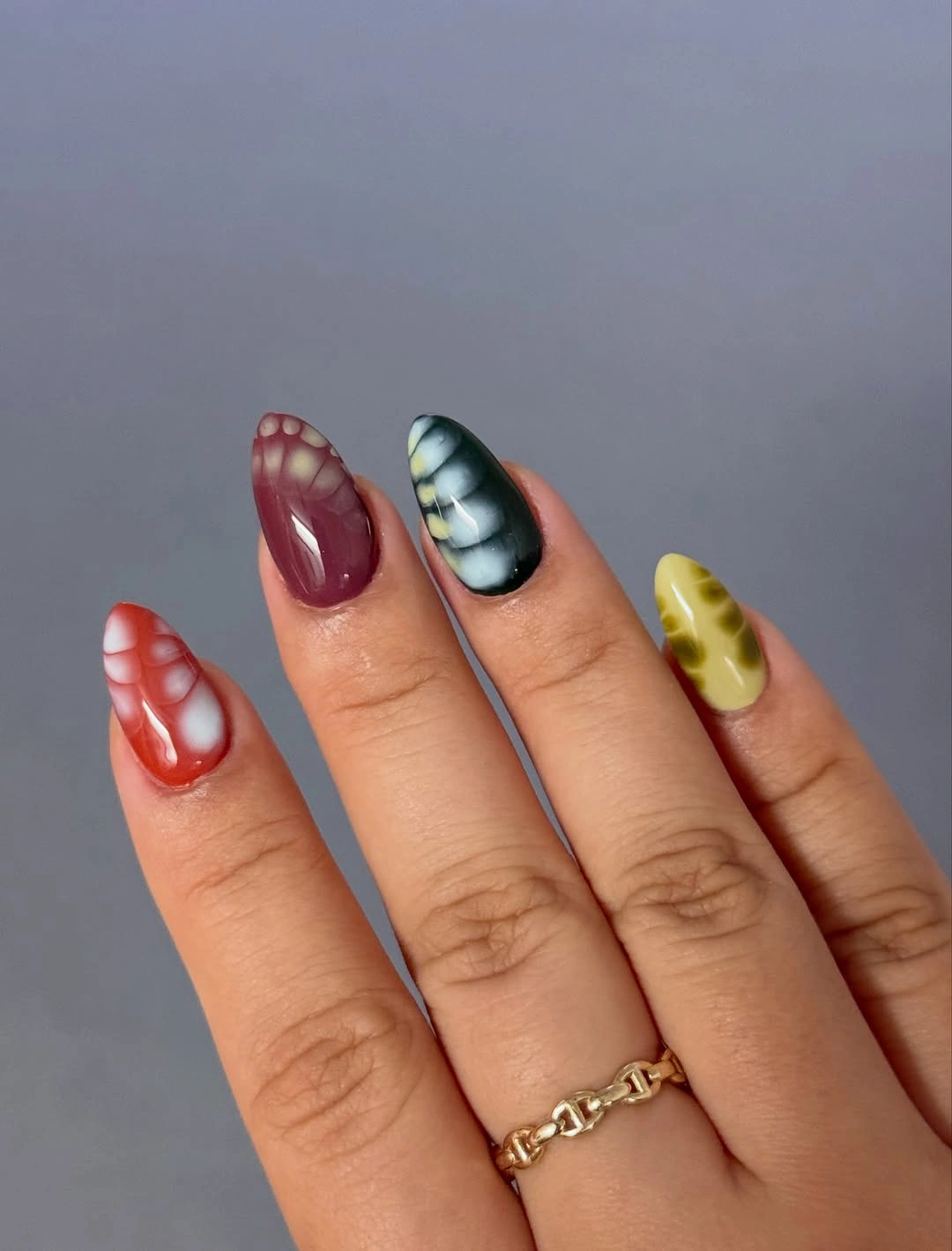
Choose burgundy, teal, and one warm yellow for a more coherent medium-length adaptation. Keep one textured detail and leave the remaining nails solid so the palette has a clear hierarchy. If the yellow feels too loud, use ochre or mustard; the contrast will remain as long as one warm light shade still interrupts the dark colors, a color-balancing choice that can also help when browsing fall nails for dark skin.
The variety is expressive, but equal emphasis on every color and texture can make the manicure difficult to read. Let the dark shade repeat and use the bright tones as accents rather than foundations. The set becomes easier to style when the eye can find the same deep value twice. One supporting detail can create rhythm without turning every nail into a focal point.
Brown Taupe And Zebra-Like Lines
Glossy chocolate brown, taupe, and cream form the base, while dark zebra-like lines bring a graphic accent to several light nails. The most consequential detail is the contrast between the warm neutral field and the narrow dark marks; the print feels wearable because it is not placed on a stark white background. Solid brown nails provide relief and keep the pattern from taking over.
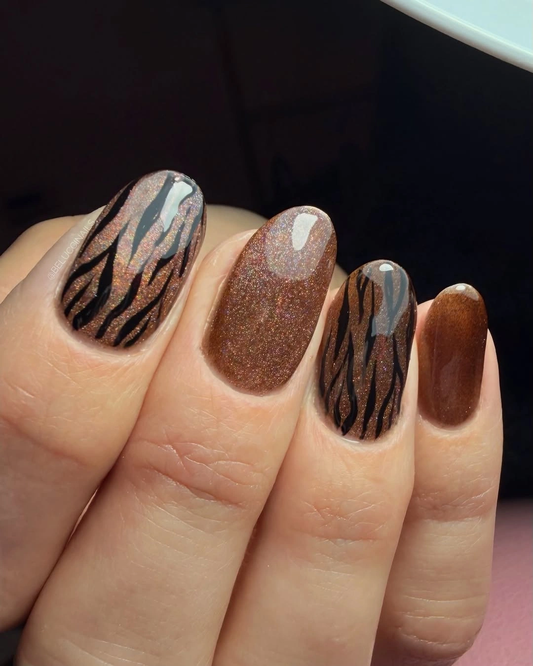
Use one patterned accent and keep the rest chocolate or taupe for an easy fall version. Short-to-medium rounded squares will suit the palette, but the lines should be fewer and wider on a smaller nail. If you want less contrast, replace cream with warm beige and keep the dark marks concentrated near the tip or center.
The pattern needs open space to stay legible, so adding another motif would blur the intended rhythm. Let the brown solids be the continuity and the light nail be the interruption. The manicure pairs well with knits because its warmth is built into the color family. The small line detail changes the balance enough without asking the whole hand to become graphic.
Lilac Pink And Purple At The Edges
Pale lilac and pink keep the center of these long stiletto nails light, while deep purple edges reinforce the pointed shape. The fine dark border is the smallest feature with the largest visual effect because it directs the eye toward the tip and makes the gradient appear sharper. The glossy surface helps the cool transition remain visible instead of turning chalky.
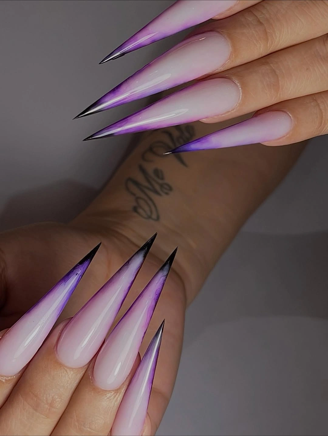
Use a medium almond for a more practical version and keep the dark purple only at the tip or side edge. A softer berry can replace the deepest purple if you want the fall color to feel warmer, but preserve the pale center so the gradient still has contrast. Reduce the number of fine lines on a shorter nail; the edge alone can carry the shape.
The pointed length and precise border are the main maintenance considerations. As the nail grows, the pale base and dark edge will make the change visible, while a blurred border can weaken the direction. Keep the design selective and let the color transition do the work. The manicure feels balanced when the dark edge sharpens the light surface rather than enclosing it completely.
Chocolate And Charcoal In A Glossy Pair
Chocolate brown and charcoal gray alternate across short-to-medium oval nails, with the glossy finish creating the small shift that keeps the near-monochrome palette alive. The colors are close in depth but different in undertone, so the eye notices the change slowly rather than through a loud accent. A few subtle reflective marks add emphasis without breaking the quiet structure.
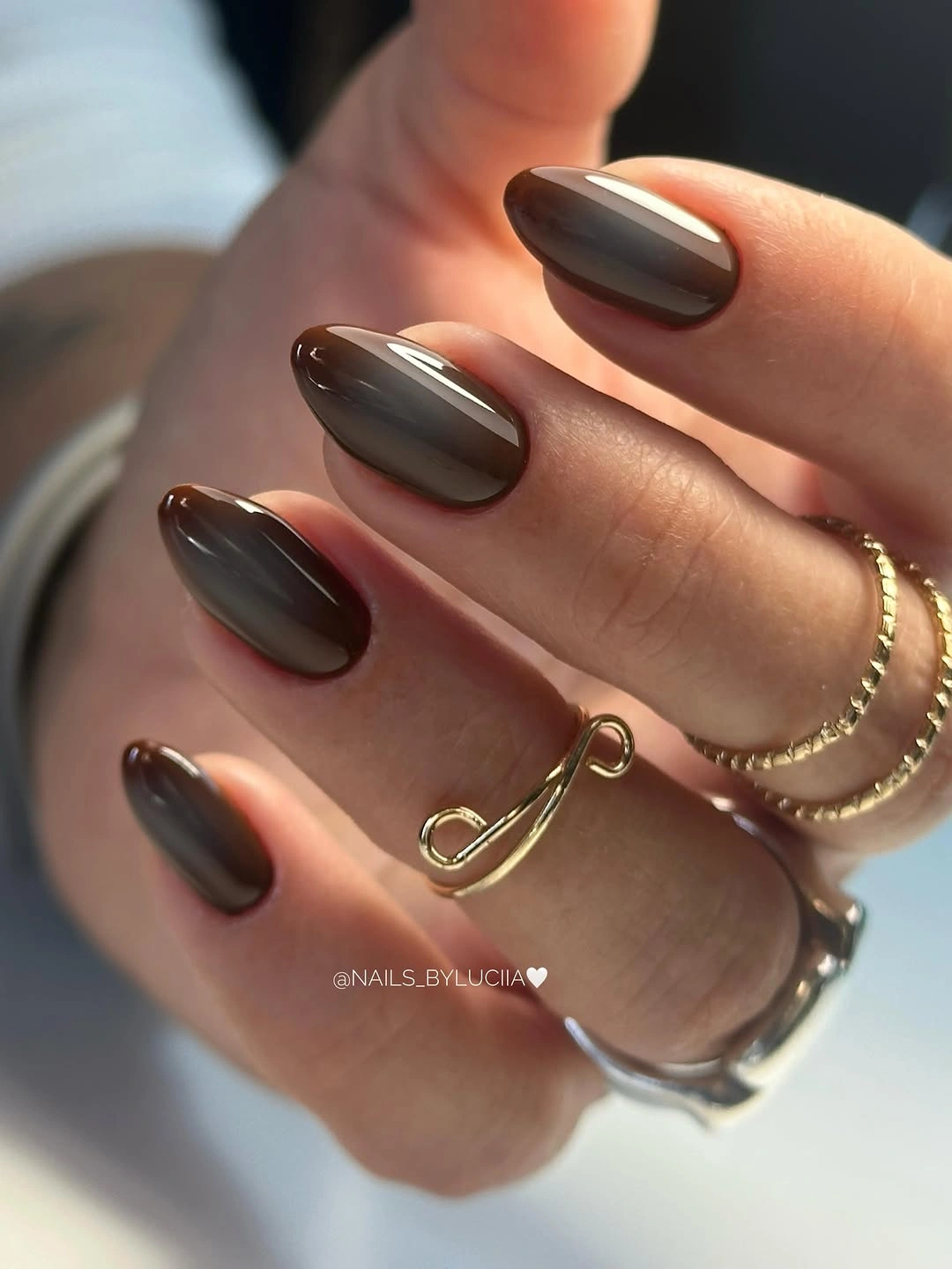
Keep chocolate on most nails and use charcoal on two accent fingers for an easy, restrained manicure. A softly rounded oval will preserve the practical silhouette, while a warm espresso can replace the gray if you prefer less cool contrast. Leave the surfaces mostly solid so the difference in undertone remains the main detail.
The palette can look nearly uniform in dim light, which means the finish and neat edges carry much of the visual interest. That is a useful limit to understand before choosing it. Keep the reflective marks small and let the brown and charcoal repeat. The result feels rich because the colors are close enough to relate, yet different enough to create a quiet rhythm.