
A seasonal nail color does not need a costume to feel timely. The shades that stay interesting are often the ones that change character with light, distance, and the shape of the nail itself. Depth can be quiet, reflection can be restrained, and a dark tone can look unexpectedly light when it is given enough space around the edges instead of being forced to explain itself.
Choose color by deciding what you want it to do, not by asking whether it belongs to a particular month. Some shades steady the hand, some sharpen it, and some create a soft interruption in an otherwise familiar routine. Once that role is clear, finish and placement become useful adjustments: they can deepen the mood, open it up, or make the same shade feel entirely different.
Deep Wine Red With Mirror-Like Gloss
Medium almond nails in a deep wine red prove that one color can create enough atmosphere when the coverage is even and the finish is glossy. The shade appears darkest near the edges and lighter where it catches the light, so it has dimension without any added art. Its clean surface lets the tapered shape remain visible, which keeps the rich red from looking heavy or flat.
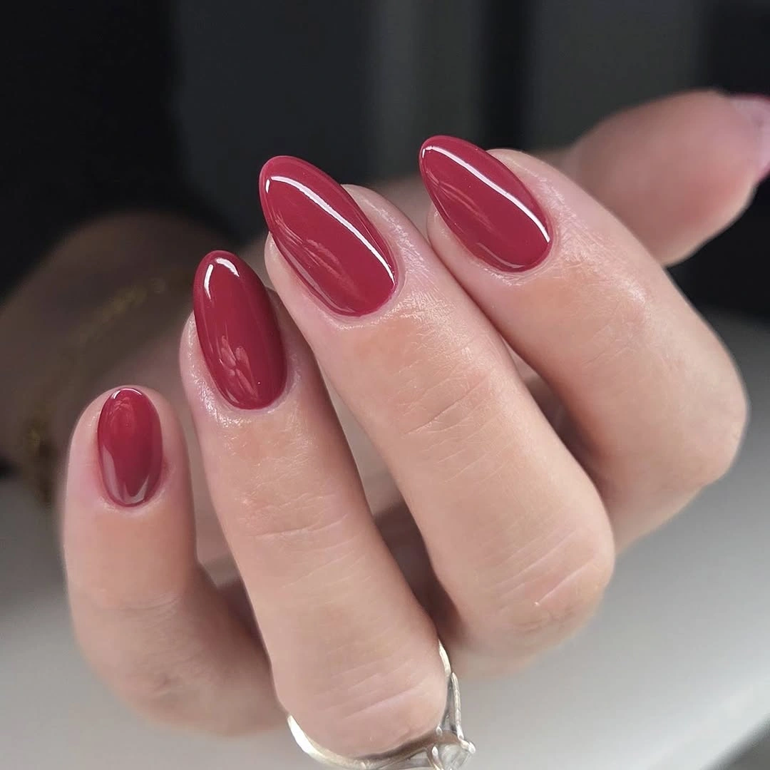
Wine red works well as a nail colour for October because it sits between a bright berry and a nearly brown depth. If you want the effect to feel softer, choose a slightly shorter oval and keep the polish free of extra accent nails. Adding gold or black could make the result more ornate, but the uninterrupted red is the reason this version feels so composed.
Uniform dark color asks for clean edges, since small chips become more visible at the tip than they would with a pale neutral. A thin transparent-looking top layer can help preserve the reflected light that gives the shade its depth, without changing its appearance. The almond silhouette keeps the red fluid; a sharp square would make the same color look more graphic and assertive. For adjacent deep-tone inspiration, see the site’s maroon fall nails.
Olive Tips With Quiet Botanical Marks
Olive green appears at the tips and in small painted details against pale pink nails, creating an earthy palette with more lightness than a full olive set. Tiny cream-and-green marks sit on selected fingers, while the open base prevents the design from feeling dense. The contrast is subtle but clear: olive adds depth at the edges, and pink leaves room for the small decorative placement to breathe.
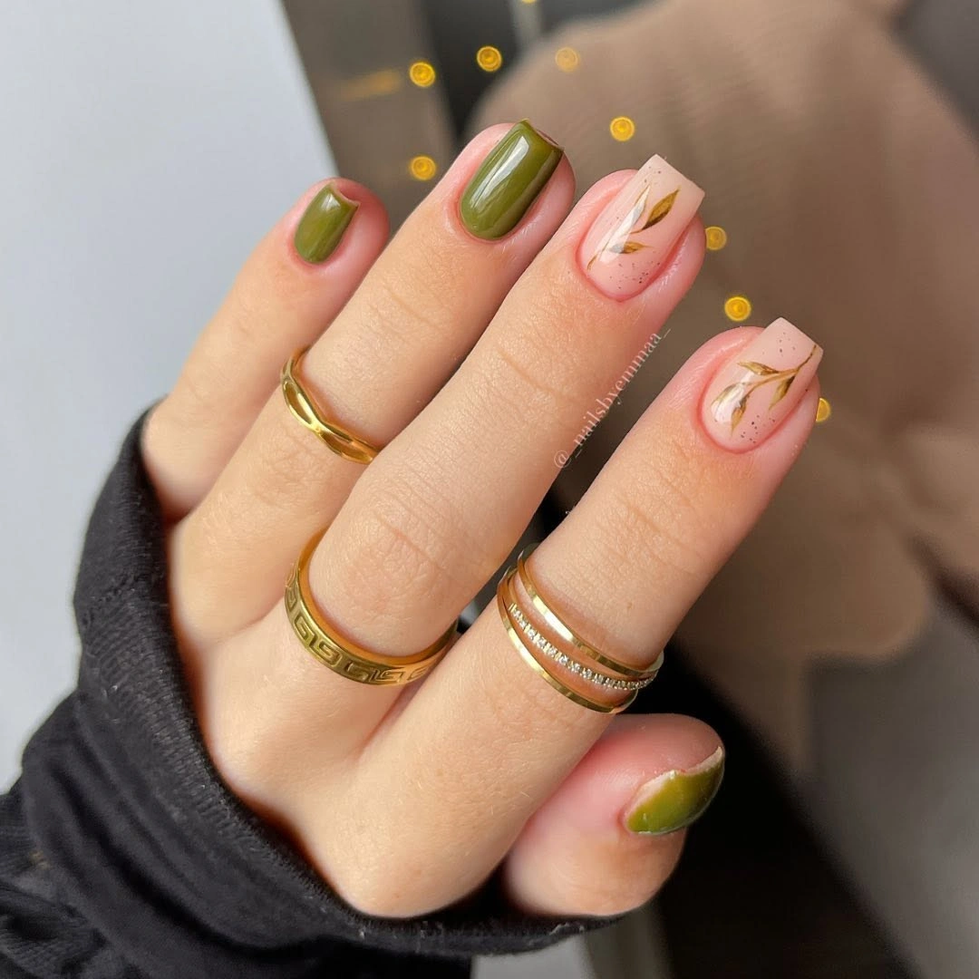
The design is most convincing when the olive is treated as a border rather than spread equally over every nail. To make it simpler, use the green tip on two or three fingers and choose one botanical accent as the only drawing. That edit preserves the soft seasonal direction while making the color placement easier to read from a distance.
Olive tips are darker than the natural-looking center, so new growth can be less obvious than with a full saturated nail but more noticeable than with a blurred gradient. Keep the line slightly curved and narrow if practical upkeep is a priority. The pale base does important work here, because it stops the green from becoming too heavy on a shorter length.
Deep Teal Beside Pink Leaf Accents
Deep teal solid nails are paired with pale pink accents traced by fine teal leaves, combining a dense cool color with delicate line work. The solid nails create a strong inky base, while the leaf patterns repeat the same shade in a much lighter visual voice. That variation makes the manicure feel coordinated without requiring every finger to carry the same amount of color.
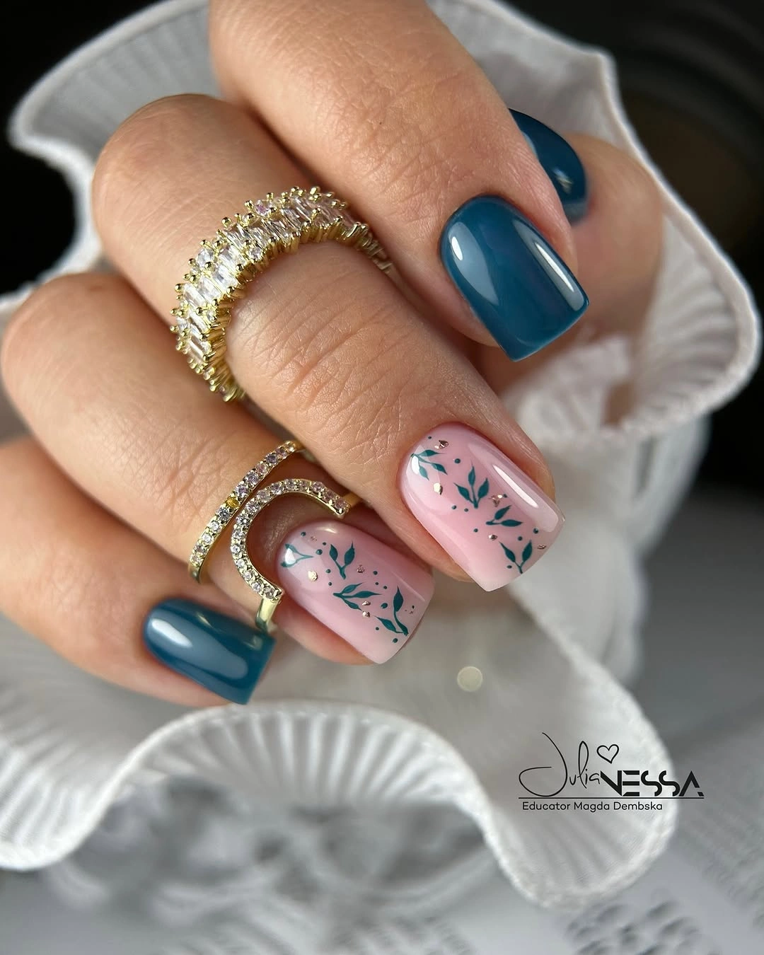
The leaf detail is most effective because it stays narrow and leaves the pink surface visible between the stems. If you prefer less contrast, use teal only as a small side accent instead of full solid nails, then keep one leaf nail as the focus. Adding another cool shade would be unnecessary, since the repeated teal already provides enough continuity across the hand.
Square tips give the dark teal a compact, graphic finish, but their corners can make wear at the free edge easier to notice. A soft square would retain the same color blocking with a slightly gentler outline. The pale accent nails should remain smooth and uncluttered, because the line work needs open ground to feel precise rather than busy.
Pearly Taupe With a Smoky Brown Shift
Medium almond nails use a taupe-brown base with a pearly reflection that shifts across the curved surface. The color stays neutral at first glance, yet the light-catching finish adds a smoky depth that keeps it from reading as plain beige. It is a quiet manicure with a controlled after-dark energy, especially where the reflective sheen makes the brown appear cooler or warmer in different angles.
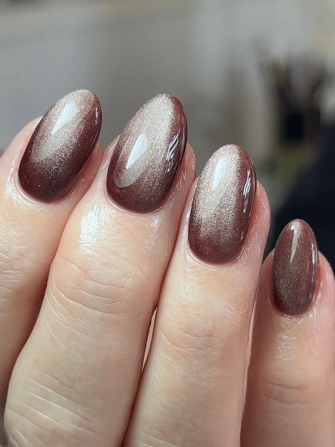
The strength of this shade is that its detail comes from finish rather than a drawn motif. A simpler color palette is all it needs, so resist adding a bright accent nail that would interrupt the subtle change in reflection. If you want more contrast, choose a darker taupe on one finger only and let the rest keep their pearly brown surface.
Shimmered neutrals depend on an even application because irregular texture can distract from the soft reflected effect. A short almond or oval would make this idea especially wearable, while a very long point might turn the neutral into a more dramatic statement. The color remains versatile because it responds to light without becoming a high-saturation focal point.
Orange and Brown With Leaf-Like Detail
Bright orange, deep brown, and pale pink are arranged across medium almond nails, with a leaf-like accent carrying tiny warm metallic marks. Orange supplies the brightest point, while the dark brown anchors the palette so it feels autumnal rather than purely citrus. The pale accent nail gives the leaf detail a calmer setting, allowing the colors to appear layered instead of piled on.
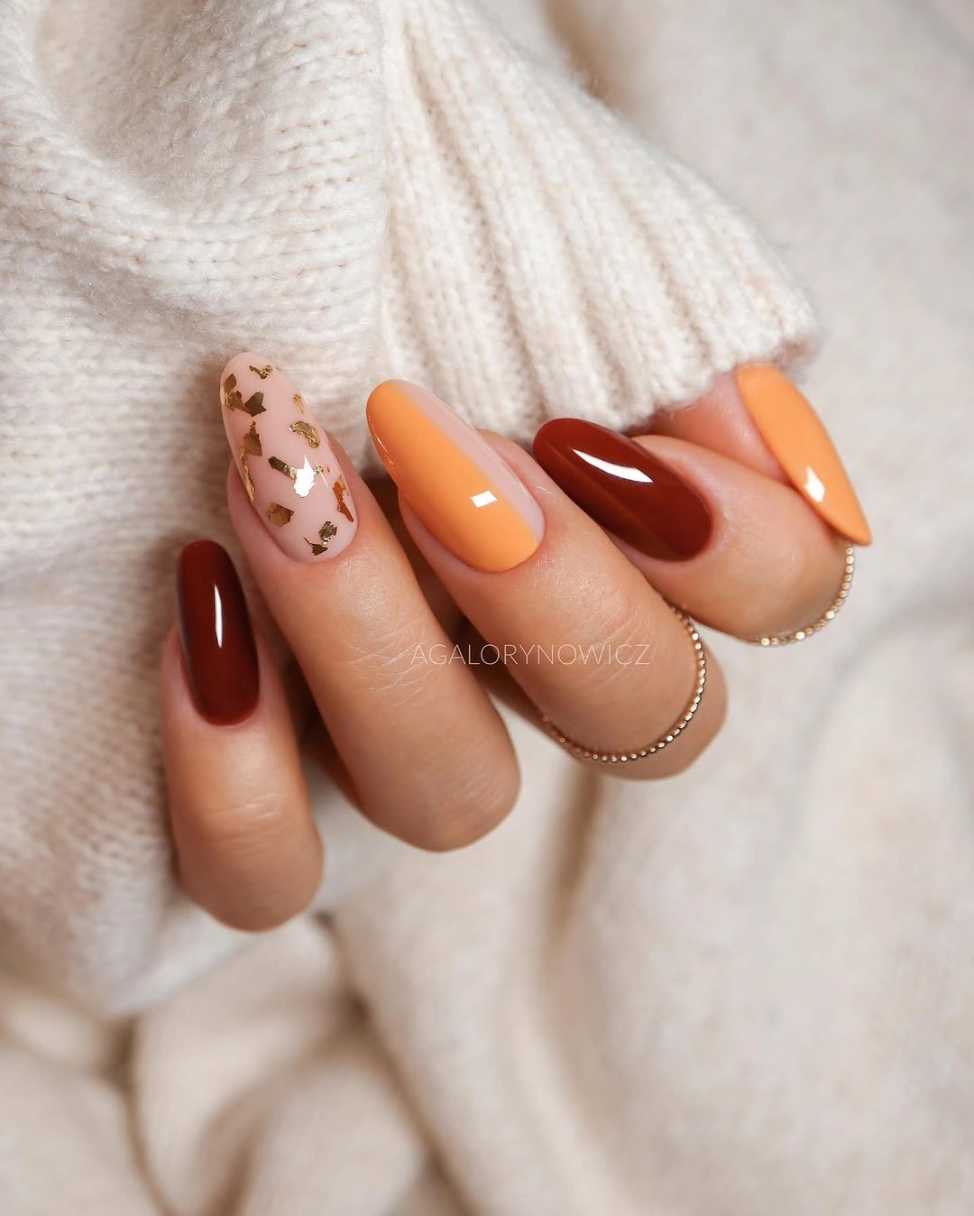
Color contrast is the main event here, so a good edit would be to keep either the orange or brown as the full-color nail and let the other appear only in the accent art. That choice makes the arrangement easier to pair with clothing and reduces the visual competition between two saturated tones. The small metallic marks should remain restrained, because they are there to catch light, not to become a third main color.
The almond shape helps the leaf-like motif follow a natural direction through the center of the pale nail. On a shorter set, use one orange nail, one brown nail, and one simple accent rather than trying to repeat every color. The warm palette stays readable when each shade has a distinct role: brightness, depth, or small detail.
Olive Panels With Fine Pale Florals
Olive green panels sit beside pale pink nails with thin dark leaves and small white flower-like marks. The design feels softer than a full olive manicure because the pale base breaks up the darker color and makes the botanical lines appear more delicate. Olive remains the color anchor, but the narrow placement keeps it from covering the hand in a single heavy block.
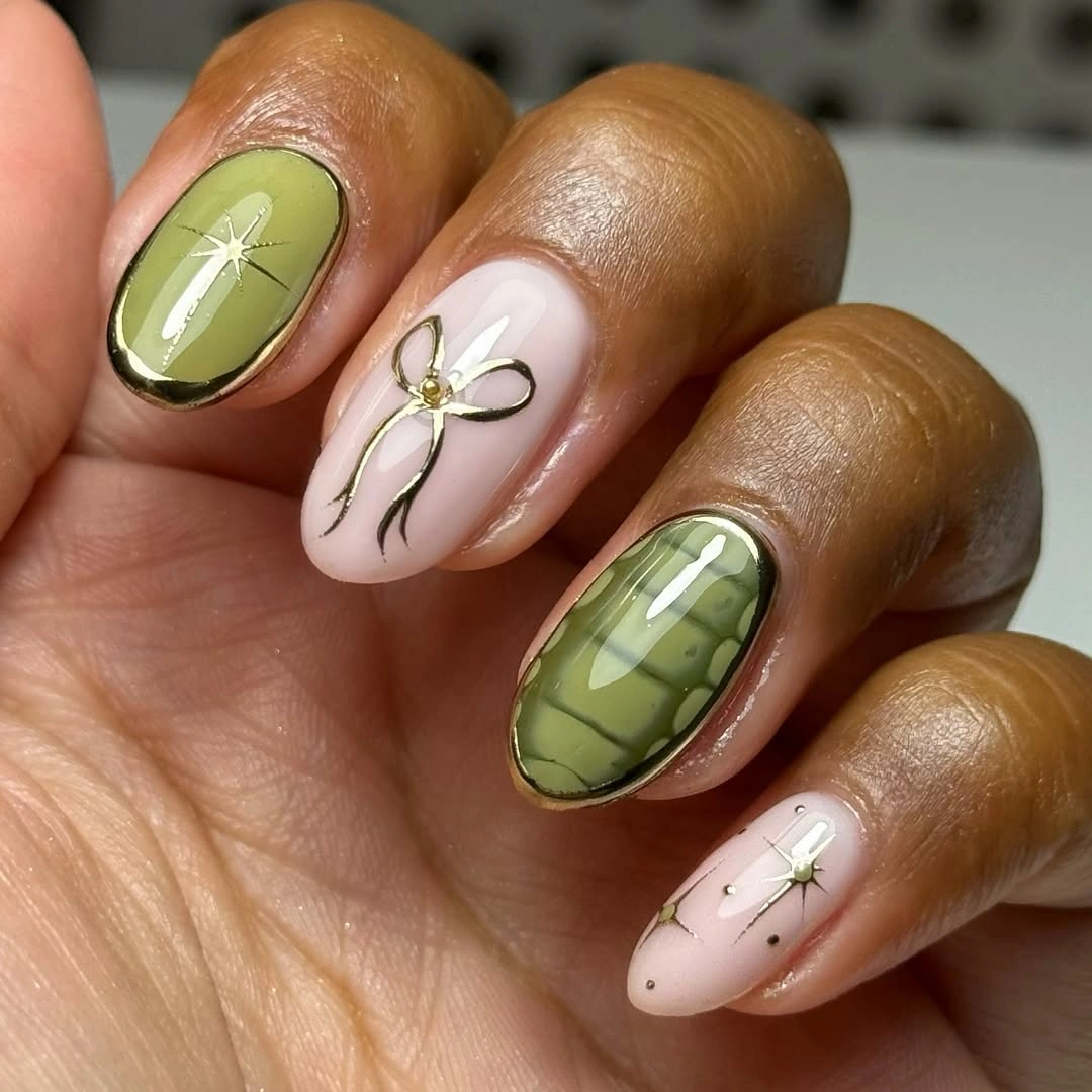
The most useful adjustment is controlling the number of drawn elements on each pale nail. Keep one flower or leaf cluster clear, then let the remaining space stay pink and glossy. If more intensity is wanted, deepen the olive slightly rather than adding another bright shade, since the muted green is what gives the manicure its grounded, earthy character.
Fine florals need a quiet background to remain visible, so skip extra glitter or thick French edges around them. The design will read best when the olive panels have clean boundaries and the pale nails carry only a few crisp marks. A rounded shape would soften the result further, while the current proportion keeps the line work neat and contemporary.
Fine Burgundy Outline Around Soft Pink
Short rounded-square nails use a pale pink center surrounded by a thin burgundy outline. That narrow border creates more tension than a full dark tip would, making the soft base look intentionally framed without losing its lightness. Because the line follows the nail’s perimeter, the color also emphasizes the compact shape and gives a minimal set a very deliberate finish.
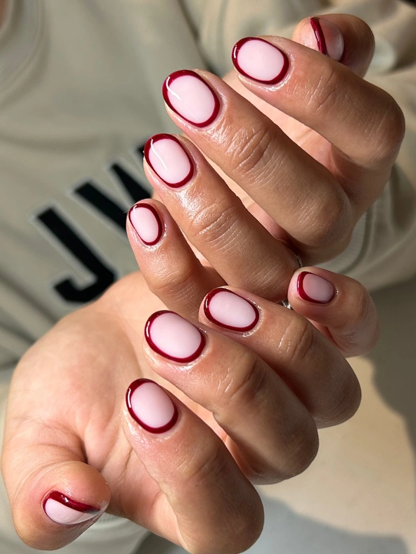
The burgundy line should remain slim and evenly spaced, otherwise it starts to overpower the pink field that makes the design feel clean. For a more understated variation, frame only the tip and one sidewall rather than tracing the entire nail. That partial outline would preserve the same color contrast while making the grow-out area less visually defined.
Minimal borders are practical only when the line work stays crisp, so any uneven wear may be noticeable sooner than with a softly blended color. A darker berry could substitute for burgundy if you want a cooler finish, but avoid adding a second accent shade. The beauty of this idea is its restraint: one pale color, one deep color, and a precise relationship between them. More pale-base variations are collected in these nude fall nail ideas.
Green Web Tips With Black Shadows
Long square nails pair nude-pink centers with black French tips, bright green web patterns, and dark spider-like details. The black tips create a shadowed frame, while the green becomes a concentrated flash within that darker zone. Leaving the center nude is essential because it prevents the design from becoming a full wall of color and lets each web line stay distinct.
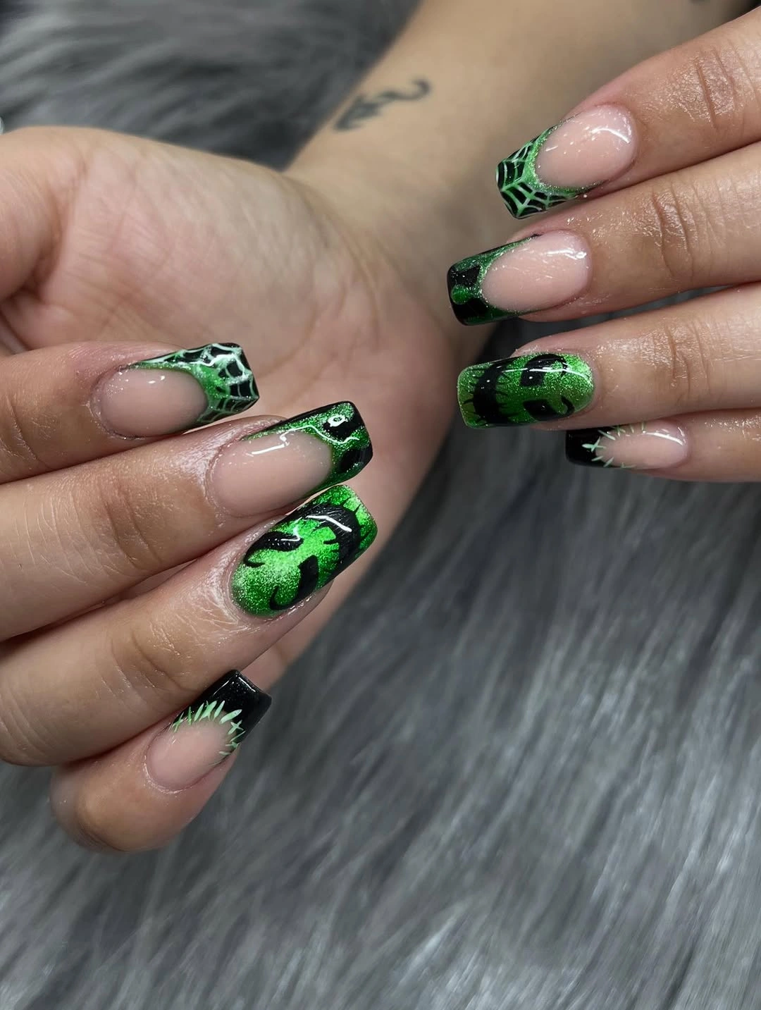
The green is most effective when it appears in selected web sections rather than on every tip. A more wearable version could use black French edges on most nails and place the bright green web on two accents only. That gives the color its own moment while preserving the contrast between pale center, dark edge, and neon-like detail.
High-contrast tips can make edge wear and new growth easier to notice, especially on a long square shape. Keep the web lines open rather than packed tightly so they do not blur into the black background. If a shorter length is chosen, reduce the spider-like details first and let the green web be the single recognizable visual feature.
Mustard Tips With Tiny White Ghosts
Mustard yellow tips sit over nude bases with small white ghost figures, orange accents, and fine black seasonal marks. The warm mustard acts as a softer alternative to classic black or red, giving the long square shape a distinct color block before the small art appears. The white ghosts stand out because they are placed against clear nude space rather than crowded directly into the tip color.
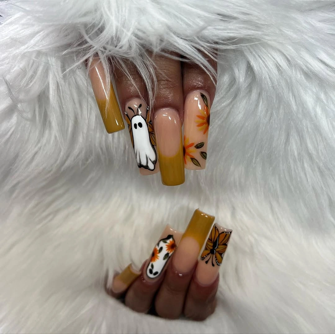
Spacing is the detail that keeps this set readable, so let the ghost appear only on one or two nails and use the mustard edge elsewhere without extra decoration. If the orange marks feel too busy, remove them before changing the yellow; mustard already establishes the warm palette. Keeping black as a fine line rather than a broad area preserves the lightness of the design.
The long square length provides room for several motifs, but it can make the tip area look heavy if every nail has an icon. A shorter version would benefit from one mustard French edge and one small white accent, leaving the other nails mostly nude. The pale center is not empty space here – it is the relief that makes the warm color and small drawings work together.
Taupe Copper Mustard and Burgundy Mix
Taupe, copper glitter, mustard yellow, and deep burgundy appear as separate solid nails in a compact square manicure. Rather than blending the shades, the set lets each finish have a distinct place: taupe softens, glitter reflects, mustard brightens, and burgundy adds depth. That separation makes the mix feel intentional even though the palette includes several warm notes at once.
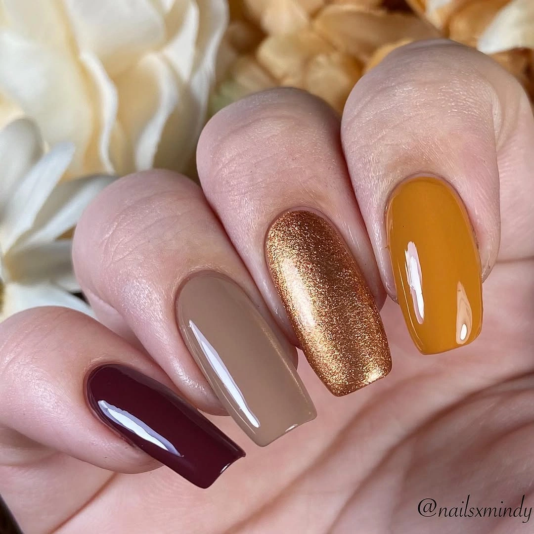
The copper glitter serves as a bridge between the muted taupe and the stronger yellow or burgundy, which is why one reflective accent is enough. To edit the palette down, keep taupe and burgundy as the main pair, then choose either mustard or copper for a single interruption. Adding all four colors on every nail would remove the calm color-block rhythm that makes this set appealing.
Short square nails suit this approach because each solid color is easy to identify at a glance. The practical advantage is that minor wear can be less obvious on a mixed set than on a uniform dark manicure. Keep the finishes smooth and the glitter confined to one or two nails, because too much shimmer would make the palette feel less grounded and more scattered.
Lavender Shimmer With a Small Ghost
Soft lavender nails catch light with an iridescent-looking sheen, while a white ghost, orange pumpkin-like mark, and small gold drip add selective seasonal detail. The lavender changes the mood of the tiny icons by giving them a cooler, lighter background than a dark Halloween palette would. Its reflective surface remains the larger visual field, so the accents feel like small interruptions rather than a crowded theme.
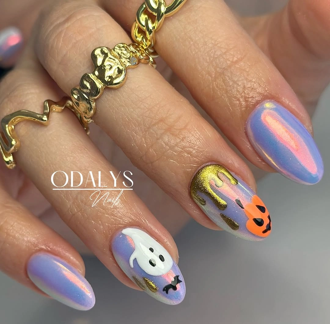
The most balanced version of this manicure would place the ghost on one nail and let the lavender shimmer remain uninterrupted on the others. A single orange or gold accent is sufficient, because both are already warmer than the base and immediately draw attention. If more contrast is needed, deepen the lavender slightly instead of increasing the number of icons.
Reflective pastel color can make small details look softer, which is useful when you want seasonal art without an overly graphic result. The icons should have clean edges so they do not disappear into the sheen. A medium almond shape gives the lavender enough surface to shift in light, while a very short length would make the ghost and gold detail compete more closely.
Red Reflections on Dark French Points
Medium almond nails use dark bases with reflective red pointed French edges, creating a sharp line of warm light near the tips. The red is narrow enough to feel like a controlled flare rather than full coverage, while the dark base keeps the palette grounded. Together, they make the nail shape look longer and more tapered because the strongest color follows the outer edge.
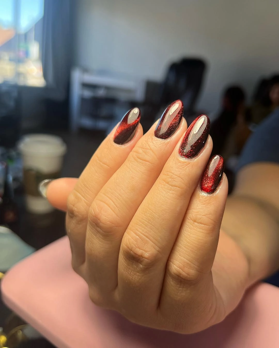
The red edge should stay focused at the tip, since extending it too far down the nail would turn the effect into a heavier two-tone block. If you want less intensity, use a deeper berry-red reflection or a smaller V-shaped point. The dark base already creates enough depth, so adding line art or stones would distract from the clean color geometry.
French points are especially dependent on symmetry, and uneven angles will show more clearly against a dark background. A short almond or oval shape could keep the same red-black mood while making the point less dramatic. The reflected red works because it adds dimension to the black, not because it tries to compete with it as a second full color.
Berry Almond Nails in Uniform Gloss
Deep berry-burgundy almond nails rely on a uniform glossy color and a consistent tapered shape. There are no accent details competing for attention, so the finish itself becomes the visual story: light reflects along the center, while the side edges reveal the shade’s darker depth. The result feels saturated and focused, proving that October nail colour ideas can be built from one carefully chosen tone.
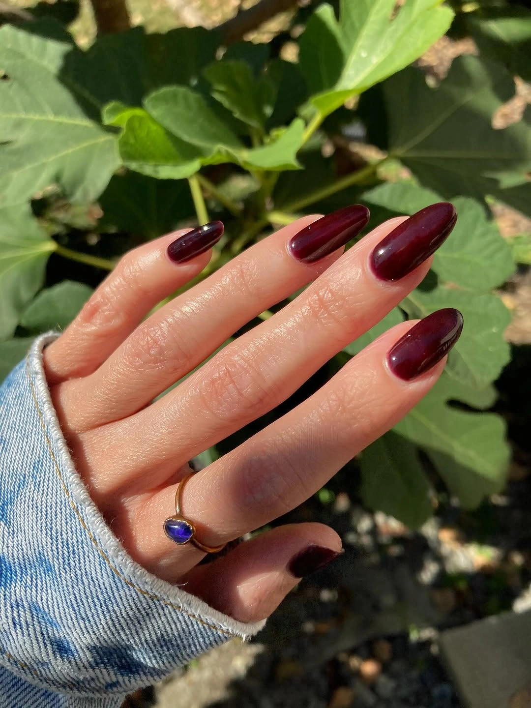
When a manicure is this uniform, the proportion of the nail matters as much as the color. Medium-long almond tips make the berry feel fluid and elegant, while a short square would make the same shade more compact and graphic. If you want a variation, change the finish to a soft shimmer or add one subtle side accent, but keep the color family consistent.
Dark glossy colors show their depth best when the edges and cuticle area remain clean, because there is no pattern to camouflage unevenness. The practical tradeoff is that tip wear may stand out sooner than with a pale neutral. A slightly deeper base at the sidewalls can maintain the sleek outline, but avoid adding extra contrast that would break the calm solid-color effect.
Mint Coffin Nails With One Shimmer Accent
Long coffin nails are covered in a soft mint pastel, with one pale glitter accent providing a small change in texture. The mint is light but solid enough to make the extended shape feel like a clear color statement, while the shimmer nail gives the set a single reflective point. Keeping the accents limited is what allows the airy color to remain the main impression.
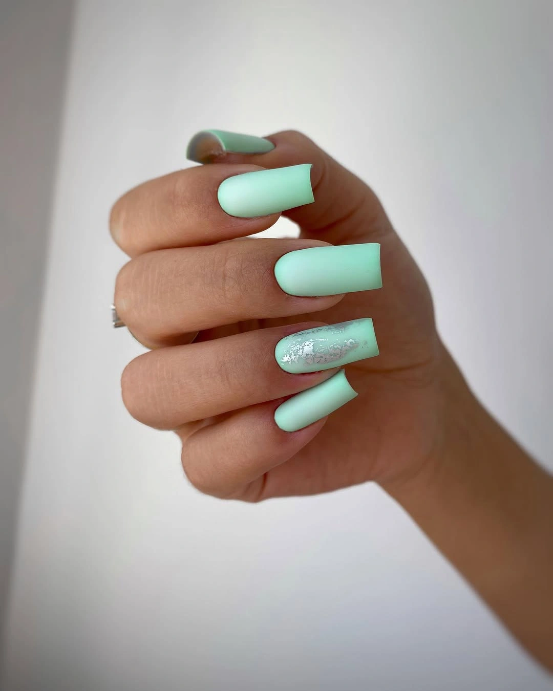
One glitter accent works because it does not interrupt the mint field across the rest of the hand. If you want a cooler version, use a silvery shimmer; if you want a warmer one, choose a soft pearl instead of adding a new saturated color. More glitter would make the long shape look busier, especially because coffin tips already have a strong straight edge.
Pastel mint can make length look more obvious than a dark shade does, so consider a slightly shorter coffin if you want the color to feel softer in daily life. The solid finish will also make uneven corners easier to spot, which is why a clean outline matters. The pale shimmer should remain close in value to mint so it reads as texture, not as a separate nail color.
Green and Yellow Curves With Silver Accent
Nude-based almond nails use curved green and yellow tip sections, a white interruption, and one silver-textured accent. The color is not placed symmetrically, which gives the tips a lively movement while the nude center keeps the set from becoming too saturated. Green and yellow share the edge space, so the design feels more like a composed color arc than a traditional French manicure.
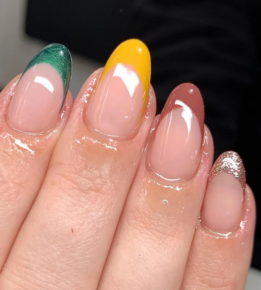
The curved sections work best when each color has enough room to be seen separately. If the design needs simplifying, choose either green or yellow as the main tip and reserve the other for one accent nail. The silver texture should stay limited, because its brightness can quickly become the focal point and pull attention away from the clean colored curves.
Asymmetrical tips are forgiving in one way – they do not require mirrored placement on every nail – but they still need a clear edge between shades. Keep the nude base visible near the cuticle to preserve lightness and reduce the appearance of grow-out. A shorter oval would make the curves feel softer, while the almond shape gives them a more directional, lively finish.
Black and Lavender Tips With Bats
Long pointed nails feature nude-pink centers, black and lavender diagonal tips, tiny bat silhouettes, and pale accents. The diagonal color split is the structural choice that makes the dark-and-purple palette feel spacious, giving the small bats a clean place to sit. Black establishes depth, lavender softens the contrast, and the nude base prevents the pointed shape from looking too visually dense.
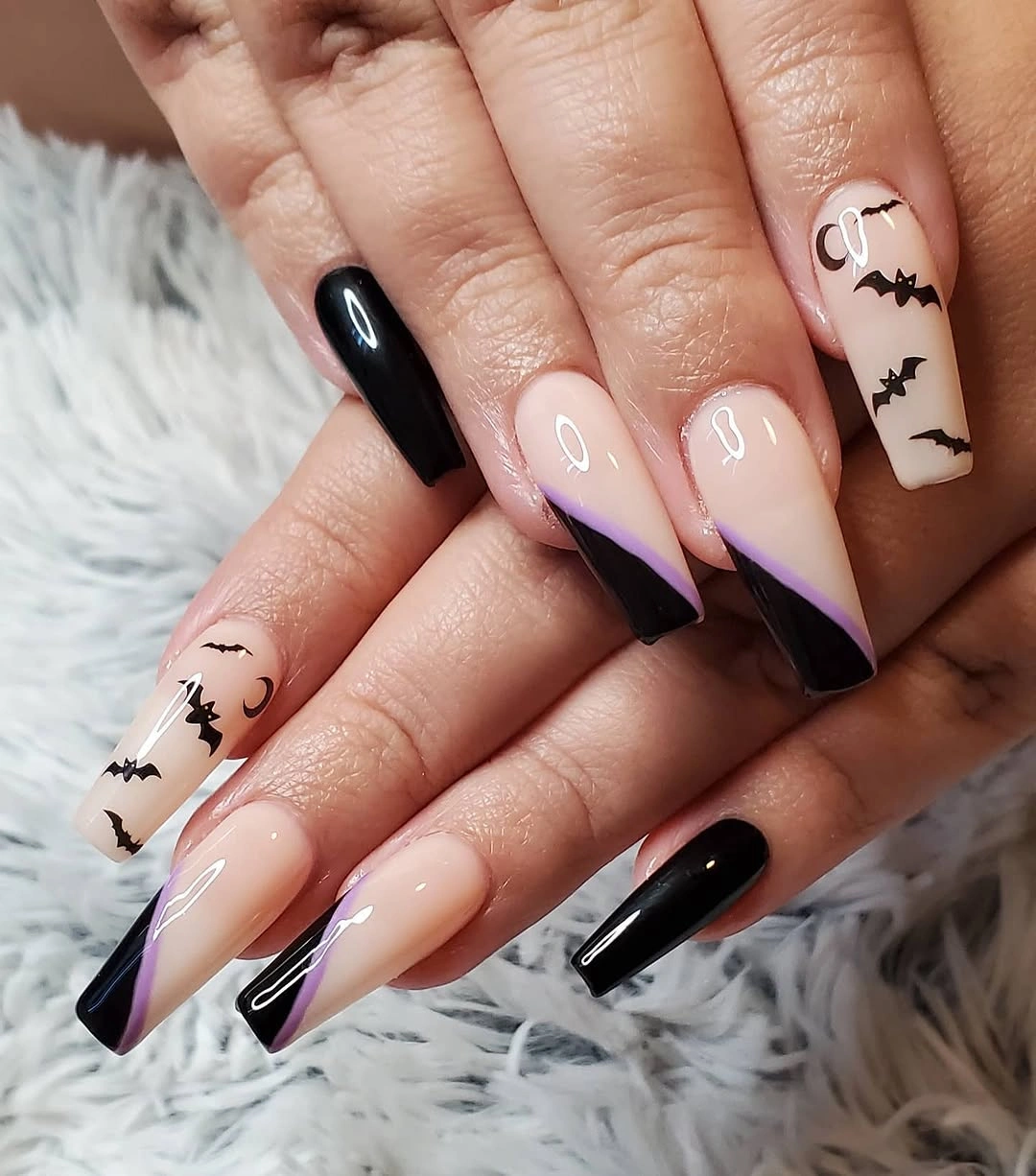
The bats should remain small and limited to a few nails, because the diagonal tips already contain a strong graphic line. A more restrained version could keep the lavender-and-black split on every finger but use one bat as the only illustration. That preserves the color tension while allowing the long pointed silhouette to be noticed as part of the design.
Pointed tips make dark color feel more dramatic, so placement near the free edge is important for keeping the nude center open. If the black begins too far down the nail, it can make the manicure feel heavier and shorten the visible pink space. The lavender is the useful counterpoint here; replacing it with another dark shade would flatten the palette’s depth.
Black Web French Tips on Nude Pink
Medium square nails use a nude-pink base, black French tips, and white spiderweb lines traced across the dark edge. The webs become readable because they sit where contrast is highest, while the pale center remains open and smooth. This is a graphic color story built from only three elements – nude, black, and white – each with a very clear visual job.
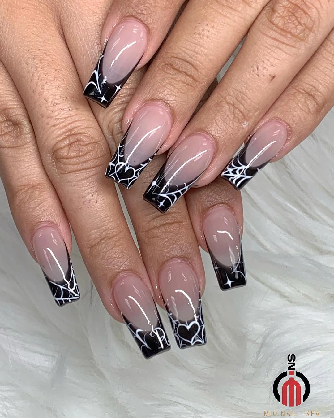
The black tip should not climb too far toward the cuticle, since the nude middle is what keeps the design from looking like full dark coverage. For a lighter version, use web lines on two tips and leave the others plain black or nude. Adding a bright color would shift the focus away from the clean black-and-white structure that gives the set its clarity.
Square tips make the web linework look sharp and architectural, but they also demand neat corners and even borders. Fine white lines are best kept open rather than densely layered, so each web remains legible. A shorter square could carry the same contrast with a smaller tip zone, though the web would need fewer spokes to avoid filling the available space. The site’s fall square nail ideas give another useful reference for maintaining a clear tip outline.
Dusty Rose Marble With Gold Focus
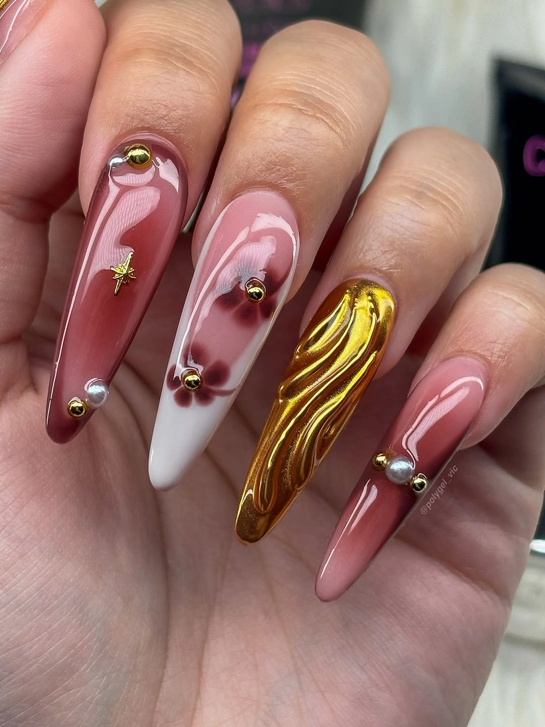
Long almond nails combine dusty rose, white swirls, tiny gold bead-like details, and one gold textured accent. The marble-like movement remains soft because the rose and white stay close in value, while the metallic nail creates one concentrated point of brightness. That single high-shine interruption keeps the palette from becoming too muted without taking over the rest of the hand.
The gold accent is most effective when it remains isolated, allowing the surrounding rose-and-white swirls to retain their quieter rhythm. If you prefer a flatter surface, replace the textured gold nail with a thin metallic line on one marble accent. The color balance would stay intact, but the manicure would feel more practical for frequent hand use and less dependent on raised detail.
Marble patterns do not need identical lines, yet their color density should stay consistent from nail to nail. Keep the white sections soft and connected to the rose rather than adding sharp black outlines that would change the mood completely. The almond shape gives the swirls direction, while the small gold details catch light without disrupting the muted palette.
Glossy Red Squares With a Gold Edge
Long square nails use glossy red as the dominant color, with one nail carrying a small gold-and-red striped or edged accent. The red creates a bold uninterrupted block across the flat tips, and the limited gold provides just enough reflected light to break the uniform surface. Keeping the accent small is what makes the result feel controlled instead of turning it into a full metallic manicure.
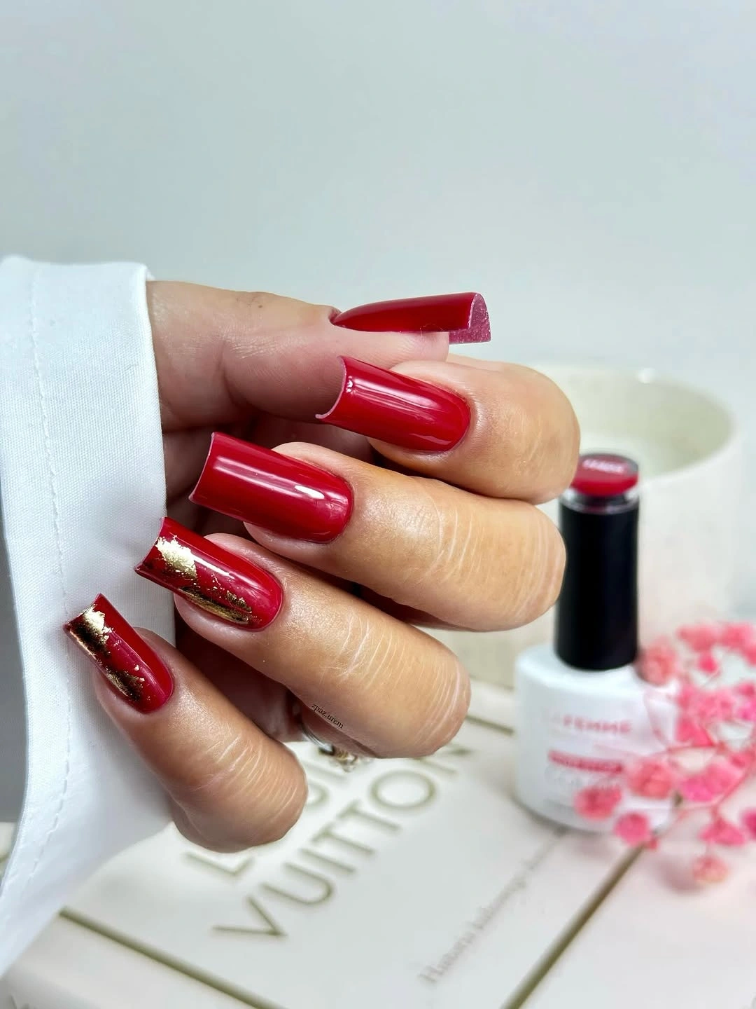
Red has enough visual force that it benefits from a single companion finish rather than several competing details. A thin gold line near one edge or cuticle would be a softer variation, while a full gold nail would make the set much more decorative. The most important choice is preserving red as the primary field so the square shape reads clean and intentionally bold.
Long square tips make solid red especially visible, which means clean corners and even color coverage affect the whole look. For a more relaxed version, shorten the square slightly or choose a softened corner rather than changing the red itself. The gold accent should remain close to the red in scale, because a large metallic pattern would break the strong uninterrupted color line.
Brown Cream and White Ribbon Swirls
Long square nails carry brown, cream, white, and taupe swirls that move like layered ribbons across the tips. The palette remains calm because all four shades stay close to a warm neutral family, while the repeated curves create the sense of motion. Unlike a high-contrast graphic manicure, this design relies on changing line direction and value to keep every nail visually active.
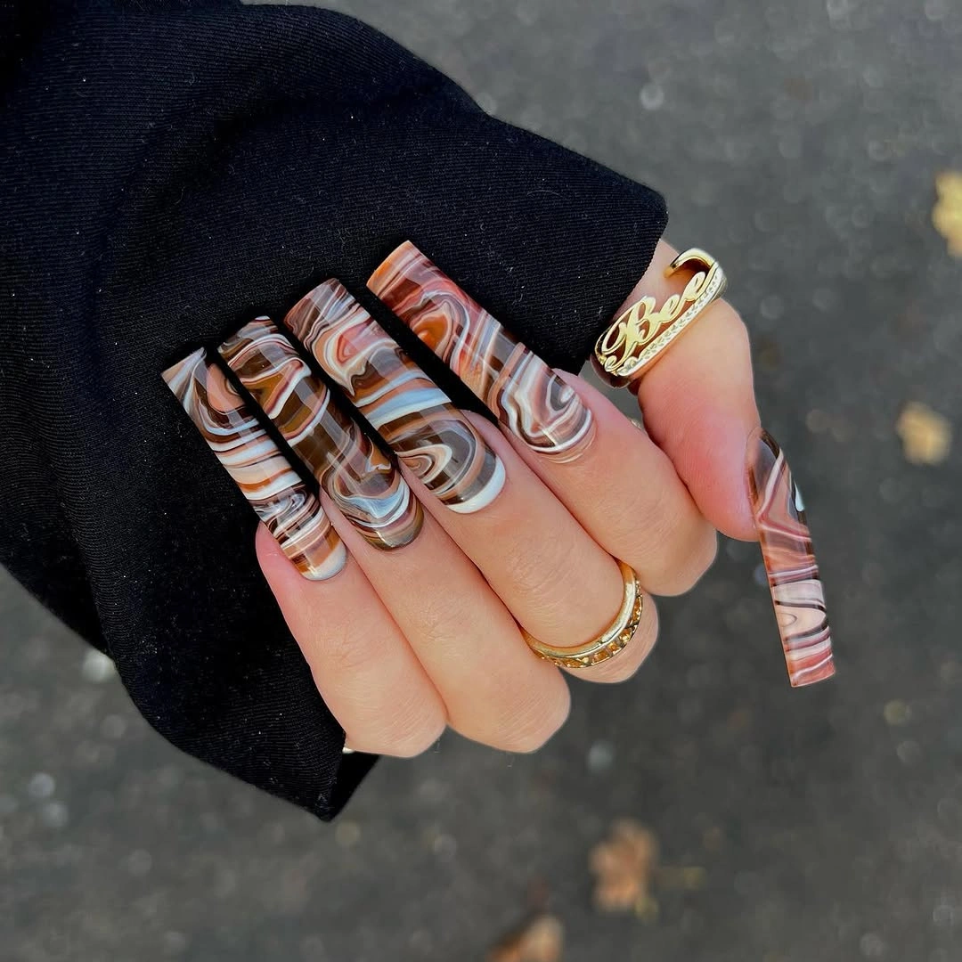
When several neutral swirls overlap, the most useful restraint is leaving clear sections of one color between them. That pause stops the lines from turning muddy and helps the cream or white remain visible against the brown. If a simpler version is preferred, use the ribbon pattern on two nails and keep the others a glossy warm taupe or chocolate brown.
The long flat tips give the curves space to travel, but they also make uneven lines easy to notice. Keep the swirls broad and confident rather than adding many fine strands that can blur together. A shorter square could use fewer, larger arcs and still preserve the same warm abstract direction, especially when the cream is used as a highlight rather than a full base.
Dark Teal Blocks With Peach Leaf Art
Dark teal solid nails are balanced by pale peach accents carrying fine teal leaf-like shapes. The deep teal reads almost inky against the soft warm base, so the botanical marks feel connected to the solid nails without needing a new accent color. This color relationship is calm but not flat: darkness sits on some fingers, while the peach opens space for the details to show their shape.
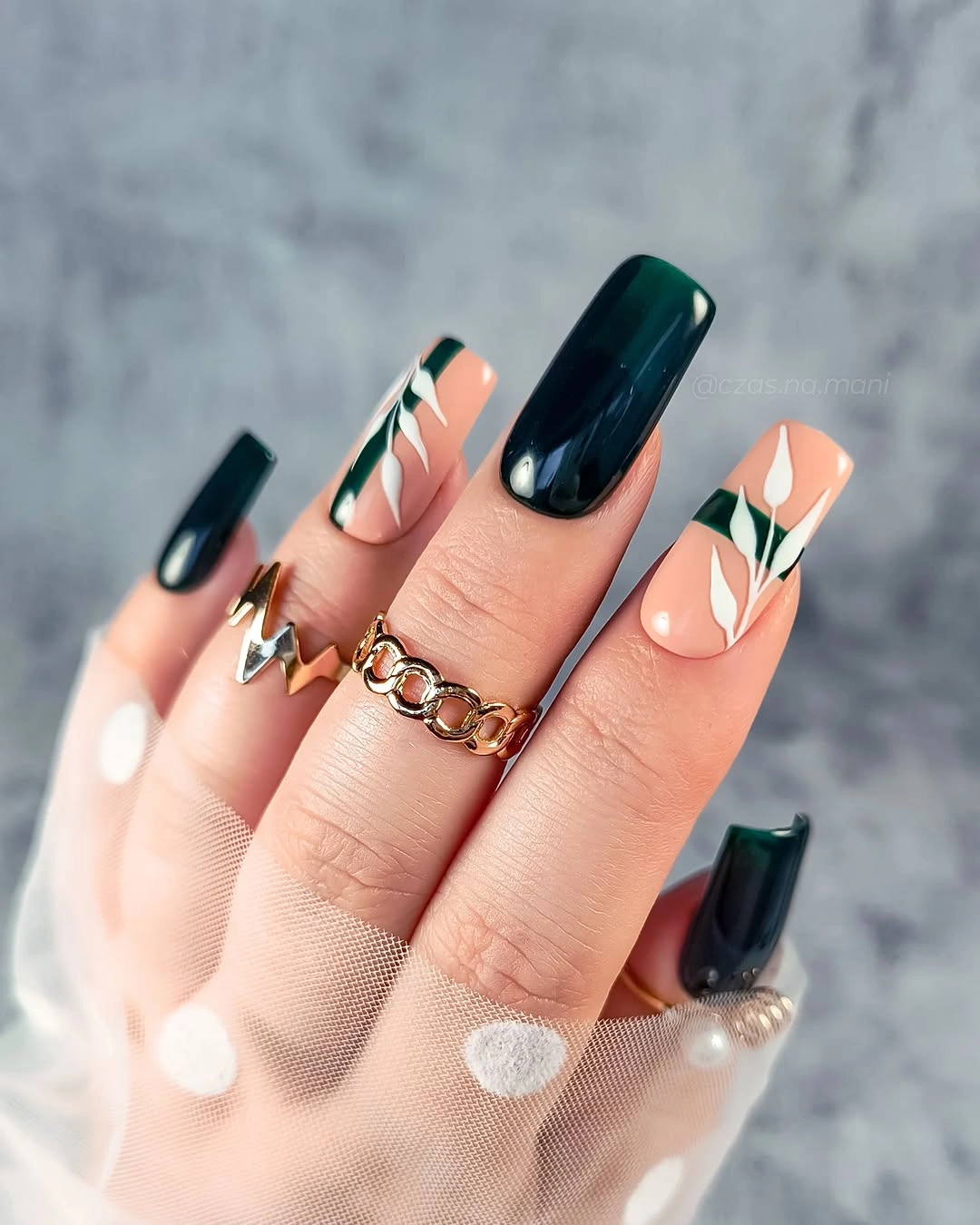
The peach areas should remain generous around the leaf marks, otherwise the fine teal shapes lose their crisp outline. If you want a more minimal manicure, use dark teal solids on most nails and leave one peach leaf accent as the only pattern. That adjustment keeps the color contrast intact and makes the botanical detail feel more intentional rather than repeated for its own sake.
Long square nails give the dark teal a strong silhouette, while the peach accent keeps the set from becoming a single heavy color block. A slim gold ring or warm accessory would pair naturally with the peach, but the nail design itself does not need another metallic element. The finish stays most readable when the teal remains glossy and the leaf art is kept fine and separated.