
A playful manicure becomes memorable when it has the nerve to leave something out. The difference between deliberate detail and visual noise is usually not talent or complexity, but the confidence to give a small mark enough space around it. When every nail asks for equal attention, the hand loses rhythm; when one choice is allowed to lead, even an unusual idea can feel surprisingly composed.
Before committing to a design, decide where the tension belongs and protect that decision. A border changes the silhouette, a central accent changes the pace, and a small interruption can carry more personality than full coverage ever could. Let repetition create continuity, then break it once with purpose; that is the point at which decoration starts to look considered instead of merely busy.
Cobalt Edges With Plaid Accent Nails
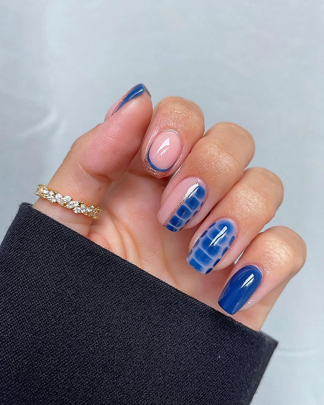
Medium almond nails use a pale pink base, cobalt edges, and a small blue plaid pattern on selected nails. The plaid is the consequential detail because it turns a simple blue French-like outline into a coordinated set without covering every nail. Solid cobalt fingers give the check pattern a clean context, so the design reads as a planned variation rather than a collection of unrelated blue marks.
The blue is placed most heavily at the tips and sides, which keeps the center of each nail light and makes the length appear open. If you wanted a quieter version, keep the cobalt border on two nails and use the plaid only once as a small accent. Moving the pattern onto every nail would remove the negative space that makes the color feel crisp.
Because the contrast is strongest at the free edge, chips or grow-out may draw attention sooner than with a softer fade. A slightly thinner blue line would reduce that effect while preserving the same cool, graphic mood. The almond shape helps the outline look fluid; a square shape would make the plaid feel more structured and slightly more assertive.
Pink Base With Tiny Dark Halloween Marks
A soft pink base gives black French tips, fine web lines, a tiny spider, and red cherry-like accents enough room to remain distinct. The important choice is spacing: each dark or red mark sits on its own small area rather than forming one dense collage. That restraint lets the playful icons feel clean even though several motifs appear across the set.
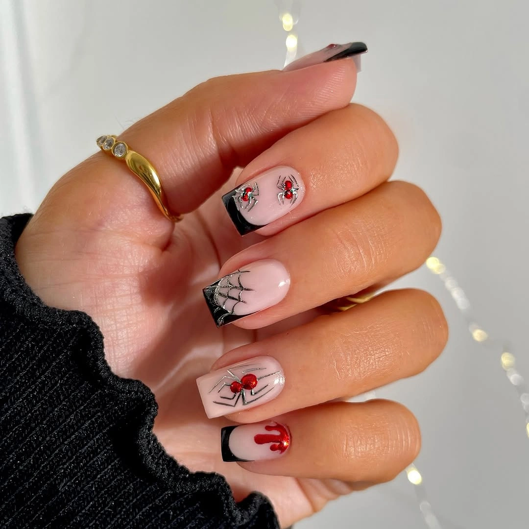
Black is concentrated at a few tips and line details, which keeps it from overwhelming the pale base. For a simpler October nails design, choose either the spider-web direction or the red fruit-like accents, then repeat it sparingly. Keeping both is fun, but a single motif family would make the manicure easier to pair with patterned sleeves or jewelry.
Fine lines need visual breathing room, so avoid adding extra glitter or a heavily textured background behind them. The soft pink field is doing practical work by making the web and red details readable without high color saturation. If a short length is preferred, place the spider or cherry motif closer to the center and reserve the tip for one narrow black curve.
Cream Square Nails With Gothic Webs
Long square nails pair a creamy base with black spiderwebs, dark spider-like motifs, rhinestone-style accents, and sections of nude negative space. The squared length amplifies every graphic element, especially the black line work near the tips and sidewalls. Cream is a smart background here because it is softer than stark white but still clear enough for the dark art to feel sharply placed.
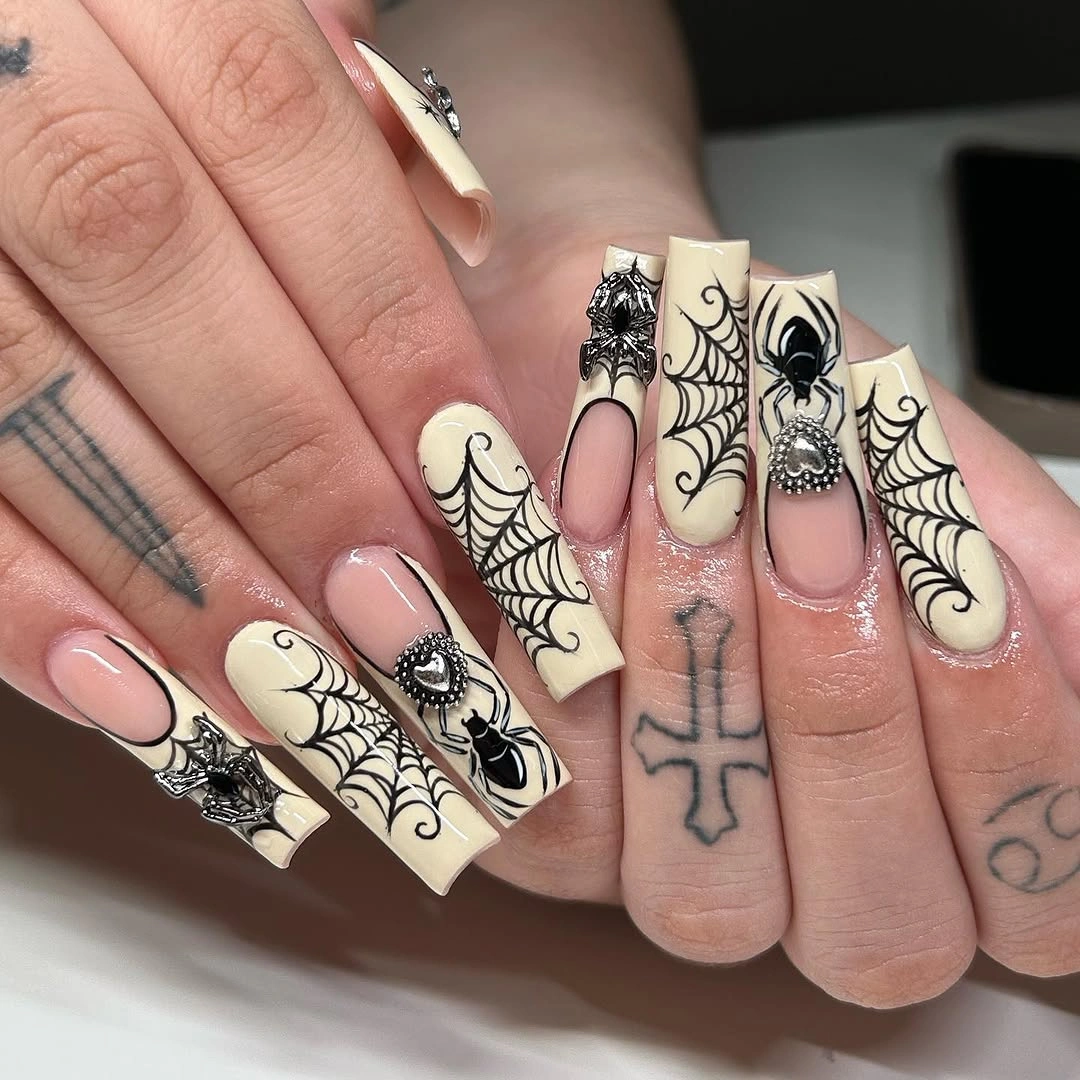
The design succeeds by alternating dense black areas with open cream panels instead of covering all ten nails in the same web pattern. If you want the gothic mood with less intensity, keep a single web accent and use black French edges on the remaining nails. That edit preserves the high contrast while making the length and decoration easier to read at a glance.
Long square tips offer a large surface for art, but they also make every corner and border more visible during wear. A less ornate version would benefit from reducing the raised-looking embellishments and focusing on crisp web lines instead. The cream base will stay the unifying feature even when individual accents vary, provided black remains the only dominant detail color.
Tortoiseshell Center With Electric Blue Outline
Brown tortoiseshell-style centers are framed by vivid blue along the pointed almond tips, creating an unexpected warm-cool contrast. The blue outline is the detail that changes the familiar mottled pattern, giving each nail a more graphic boundary without hiding the brown variation. Because the central pattern remains warm and diffuse, the crisp blue edge feels intentional rather than decorative overload.
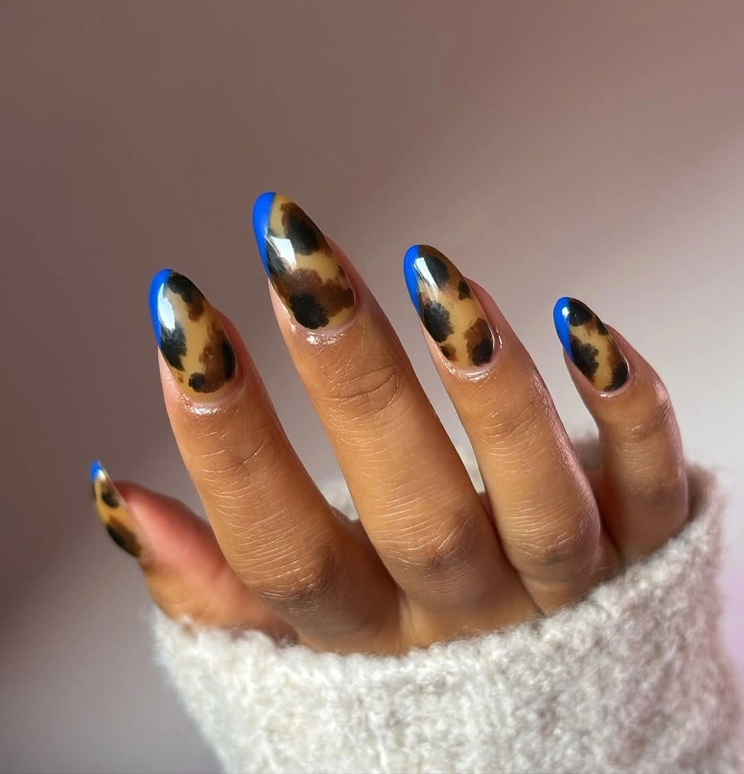
There is enough color contrast already, so the most controlled adjustment would be changing only the blue from bright cobalt to a deeper navy. That would keep the outline visible while making the manicure easier to wear beside neutral clothes. Replacing the blue with another warm color would flatten the distinction that gives this set its character.
The pointed shape extends the blue border, which makes the nails look longer and more dramatic than a rounded version would. On a shorter length, use the mottled pattern on one or two accents and create a smaller blue tip on the rest. The pattern does not need to be identical on each finger; its visual consistency comes from the shared border and warm center.
Teal Mustard Blocks With Gold Speckles
Short rounded nails combine mustard, deep teal, soft pink negative space, and fine gold-speckled accents. The half-moon and color-block placement makes the design look graphic without requiring a full nail of pattern on every finger. Teal and mustard create a strong seasonal contrast, while the exposed pink sections keep the compact length from looking visually crowded.
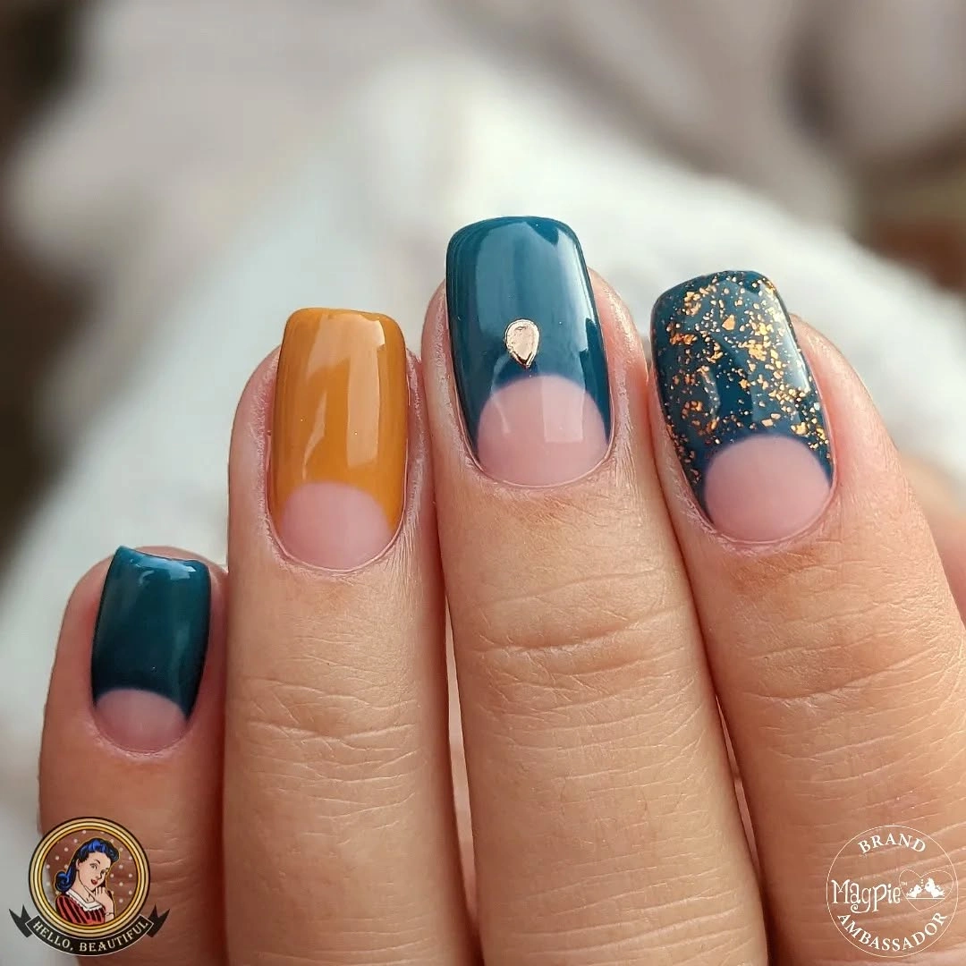
The tiny gold flecks work as a supporting texture rather than a headline, which is why the larger teal and mustard shapes remain easy to notice. To simplify the set, reserve the speckles for just one teal accent and repeat the plain color blocks elsewhere. Adding gold to every nail would make the finish more uniform but would reduce the clean spacing between the colors.
Short nails can carry color placement especially well when the shapes are bold and the base color remains visible. A narrow mustard curve near the cuticle would be a practical substitute if a larger block feels too strong. Keep the lines clean and avoid a third saturated color, because the teal-mustard contrast already provides enough movement for the length; these fall nail art ideas are a useful companion for comparing detail density.
Small Ghosts and Pumpkin-Like Accents
Pale pink short nails hold tiny white ghost faces, orange pumpkin-like marks, a black web, and a small drip detail. The mini icons are separated so that each one can be noticed without turning the whole manicure into a dense scene. Their scale matters more than their number: small accents feel playful against the clear base because the pink remains visible around each drawing.
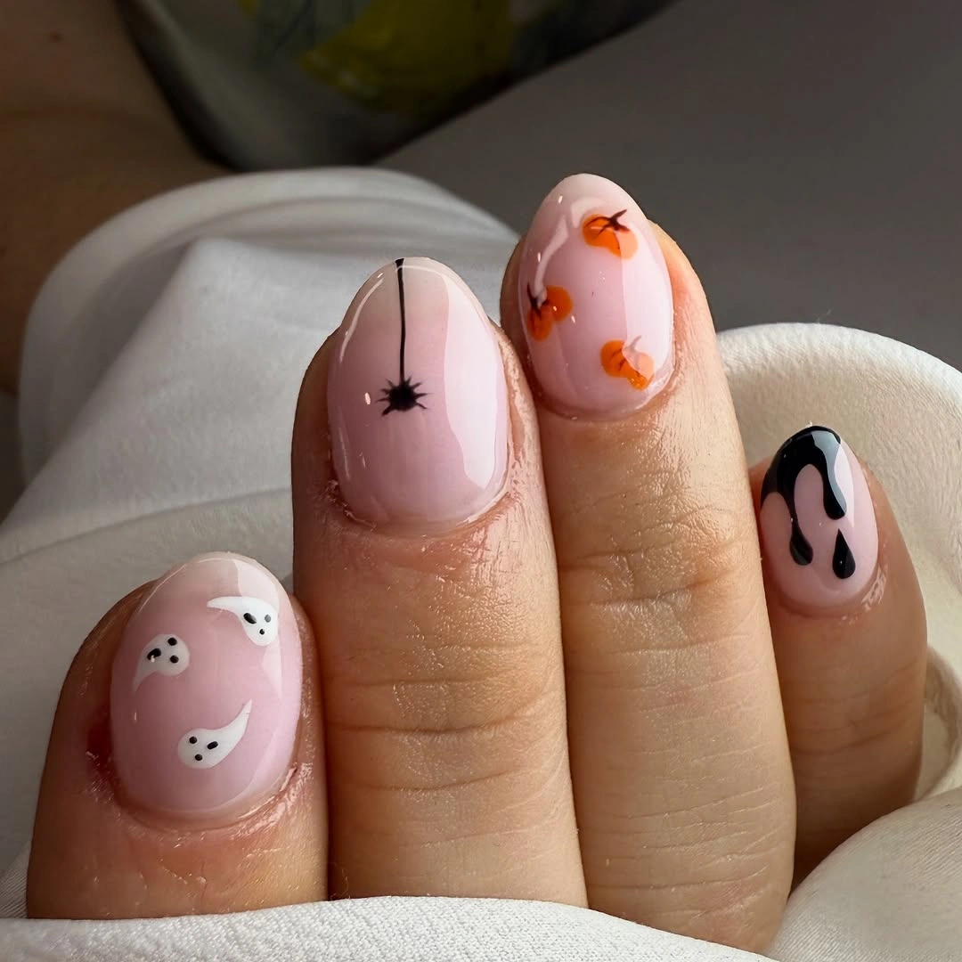
For a less decorated version, keep the ghost on one nail and use the orange detail as a single companion accent. The black web should stay thin, since a wide dark section would pull attention away from the lighter icons. This is a good example of how negative space can make seasonal art feel more considered than adding another character or symbol.
The short rounded shape is practical for tiny motifs because it gives them a soft, compact frame. Very detailed art near the sidewalls may look less distinct as the nails grow, so place the key icon closer to the center. A glossy pale base helps the small white and orange marks remain legible without needing stronger outlines around every feature.
Lime Glitter With Black Drip Edges
Medium almond nails use a bright lime glitter base with thick black drips around the tips and one face-like black accent. The black placement is intentionally concentrated at the edge, allowing the luminous green surface to remain the larger visual field. That division gives the manicure a bold, almost illustrated look while still leaving the almond shape visible through the contrast.
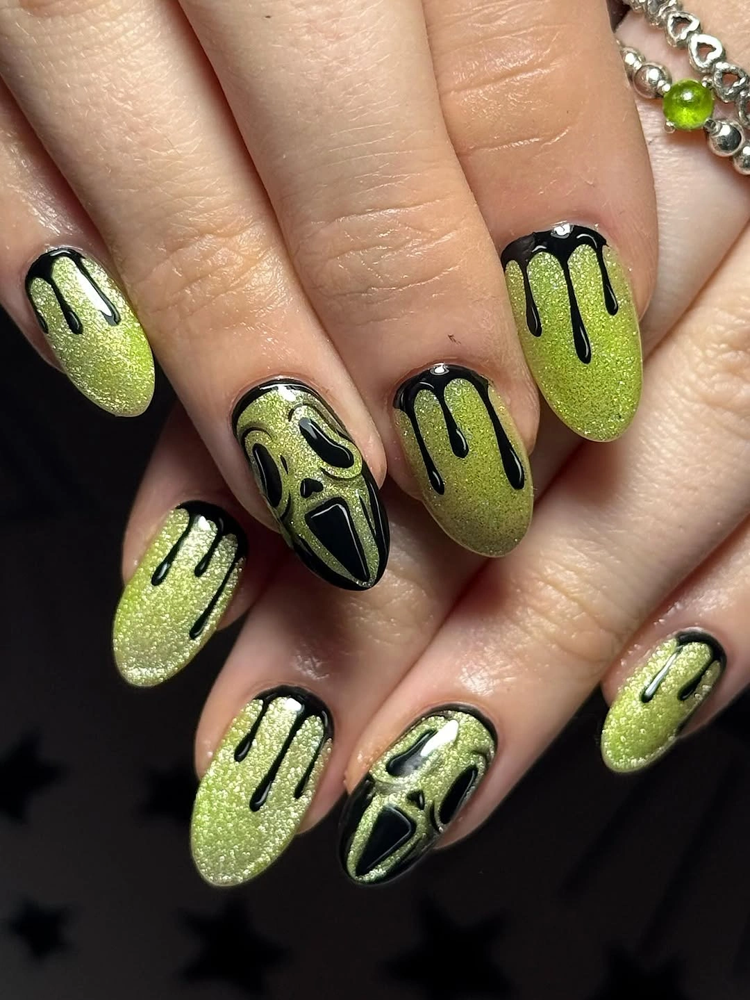
The drip line has enough personality that the rest of the details should remain limited. If the full set feels too intense, keep black on two tip edges and replace the face-like accent with a plain glitter nail. Reducing the number of black marks would not weaken the theme; it would simply let the lime finish do more of the visual work.
Dark tips can make grow-out or edge wear more noticeable than a soft neutral edge, particularly when placed thickly. A narrower drip would be easier to maintain while preserving the same sharp contrast. The glitter adds texture from a distance, so avoid additional stones or metallic accents that could compete with the reflective green surface.
Mushroom Dots Over a Pale Pink Base
Short rounded nails feature pale pink space, red mushroom cap shapes, tiny white dots, and delicate white curves. The dots are the quiet detail that links the red accents without making every nail look the same. Because the motifs are rounded and small, they suit the gentle nail shape and keep the overall result more whimsical than dramatic.
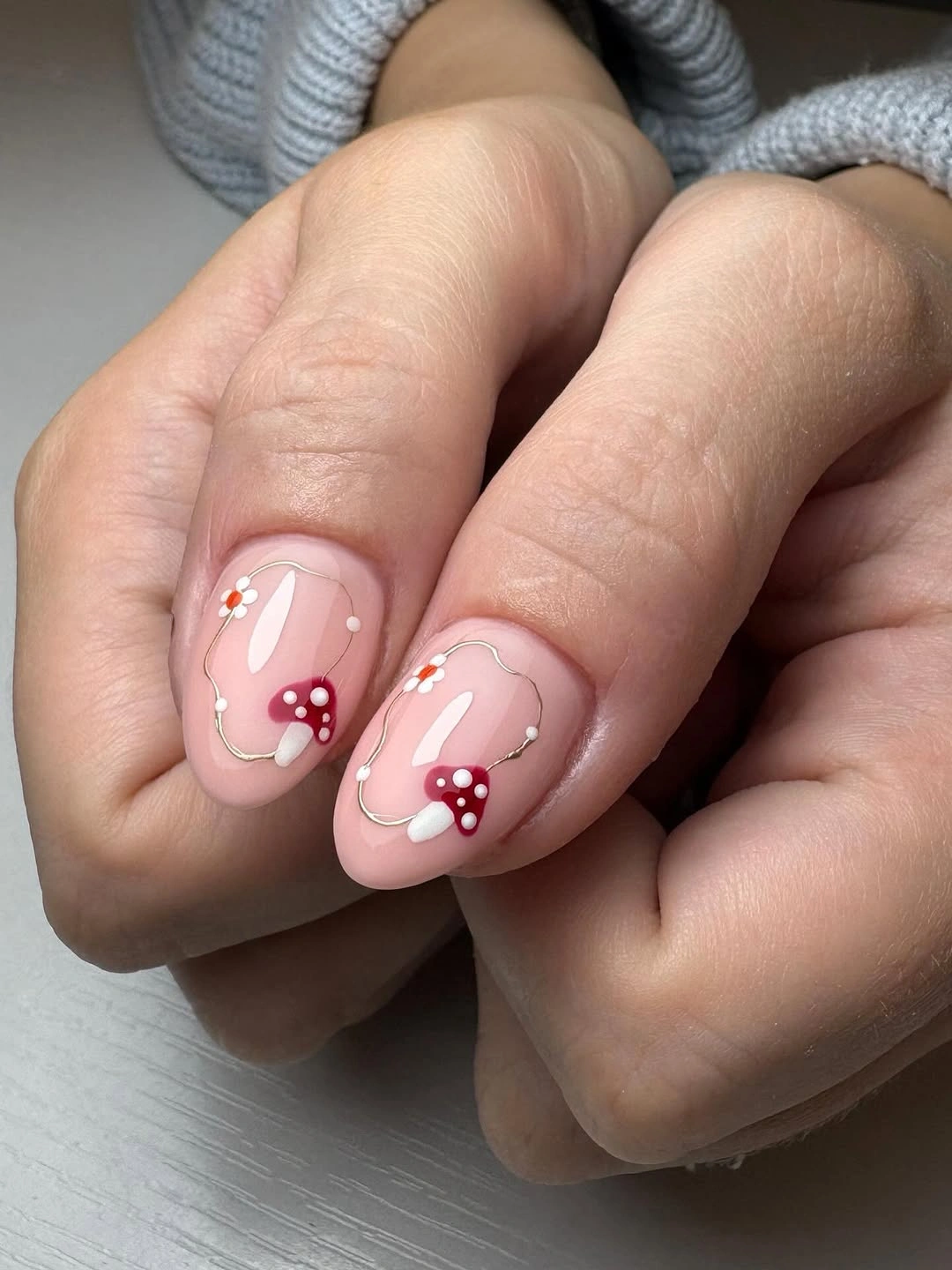
White dots are useful here because they repeat the mushroom idea without needing another full painted icon. For a cleaner adaptation, place one red cap on an accent nail and use only white dots or a narrow red tip elsewhere. That edit retains the color story while reducing the amount of literal artwork across the hand.
The pale base makes the red feel warm and clear, but it also means precise placement matters near the cuticle and side edges. Leave a small margin around each icon so the design does not look cramped as the nails grow. A matte background would soften the result, while the glossy finish shown keeps the white dots and red forms visually lively.
Burgundy Tips With a Fine Web Accent
Glossy dark burgundy nails sit beside pale pink accent nails with fine white spiderweb lines and a subtle burgundy dot detail. The web is small enough to operate as texture rather than a full theme, while the deep color creates a richer frame on the remaining nails. This balance makes the manicure feel seasonal without relying on orange, black, or large icons.
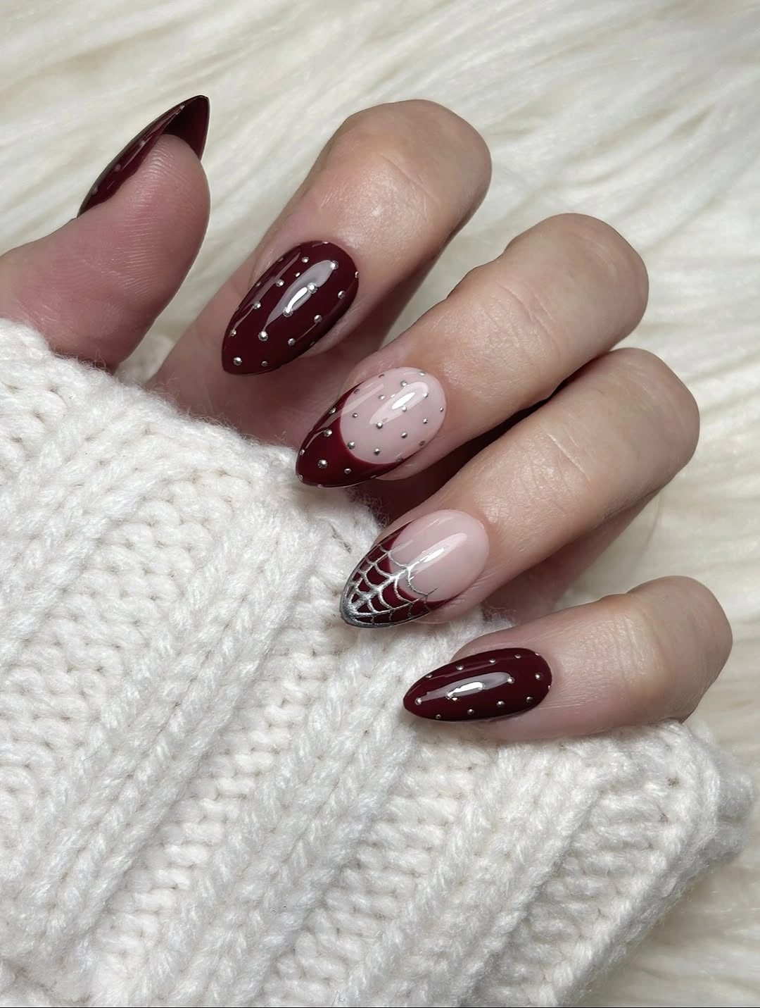
The burgundy has more visual weight than the pale base, so limiting it to a few full nails keeps the hand from becoming too dark. A softer variation could use burgundy only as a French edge and retain more of the nude-pink field. The white web lines should stay thin, because their job is to add precision, not to cover the accent nail.
Medium almond nails give the dark color enough length to look sleek, but the detail would also translate to a shorter oval shape. If shorter nails are preferred, place the web on just one finger and use a single burgundy side accent on another. The glossy surface helps the dark tone feel polished, while a matte finish would make the webwork look more muted.
Hot Pink Graphic Collage on Square Tips
Long square nails use hot pink as a common base for black outlines, printed-looking mini graphics, and small multicolor accents. The shared pink field is what prevents the individual designs from breaking into separate ideas. Black linework appears repeatedly at the edges and centers, giving the dense artwork a firm visual structure across the long rectangular tips.
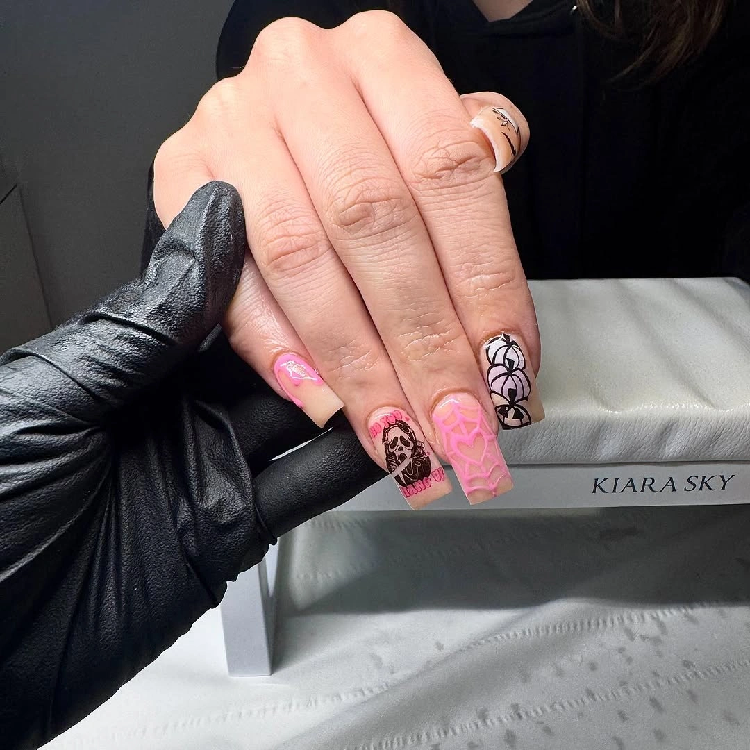
Because the layout is already full, the most useful adjustment is removing rather than adding detail. A version with pink, black linework, and just one illustrated accent would still feel expressive but would be easier to read. More glitter or another bright base color would compete with the graphic marks and make the square shape feel even more visually dense.
Long square nails offer space for collage-like decoration, but the large flat tips make chipped corners and uneven borders more noticeable. Keep the black outlines even if you want the art to look intentional from farther away. For everyday wear, a shorter square or soft coffin shape could retain the pink-and-black contrast while reducing the amount of visible artwork; the site’s fall square nail ideas show why cleaner edges matter on this shape.
Pale Pink Botanical Lines and Tiny Stars
Medium almond nails pair a pale pink base with fine green leaves, small star-like forms, and restrained orange and burgundy details. The leaves are placed as light directional marks rather than full coverage, which allows the manicure to retain a calm, airy surface. Small color changes appear between the botanical lines, giving the set interest without turning any single nail into a crowded accent.
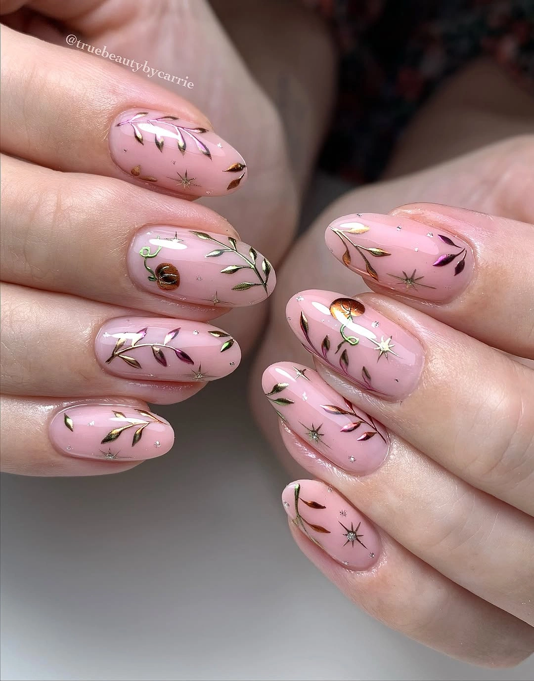
The strongest part of this design is its use of open space, so a good adaptation would preserve the pink base even if you simplify the art. Choose one leaf direction and repeat it on two nails, then place a star or tiny warm accent on one additional finger. That layout would maintain the visual rhythm while making the individual marks easier to distinguish.
Fine botanical lines can lose clarity when too many colors are layered on top of one another. Keep the green leaves as the main drawing and let the orange or burgundy serve only as a tiny interruption. The almond shape supports the tapered direction of the stems, whereas a broad square tip would make the same delicate composition feel more static.
Pink Shimmer With Black Stitched Borders
Hot pink shimmery square nails are edged with black outlines and black stitched or web-like marks near the tips. The border is the key detail because it gives the bright pink a contained, graphic silhouette instead of allowing the shimmer to read as one uninterrupted surface. Each dark line is placed close to the perimeter, which makes the square shape feel crisp and deliberate.
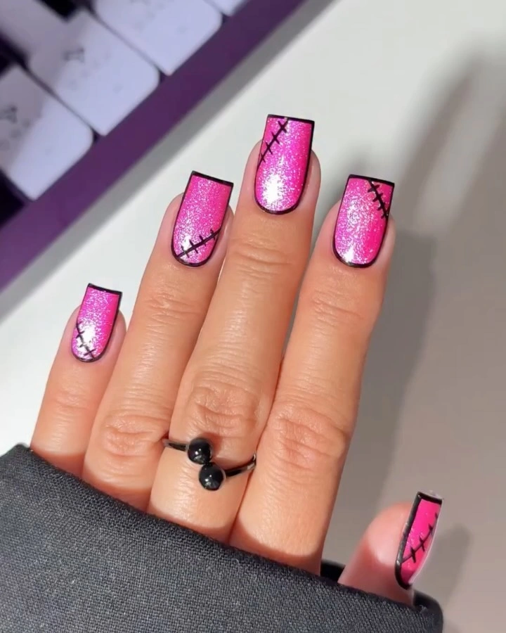
The pink finish already reflects light, so the black outline should remain consistent rather than becoming thicker on selected nails. If a full border feels too strong, use the stitched detail on two accents and leave the other tips plain pink. That change keeps the contrast but gives the shimmer more space to register without competing with a dark frame.
Square tips make borders look especially graphic because the corners provide clear stopping points for each line. With a rounded or almond shape, the same black placement would appear softer and more fluid. The main tradeoff is upkeep: crisp outlines and high-contrast edges can make small chips more visible, so a narrower border is the calmer practical choice.
Pumpkin Details With Raised White Ghosts
Long almond nails use a pale pink field for orange pumpkin-like details, small black marks, and white raised ghost figures on selected nails. The dimensional white accents are the immediate focal points, while the orange elements keep the set connected to a warm seasonal palette. Most nails remain largely pale, which prevents the mix of flat drawing and raised-looking decoration from feeling too heavy.
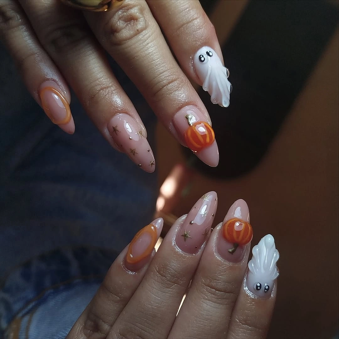
The white ghost accents are effective because they appear only on a limited number of nails. If you want a more practical version, swap the raised forms for flat white silhouettes and keep the orange art as the only other major detail. The pale base will still preserve the same gentle contrast, while the surface becomes easier to manage during everyday tasks.
Raised accents can catch the light and add texture, but they may be less convenient for hands that type, cook, or handle fabric frequently. Place them near the center of the nail rather than directly at the free edge if comfort is the priority. A shorter almond shape would make the icons feel more compact, while the long length here gives them extra room to stand apart.
Lavender Frames With Silver Charm Details
Short square nails use pale bases, lavender French-like frames, silver cross-shaped charms, loop details, and one striped purple accent. The lavender border provides a structured location for the metallic pieces, so the embellishments do not appear randomly placed. On a short length, that organization matters: the design stays readable because each nail has a clear edge, center, or accent role.
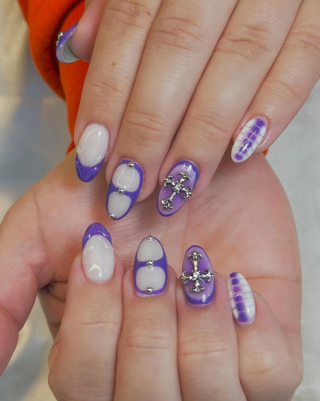
Metallic charms can quickly become the focus, so the lavender needs to remain visible as a continuous frame around them. A simpler adaptation would keep one charm nail and use lavender tips on the rest, letting the stripe pattern become optional. Adding rhinestones to every finger would reduce the small-scale clarity that makes this set feel considered.
Short square tips make the border look neat, but raised metal details may catch on knitwear or hair more easily than flat linework. Choose fewer charms if the manicure needs to be practical for daily use, and let the purple frame carry the color. The striped accent can remain because it echoes the lavender without adding a new dominant finish or motif.
Orange Flowers With Green Striped Tips
Long almond nails mix orange flower motifs, slender green leaf lines, and orange-and-green striped tip sections over a nude-pink base. The placement changes from nail to nail, but the same two colors recur often enough to keep the set coherent. The floral nails offer a soft focal point, while the striped tips provide a more graphic counterweight at the edge.
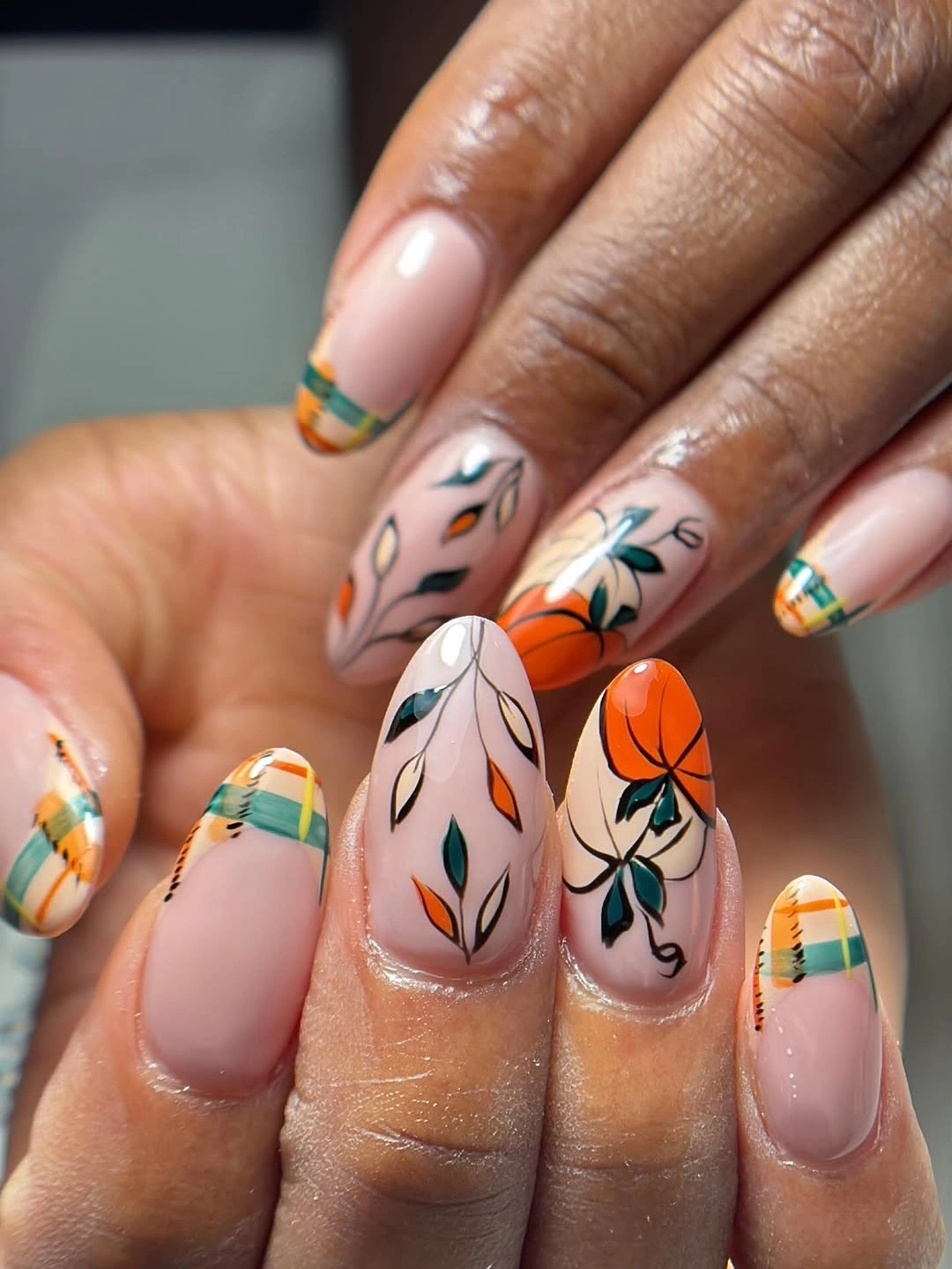
The orange and green are balanced because neither color covers every nail completely. To make the design more minimal, keep the flower on one accent and use a single green or orange tip elsewhere. That variation would still feel seasonally warm while giving the neutral base a larger role and making the individual lines easier to maintain.
Long almond tips support the leaf direction and make the striped edges feel tapered rather than blocky. If you shorten the nails, reduce the number of stripes so the tip does not become visually thick. The floral detail should remain centered and slightly open, since a dense cluster would compete with the crisp color rhythm already established at the edges; a related color-first approach appears in the site’s fall manicure colors.
Emerald Solids With Zebra Accent Nails
Deep emerald solid nails sit beside pale pink accents traced with black zebra-like stripes. The main detail is the contrast between uninterrupted green color and the fine, irregular dark linework, which keeps the animal pattern from dominating the hand. The palette is concise but energetic because the pale base offers relief between the saturated green nails.
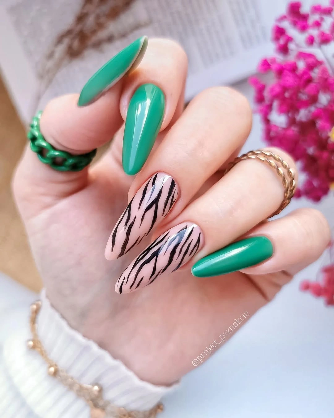
Use the zebra pattern sparingly if the green is meant to remain the leading color. Two patterned nails are enough to create movement, while additional stripes could make the set feel more graphic than polished. A softer forest green would reduce the contrast, but the deeper emerald here makes the pale accents and black lines look especially precise.
The almond shape helps the zebra marks follow a tapered direction, which is more forgiving than trying to make every stripe identical. Keep the line widths varied but not crowded, and leave some pink base visible between them. If the pattern begins too close to the cuticle, its grow-out will be more obvious, so a central or tip-focused placement is easier to live with.
Smoky Neutrals With Amber Marbling
Medium square nails show a sheer charcoal-brown field with soft gray and amber swirls that resemble smoky stone. The marbling is intentionally diffuse, so the eye notices the layered color depth before it notices any single line. Gloss across the surface helps the muted neutrals appear dimensional, giving the design a quieter direction than the high-contrast graphic sets around it.
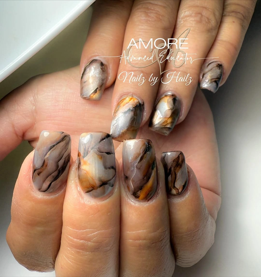
Marbling does not need to be perfectly matched from nail to nail, because its strength comes from repeating the same color density and movement. For a more restrained version, use the swirl on two accent nails and keep the rest a translucent brown. That approach preserves the amber warmth while making the set feel lighter and easier to coordinate with jewelry.
The square shape gives the flowing marks a stable frame, which stops the soft marbling from looking indistinct. Avoid adding crisp black outlines, since they would change the manicure from smoky to graphic and erase the subtle transition between the neutrals. A short square version could work well, provided the amber streaks are kept broad enough to remain visible on the smaller surface.
Rainbow Bands With Tiny Ghost Faces
Long almond nails combine purple, orange, green, pink, and blue bands with small ghost faces and circular accent shapes. The color bands create the main rhythm, while the tiny faces operate as a secondary surprise rather than the only focus. Because each nail uses a different arrangement, the repeated bright palette is what holds the playful mix together.
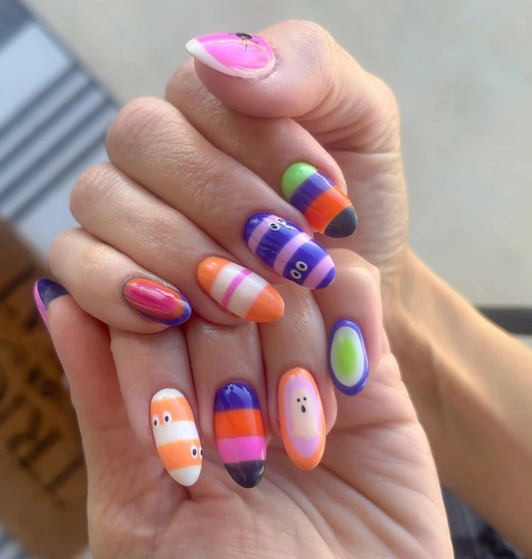
The easiest way to make this style less busy is to reduce the palette to three bright colors and let the ghost appear only once or twice. Keeping the bands broad and separate will make each shade easier to recognize on the long almond shape. A more neutral base would soften the effect, but it would also remove the full, festive color rhythm that defines the design.
Bright horizontal or curved bands can look different as nails grow, so leave a small neutral space near the cuticle if maintenance is a concern. The tiny faces are most legible when they sit on a single-color panel rather than over multiple stripes. Avoid adding heavy glitter, because the existing palette already provides plenty of visual movement and contrast.
Delicate Fall Drawings Over Pale Pink
Medium almond nails use a pale pink base for tiny red berry-like dots, orange seasonal motifs, fine black marks, and small white ghost-like accents. The visible detail stays light because most of each nail remains open and glossy. Rather than relying on one large illustration, the set distributes several miniature drawings with enough distance between them to keep the surface calm.
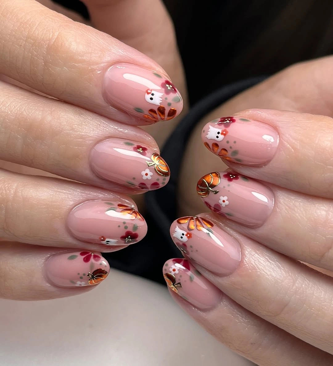
The small drawings work because the pink base acts as a neutral pause between colors and prevents the orange and red from blending together. For a more minimal option, choose the berry-like accents as the recurring motif and place one ghost-like detail on a single nail. That choice would keep the seasonal feeling while making the manicure more readable from farther away.
Fine art needs a clean glossy background, so skip extra glitter or broad French tips that would compete with the tiny marks. Place the most important detail toward the center of the nail if you want it to remain visible through some growth. The almond shape gives these icons a gentle frame, but the art would also translate well to a short oval with fewer colors.
Copper Glitter Beside Cream Leaf Accents
Copper glitter nails are balanced by creamy nude bases with leaf-like raised details and small metallic touches. The central decision is contrast of finish: reflective copper is paired with soft cream so neither surface has to dominate every nail. The leaf forms create extra texture on selected fingers, while the glitter adds a warmer, more continuous shimmer to the others.
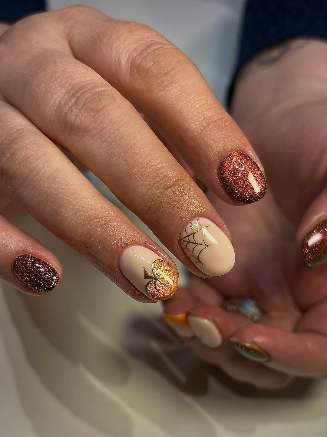
Use the textured leaf detail on only a few nails if you want the copper sparkle to remain visible as an equal partner. A version with one cream accent and the rest copper would read more like a color statement, while several cream nails make the set more decorative. The metallic touches should stay small, because full foil coverage would blur the distinction between glitter and raised accents.
Textured surfaces can be eye-catching, but they may be less convenient than flat designs when handling fabric or washing hair. If practicality matters, interpret the leaf as a painted line instead and keep the cream base smooth. The copper shade provides enough seasonal warmth on its own, so the softer neutrals are best used as space for the details rather than as another competing color block.
Burgundy Mini Icons and Checkerboard Details
Short-to-medium nails mix dark burgundy, small black-and-cream checkerboard sections, cherry-like marks, tiny skull-like faces, hearts, and a pale base. The unifying detail is not one motif but the repeated burgundy and black that appear across different kinds of art. That shared color logic keeps a varied set from feeling scattered, even when individual nails have different graphic personalities.
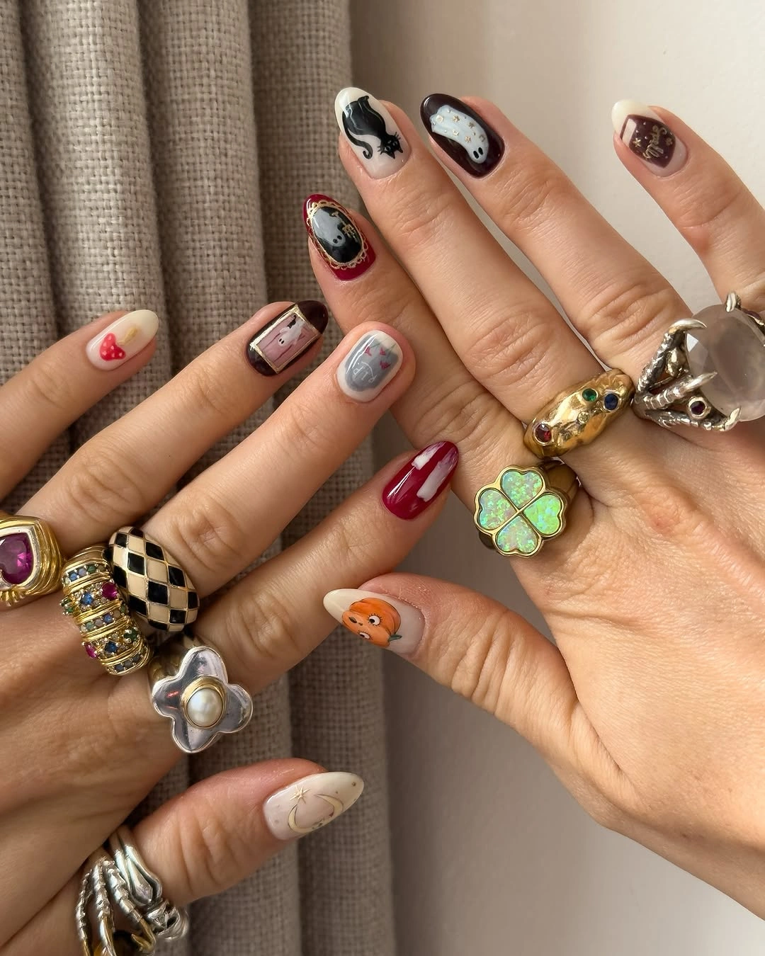
The checkerboard is visually dense, so it is most effective as a single accent rather than a pattern repeated across several nails. To simplify the design, retain burgundy solids, one checkerboard nail, and one tiny icon, then let the remaining nails stay pale. Removing details rather than swapping colors keeps the same dark, playful mood while giving the hand more breathing room.
Shorter nails make small icons look charming but leave little room for several motifs at once. Place the most recognizable drawing in the center and keep borders or dots near the tip, where they are easier to read. A glossy finish supports the rich burgundy, while a matte version would make the checkerboard and tiny black outlines appear flatter and more graphic.
Reflective Red Tips With Black Web Lines
Long pointed almond nails transition from reflective deep red toward black at the tips, with black spiderweb lines crossing several fingers. The red-to-dark contrast is already dramatic, so the web functions best as a precise overlay rather than a dense full-nail drawing. The pointed shape lengthens the gradient-like effect and gives each web line a tapered surface to follow.
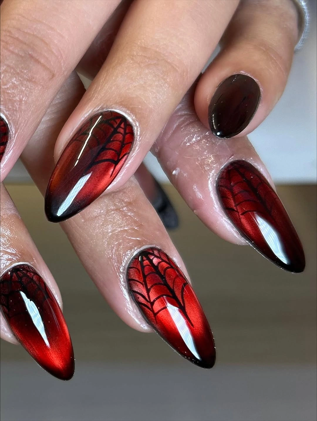
If the full pointed length feels too bold, move the red and black contrast onto a shorter oval shape and use web lines on one or two accents. The visual identity would remain because the red finish and dark edge create the main tension. Adding orange or white would dilute that focused contrast, so keep any additional accent within the existing red-black range.
Reflective dark tips can show chips at the free edge more readily than a pale color, especially when paired with fine black linework. A thinner web or a smaller dark section would make the design easier to maintain while preserving its dramatic direction. The long point is part of the effect, but a moderately tapered almond would offer a more practical version without losing the color depth.
Black Polka Tips With Purple Rose Accents
Medium almond nails use pale pink space, black French tips dotted in white, a purple rose, a green heart, and small face-like art on selected nails. The dotted black border is the repeating device that gives the varied icons a common frame. Without it, the rose and small drawings would feel more separate; with it, the set has a consistent edge-to-center relationship.
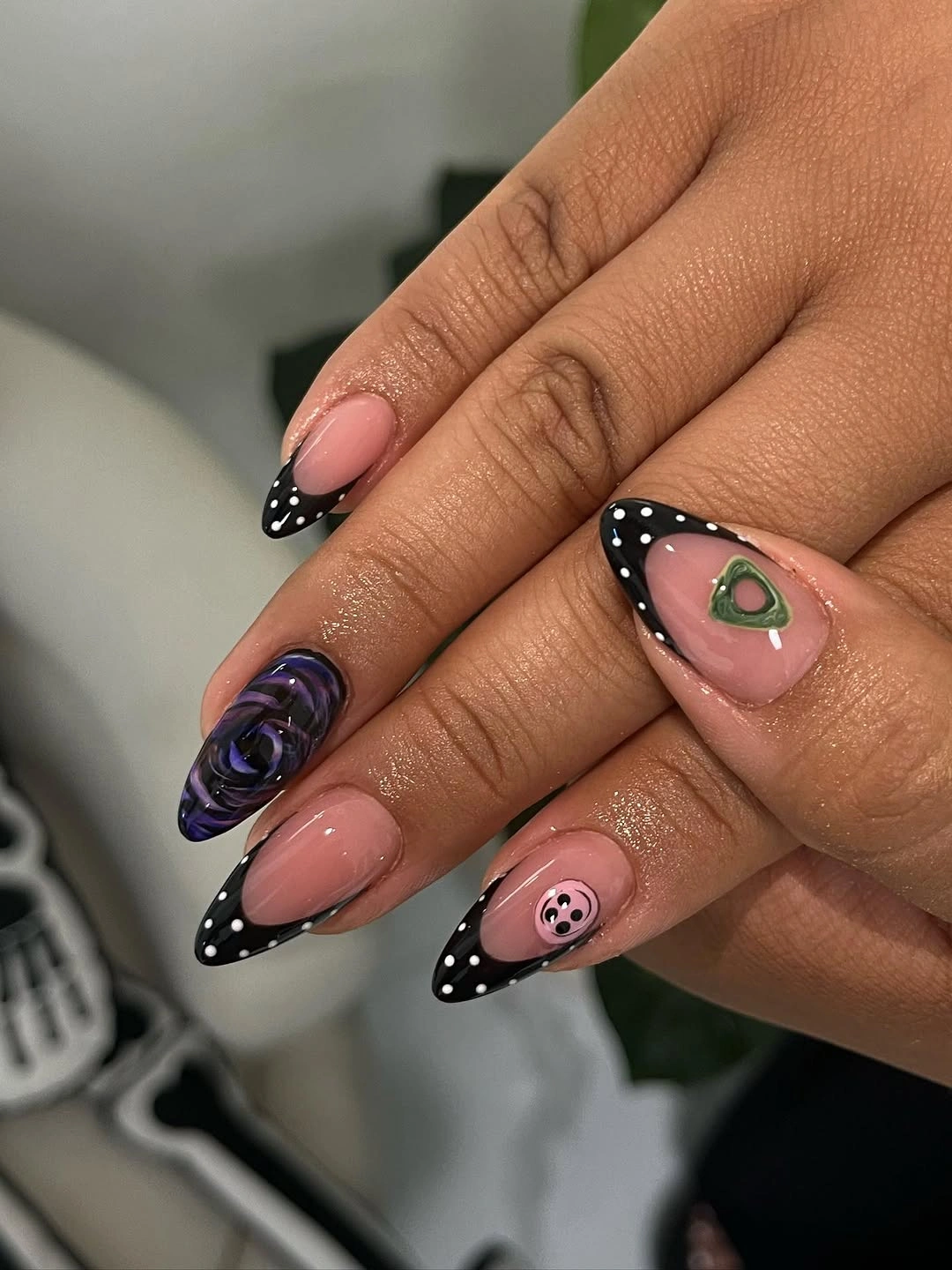
The black tips should remain the most repeated feature, while the purple rose and green heart stay limited to individual accents. For a simpler adaptation, use the dotted French on most nails and choose only the rose as the single illustration. That change preserves the manicure’s contrast and playful border while giving the pale pink base more visual room.
Multiple icons can become difficult to read when they sit beside a bold French edge, so separating them with plain nails is a practical choice. The almond shape keeps the black tips curved and soft rather than severe. If you prefer less contrast at the grown-out area, shift the dots onto a narrow side border and leave the free edge mostly pale pink.