An outfit rarely feels wrong because one item is bad. More often, the eye has nowhere calm to land: the top, bottom, and accessories ask for equal attention, or the proportions stop at several competing points. The most satisfying personal style begins with one decision you genuinely enjoy, then makes everything around it quieter enough for that decision to register. That approach leaves room for comfort, mood, and real movement instead of turning getting dressed into a set of rules.
Before changing anything, look at the outfit from a few steps away and identify its clearest line. A strong shoulder, a long leg, a narrow waist break, or a repeated neutral can guide the rest of the choices without demanding a match. That mindset makes personal style easier to adapt because it treats proportion as a useful signal rather than a rule, leaving enough room for your own closet, movement, and sense of ease.
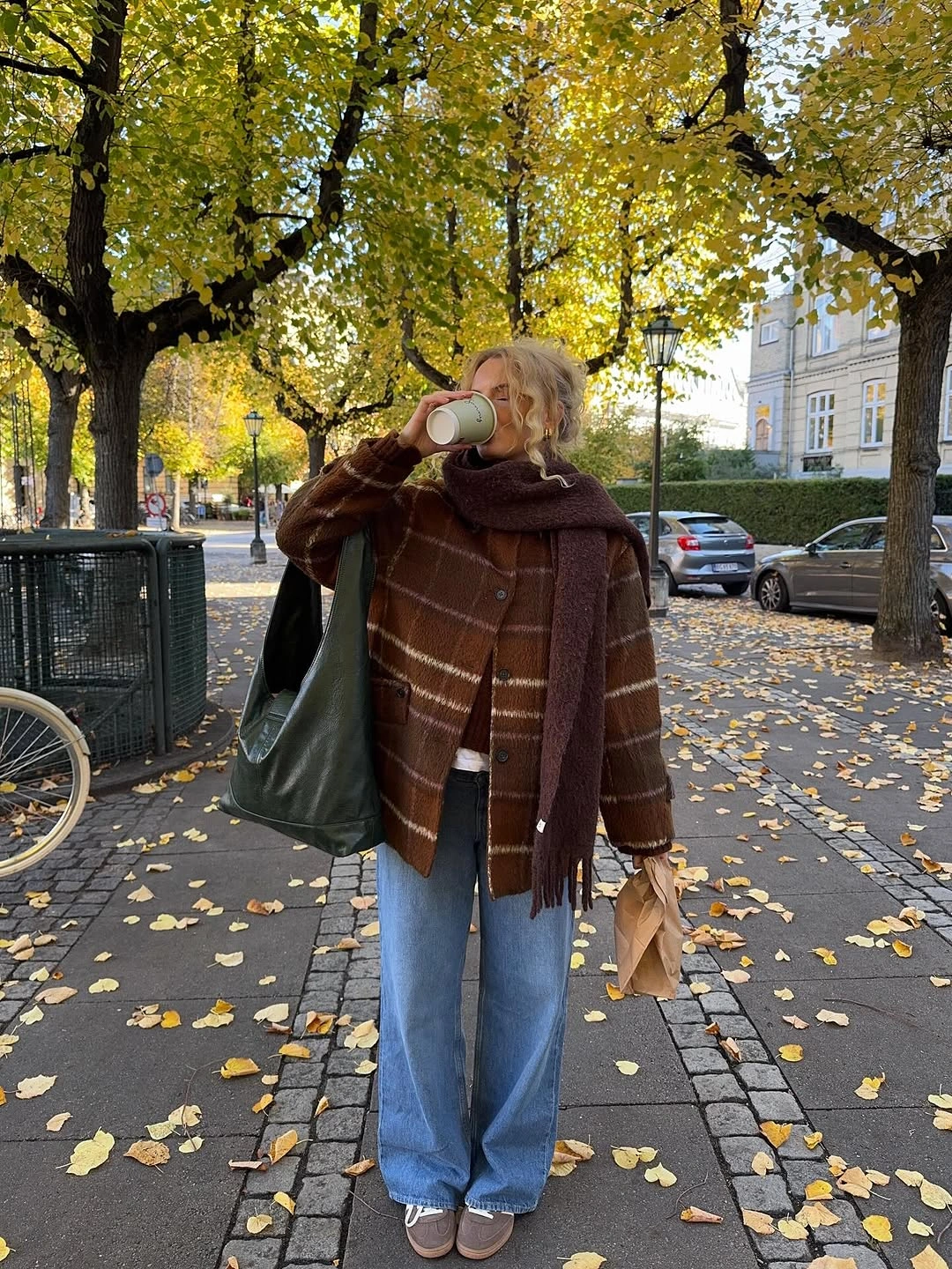
A Fringed Plaid Wrap Over Relaxed Denim
The brown plaid wrap creates the first long line here, falling over a dark outer layer and loose blue jeans instead of sitting like a small accessory at the neck. A white shirt hem appears between the darker layers, which keeps the upper half from becoming a single dense shape. That small light interruption is why the relaxed denim still feels connected to the layered top rather than simply casual.
For a similar proportion, keep the jeans straight or wide but let the wrap hang below the hip rather than bunching it tightly at the shoulders. A compact tan bag and brown shoes make sense because they repeat the wrap’s warmer notes without adding a competing color. A large scarf can add visible bulk at the chest, so a simpler inner layer makes the result easier to move in.
The appeal is the contrast between soft fringe and the firmer, easy geometry of denim. It reads grounded because the look has one clear focal layer, not several decorative ideas fighting for attention. If the plaid is the strongest pattern you own, treat it as the outermost visual statement and keep jewelry, belts, and patterned footwear quiet around it. The same restraint makes many September outfit ideas easier to adapt when the weather calls for another visible layer.
A Tonal Wrap With a Long Camel Base
A long beige base and a broad brown wrap create a calm, nearly continuous column, even though the shoulder layer is much larger in scale. The closely related warm tones make the generous wrap feel like part of the silhouette rather than an afterthought placed on top. Brown ankle boots and a small crossbody bag keep the color story close to the ground, where the long lines need a little definition.
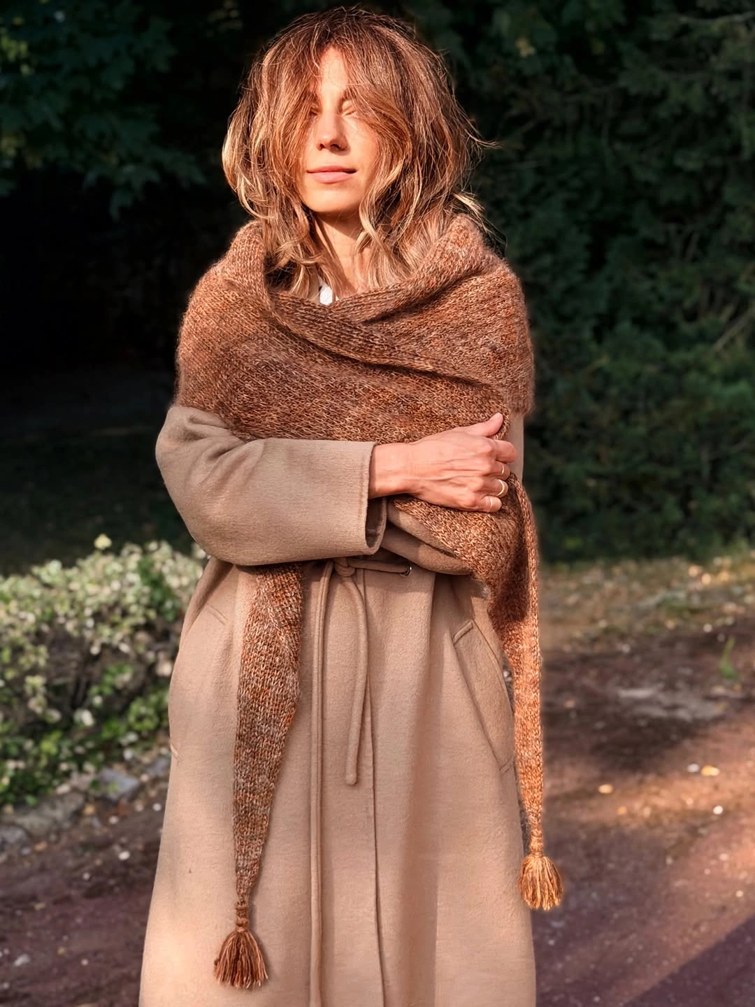
This approach works best when the underlayer stays relatively slim through the middle, because a loose dress or coat plus a very wide wrap can hide every change in proportion. Try a shorter wrap if you prefer more arm movement, or let one end fall vertically to preserve the elongated effect. The tradeoff is warmth-looking volume around the shoulders, which can feel restrictive when carried all day.
There is a quiet richness in repeating brown and camel without forcing an exact match. The visible texture of the wrap brings depth, while the smoother-looking base prevents the outfit from becoming fuzzy from head to toe. When colors are this close, the shoe shape and bag size matter more than usual, so choose pieces that look deliberate rather than overly delicate. That quiet editing is also helpful when adapting October outfit ideas to your own outerwear and footwear.
Oversized Black Layers With Cuffed Jeans
The roomy black jacket is the dominant shape, but the pale blue jeans and exposed sneaker details keep it from reading as one solid oversized block. A pronounced denim cuff creates a horizontal pause above the dark shoes, giving the lower half a precise ending. That contrast makes the relaxed jacket feel more considered and keeps the casual pieces from slipping into visual heaviness.
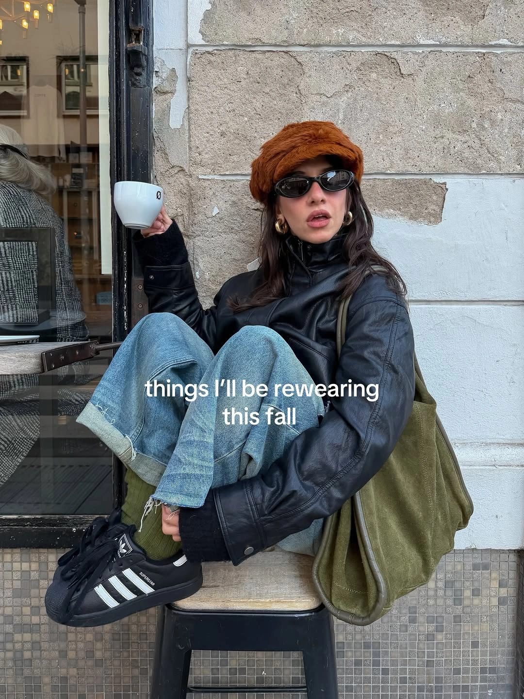
When an upper layer has this much volume, a simple jean wash and a low-profile sneaker are useful balancing tools. You could replace the cuff with a straight hem if you want a cleaner line, but avoid adding a second wide item at the ankle. The jacket will still be the statement, while the leg shape remains clear enough for walking, sitting, and everyday movement.
Black outerwear can feel abrupt beside pale denim, yet the dark shoe and dark head covering create several small anchors that make the contrast feel intentional. The outfit proves that oversized proportions do not require oversized accessories as well. A small bag, minimal jewelry, and one strong jacket surface are enough to carry the mood without making the silhouette harder to read.
A Blazer and Silver Sneakers in Conversation
The gray patterned blazer brings a tailored outline to the pale top and dark brown trousers, while the reflective silver sneakers interrupt the expected polished finish. That tension is the point: the blazer looks less formal because the shoe is visibly casual, and the sneaker looks more purposeful because the trousers give it structure. A dark brown handbag repeats the trouser tone and quietly bridges those two dress codes.
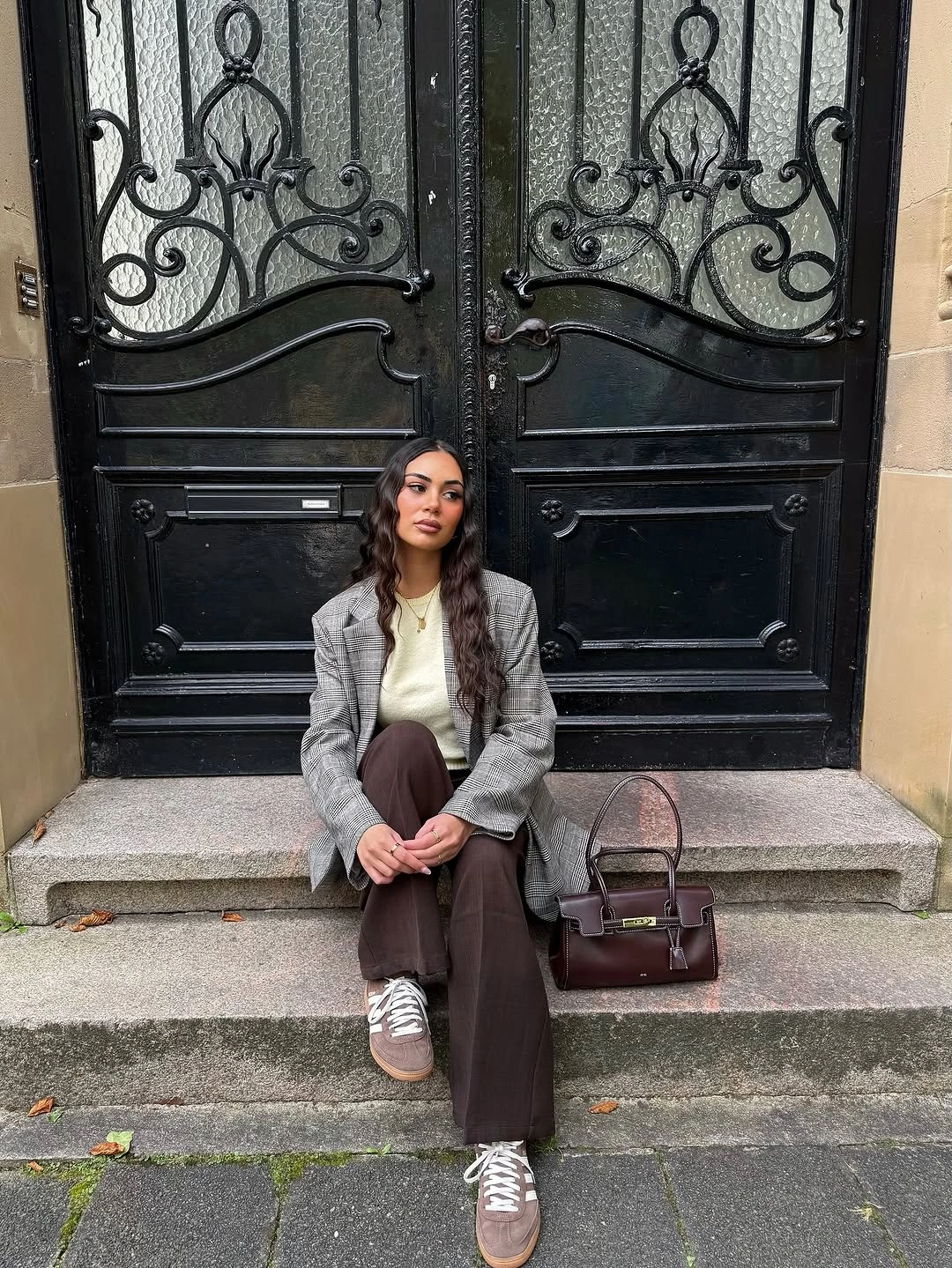
If you like the mix but want it less bold, choose a matte gray sneaker or a smoother white pair and keep the trouser hem just above the shoe. If you want to keep the metallic note, let it be the only reflective element. Wide trousers can swallow a low shoe when they run too long, so checking the break at the ankle is more useful than adding extra layers.
This is a strong formula for days when a jacket feels right but a traditional dress shoe feels too rigid. The small pattern in the blazer adds texture without pulling attention from the silver finish below. Because the outfit uses brown, gray, cream, and metal rather than one matched set, it feels assembled with judgment instead of overly coordinated.
Dark Brown Moto Energy With Blue Jeans
The deep brown moto-style jacket gives a straightforward blue-jean base a stronger center of gravity, especially through its broad shoulder line and zip-front surface. Nothing else needs to compete with it: the visible bag strap is narrow, the denim is clean, and the palette stays within brown and blue. That restraint is what makes the jacket feel like a styling choice rather than a costume element.
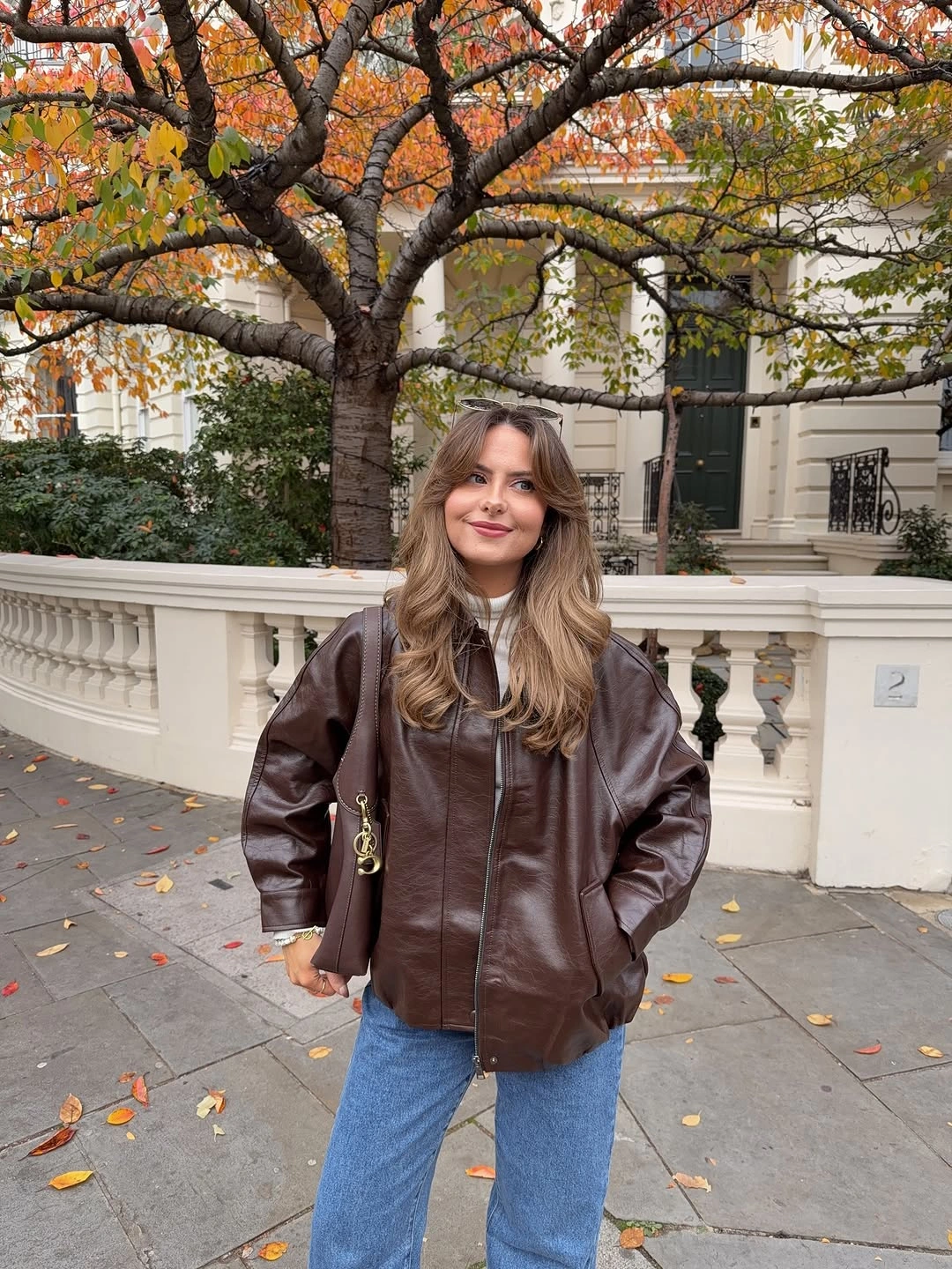
For a version that keeps the same balance, pair a cropped or hip-length brown layer with uncomplicated straight jeans and shoes that do not add another strong texture. A slightly larger bag would make the upper half feel heavier, so a compact shoulder or crossbody shape is the safer adjustment. The structured shoulders can look dominant if the jeans become too narrow or overly distressed.
Brown works especially well here because it softens the familiar dark-jacket-and-denim contrast without disappearing into the background. The visual surface of the jacket feels richer than the plain jean wash, so the outfit still has depth even without print. Let that surface do the work and leave the rest of the look practical, clean, and easy to repeat.
A Bright Red Center Beneath Black Layers
The red buttoned layer appears as a narrow, vivid strip between a black outer layer and gray checked trousers. That precise placement makes the color feel intentional, since it draws the eye toward the center without covering the whole silhouette. The dark hat, bag, and outerwear keep the red from becoming isolated, while the checked trousers add quieter movement below.
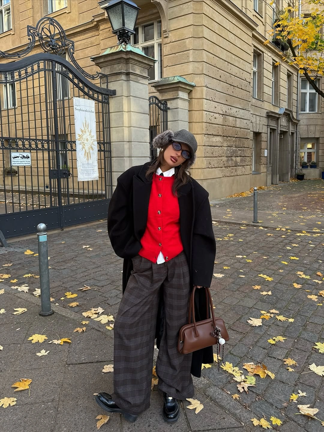
Try this color placement with a cardigan, a buttoned shirt, or even a fine knit, but keep only a small portion visible at the front. The effect becomes less sharp if a bright accessory is repeated at every point of the outfit. A hat is optional here; without it, the red will carry more attention upward, which may be welcome if you prefer a clearer face-framing note.
The outfit is useful because it makes a saturated color feel wearable with pieces many people already own. Gray checks offer enough texture to support the red but remain quieter than another print or bold shoe. When the middle layer is the main accent, a dark shoe and bag give the outfit a stable ending and prevent the eye from drifting away from that central line. The same focused use of color can make September fashion trends feel personal rather than overly coordinated.
An Argyle Top With a Narrow Lower Half
The oversized argyle knit has a broad, almost poncho-like shape, so the short black skirt and tall black boots do important balancing work below it. They create a long narrow vertical line where the upper half is widest. The dark bag follows that same slim direction, which keeps the pattern from looking disconnected from the rest of the silhouette.
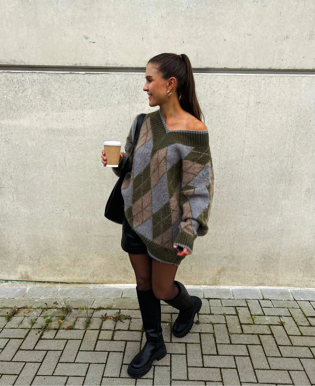
A similar top needs a deliberate lower half: opaque tights, a slim skirt, or fitted trousers will usually read more clearly than another loose piece. Tall boots extend the line, while shorter boots would put a stronger break at the calf. The tradeoff is coverage and movement, since a large knit and a short hem can feel more dramatic than practical for every setting.
The argyle pattern already brings color and geometry, so there is no need to layer another scarf or a bold necklace over it. Let the knit stay generous and let the lower half act as a calm frame. That gives the outfit a playful proportion without turning it into a collection of unrelated statement pieces.
Graphic Spots and a Soft Waist Break
Large white spots make the black knit instantly recognizable, but the pale shirt tied at the waist gives the pattern a softer landing place. The knot creates a light horizontal break instead of allowing the dark sweater to extend uninterrupted through the middle. With the black bag and dark glasses kept simple, the sweater remains the clear visual event.
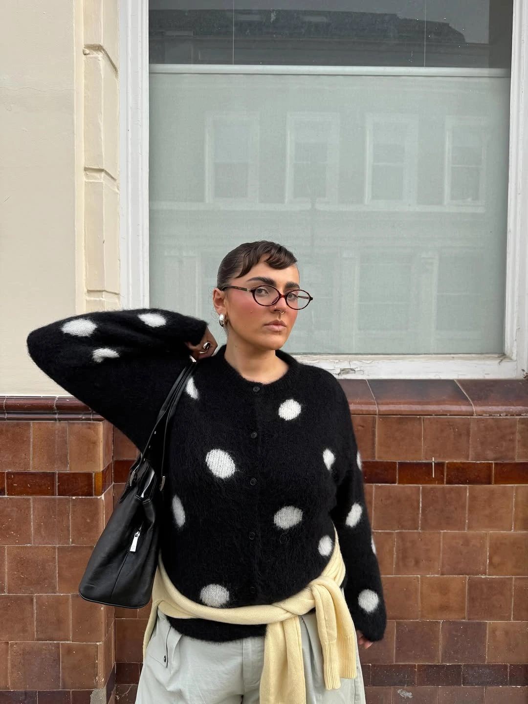
A tied shirt is most useful when the sweater is roomy and you want a visible waist reference without tucking anything in. A straight jean or a simple skirt would keep the same idea intact, while a busy printed bottom would compete with the oversized spots. The knot adds some bulk, so it is best placed slightly to one side or kept low and loose rather than pulled tightly.
What makes this combination work is the contrast in both color and scale: big graphic circles above, a small pale tie below. The shirt does not need to match the spots exactly because it has a different job, which is to lighten the middle. That distinction keeps the styling playful but still readable from every angle.
Green Knit Framed by Warm Tan Accessories
The long olive-green sweater is the strongest color in the outfit, while black leggings create a narrow, quiet base underneath it. Tan boots and a tan crossbody bag appear at two separate points, framing the green rather than leaving it as a lone bright column. That warm repetition gives the outfit a clear palette logic without requiring identical accessories.
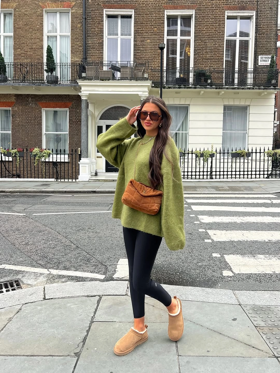
To recreate the balance, keep the lower layer fitted enough that the sweater length remains visible and choose one warm accessory color to repeat once or twice. Darker brown boots would make the look more muted, while pale tan keeps the contrast noticeable. Long tops are forgiving, but pairing them with another loose trouser can remove the clean silhouette that makes this version work.
The green does not need a competing necklace or scarf because the bag and footwear already explain how it belongs with the rest of the outfit. This is a useful lesson for color that feels a little bold: repeat a related neutral at the top and bottom of the figure. The result looks grounded, yet the knit still carries enough personality to make the outfit memorable.
Moving Burgundy Fringe Over Relaxed Trousers
The long burgundy fringe is the feature that gives this outfit movement, falling over soft tan trousers and creating a strong vertical sweep down the back. Because the trousers stay pale and relaxed, the wrap can move without competing against another busy texture. A small burgundy bag provides a discreet repeat of the deep color and keeps the accent from ending at the shoulders.
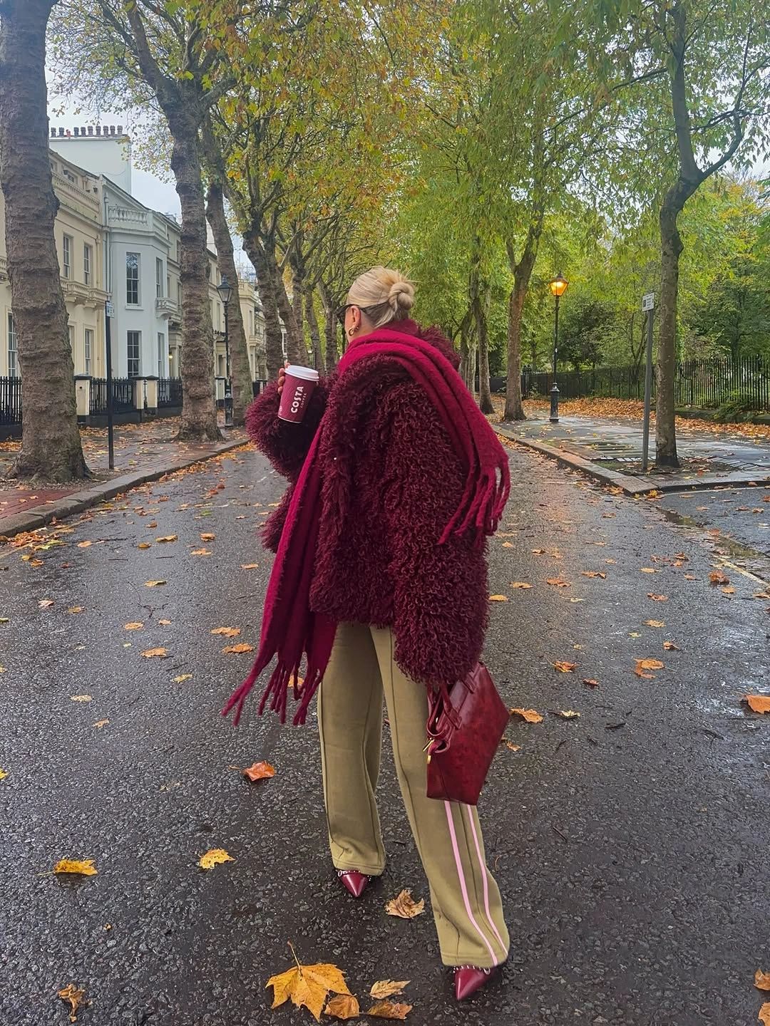
If you like the color but not the amount of fringe, use a shorter wrap or let only one end hang long over a simpler coat. The lighter trouser is important because it creates contrast behind the darker movement; a black pant would make the fringe less visible. Long fringe can catch on bag hardware or chair arms, so less volume is often the more practical choice for a busy day.
There is a pleasing softness in the way burgundy and tan sit together without becoming overly matched. The wrap feels expressive, but the rest of the outfit stays calm enough to support it. That is a good rule for any dramatic accessory: let it have one job, then give everything around it a quieter shape and finish.
A Shaped Brown Jacket Above Plaid Trousers
The brown jacket ends near the waist just as the wide plaid trousers begin, creating a useful change in proportion between the compact upper half and the longer lower line. A pale neckline detail prevents the jacket from feeling too closed, while the small structured bag stays quiet beside the trouser pattern. The result has definition without needing a belt or a sharply contrasting shoe.
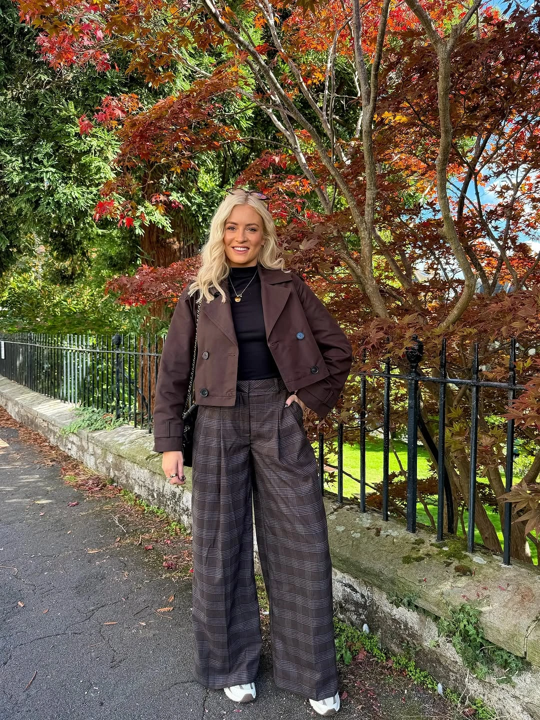
For patterned trousers, a fitted or hip-length outer layer is often easier to style than a long loose coat because it shows where the legs begin. Keep shoes plain and give the hem enough room to fall cleanly rather than bunching over the foot. If the trousers are very wide, a bag that is too large can add weight at the hip and blur the strong waist break.
The jacket and bag share a related brown tone, but the outfit avoids looking flat because the plaid introduces gray and darker lines below. That mix is more interesting than an exact head-to-toe set and still feels coherent. The lesson is simple: when the lower half has pattern, repeat one quiet color from it above rather than adding a second pattern.
Burgundy Cardigan and Tall Brown Boots
A loose burgundy cardigan softens the strong lower line created by tall dark brown boots and a short brown hem. The boots occupy most of the visible lower half, so the relaxed cardigan keeps the contrast from becoming too sharp or formal. A small patterned bag adds detail near the waist, where it can be noticed without interrupting the long boot shape.
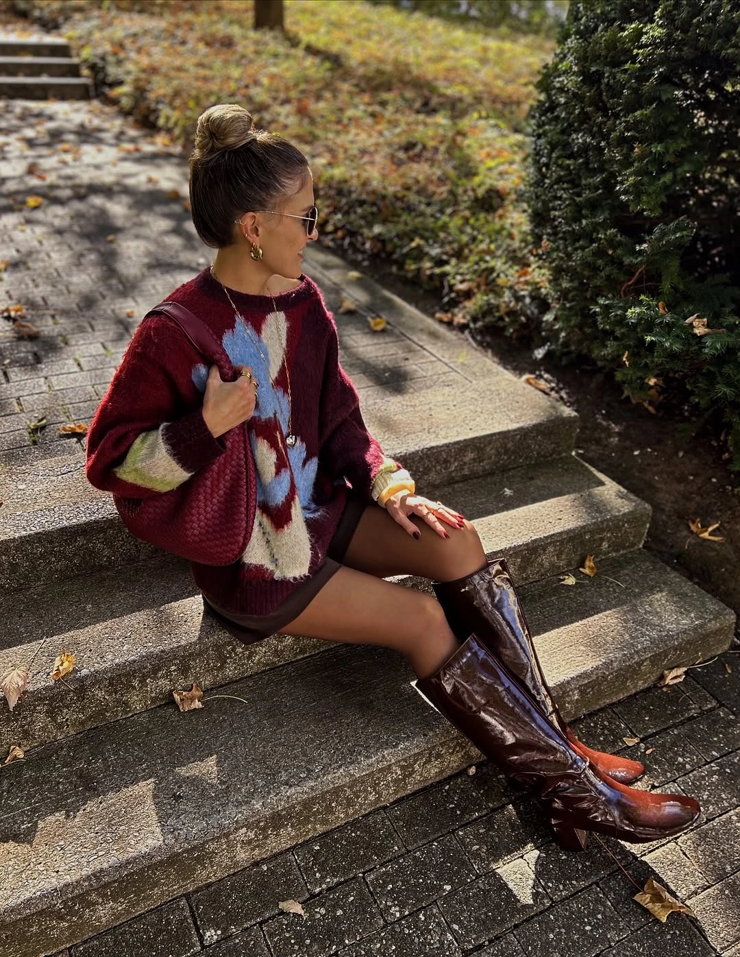
If you want the same relationship with more coverage, opaque tights can extend the dark line and make the short lower layer feel less exposed. A flatter boot would reduce the visual drama, while a taller shaft retains the strong vertical effect. Knee-high boots can be less flexible for long walks or stairs, so the cardigan’s ease is helpful as a counterweight rather than another restrictive piece.
The cardigan and boots are different in texture and structure, but their related brown-red depth makes the pairing feel quiet rather than severe. It is a good example of letting a soft layer make a bold footwear choice more approachable. Keep the top and bag simple, then let the boot height and cardigan volume provide the full story.
Black and White Layers for a Clear Sporty Shape
A loose white top stays visible because the black sleeveless layer frames it instead of hiding it, creating a clean black-and-white outline through the torso. Black leggings continue the darker line below, while white sneakers repeat the light top at the ground. The small crossbody bag fits close to the body, so it does not disrupt the direct vertical structure.
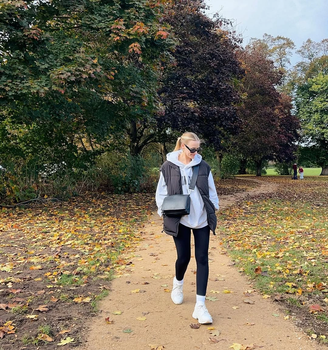
This formula works when each color has a distinct role: light for the base, dark for the frame, and a repeated light shoe to finish the outfit. You could swap leggings for tapered trousers if you want more structure while keeping the same contrast. A loose shirt can move around in a breeze or during errands, so a slightly shorter or partially tucked version may feel easier to manage.
The appeal here is less about athletic clothing and more about readable layering. The dark vest-like piece creates shape without needing a fitted jacket, which is useful for comfortable outfits that still benefit from a defined middle. Keep the palette strict and the accessories small, because extra color would weaken the crisp framing effect that makes this look work.
An Orange Hat Above a Pale Denim Base
The bright orange ribbed hat is a concentrated accent against a pale textured-looking top layer and loose light-blue jeans. Because the rest of the outfit stays cream, blue, and soft neutral, the color sits near the face as a deliberate focal point rather than asking the bag or shoes to match. The printed cream tote adds visual interest without introducing a heavier dark note.
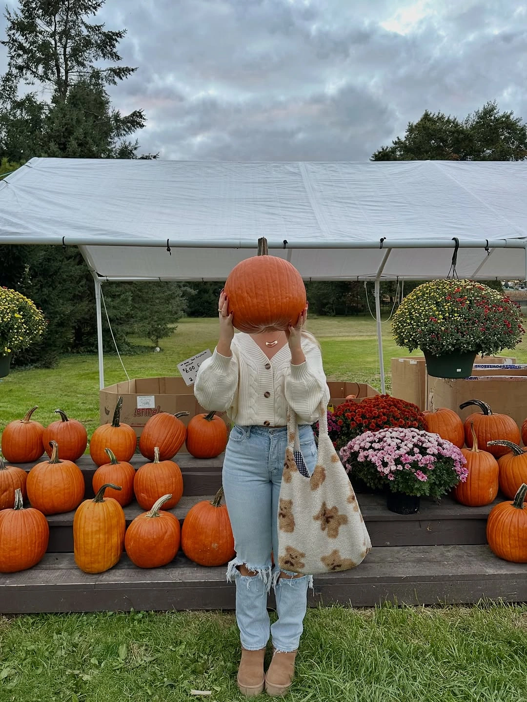
A colorful hat is an easy way to test a shade before committing to a brighter coat or trouser. Keep the rest of the palette light if you want the accent to feel clear, or switch to a scarf in the same area if hats are not your preference. Strong headwear takes attention quickly, so it works best when the outfit below it remains visually calm and unfussy.
The pale base has enough texture and print to feel interesting, yet neither detail competes with the orange because both are low-contrast. That is a useful approach to an accent color: let it be small but place it where the eye naturally begins. A single focused note can make relaxed jeans and a soft top layer feel much more deliberate.
Plum Trousers Linked With Burgundy Stripes
The wide plum trousers could feel separate from the cream-and-burgundy striped sweater, but the small burgundy bag makes a direct color bridge between them. That repeated warm tone explains the combination without turning it into a matched set. Light rounded shoes stay understated at the hem, allowing the trousers to keep their length and the sweater to retain its patterned focus.
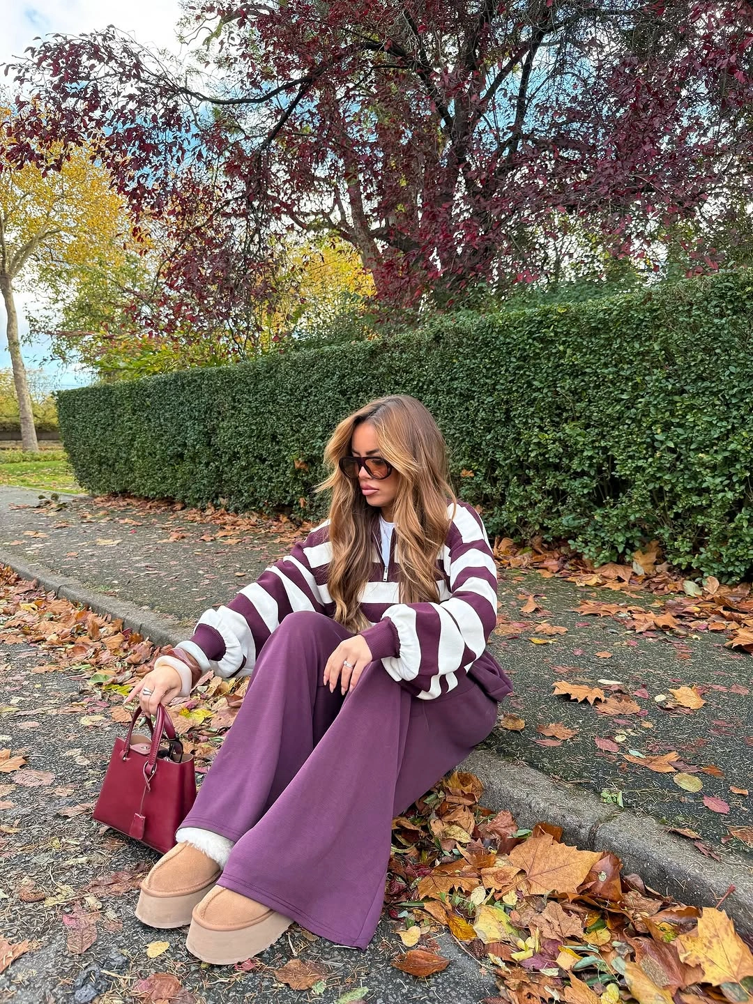
When combining related but different colors, repeat one of them in a small accessory rather than adding the same shade in every layer. A neutral shoe is useful here because it gives the trouser color room to stand out without introducing a new story at the foot. Very wide hems can cover delicate shoes, so choose footwear with enough visual presence to avoid a disappearing lower edge.
The outfit feels warm and grounded because burgundy appears twice while the purple-toned trousers remain the unexpected note. That is more convincing than relying on a vague idea of color harmony. Look for one visible link, then let the second color have a little independence; it keeps the result personal rather than overly planned.
Graphic Sweatshirt, Loose Jeans, and Soft Tan Boots
A dark graphic sweatshirt and black backpack place most of the visual weight at the top, while the light loose jeans and pale rounded boots soften the lower half. The boots echo the denim’s lightness instead of creating a sharp black endpoint, which gives the casual pieces a gentle tonal flow. The bag remains compact enough that the sweatshirt graphic can stay visible and unforced.
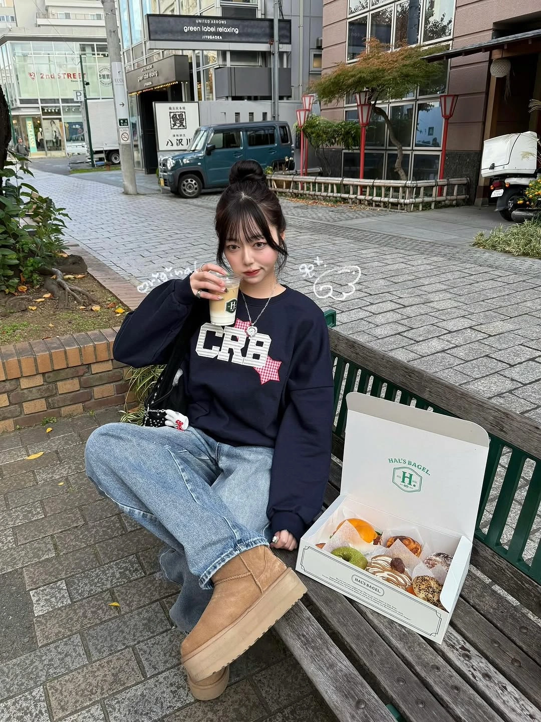
For this kind of everyday proportion, let the jeans fall loosely but make sure the shoe has a rounded or solid enough shape to hold the hem. A sleeker sneaker would make the outfit feel sharper, while the pale boot keeps it softer. Bulkier footwear changes the trouser break, so a cuff or a slightly shorter inseam can help the denim avoid pooling around the ankle.
The combination is comfortable without looking random because every item has a visual partner: dark sweatshirt with dark bag, light jeans with light boots. Those small pairings are what make relaxed dressing look intentional. Keep the graphic as the only strong message or pattern, and the rest of the outfit can remain quietly functional.
A Brown Wrap, White Blouse, and Strap Shoes
The large brown wrap makes the upper half generous and warm-looking, while a white blouse and white socks create two separate light points that connect the top to the dark strap shoes. A short black skirt leaves a clean gap between the wide shoulder layer and the footwear. That three-part structure keeps the outfit from feeling like a single heavy mass despite the wrap’s size.
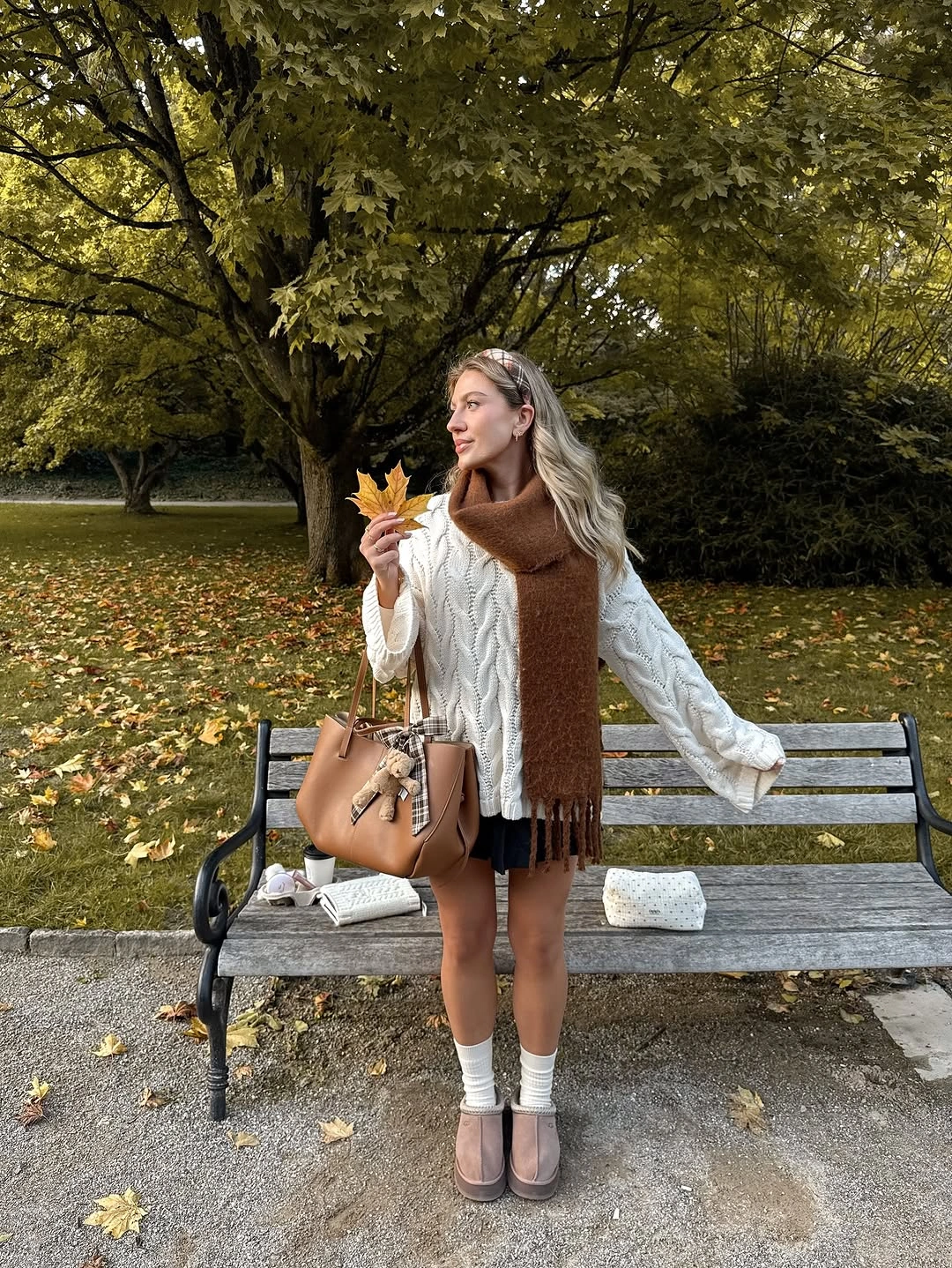
Opaque tights would make the lower half more continuous if the short hem feels too exposed, while bare legs keep the contrast more graphic. The socks are not a minor detail here; they repeat the blouse color and make the shoes look placed rather than abrupt. A very wide scarf already carries drama, so skip additional statement jewelry and let the shoulders remain the focal area.
This look works through echoed color rather than exact matching. The pale blouse and socks create a subtle top-to-bottom rhythm, then the brown wrap provides the strongest texture near the face. It is a thoughtful way to style a short skirt with a large layer: build a few clear connections instead of trying to make every piece equally prominent.
A Compact Brown Jacket Over a Graphic Maxi
The dark brown jacket and top form a compact upper block, which gives the long black-and-white patterned lower layer a clean place to begin. Because the graphic skirt or trousers reaches almost to the ground, its scale needs that quieter top half to stay legible. The small dark handbag and sunglasses do not interrupt the pattern, so the long vertical element remains the visible focus.
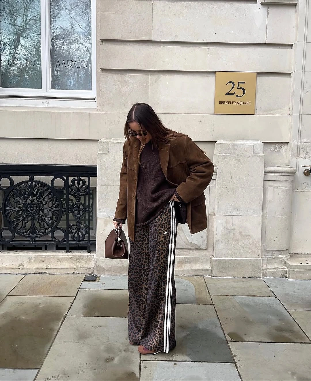
When a lower layer has this much contrast and length, choose one solid jacket color that relates to one of its darker tones. A simple boot works better than a decorative shoe because the hem already supplies movement near the floor. Long printed layers can catch or twist as you walk, so leaving enough clearance at the ankle matters as much as the pattern choice itself.
The strength of this outfit is its scale contrast: short, quiet, and dark above; long, graphic, and expressive below. It shows that a dramatic pattern does not need an equally dramatic top. One restrained jacket makes the whole look easier to wear and leaves room for the patterned lower half to feel intentional rather than overwhelming.
A Quilted Burgundy Vest With a Soft Pink Skirt
The burgundy quilted vest adds compact structure above a dusty pink patterned skirt, creating a clear contrast between a practical-looking layer and a softer decorative lower half. White socks and dark strap shoes echo the blouse and give the hem a tidy ending. A small burgundy bag repeats the vest color, which helps the dark footwear feel integrated rather than visually separate.
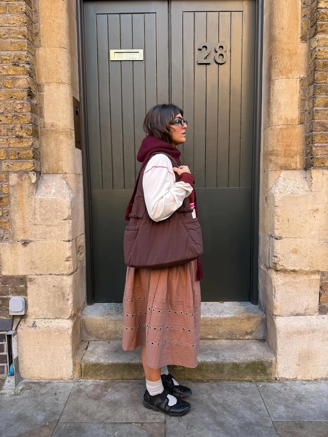
To adapt the idea, keep the vest fairly short so it does not cut across the longest part of the skirt at an awkward point. A simple ankle boot could make the look less delicate, while the socks and strap shoes preserve its light-dark contrast. The skirt has enough visible texture already, so a plain top is the useful choice beneath the vest.
The burgundy repeat is what lets the structured layer and romantic-looking skirt share the same outfit. Without it, the pieces might feel unrelated in mood; with it, the contrast becomes a point of interest. This is a good pairing for anyone who likes softness but also wants an outer layer that gives the torso a defined outline.
A Taupe Tote Against an All-Dark Column
The long black coat, dark short lower layer, tights, and ankle boots create an almost uninterrupted vertical column. A large taupe structured tote breaks that depth with one lighter, warmer note at the side of the body. Because the bag is the only strong contrast, it makes the dark layers easier to see as separate pieces without taking away their clean, minimal mood.
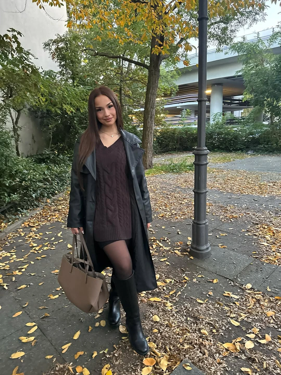
For a similar result, keep the clothing palette close and choose one bag that is visibly lighter but not bright. A scarf in taupe could repeat the contrast if you want it stronger, though the single-bag version is more restrained. A long coat can hide the waist completely, so a tote with some structure helps preserve an intentional outline at the side.
Minimal dressing works best when contrast is placed on purpose rather than scattered everywhere. The tote gives the eye a place to pause, then the rest of the outfit can remain dark and direct. That small interruption is enough to make the coat-and-boots combination feel composed, especially when you prefer accessories that are useful as well as visually clear.
Pale Pink Scarf Over an All-White Base
The white sweater and wide white trousers create a calm, light foundation, while the long pale pink scarf supplies a soft vertical line through the center. A tan shoulder bag adds a second warm note at the side, preventing the pale palette from becoming too flat. The scarf is subtle enough to preserve the quiet effect, yet visible enough to explain the transition between top and trousers.
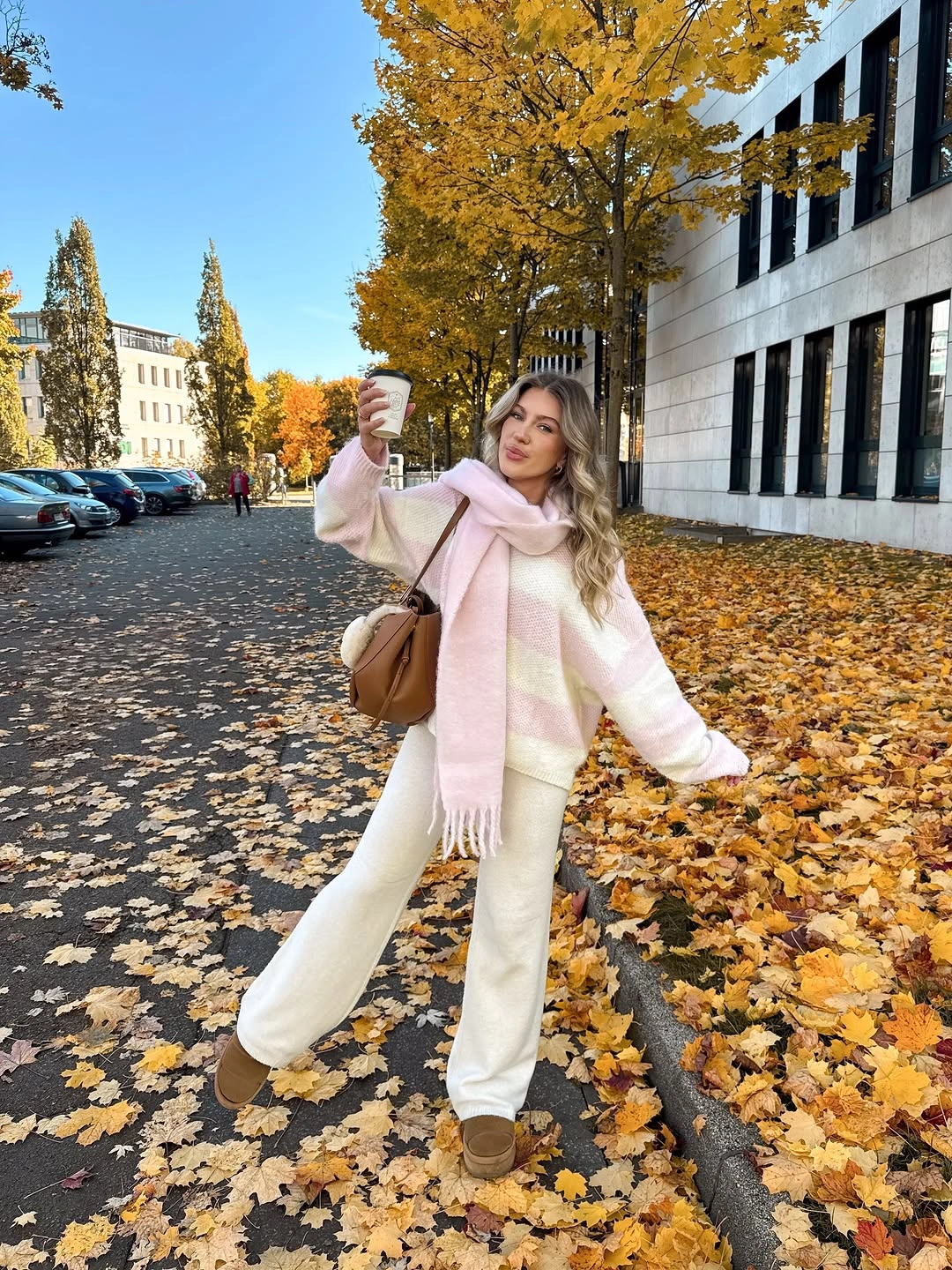
A long scarf is especially helpful with light neutrals because it brings direction without requiring a dark belt or jacket. You could choose a deeper shoe for more grounding, or keep the footwear quiet to preserve the nearly monochrome effect. Light trousers are practical only when you are comfortable with everyday marks showing more easily, so the palette is worth choosing for the right kind of day.
The outfit feels soft because every color sits close to white, cream, tan, or blush, but it is not shapeless. The scarf provides the key vertical detail and the bag adds a side accent, giving the eye two clear stops. That is enough structure for a light palette to feel intentional while remaining relaxed and open.
Plaid Overshirt With Tall Boots and Tights
The brown-and-blue plaid overshirt creates a long upper layer, while a short dark hem appears between it and the knee-high black boots. That visible break is what keeps the outfit from becoming one continuous brown-and-black column. A small beige tote with a warm graphic brings a light point to the side, making the darker lower half feel more balanced.
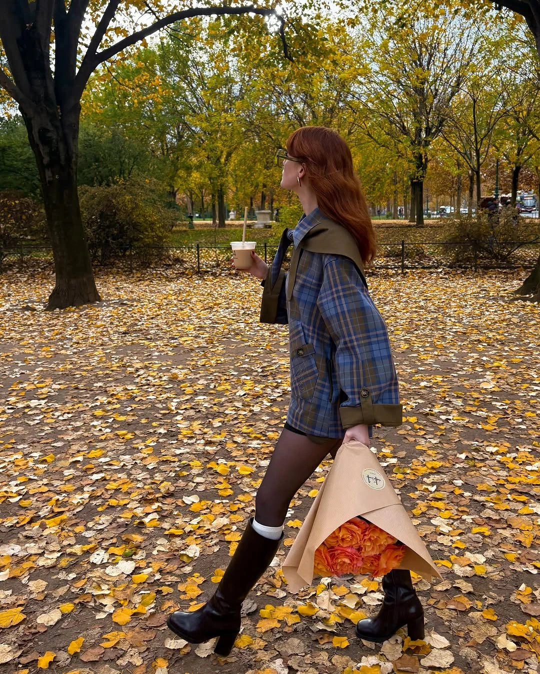
To use this proportion, let the overshirt reach low enough to feel substantial but not so low that it hides the skirt or dress completely. Opaque tights would make the lower line more uniform, while sheerer tights retain a little separation before the boots begin. Tall boots have a strong visual presence, so the bag and jewelry should stay compact unless you want a much bolder effect.
The outfit finishes on a practical contrast: a relaxed plaid layer above, a sharper boot line below, and one light accessory at the side. It is a useful way to make a long overshirt feel more intentional than a simple outer layer. Let the hem break do its job, and the boots will provide all the structure the lower half needs.