
Hair color decisions become frustrating when a shade looks appealing in isolation but the finished result feels disconnected from the person wearing it. Color is not only a name or a brightness level; it changes the way a shape is read, where attention lands, and how much effort the finished look appears to require. The most convincing result usually comes from a relationship between the color and the form, not from choosing the most noticeable option on a screen.
A better test is to judge the decision by its behavior. Consider whether the contrast has a clear purpose, whether the placement still makes sense when the hair moves, and whether the result will remain visually comfortable between styling days. Change one variable when you want to experiment, then watch what that change does to the whole impression. A shade earns its place when it supports the person and the shape instead of asking to be admired separately.
Coral and pink ribbons animate dark waves
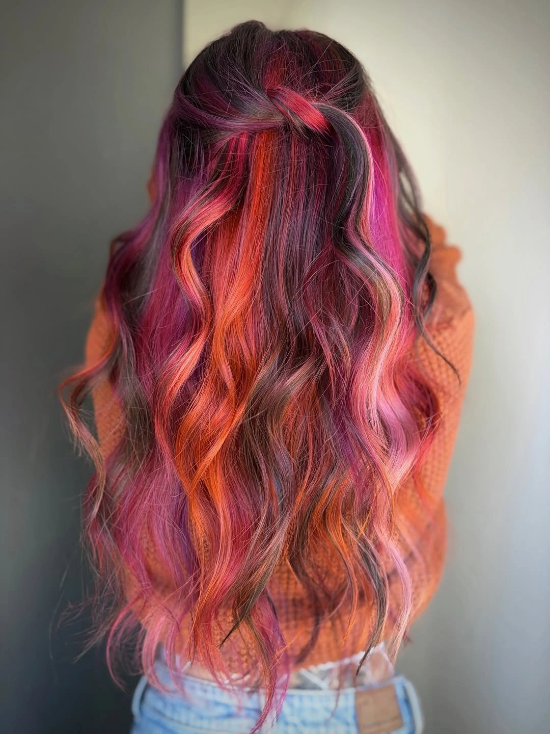
Long loose waves become much more expressive when a deep plum base carries separate magenta, coral, and pink ribbons through the lengths. The color is not placed as one flat bright field; it follows the movement of the waves, so each bend reveals a slightly different warm note. That keeps the back view full and dimensional while allowing the dark foundation to remain visible. The result suits someone who wants a vivid September color direction with movement built into the presentation.
The wave pattern is essential because it separates the panels and gives the high saturation somewhere to travel. If the hair were perfectly straight, the same placement could read as harder vertical stripes, while tighter curls would break the ribbons into smaller flashes. A softer rose or muted copper could reduce the contrast without changing the placement logic. The practical choice is to protect the wave definition, since aggressive brushing could blur the difference between plum, coral, and pink.
This color story is expressive rather than quiet, and that is its honest strength. The dark base gives the bright ribbons a visible frame, but strong contrast will also make fading or regrowth easier to notice than in a tonal brunette. A half-up style could expose the upper panels, while a loose braid would turn the colors into smaller sections. Keep the warm ribbons related and let the waves preserve their separation instead of adding more shades simply because the palette can hold them.
Soft chocolate waves rely on tonal depth
Long dark brown waves show that hair color does not need a bright contrast to feel considered. The shade stays within a deep chocolate family, while gentle bends through the lengths create small changes in reflection and density. Because the shape is viewed from the back, the smooth rhythm of the waves becomes the main source of movement. This is a restrained direction for someone who wants a visible update in finish and silhouette more than a dramatic color change.
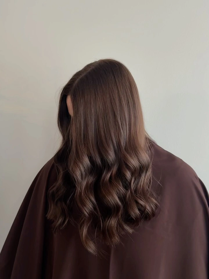
Tonal depth works best when the surface remains smooth enough for the light to move across it. A matte or heavily disrupted finish would make the color feel flatter, while a stronger wave could add more texture without changing the brown base. If you want a small variation, a slightly warmer brown around the ends would preserve the quiet impression and add dimension where the wave turns. The color is doing less visual work, so the condition and separation of the lengths matter more.
This kind of September hair Colour trend is easy to adapt because the underlying idea is not tied to a specific dramatic technique. A center part, side part, or loose low tie would shift the silhouette while keeping the chocolate tone stable. The realistic limitation is that a single dark value can hide layers when the hair is not moving, so a soft bend or a few visible end layers help. Preserve the tonal calm if you want the color to look polished rather than newly complicated.
A loose braid opens pale wavy lengths
Long pale blonde-beige hair gains a clear focal point from a loose braid gathered at the back, while the rest of the length remains wavy and open. The braid creates a small area of texture and control near the crown, and the pale scrunchie adds a gentle accent without changing the color story. Because the lower lengths remain visible, the style still reads as flowing hair rather than a fully contained updo. It is a useful example of using styling to reveal color instead of adding more contrast.
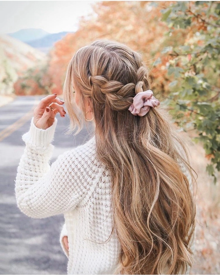
The braid works because it interrupts the smooth fall at one point and then releases the eye back into the long waves. A tighter braid would make the upper section more graphic, while a looser twist would keep the effect softer and less defined. The pale palette supports both choices, but the scrunchie should stay small if you want the hair to remain the focal point. Detangling also matters here, since rough handling can make the loose lengths lose the calm separation that gives them lightness.
For a simpler version, gather only the upper side pieces or replace the braid with a low half-up twist. That preserves the relationship between controlled crown and flowing ends while requiring less styling detail. The tradeoff is that the long pale lengths may need more care to keep the braid and wave boundaries neat, especially when the finish becomes dry-looking or fuzzy. The most useful feature to keep is the small textured anchor against the otherwise open, soft color field.
Golden waves gain dimension from a lifted crown
Bright golden yellow-blonde waves become more dimensional when the crown is gathered into a half-up twist or bun. The lifted top exposes darker warmth near the roots, while the loose lower waves carry several golden reflections through the ends. This makes the color feel layered without requiring a contrasting dark panel or a separate accent shade. The shape is cheerful and saturated, but the movement keeps it from reading as a flat block of yellow.
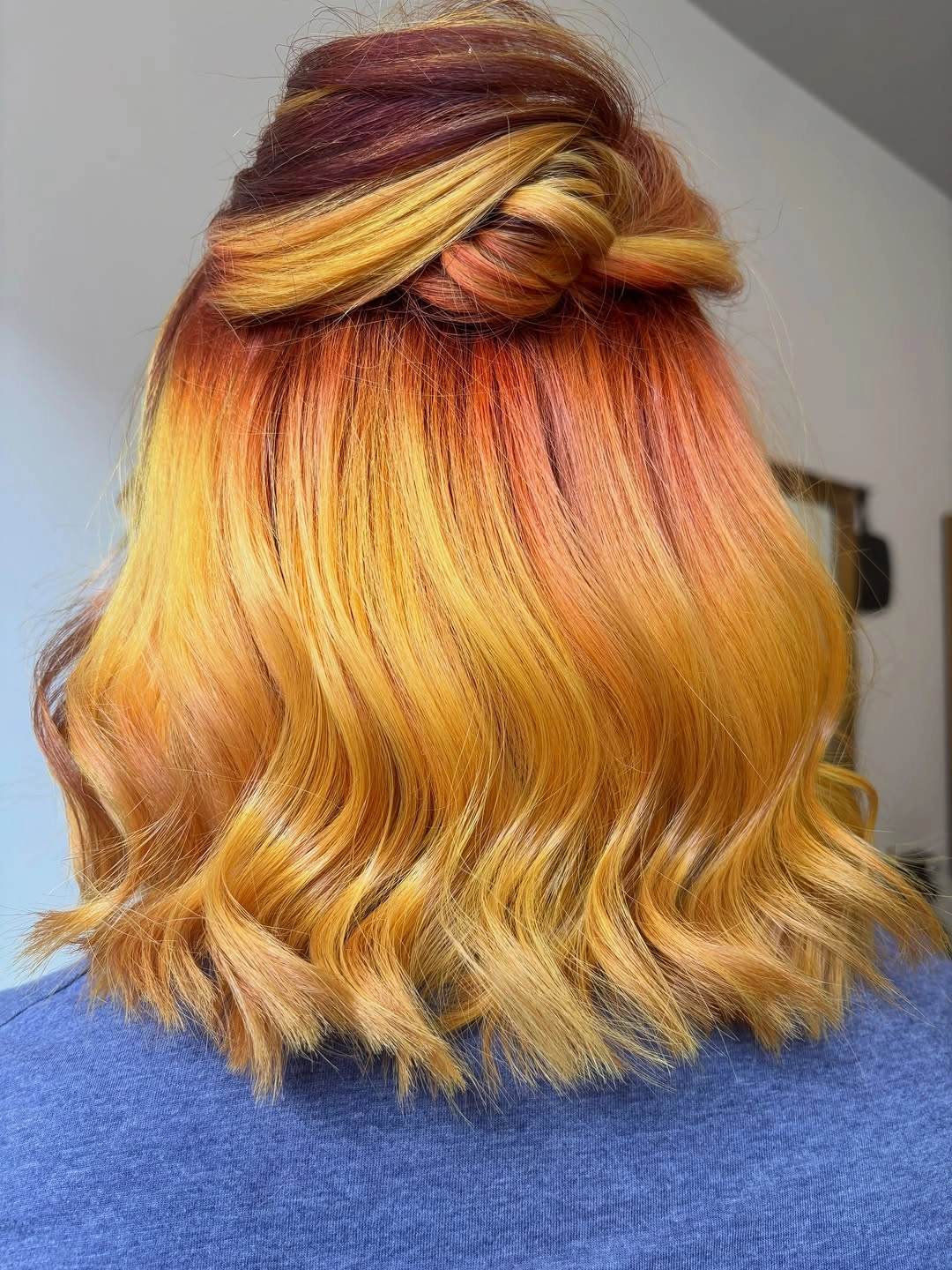
The gathered crown changes where the eye sees the strongest value contrast. Close to the head, the darker depth gives the bright lengths a starting point; farther down, the waves catch light and soften the transition. A lower half-up tie would create less lift and a calmer silhouette, while wearing everything loose would make the color more fluid. Keep the wave pattern separated, because the golden variation depends on the bends remaining visible rather than merging into one bright mass.
This is a strong choice for readers who want warm color to lead the style, not sit quietly in the background. The limitation is that saturated golden tones can show root contrast and fading clearly, so the upkeep impression is more visible than with a muted brown. A plain clip or neutral tie would let the color stay central, while a bright accessory could make the top too busy. Preserve the lifted crown only if it helps the shade look dimensional rather than simply brighter.
Copper at the front refreshes a short brown shape
A short dark brown swept-up style changes character when a warm copper or auburn accent concentrates near the front and crown. The rest of the hair stays deep, so the small warm section becomes a clear focal point without asking the whole silhouette to become bright. The compact shape makes the placement easy to notice, and the side-swept front adds a directional line. This is a lower-volume way to explore color than covering a long style with several vivid panels.
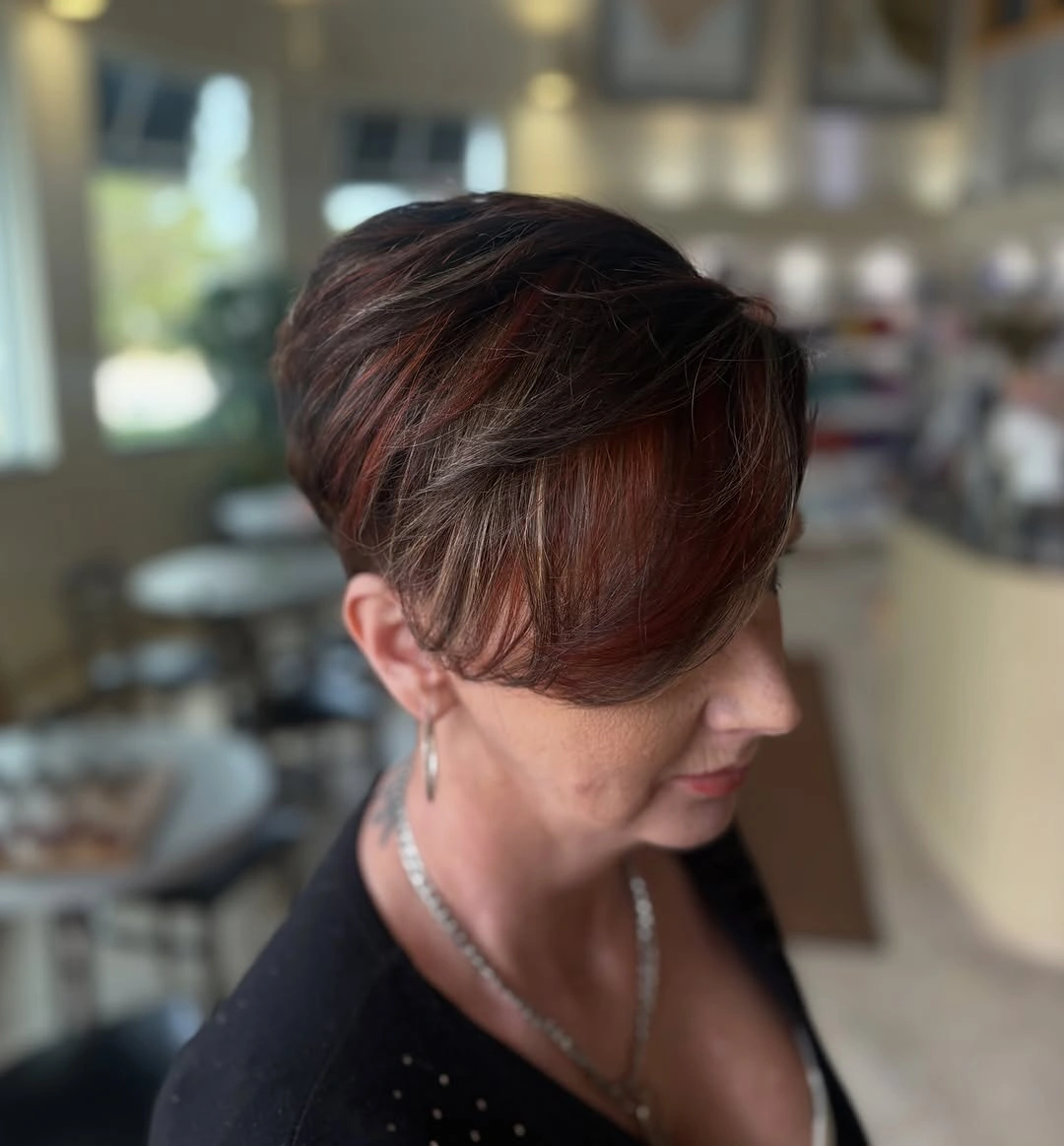
The placement works because it follows the front sweep instead of appearing as an isolated patch. If the accent moved toward the back, the style would feel more concealed and less face-led; if it spread across the whole top, the short brown base would lose its contrast. A muted auburn would soften the effect, while a brighter copper would make the front more graphic. Keep the shape lightly controlled so the warm section remains visible as the hair moves.
The practical advantage is that the color statement is concentrated, but the same concentration makes any grow-out or fading noticeable at the front. A side part could shift the accent slightly, and a softer fringe could reduce the sharpness without changing the brown foundation. Avoid claiming a specific short haircut from the visible shape; the important evidence is the compact silhouette and warm front placement. The idea is strongest when the copper acts like a small light source inside a deep frame.
Broad copper panels frame dark waves
Dark shoulder-length waves receive a strong shift when broad copper-orange panels sit around the face and continue into the lengths. The warm sections are wide enough to change the whole silhouette, yet the waves soften their edges so they do not read as rigid stripes. The dark base remains visible at the sides, creating a clear high-contrast relationship between depth and brightness. This is a more assertive direction than scattered highlights because the front placement leads the eye immediately.
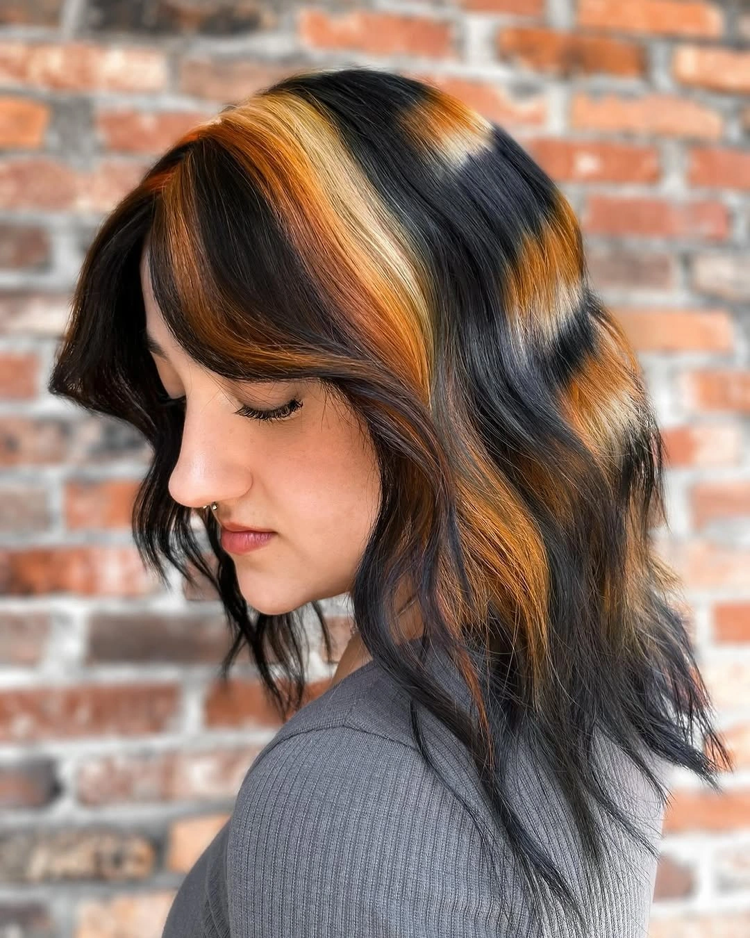
The texture of the waves is what keeps the broad panels connected to the haircut. On a straight finish, the same color blocks might look more graphic and severe, while a curlier finish would break them into smaller flashes. A narrower copper ribbon would be easier to soften, but it would also lose some of the face-framing effect. If you choose this kind of contrast, the front placement needs to be balanced so one side does not carry all the visual weight.
For daily styling, the waves can be worn loose to show the panels or tucked behind one side to make the contrast more directional. The tradeoff is that wide warm sections create a clear maintenance boundary, especially against a very dark base. A softer copper-brown could keep the same placement with less intensity. Let the dark foundation remain substantial; the color works because the brightness is framed, not because the entire head is equally saturated.
A blunt copper bob makes saturation graphic
A vivid copper-red bob with blunt bangs makes color and shape reinforce each other. The saturated shade is even across the compact silhouette, while the fringe and clean lower edge give it a graphic outline. Glasses are secondary, but they emphasize the precision around the face rather than changing the main idea. This is not a soft, blended color story; it is a clear choice for someone who wants a warm shade and a defined boundary to arrive together.
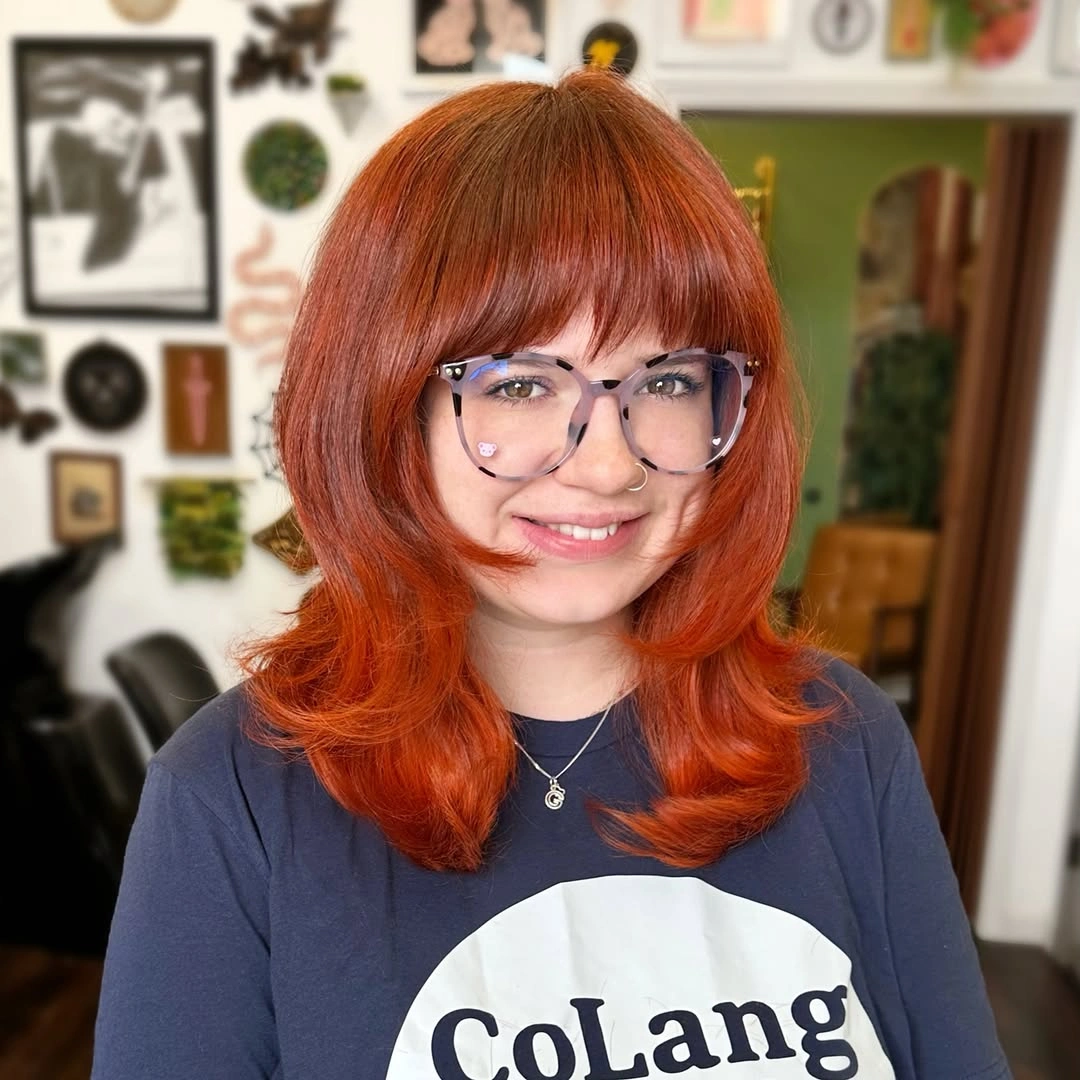
The blunt line prevents the bright color from drifting into a loose, casual impression. A slightly layered bob would make the shade feel lighter and more mobile, while a longer length would distribute the saturation across more movement. The fringe is a useful variable too: a softer curtain opening would reduce the graphic effect, while the full blunt edge keeps the color concentrated near the eyes and cheek area. Keep the lower line neat if precision is the point.
A compact saturated bob can feel visually fresh without relying on extra styling, but the clean outline also makes reshaping more noticeable. A darker copper or muted auburn would reduce the intensity while preserving the same cut-and-color relationship. Avoid naming a precise dye formula or assuming the color’s permanence; only the visible copper-red result is certain. The best takeaway is that a strong color can look calmer when the haircut gives it a disciplined frame.
Warm highlights scatter through dense curls
A rounded mass of defined brown curls shows a different route to dimension: warm highlights are scattered through the texture instead of organized into broad panels. The curls create many small areas of light and shadow, so chocolate, caramel, and copper notes appear and disappear as the shape turns. The silhouette stays full and compact, making the color feel integrated with the texture. This is a useful direction when movement matters more than a smooth color map.
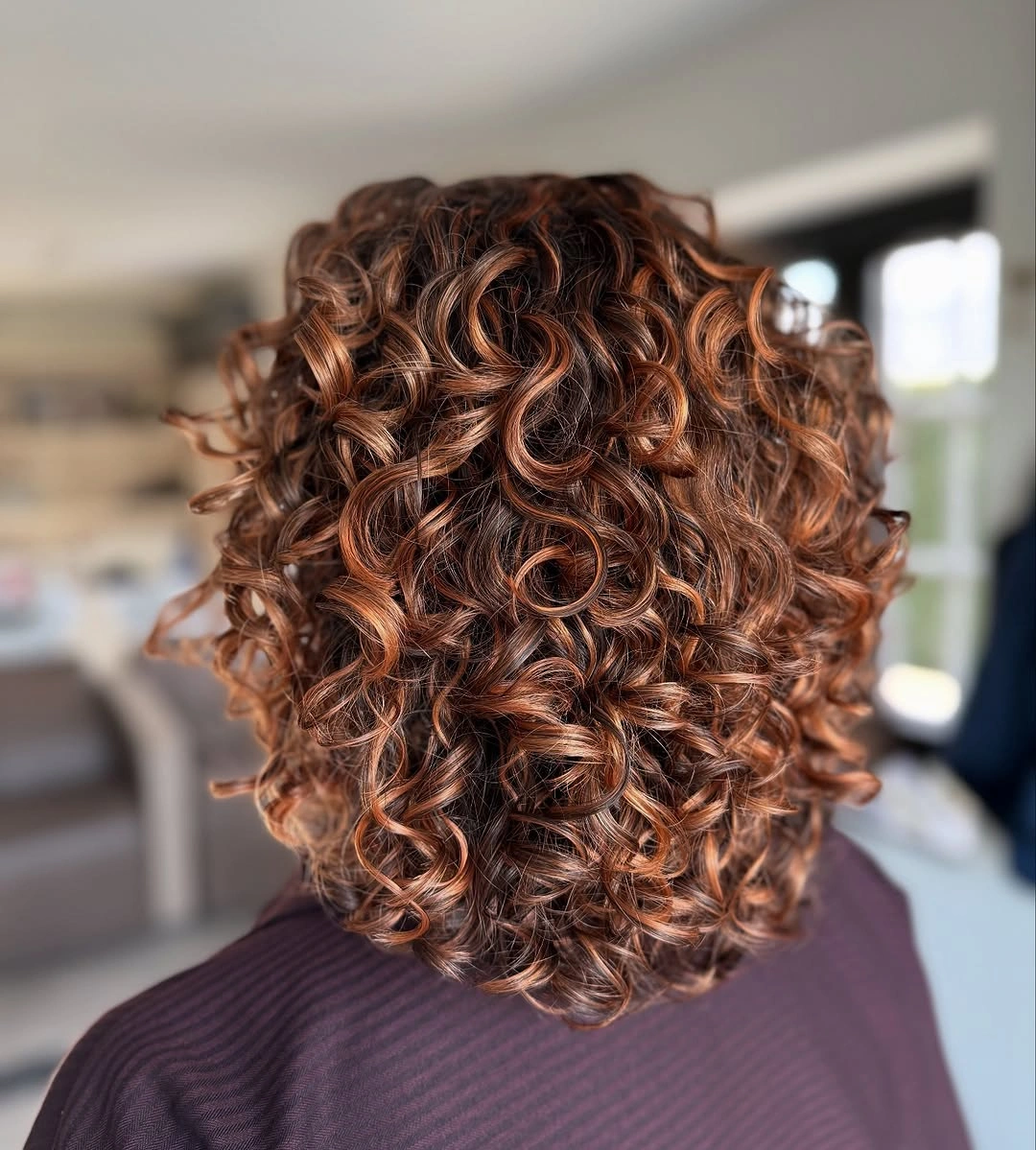
The curl pattern controls the scale of the color. Broad highlights would make the shape more graphic, while smaller warm pieces keep the result blended and active across the rounded silhouette. If you want a quieter variation, reduce the warm contrast but keep a few lighter strands near the outer edge. The practical point is to protect the curl separation, because overhandling could turn many readable highlights into one fuzzy brown surface.
This color relationship is adaptable to a shorter or slightly longer curly shape, but the impression changes if the volume moves away from the head. A more elongated silhouette would make the warm tones travel vertically, while the compact shape makes them feel concentrated. The limitation is not the number of colors; it is the need for enough definition to show their placement. Keep the base deep and let the curls create the transitions rather than adding a second heavy pattern.
Curtain bangs break up a deep brunette base
Long dark brunette hair can look more dimensional without a bright color change when curtain bangs and face-framing layers open the front. The deep base remains calm through the lengths, while the center part and soft fringe create movement around the face. Loose bends keep the silhouette from falling as one solid curtain. This is a shape-led September hair Colour trend for someone who wants a visible refresh without making color the loudest decision.
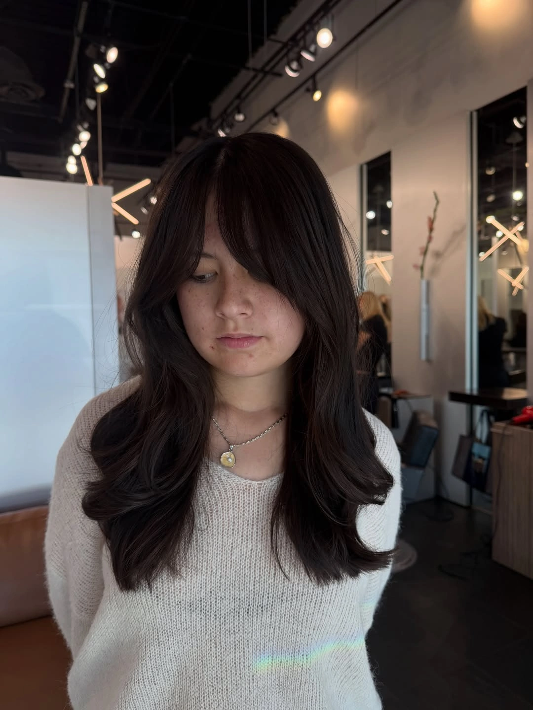
The fringe changes the value of the front area by creating space and direction, even though the shade stays dark. A side part would make the movement more sweeping, while a straighter finish would make the layers look more deliberate and less airy. If you want a little more color, a soft brown ribbon near the face could add light without replacing the brunette base. Keep the front pieces separated, because their opening is what makes the simple color feel shaped.
The practical appeal is flexibility: the long lengths can stay loose, tucked behind the ears, or gathered while the curtain pieces keep a little movement at the front. The limitation is that face-framing layers need enough styling or natural bend to avoid falling into a heavy middle line. A simpler long cut would be easier to maintain but less visibly changed. Preserve the dark tonal depth and adjust the part or fringe before reaching for a new shade.
A plum bob keeps berry color precise
A shoulder-length bob in muted plum or mauve lets a berry tone feel polished because the shape is simple and the lower edge is even. The color reads as one softened field rather than a mixture of competing reds, and the straight finish gives it a clean surface. Because there is little styling detail, the eye goes directly to the relationship between the muted shade and the bob line. It is a controlled option for someone who wants color without a complicated silhouette.
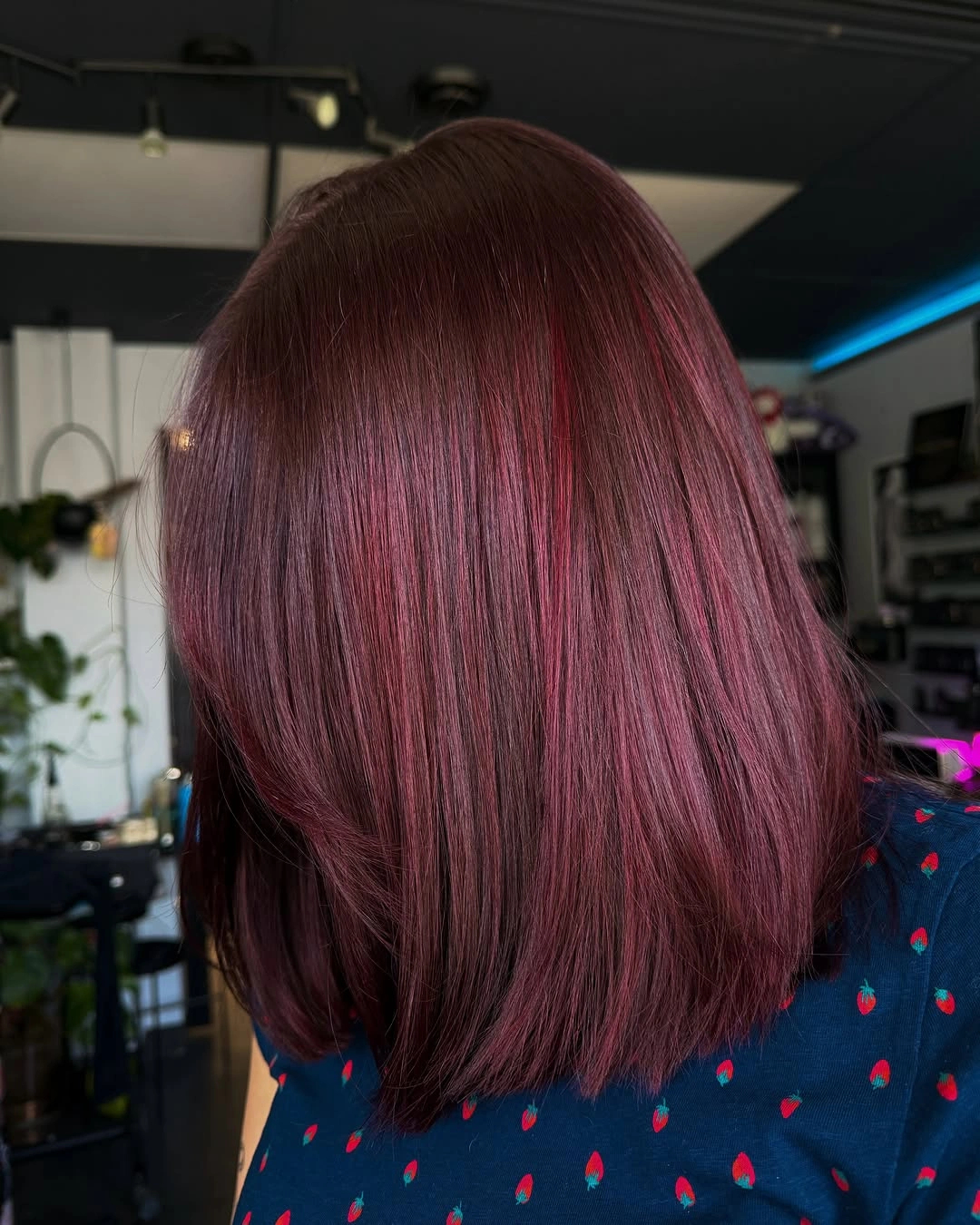
The blunt shape gives the softened berry tone enough definition to avoid looking washed out. A few waves would add movement and make the plum more dimensional, while a stronger layer would break the clean color field into smaller reflections. The shade could also become deeper and wine-like without changing the bob structure. If the goal is precision, keep the lower edge clear and let the color remain even rather than adding bright contrast pieces.
This kind of medium bob is visually direct, which makes it easy to explain but less forgiving when the edge becomes uneven or the finish loses smoothness. A slightly longer version would soften the maintenance impression, while a shorter version would make the plum more concentrated. Do not infer exact berry undertones beyond what is visible; muted plum is enough to describe the result. The strongest feature is the clean frame around a softened saturated color.
Orange waves carry several warm notes
Long vivid orange waves become richer when red and pink depth is threaded through the lengths instead of leaving one uniform orange field. The waves separate the colors into moving sections, so the eye catches coral, red, and orange at different points. A dark root and glasses are visible, but they stay secondary to the warm color story. This is an expressive choice for someone who wants the hair itself to act as the main visual accessory.
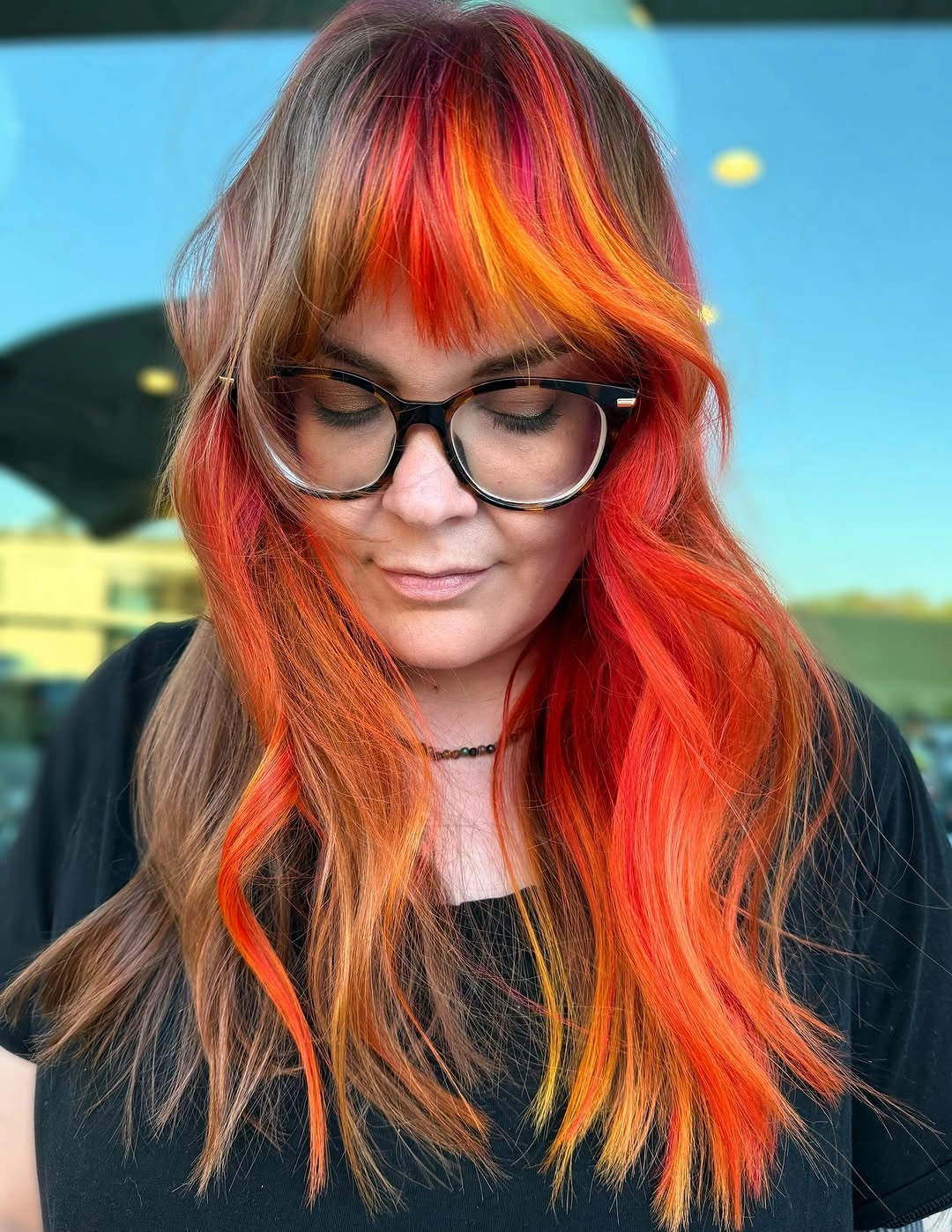
The wave rhythm prevents the warm colors from becoming a flat panel and lets the lower edge appear lighter or darker depending on its bend. A straighter finish would emphasize the vertical color placement, while a tighter curl would make the transitions smaller and more scattered. If the full saturation feels too intense, keep the orange center and reduce the pink or red edges. One controlled color variable at a time will preserve the relationship instead of turning it muddy.
High-saturation warmth is visually rewarding but less quiet in maintenance. Root contrast and fading will show clearly, and the long length carries that change across a large area. A half-up tie or loose braid can reduce the amount of color visible at once without changing the base. For a related but more concentrated direction, the site’s red hair color ideas keep the same warm emphasis in a different balance. The best reason to choose this direction is its full-silhouette energy, so keep the styling open enough for the warm tones to remain separate and legible.
Blended blonde layers keep the front airy
Long light blonde hair looks softer when the brighter front pieces blend into layers and loose waves rather than stopping in a hard line. The face-framing shape creates movement around the front, while the cream and beige tones continue through the length with gentle variation. The result is lighter and more airy than a single straight pale sheet of color. It suits readers who want a polished blonde direction where the cut does part of the dimensional work.
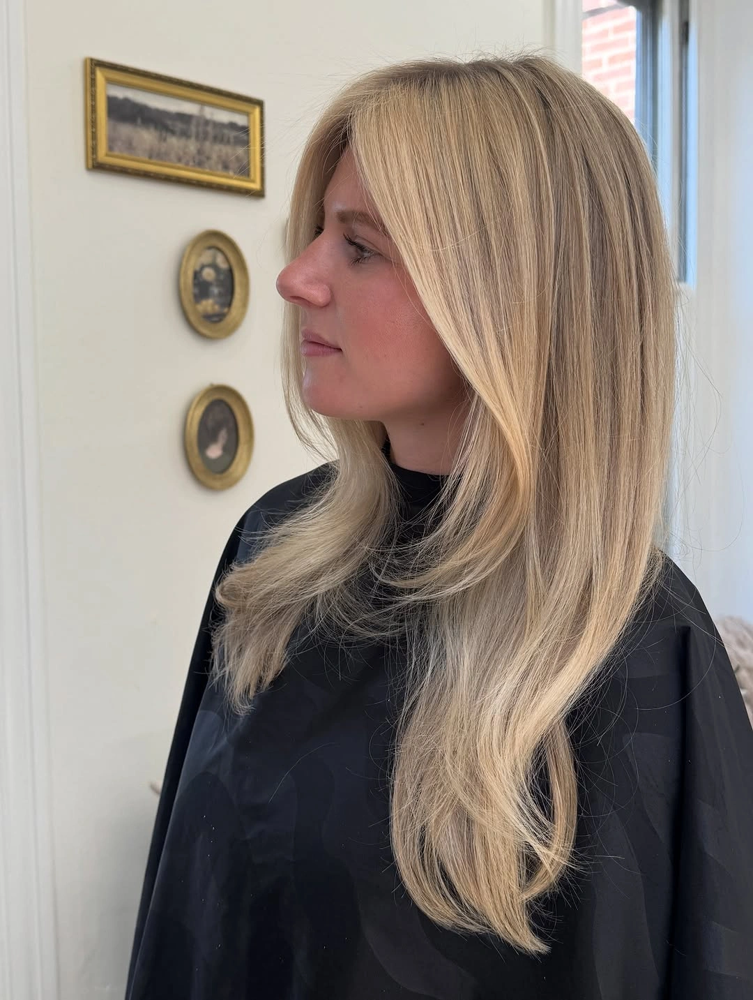
The front pieces are important because they create a visible opening and guide the eye into the waves. A center part would make the symmetry calmer, while a side part would give the same color a more directional sweep. A slightly darker beige root could add depth without changing the light overall impression. Keep the lower layers soft rather than sharply choppy, since the color appears blended because the lines continue into one another.
Long pale hair benefits from a finish that stays smooth enough for the lighter strands to reflect. The tradeoff is that the airy effect depends on movement and can look flatter when the lengths hang completely straight or become fuzzy. A loose bend is enough to restore the visual separation, so the style does not need an elaborate updo. Preserve the blended front and adjust only the wave, part, or root depth when you want a different version.
A centered part steadies pale blonde waves
Very light blonde waves take on a calm, balanced quality when a clean center part divides the front evenly. The shade stays pale and mostly tonal, so the symmetry and repeated movement through the lengths become the main visual structure. A dark high-neck top provides contrast around the hair without changing its color. This is a quieter blonde idea than a high-contrast panel, but it still feels deliberate because the part and wave rhythm are clear.
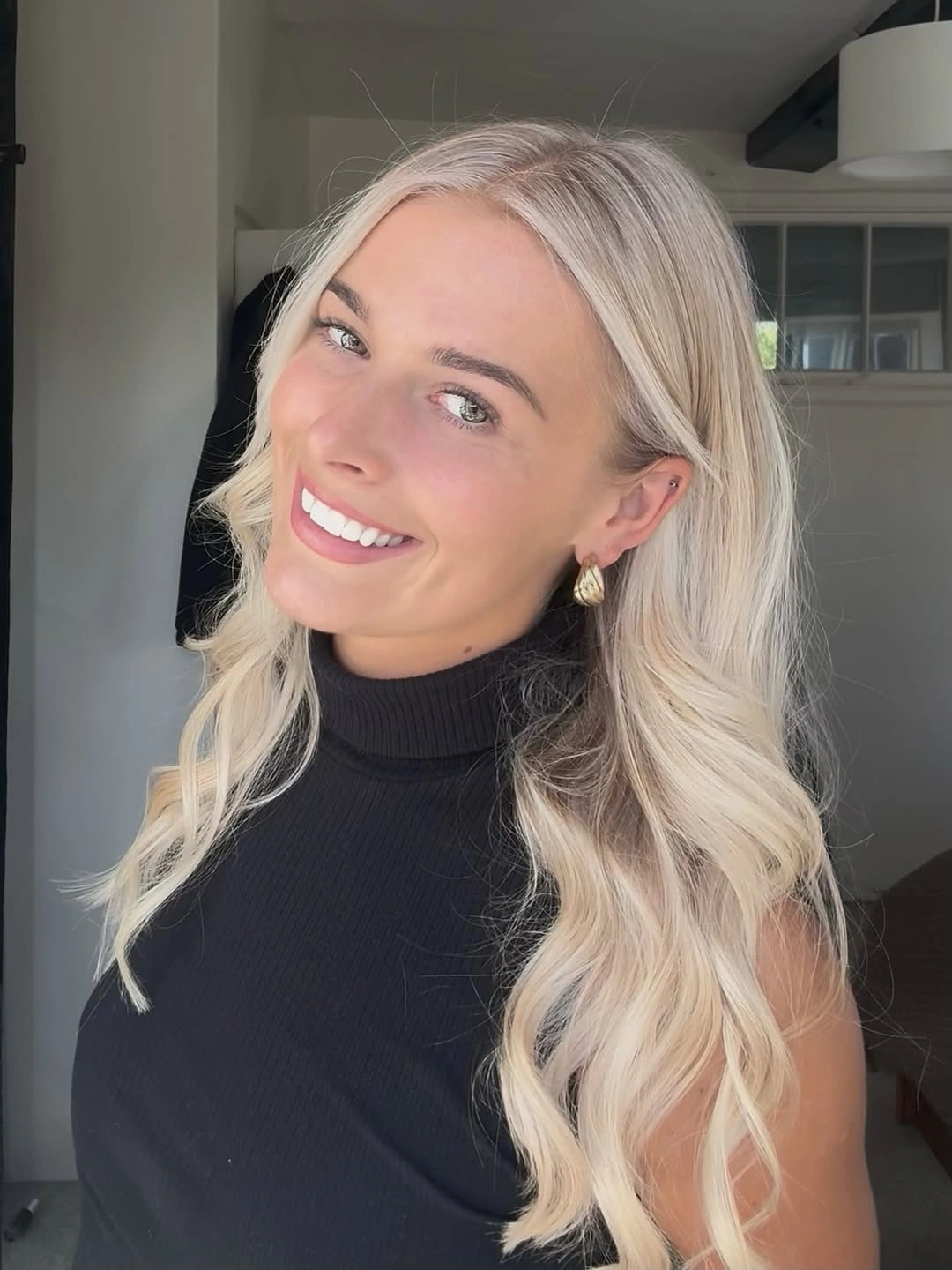
The center part creates two similar sections, allowing the light color to read as a continuous field rather than a directional sweep. A side part would add more asymmetry and perhaps make the front feel fuller on one side, while a blunt straight finish would make the pale shade more graphic. If you want subtle dimension, a slightly warmer beige through the lower waves could add depth without interrupting the symmetry. Keep the part clean if balance is the reason for choosing it.
This style works for readers who prefer the color to look polished rather than playful. The practical limitation is that a center part makes uneven movement, flyaways, or root contrast more visible because both sides are compared directly. A loose half-up tie can preserve the division while reducing the amount of hair around the face. The important relationship is pale color plus even structure, not a particular blonde label that the image cannot prove.
A side part directs medium brunette movement
Medium-length dark brunette hair becomes more directional with a side part and soft waves through the ends. The color remains deep and restrained, but the front sweep changes the balance of the silhouette and keeps the lower edge from looking blunt. A simple black top allows the hair to stay central, while the shoulder-skimming length remains easy to read. This is a practical shape-led option for someone who wants change without high-contrast color.
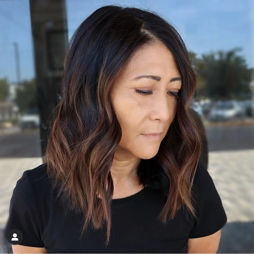
The side part creates a clear path for the waves, making one side feel fuller and the other more open. A center part would make the style quieter and more symmetrical, while a stronger layer would increase movement at the ends. A warm brown gloss-like variation could add reflection, but the visible evidence supports a dark brunette base with soft dimension rather than a precise formula. Let the part do the styling work before adding a bright accessory or a dramatic color.
Medium length is useful because it can be worn loose, tucked, or lightly tied without losing its shape. The tradeoff is that soft waves can collapse into a heavy curve if the ends are not separated, so a simple bend may be more effective than a very uniform curl. If you want a more polished finish, keep the part defined and the lower edge smooth. Preserve the directional sweep and change the shade only if the shape already feels right.
Red orange and pink panels follow layers
Layered medium hair becomes a stronger color canvas when vivid red, orange, and pink panels appear around the face and through the lower sections. The dark base keeps the colors grounded, while the layers reveal them in slices rather than as one continuous block. A side profile makes the relationship clear: the bright pieces sit where the ends and front move. This is a structured way to wear vivid color because the haircut controls how much is visible at once.
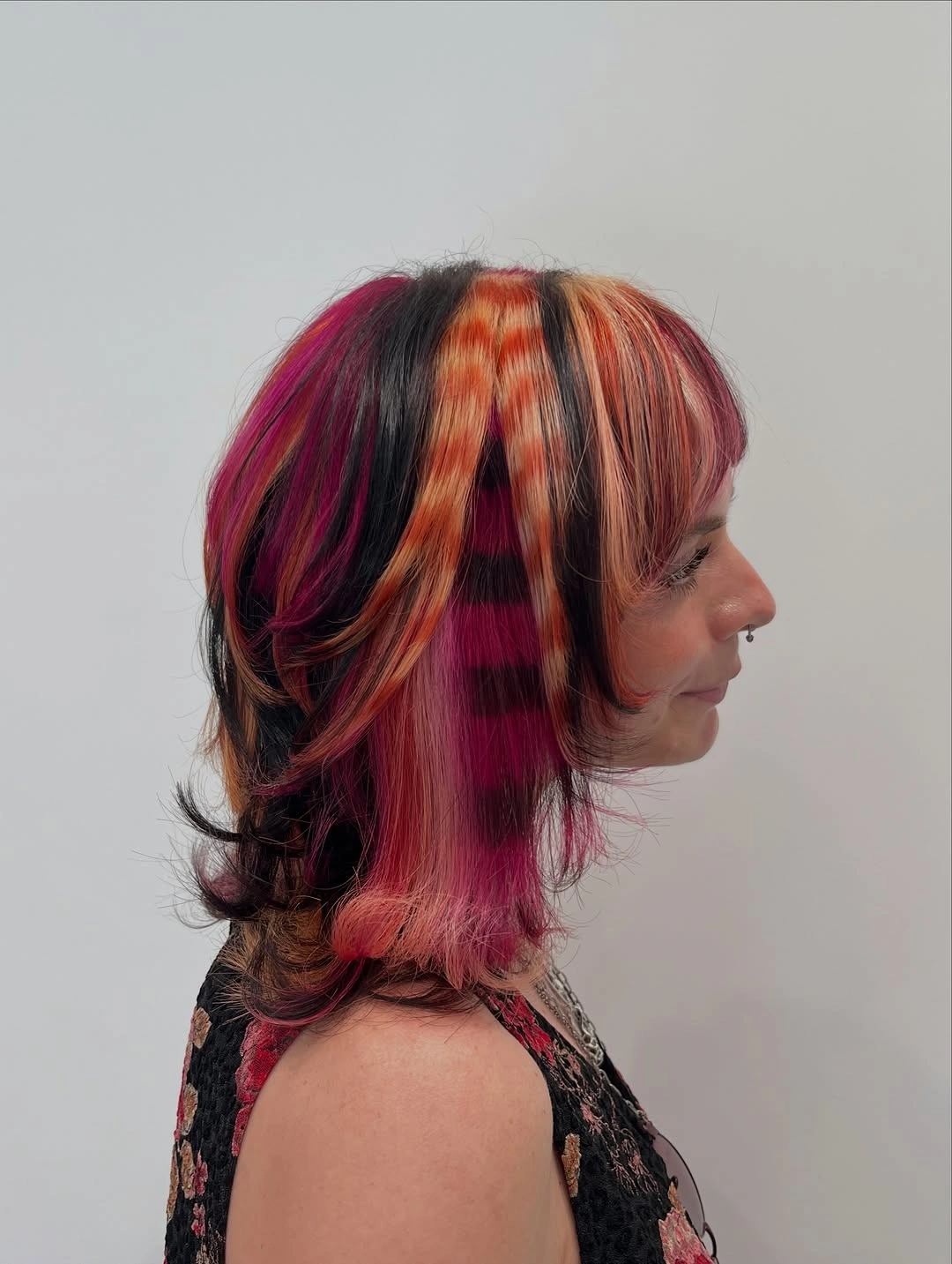
The layers make the contrast more dynamic because a different section appears as the hair turns or settles. A blunt cut would show larger, harder blocks, while a softer layer would make the panels blend and feel less graphic. If the palette needs restraint, keep the red as the main tone and use orange or pink only near the face. The placement should remain balanced across the visible front and lower edge so the color does not pull entirely to one side.
Wearing the hair loose will show the fullest range, while tucking one side can make the brighter panel feel more intentional and less widespread. The limitation is that high-contrast panels reveal fading and regrowth clearly, especially when the base is very dark. A muted auburn variation could keep the layered effect with less saturation. Let the haircut create the rhythm and avoid adding a separate bright accessory that competes with the panels.
Softly flipped ends add movement to brown hair
Medium dark brown hair can look newly shaped even when the color stays completely tonal. The upper section is smooth and understated, while layers and softly turned ends create a rounded movement at the bottom. Seen from the back, the silhouette depends on those curved ends rather than on highlights or contrast. It is a quiet September color direction for readers who want their shade to remain stable while the haircut feels lighter.
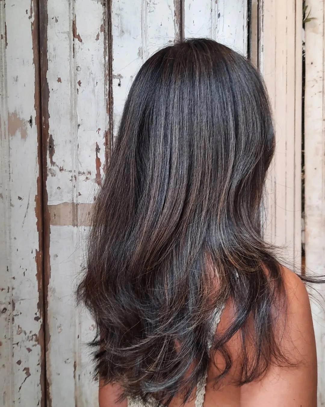
The lower movement gives the dark color places to catch light and prevents the medium length from hanging as one dense sheet. Straighter ends would make the shape more minimal, while stronger waves would add texture and soften the line further. A small change in parting could alter the front without disturbing the tonal brown base. The practical focus is keeping the ends separated enough to show their direction without making the style look overly curled.
This is easier to adapt than a high-saturation change because the color itself remains calm. A fine layer, a soft brush-through, or a tucked side can make the silhouette feel different from day to day. The limitation is that a tonal brown style can disappear when the ends lose their shape, so a little movement is not optional if the haircut is the main feature. Preserve the dark simplicity and let the lower edge carry the update.
Bronde ribbons brighten long waves
Long brown-to-blonde waves show a balanced middle ground between a deep base and bright blonde. Lighter ribbons sit around the face and continue into the length, while the brown root remains visible enough to anchor the result. The loose wave keeps the transitions blended rather than strip-like. This is a useful color relationship for someone who wants brightness and movement without the sharp contrast of vivid panels. For a deeper warm direction, the site’s auburn hair color ideas offer a related way to think about warm depth.
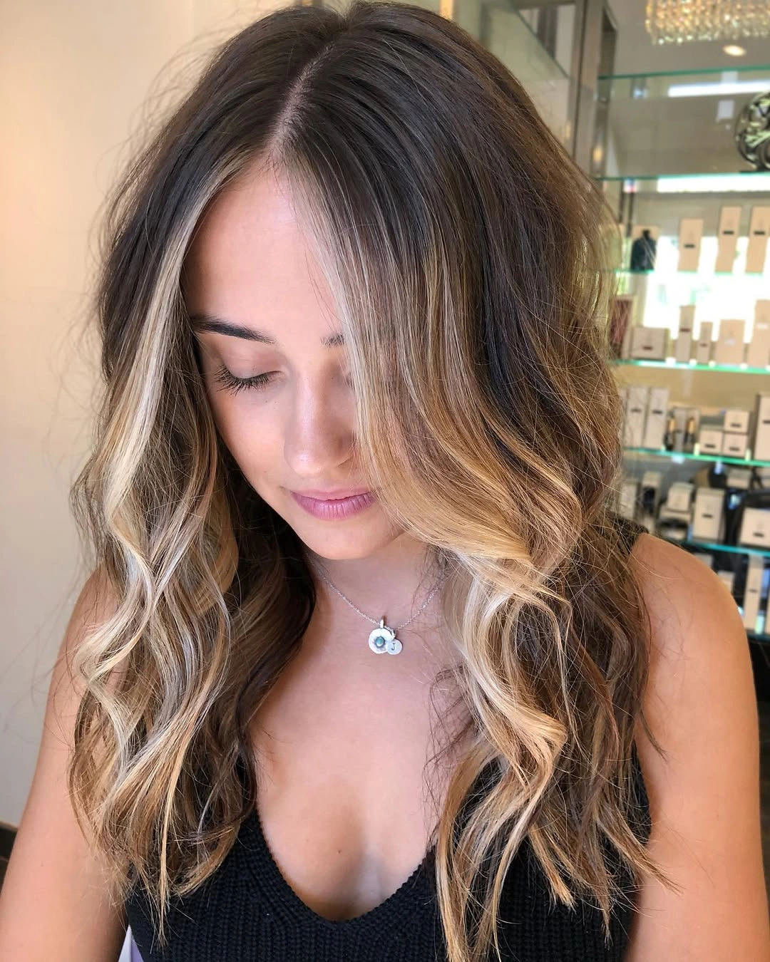
The front ribbons matter because they give the pale pieces a clear starting point while the length softens the contrast. A stronger light section would make the face frame more obvious, while a quieter beige would keep the blend closer to brunette. The wave pattern helps both options because it breaks the color into moving reflections. Keep the part in mind when adapting the idea, since a side part will shift where the lighter pieces sit relative to the face.
Bronde is practical in the visual sense because the transition is less abrupt than a solid blonde field, but it still needs enough contrast to remain visible. The tradeoff is that subtle ribbons can disappear when the hair is very straight or when the base and light pieces are too close in value. A loose bend, half-up style, or gentle face frame can restore definition. Preserve the brown anchor and change the brightness gradually rather than adding several unrelated warm tones.
Half-up styling reveals red copper panels
Long dark waves with red and copper panels become more graphic when the top is gathered into a half-up style. The lifted crown exposes warm sections that might disappear when all the hair is loose, while the lower waves keep the overall shape soft. Dark brown remains the structural base, and the color panels descend vertically through the movement. This is a reminder that styling can change the apparent intensity of a color placement without changing the color itself.
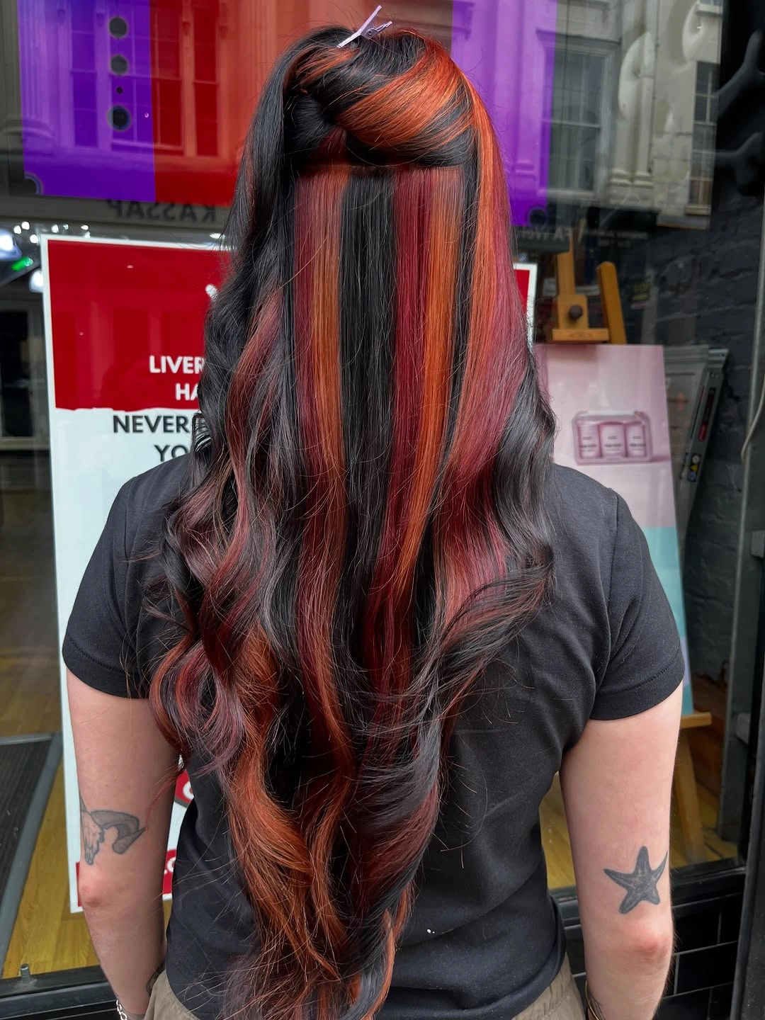
The half-up tie creates two separate visual zones: a visible upper panel and a flowing lower field. Wearing the hair loose would distribute the red and copper more quietly, while a high tie would make the contrast more concentrated near the crown. A braid could break the panels into smaller bands, but the half-up shape keeps them readable. The practical decision is how much contrast you want to reveal on a normal day, not whether the color is inherently too bold.
Because the warm panels sit against a dark base, they will remain visible even when the waves soften, but the gathered shape can make uneven placement more noticeable. Keep the top simple and avoid a large accessory if the color is already carrying the focus. The tradeoff is clear: half-up styling offers control and visibility, while loose styling offers softness and less maintenance around the tie. Preserve the red-copper relationship and use the hairstyle to adjust its volume.
A rounded plum bob softens berry depth
A short-to-medium bob in plum-burgundy color feels softer when the ends carry a gentle wave instead of staying perfectly blunt. The berry tone remains deep and cohesive, while the rounded shape gives it movement around the lower edge. The result is more approachable than a rigid wine-red block, yet it still has enough saturation to read as a deliberate color choice. It suits someone who wants a compact shape with visible depth rather than a long, dramatic color story.
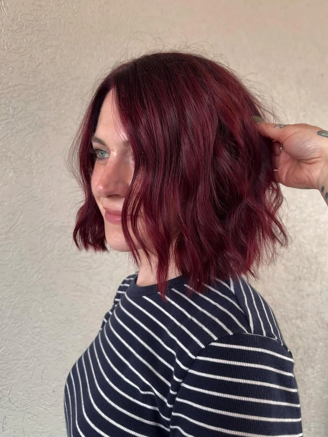
The rounded silhouette allows the plum shade to catch light across several curved surfaces. A straight finish would make the color cleaner and more graphic, while a stronger curl would break the bob into a more textured shape. A slightly muted berry tone could soften the contrast further without losing the relationship between color and cut. Keep the lower edge controlled so the wave looks intentional rather than like the shape has simply lost definition.
Shorter hair keeps a rich berry shade concentrated, which can make it feel expressive without requiring a full-length color commitment. The limitation is that the same concentration may show fading or reshaping clearly, especially around the bob edge. A longer version would distribute the color and movement more gradually. Preserve the rounded softness if you want the plum to feel warm and wearable rather than severe.
Dark roots ground shoulder-length blonde waves
Shoulder-length blonde waves look more dimensional when a darker root area remains visible above the pale lengths. The side part gives the front a directional sweep, while the loose waves stop the lighter color from reading as one flat sheet. A pale pink top is incidental but supports the gentle warmth of the hair without defining it. The rooted transition is useful because it gives the blonde a visual anchor close to the scalp.
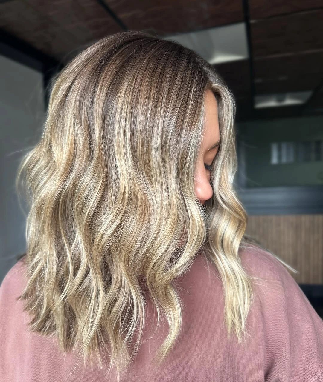
The root depth creates a gradual value change before the eye reaches the brighter lengths. A lighter root would make the result more uniform and luminous, while a stronger dark root would make the contrast more graphic. The waves soften either option by breaking the line into sections. Keep the side part clear if you want the darker area to frame the face, or shift toward the center for a more symmetrical transition.
This is a practical blonde direction for someone who likes brightness but does not want the color to look completely pale from root to end. The tradeoff is that the rooted contrast remains visible as it grows, even though it may feel softer than a hard panel. A fine wave or lightly tucked side can preserve the shape without elaborate styling. Keep the root depth controlled and let the shoulder length carry the movement.
Copper ribbons warm a mahogany base
Medium-long mahogany waves gain brightness from copper-blonde ribbons placed near the face and carried into the softer lower movement. The base stays red-brown and rich, while the lighter pieces create a warm opening around the front. Because the tones belong to the same family, the result feels more layered than contrasting. This is a useful choice for someone who wants a warm color change that still keeps depth close to the roots and through the back.
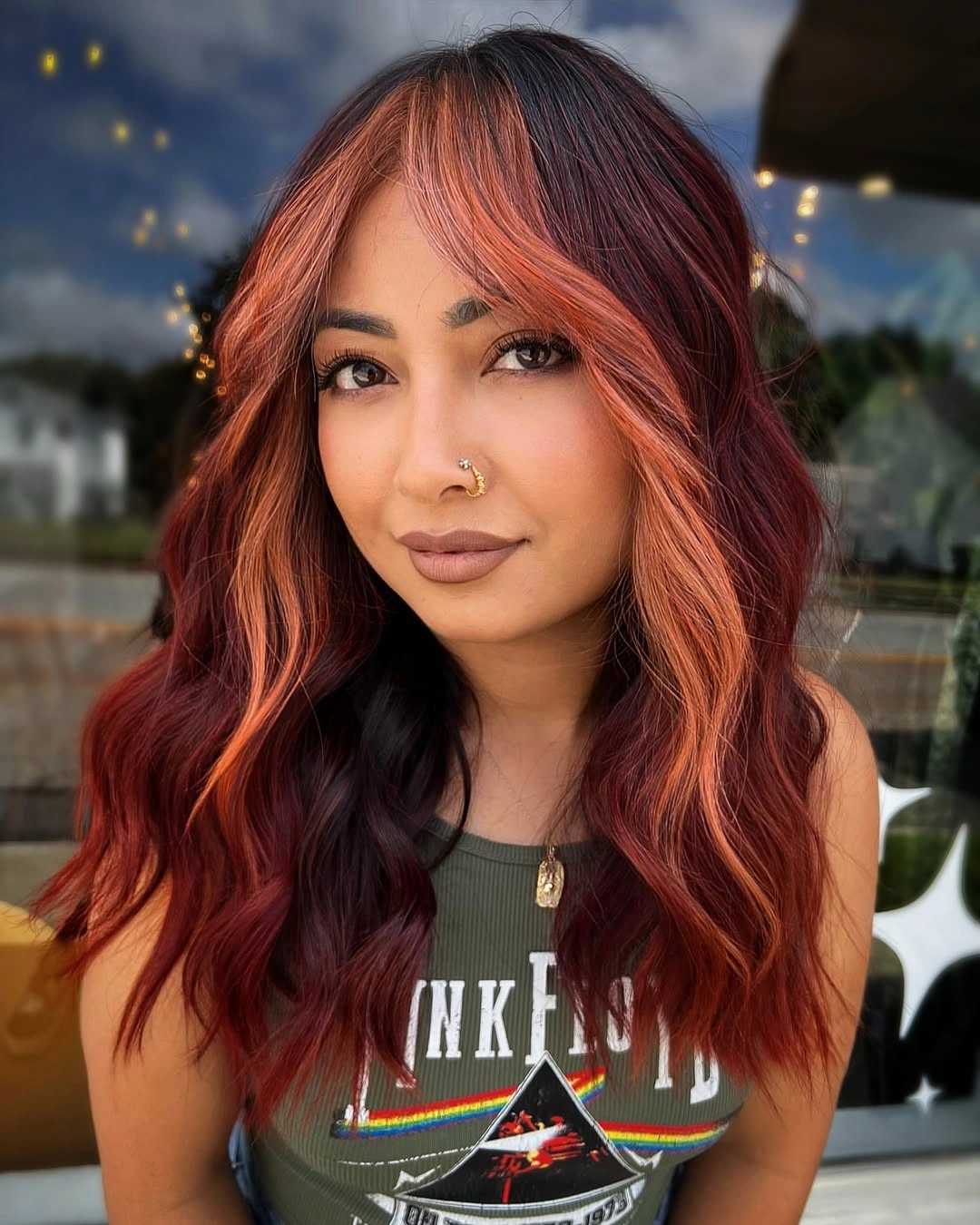
The face-framing placement makes the brighter ribbons useful even when the hair is worn simply. A deeper auburn ribbon would create a quieter variation, while a lighter copper would increase the brightness around the face without changing the mahogany base. The waves connect the pieces to the lower length, keeping them from looking like a separate front panel. Pay attention to balance from the part, because warm highlights concentrated on one side could change the visual weight.
This color story sits between muted brunette and vivid red, which makes it easier to adapt through saturation. The limitation is that red-brown and copper can shift noticeably as they fade, so the final maintenance impression depends on how much contrast you want to keep. A loose half-up style would expose the ribbons, while a side tuck would make them quieter. Keep the deep mahogany anchor and treat the copper as controlled light rather than a new competing color.
A butterfly clip organizes bright copper waves
Long bright copper waves become more intentional when a decorative butterfly clip gathers the upper section into a half-up style. The clip is visible, but the main visual event remains the orange-copper color moving through the loose lower lengths. Darker depth near the top gives the bright shade a starting point, while the waves prevent the color from becoming rigid. It is a playful way to control saturated hair without hiding the movement that makes it attractive.
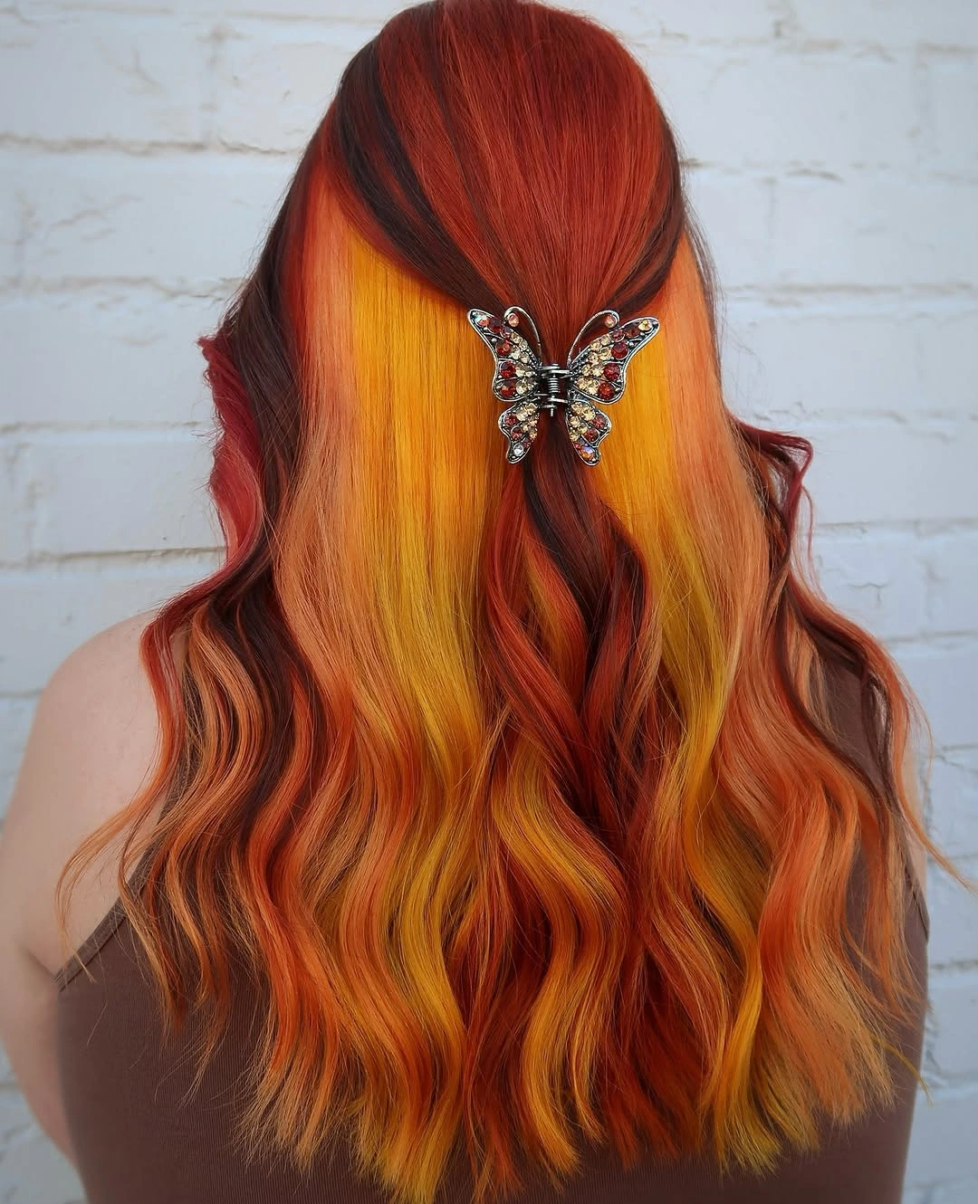
The half-up shape divides the color into a controlled crown and an open length. A plain clip would make the result quieter, while a larger decorative accessory would compete more directly with the copper. The waves do not need to be perfectly uniform; their variation helps the warm color show different values through the ends. Keep the accessory near the natural center of the hairstyle so it organizes the shape instead of pulling the eye too far to one side.
This idea can be adapted with a small claw clip, a simple tie, or a loose braid, depending on how much decoration feels comfortable. The tradeoff is that bright copper and a visible accessory together create a clearly styled look, so it may feel less neutral than an entirely loose finish. If the color already feels intense, choose a quieter clip and keep the shape half-up. Preserve the relationship between controlled crown, bright lengths, and soft movement.
Taupe-bronde ribbons follow layered ends
Medium taupe-bronde waves look dimensional because the lighter ribbons follow the layers and softly turned ends instead of forming broad, high-contrast bands. The base remains cool brown-beige, and the brighter pieces are quiet enough to appear as movement rather than a separate color block. A side part adds a little direction to the front, while the lower edge keeps the silhouette light. This is a restrained color idea for readers who want visible texture without high saturation.
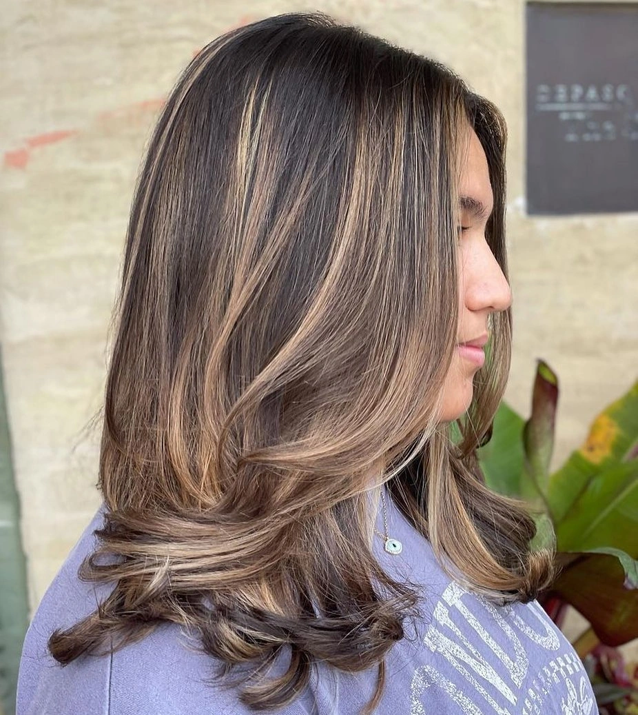
The placement works because the color and haircut repeat the same movement. When the ends turn, the lighter ribbons become visible; when the hair rests, the taupe base returns to the foreground. A brighter blonde would make the dimension more obvious, while a closer beige would create an even quieter result. Keep enough contrast to see the ribbons in a neutral light, but do not add extra warm tones that would change the muted character.
This palette can be adapted to a shorter medium cut or a smoother finish, although the impression will become cleaner and less fluid. The limitation is that subtle ribbons can disappear when the ends lose their shape, so a simple bend or a defined side part may be more useful than a complex style. The color relationship is cool brown, soft beige, and controlled light. Preserve that restraint if you want the result to feel modern without becoming loud.
Honey copper waves catch light through length
Long honey-copper waves create a warm color field where the lightest pieces appear along the bends rather than as separate hard panels. The palette moves between golden beige, copper, and honey, giving the length a luminous but softer impression than vivid orange. Seen from the back, the repeated wave pattern makes the color feel layered all the way to the ends. This is a good direction for someone who wants warmth and glow without a high-contrast dark-to-bright design.
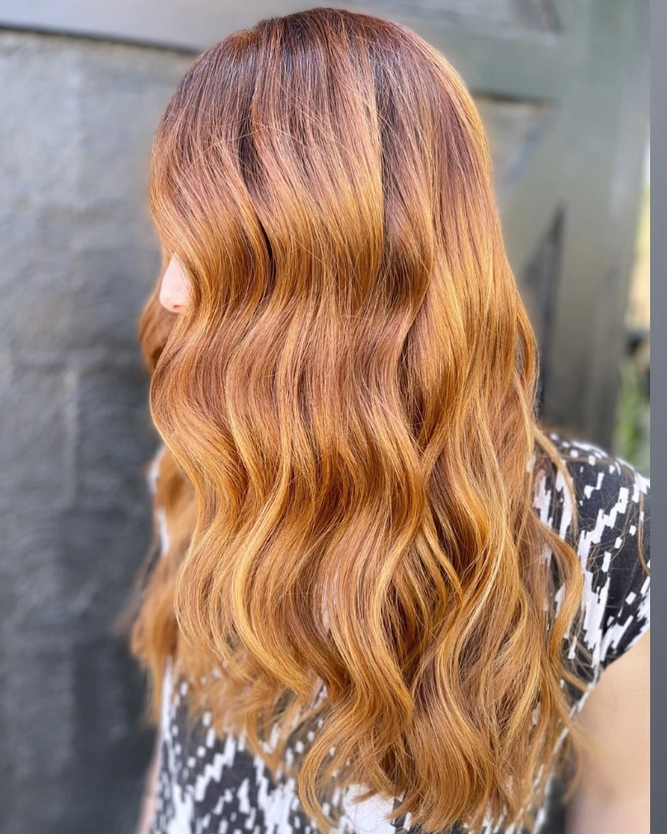
The waves control how the warm values alternate. A straight finish would make the honey and copper pieces read more vertically, while tighter curls would scatter them into smaller flashes. A slightly deeper root could ground the pale warmth, but the visible version already relies on gentle variation rather than dramatic contrast. Protect the ends and keep the wave separation soft, because rough texture could make the luminous palette appear less connected.
This shade family is expressive but less graphic than red and black panels, so it can be adapted through saturation or length without losing its main idea. The tradeoff is that warm light colors can look different under indoor and outdoor lighting, making the result feel more variable than a deep brunette. A half-up style would expose the crown and let the lower waves stay open. Preserve the honey-to-copper flow and avoid introducing a cool accent that would interrupt it.
Graphic red panels sharpen a wine base
Long straight hair becomes a deliberately graphic surface when a deep wine-red base is divided by black sections and bright red vertical panels. The smooth shape keeps every color boundary visible from root to end, so the design feels more linear than blended. There is no wave to soften the contrast; the length acts almost like a clean map of dark and bright values. This is the boldest option for someone who wants clarity rather than subtle dimension.
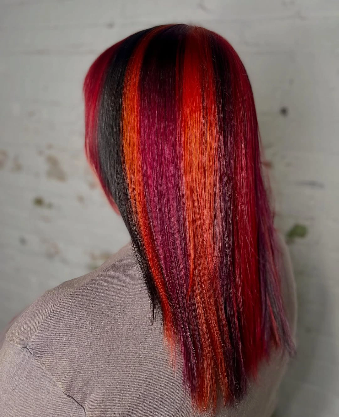
The straight finish is the key variable because it lets the vertical panels stay crisp and evenly legible. Loose waves would break the lines and make the color feel more blended, while a shorter cut would compress the placement into a smaller graphic shape. If the contrast is too strong, the bright red can be narrowed while the wine base remains. Keep the black sections purposeful, since they create the negative space that makes the red visible.
This style offers a strong visual result but little camouflage for uneven fading or shifted placement. The long smooth line also requires the ends to remain neat, because frizz would soften the very structure that defines the look. A simple center or side part could change the front emphasis, but adding extra accessories would not be necessary. The useful conclusion is that dark color can stay dramatic and readable when contrast is placed with restraint and the silhouette stays clean.